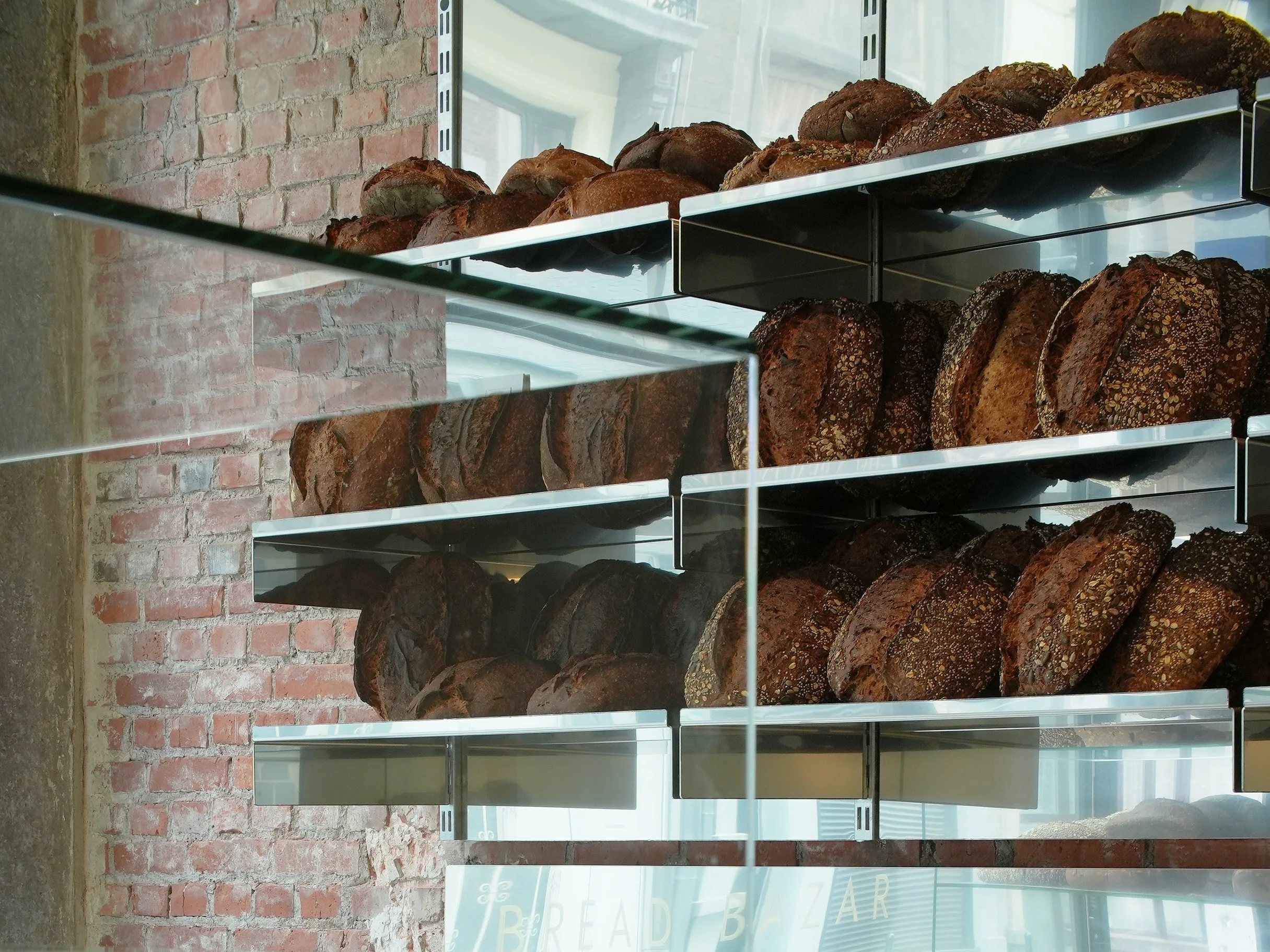
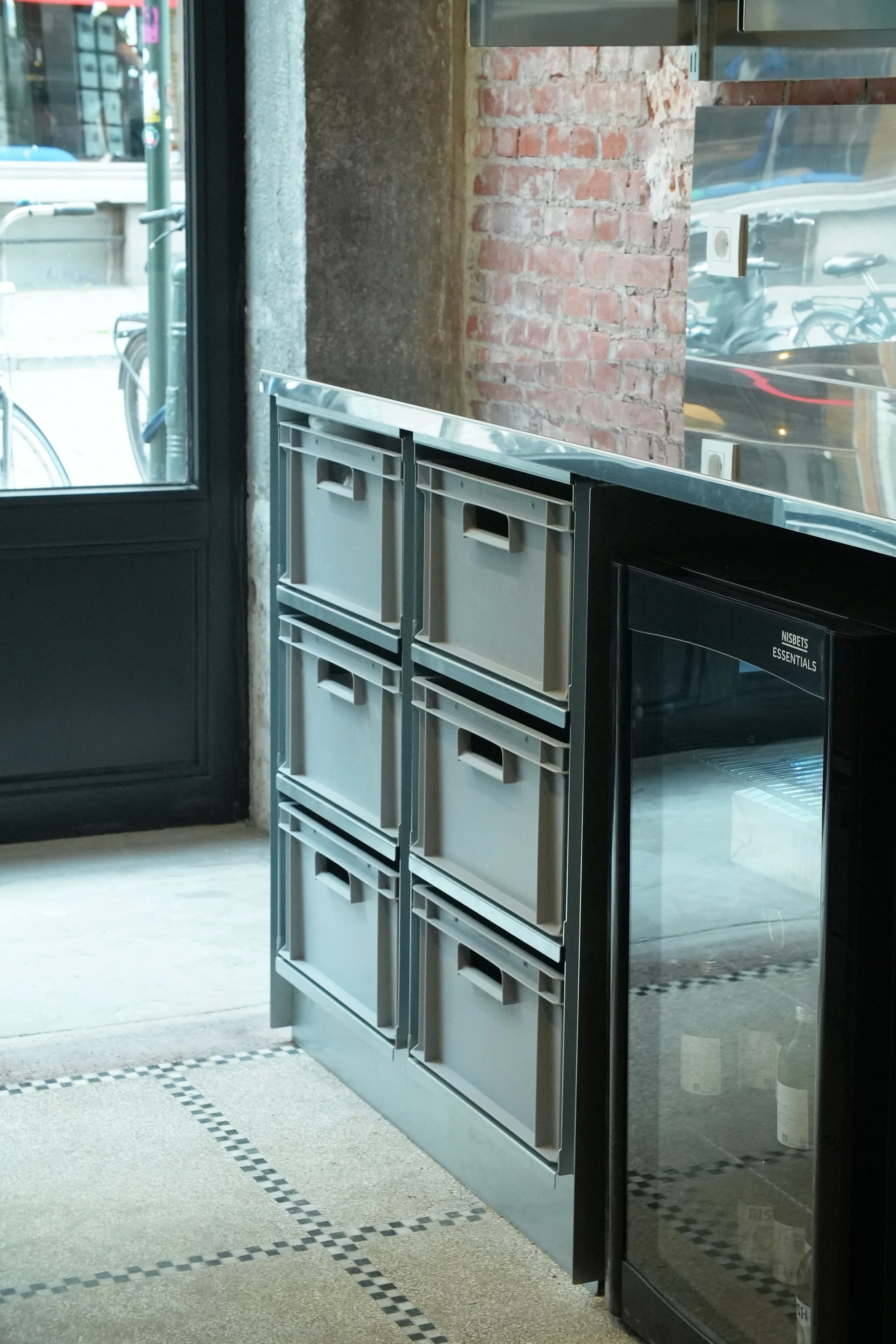
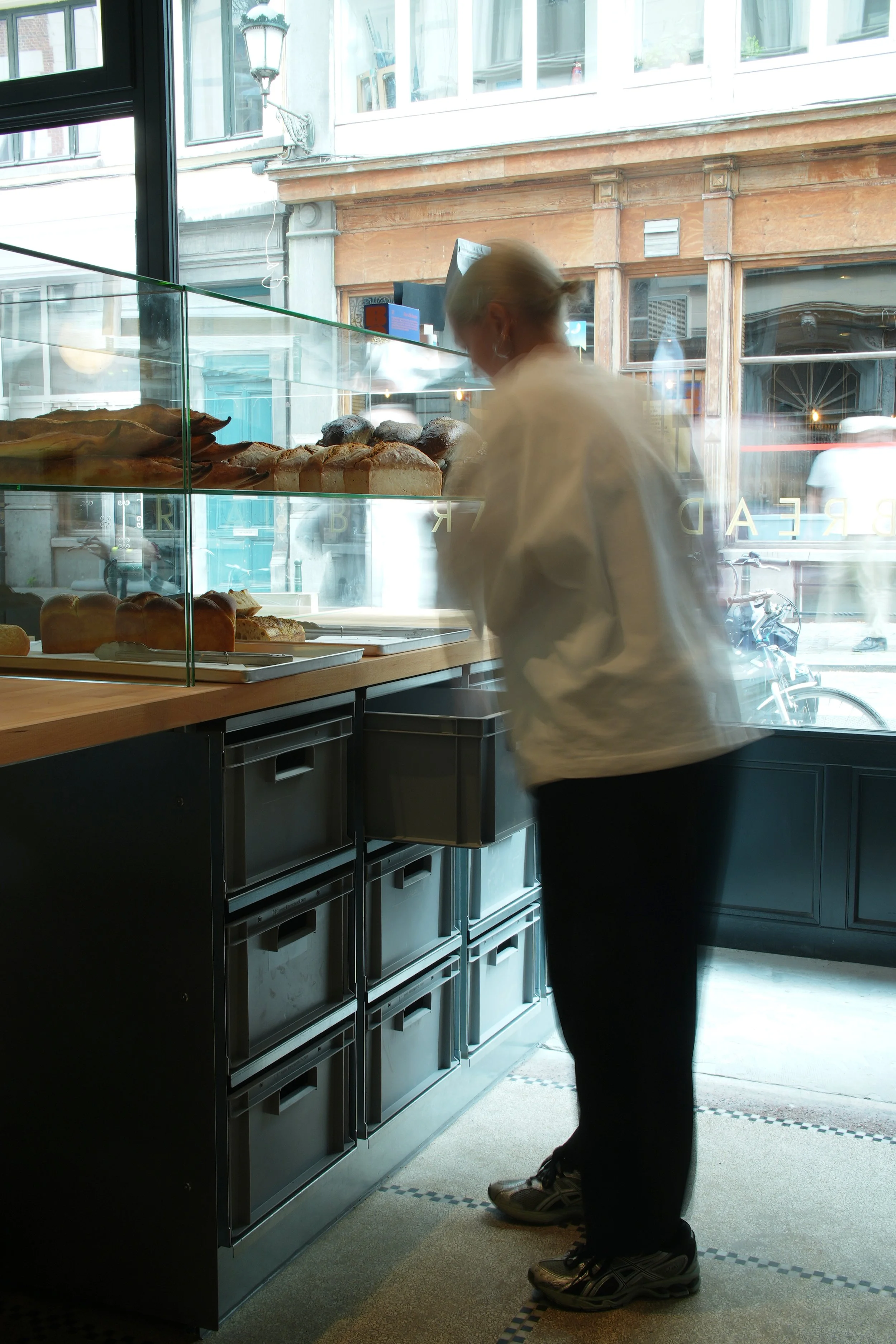
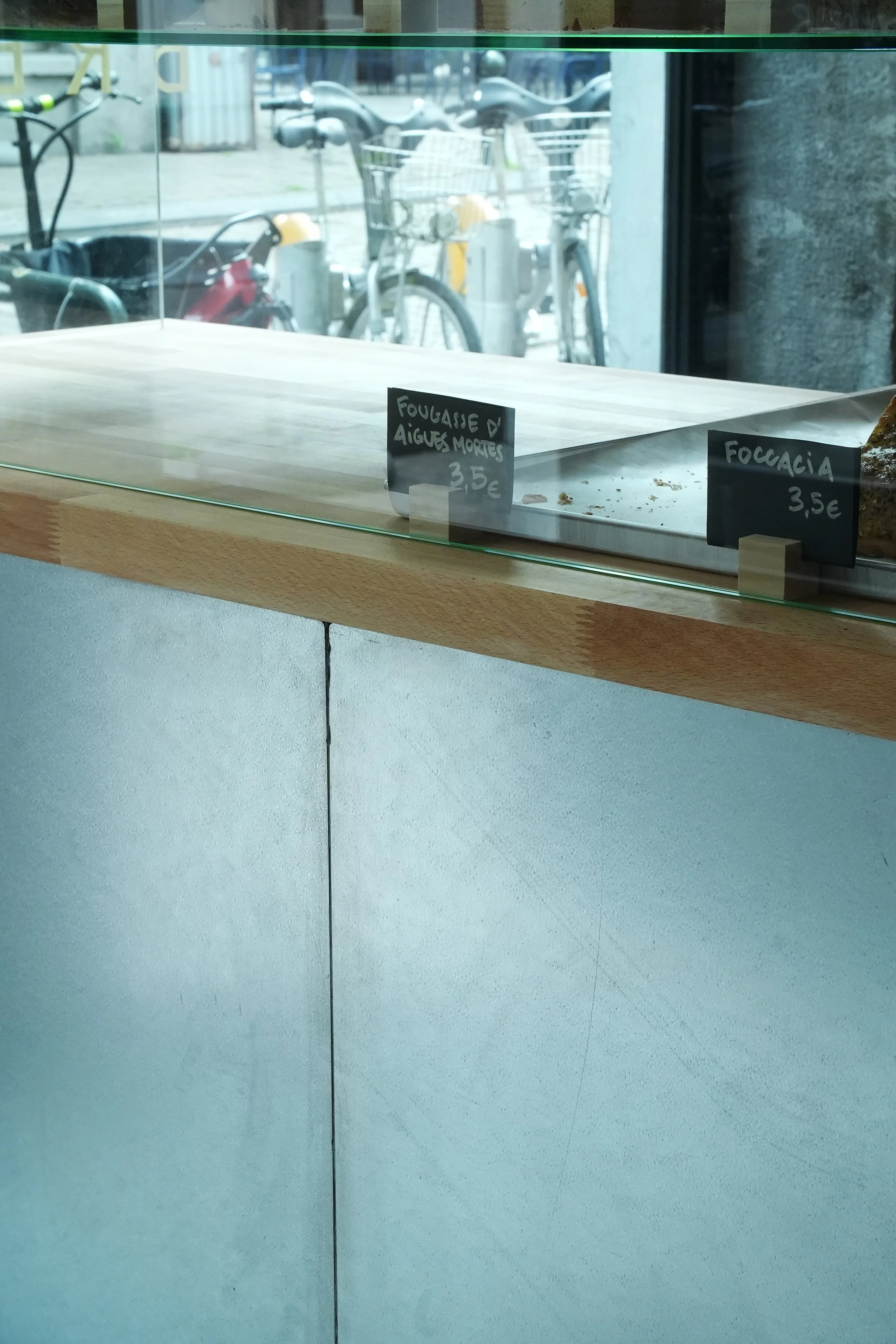
BREAD BAZAR BXL
Kitchen designed for @breadbazar.bxl a new sourdough bakery in Dansaert.
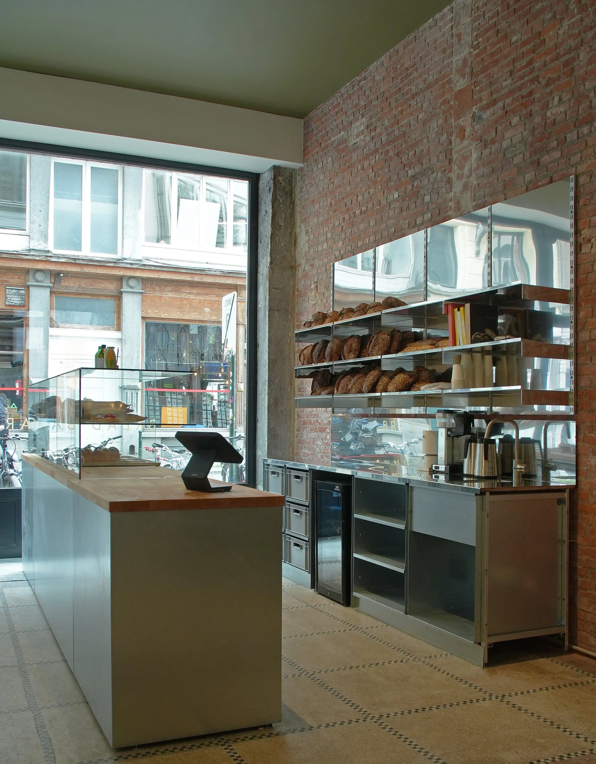
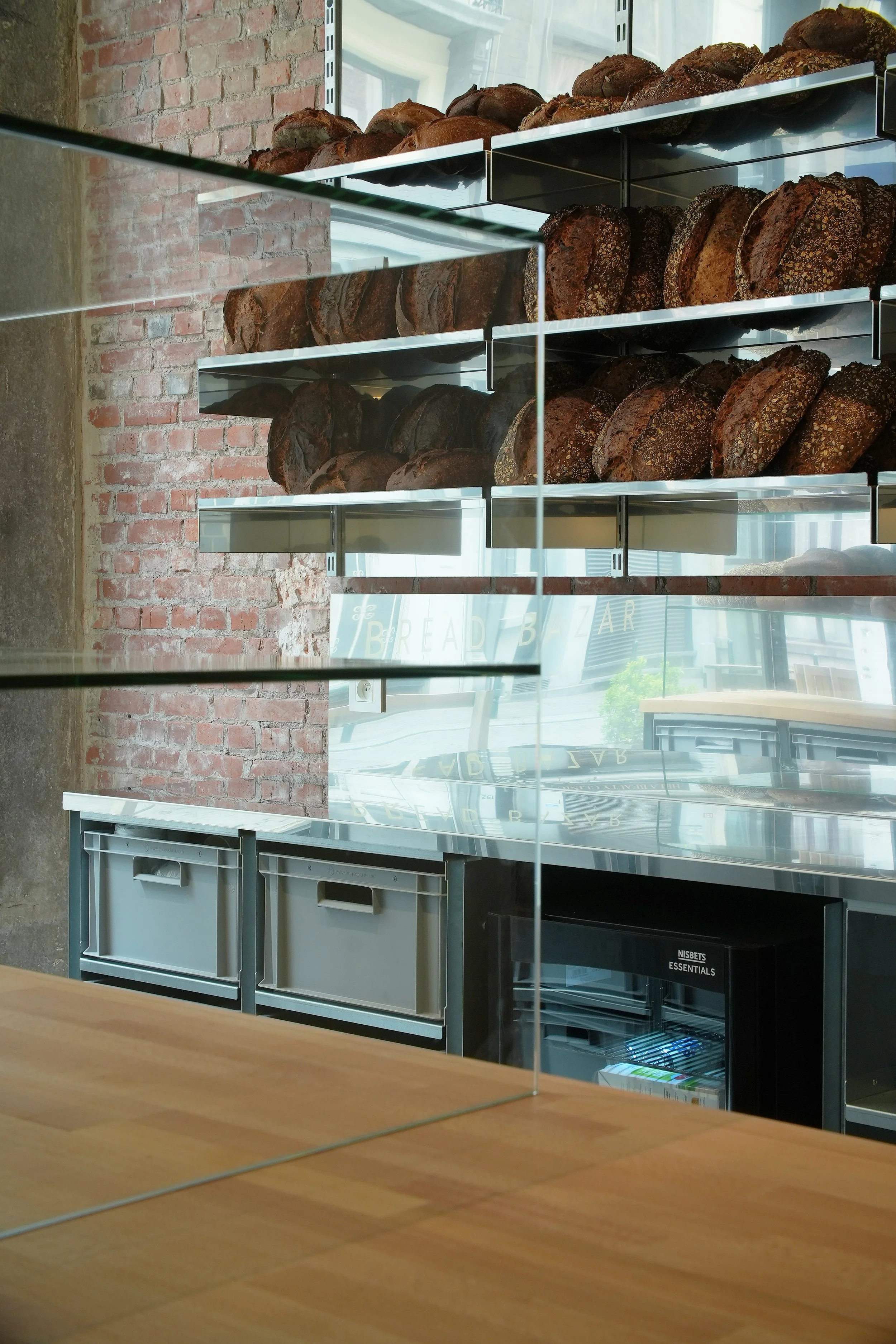
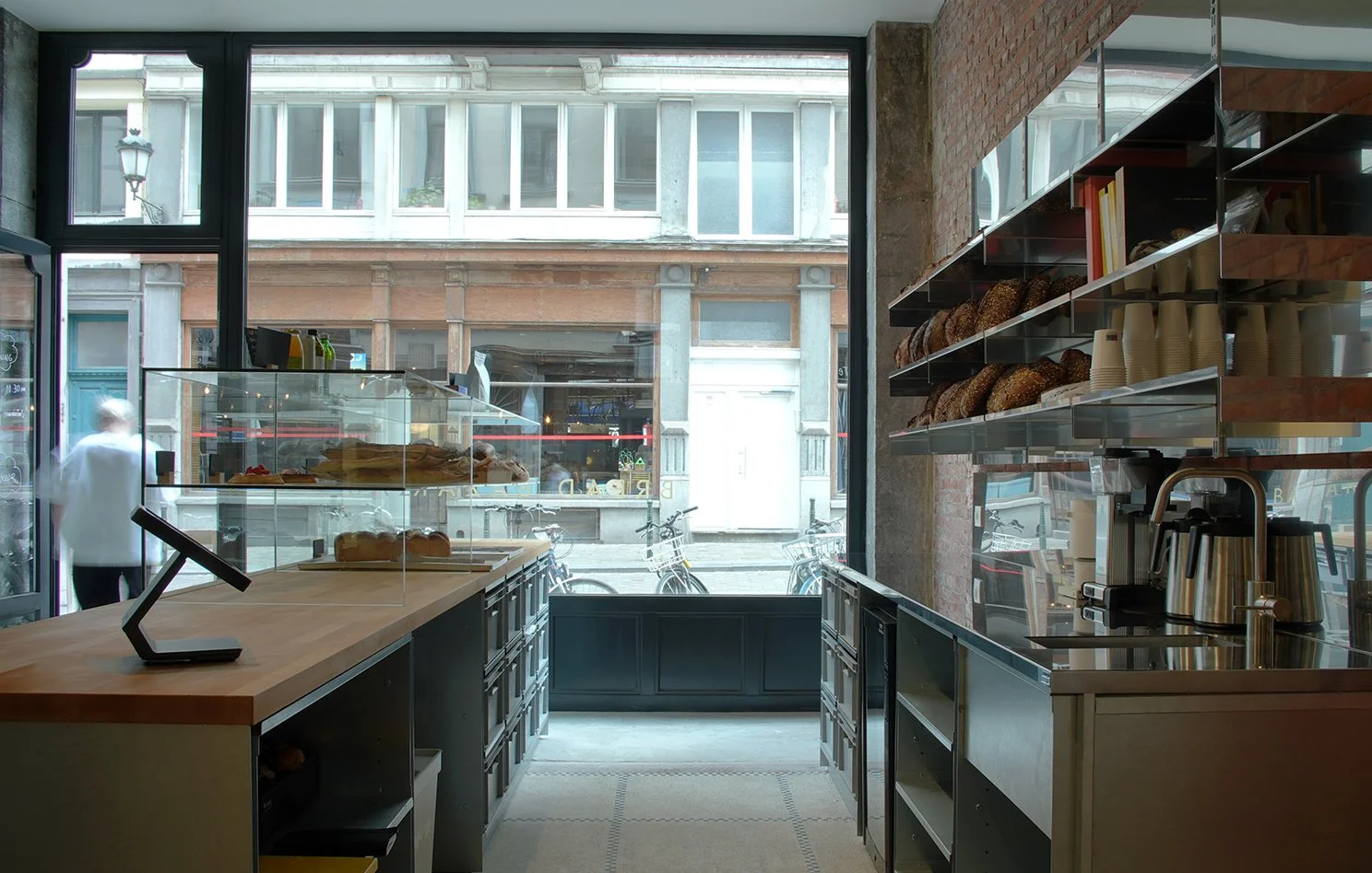
A place of bread.
Where flour meets sourdough starter,
And where inox meets wood. To give a
Tangy complex favor to the space.

In a space thought by Studio Cayelle
we designed both the front and back counter.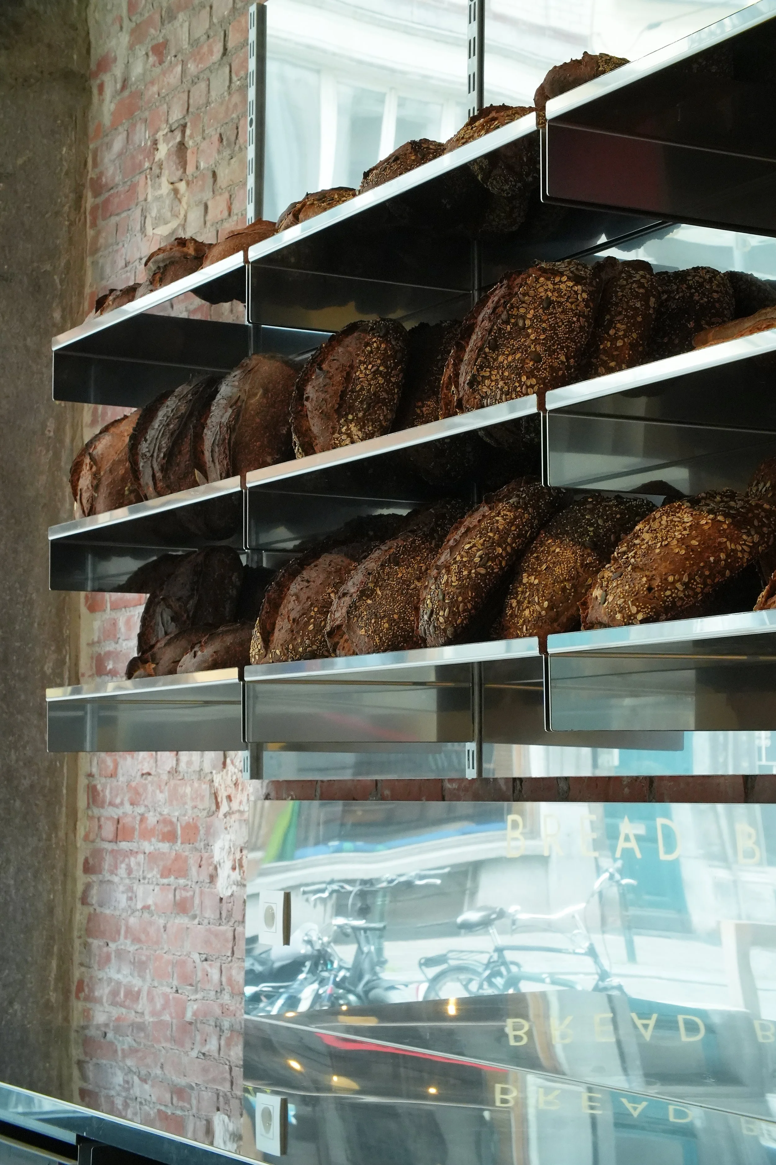
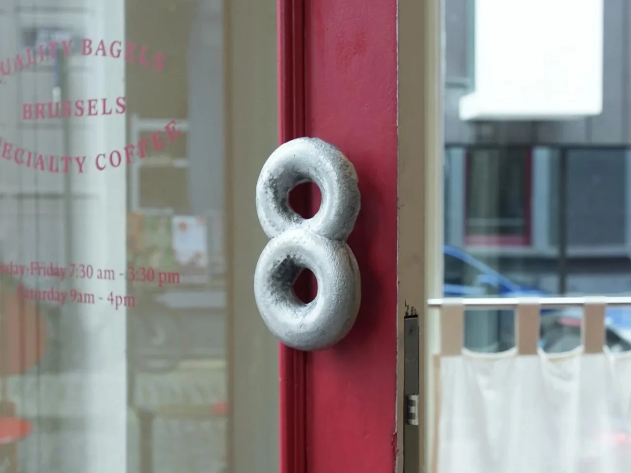
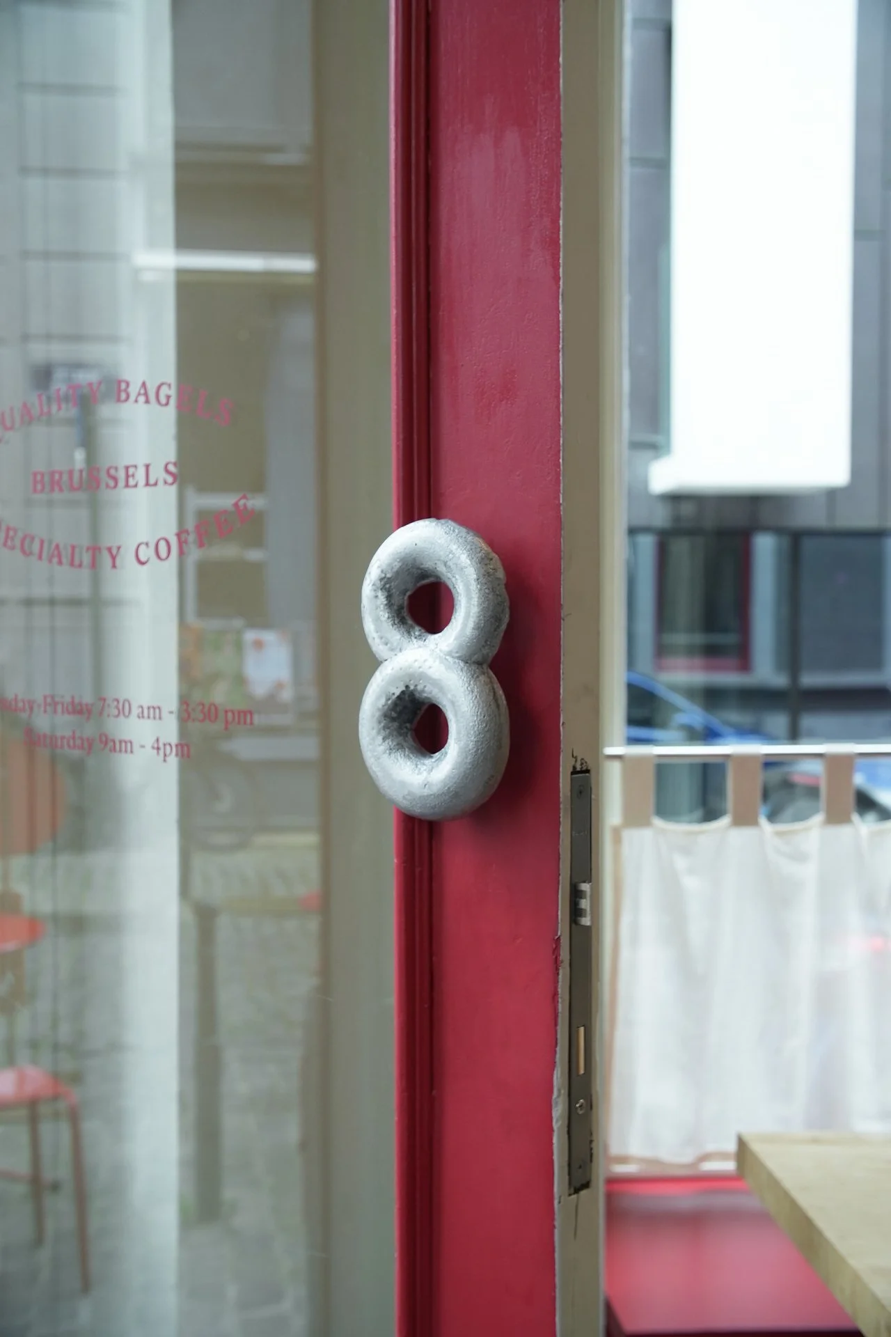
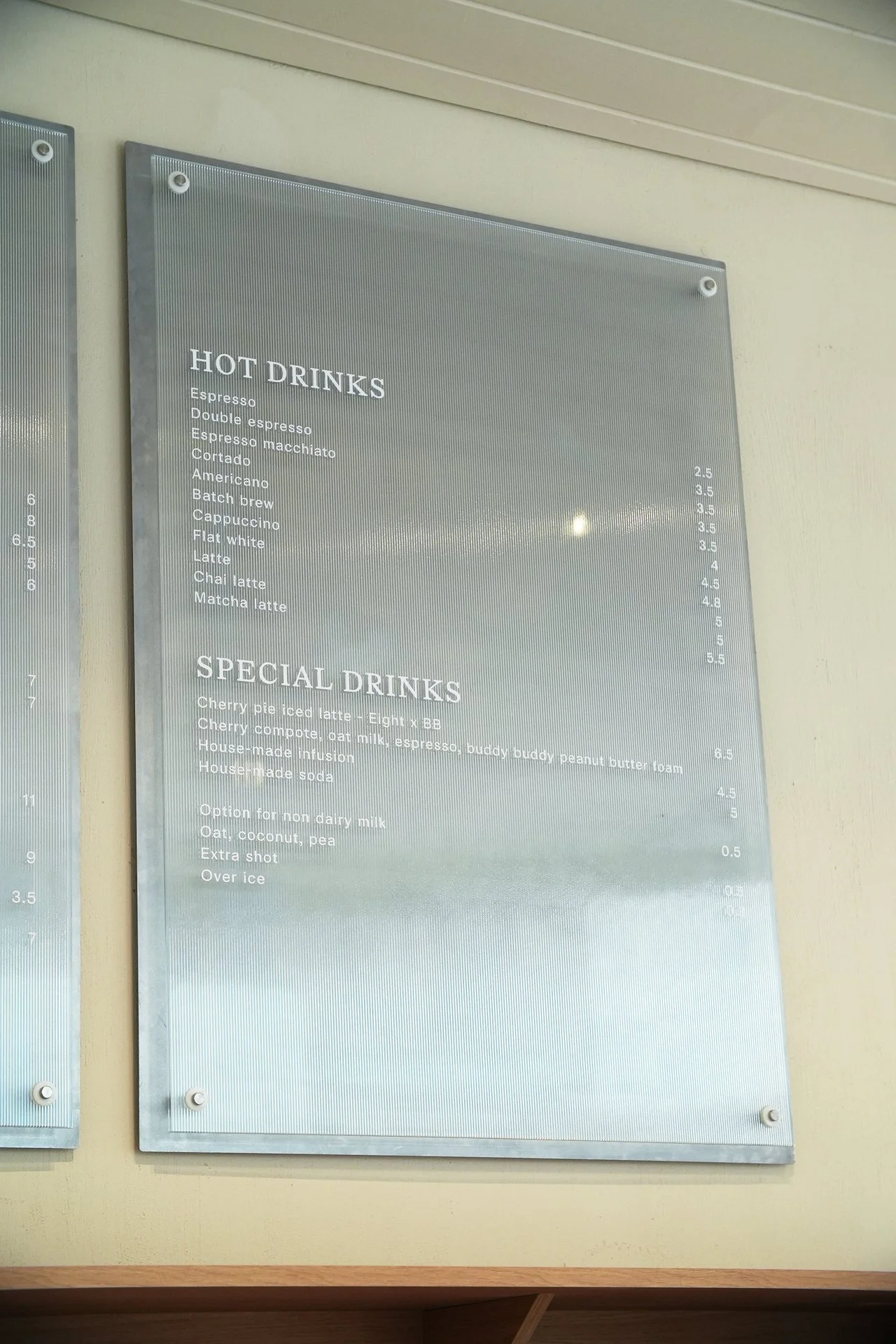
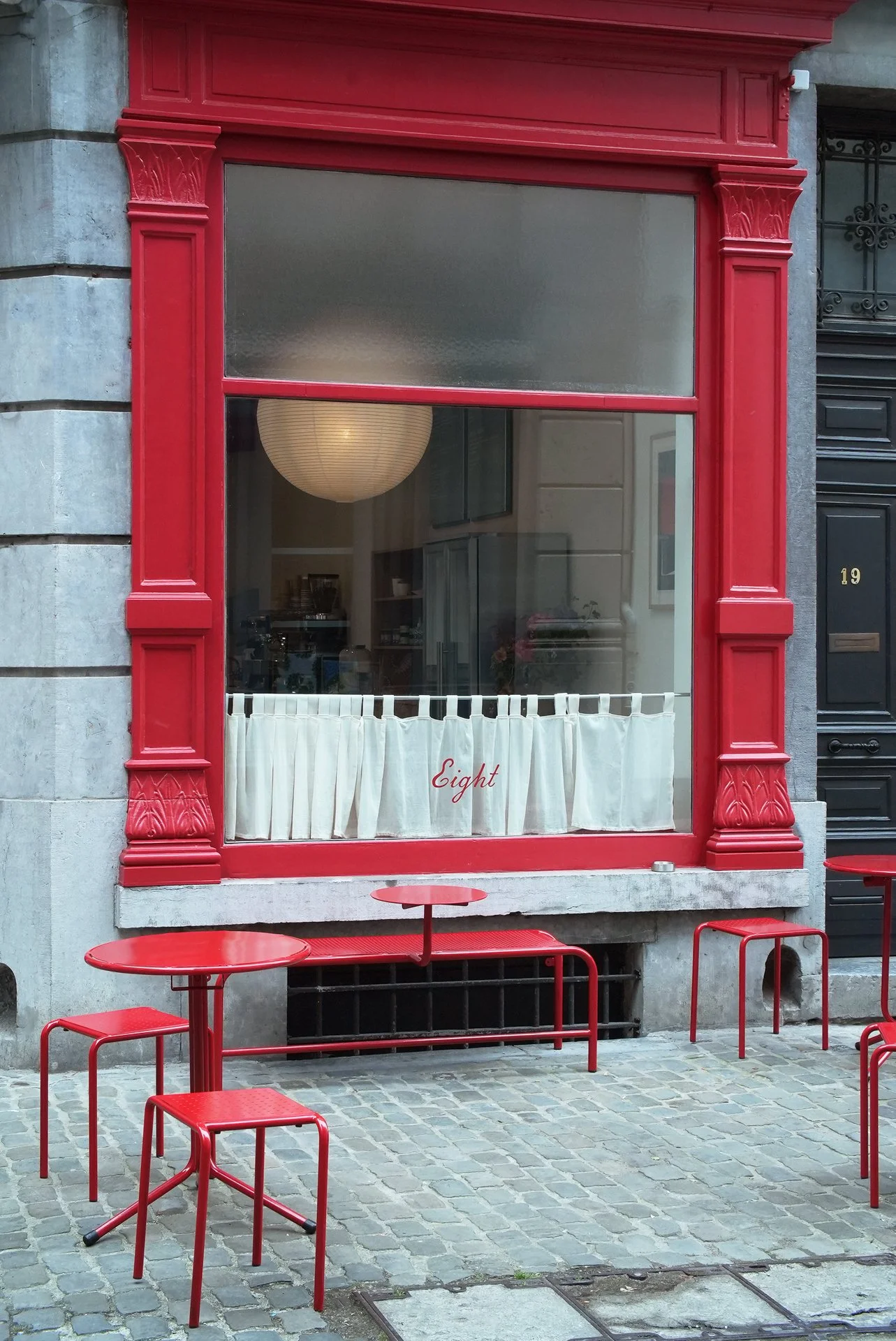
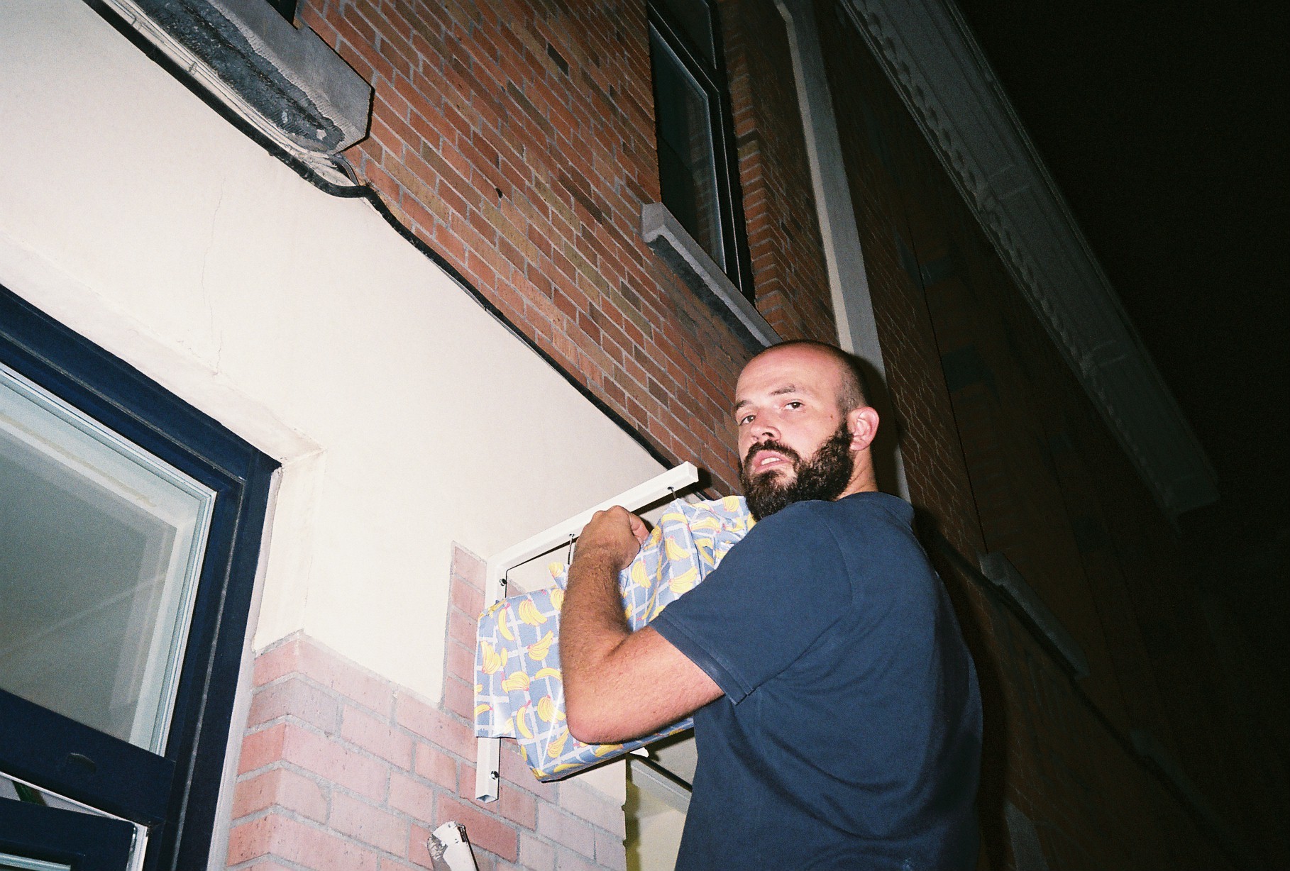
8 EIGHT
Custom-made handle, signage, and curtain design for @eight.brussels, a brand-new coffee and bagel shop in Brussels.
A place of bagels.
Deconstructed,
cut in two.
Overlaying,
with a potential overlay
of ingredients and materials
unless you prefer it plain.

To a beautifully designed space by Sill and Sound Architects,
we added some toppings with a taste of fabric, metal, and glass.
We designed curtains, signage flags, the menu board, and a handle.
The cherry on top. 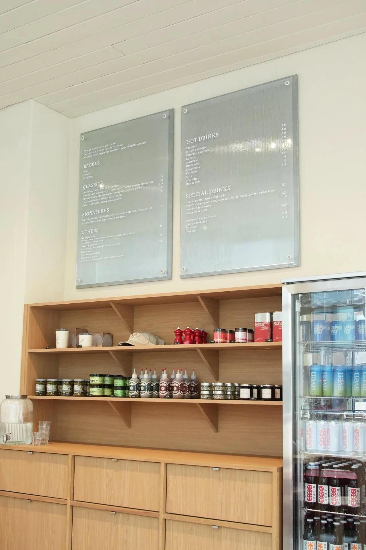
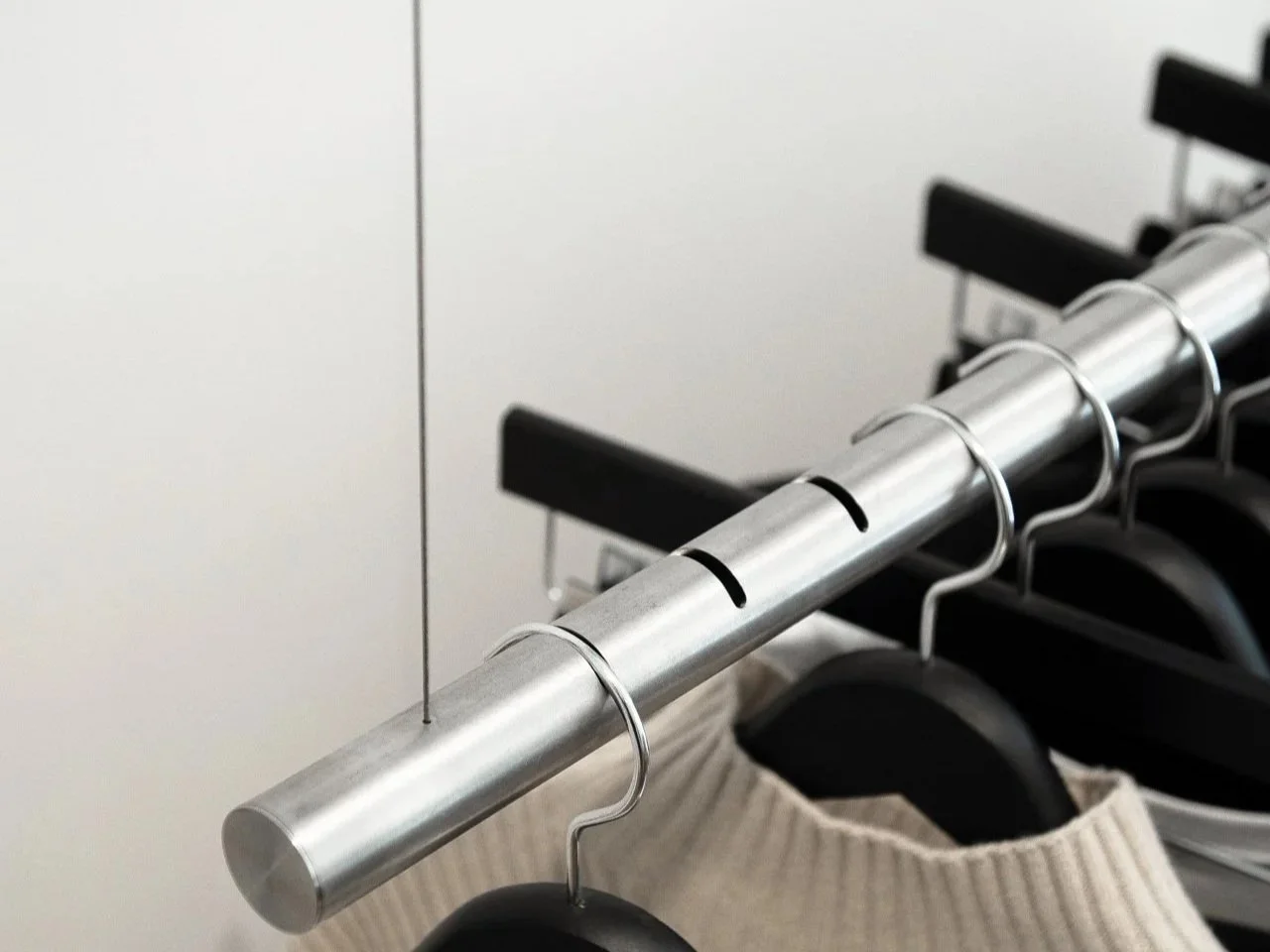
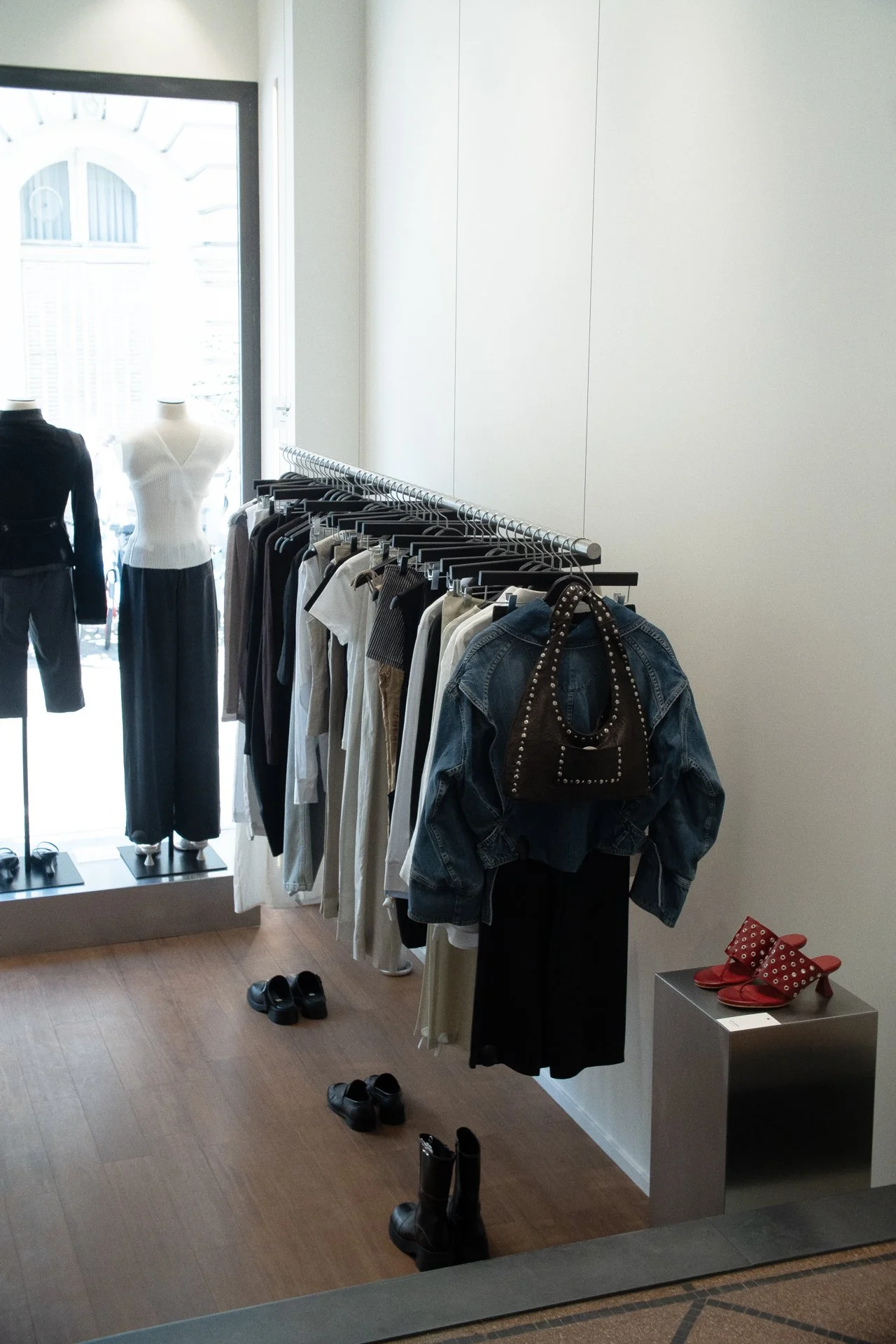
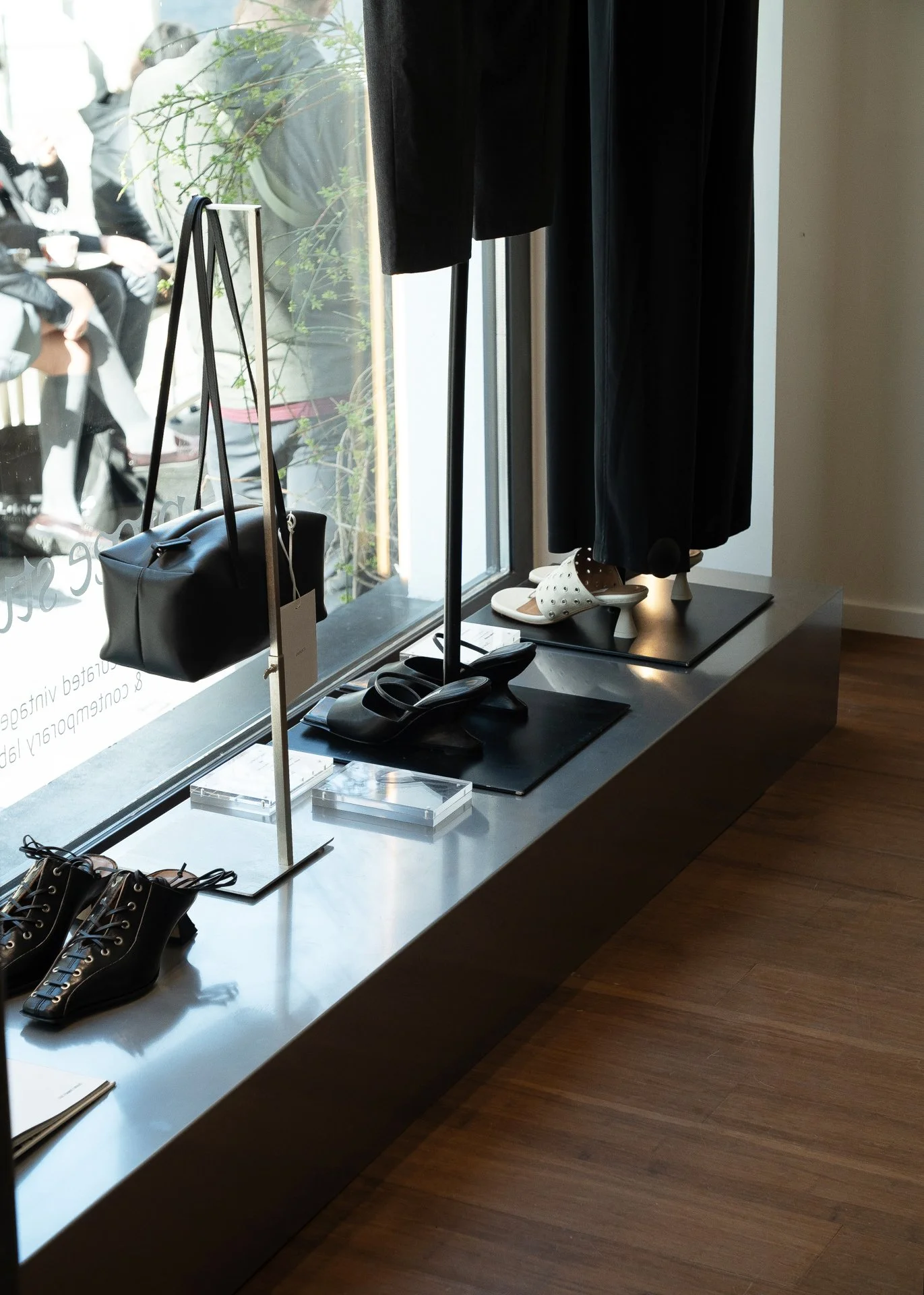
PROSE
Timeless suspended lines. Fluid, yet with an intentional a rhythm. One beat for each hanger. Sophisticatedly minimal. And a counter, statement piece: bold and simply beautiful.
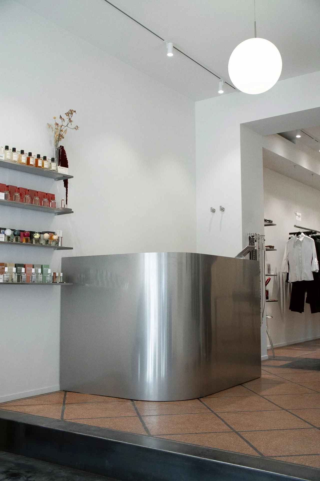
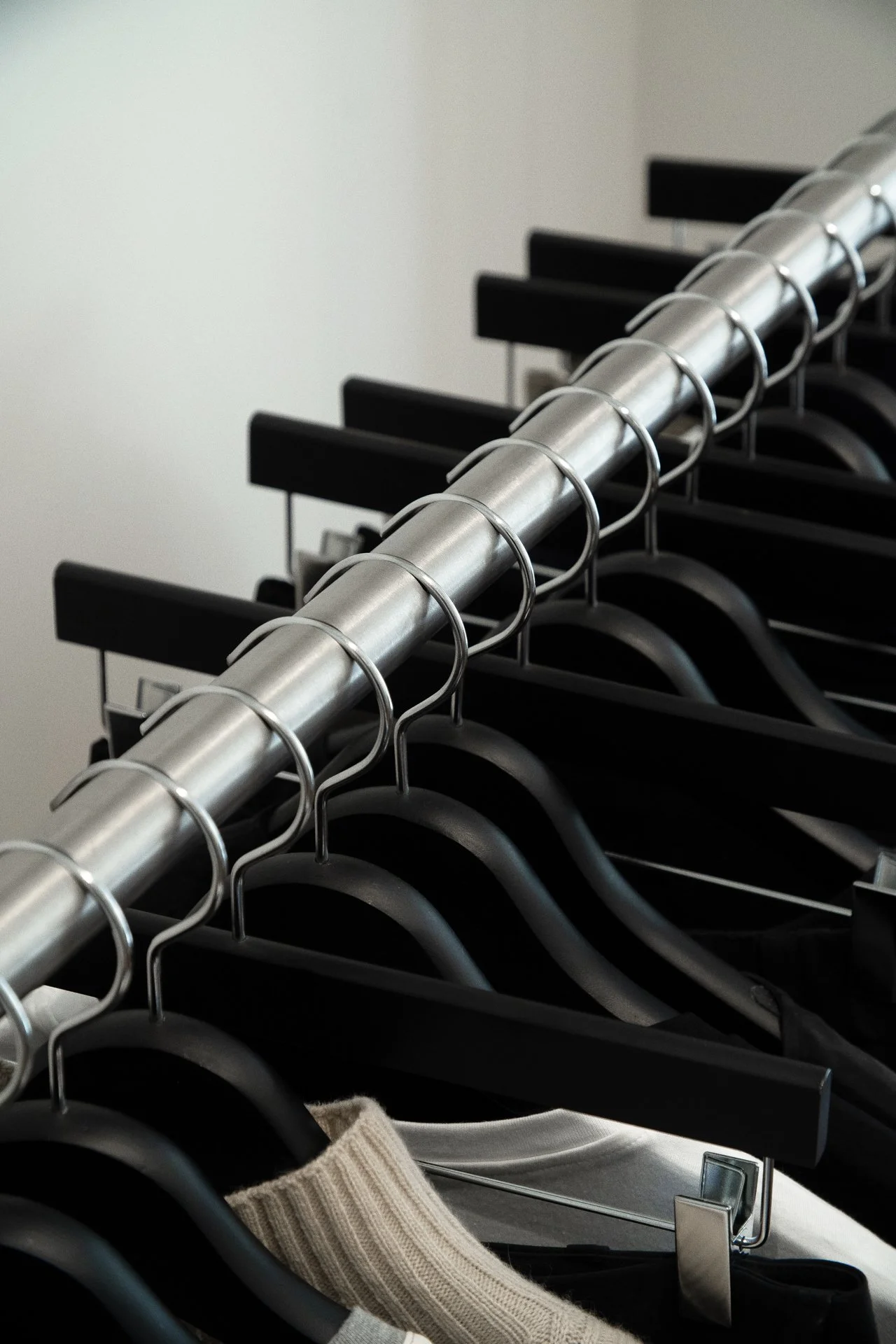
Timeless suspended lines. Fluid, yet with an intentional a rhythm. One beat for each hanger. Sophisticatedly minimal.And a counter, statement piece: bold and simply beautiful.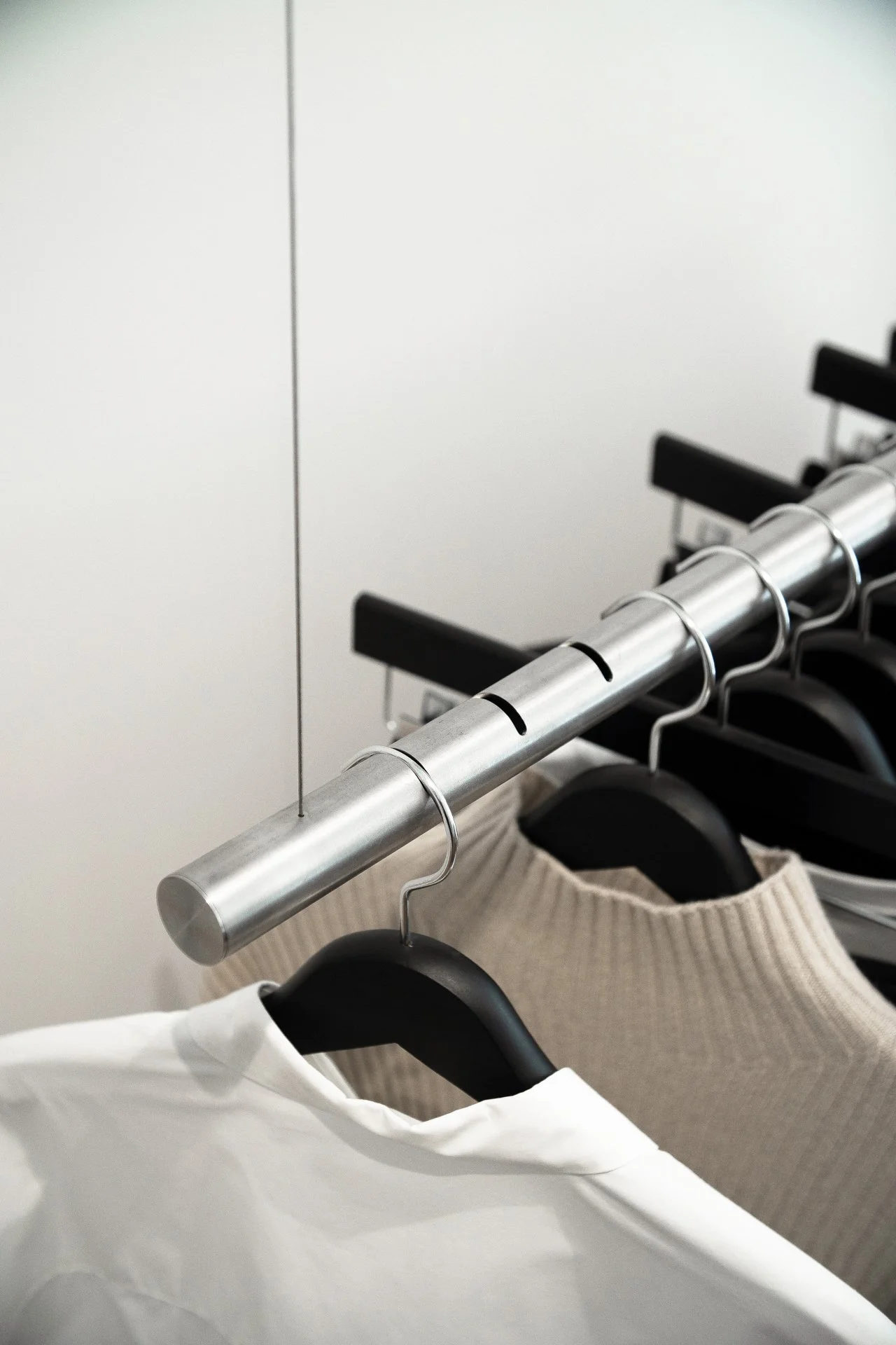
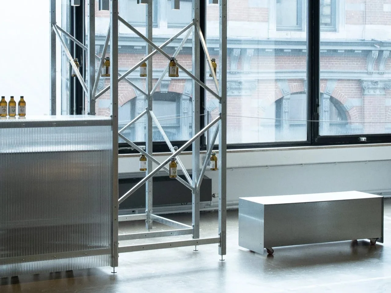
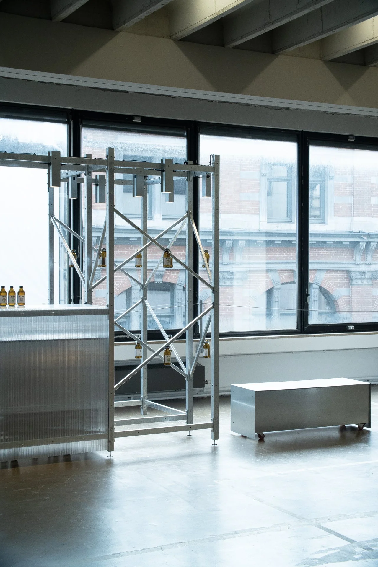
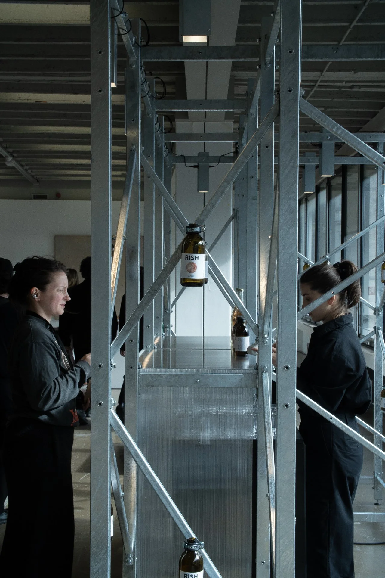
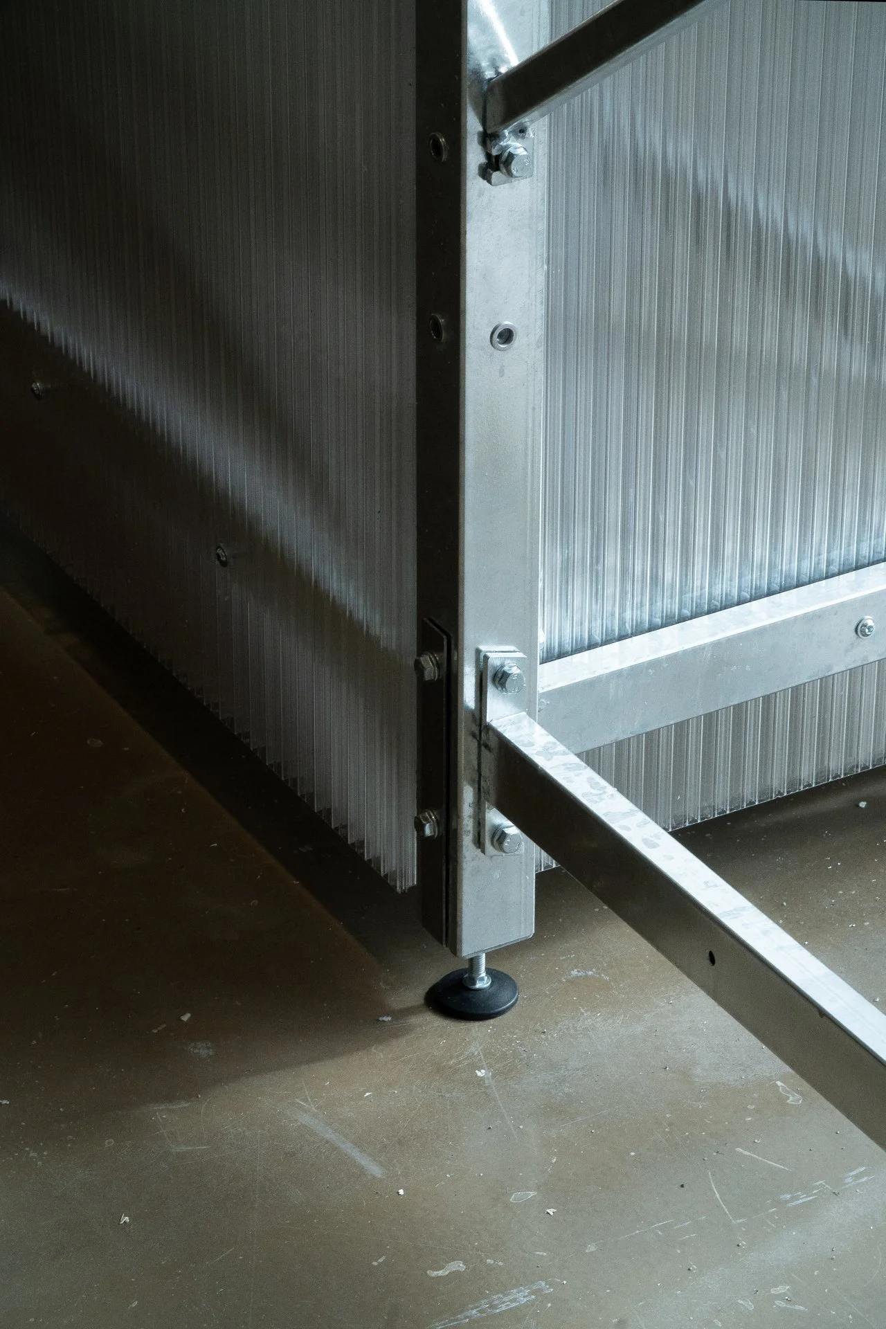
RISH
A new year of Collectible , and a new collaboration. With our same beloved RISH.
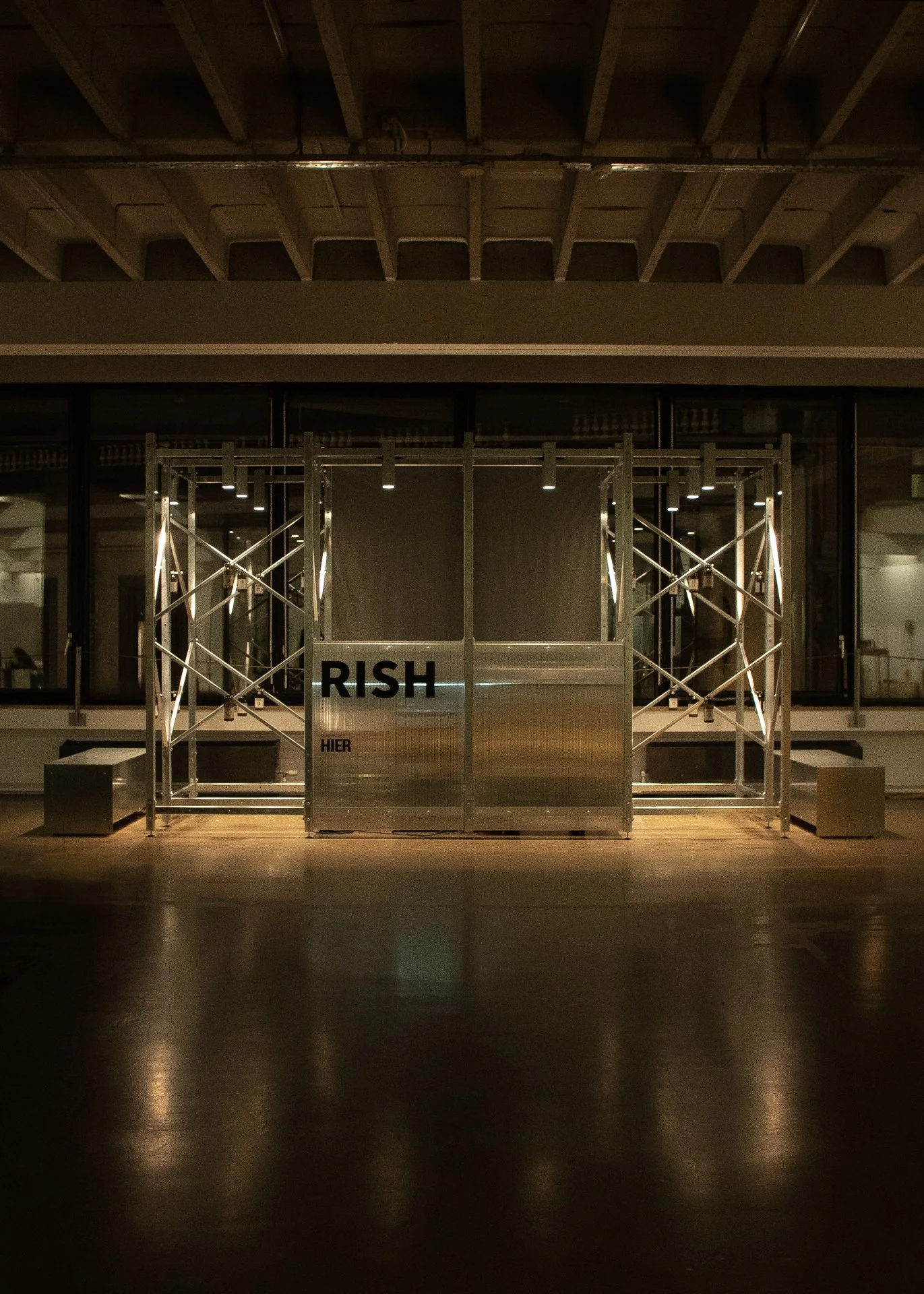
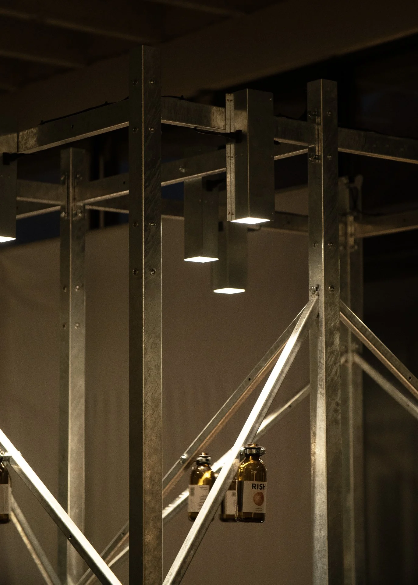
A new year of Collectible , and a new collaboration. With our same beloved RISH.The structure used, has been used before. At MOM 2026, for Belgium Is Design.The lighting used, has been used before. At Alcova , Milan Design Week 2025, Belgium Is Design.And both configured differently, for RISH, with love.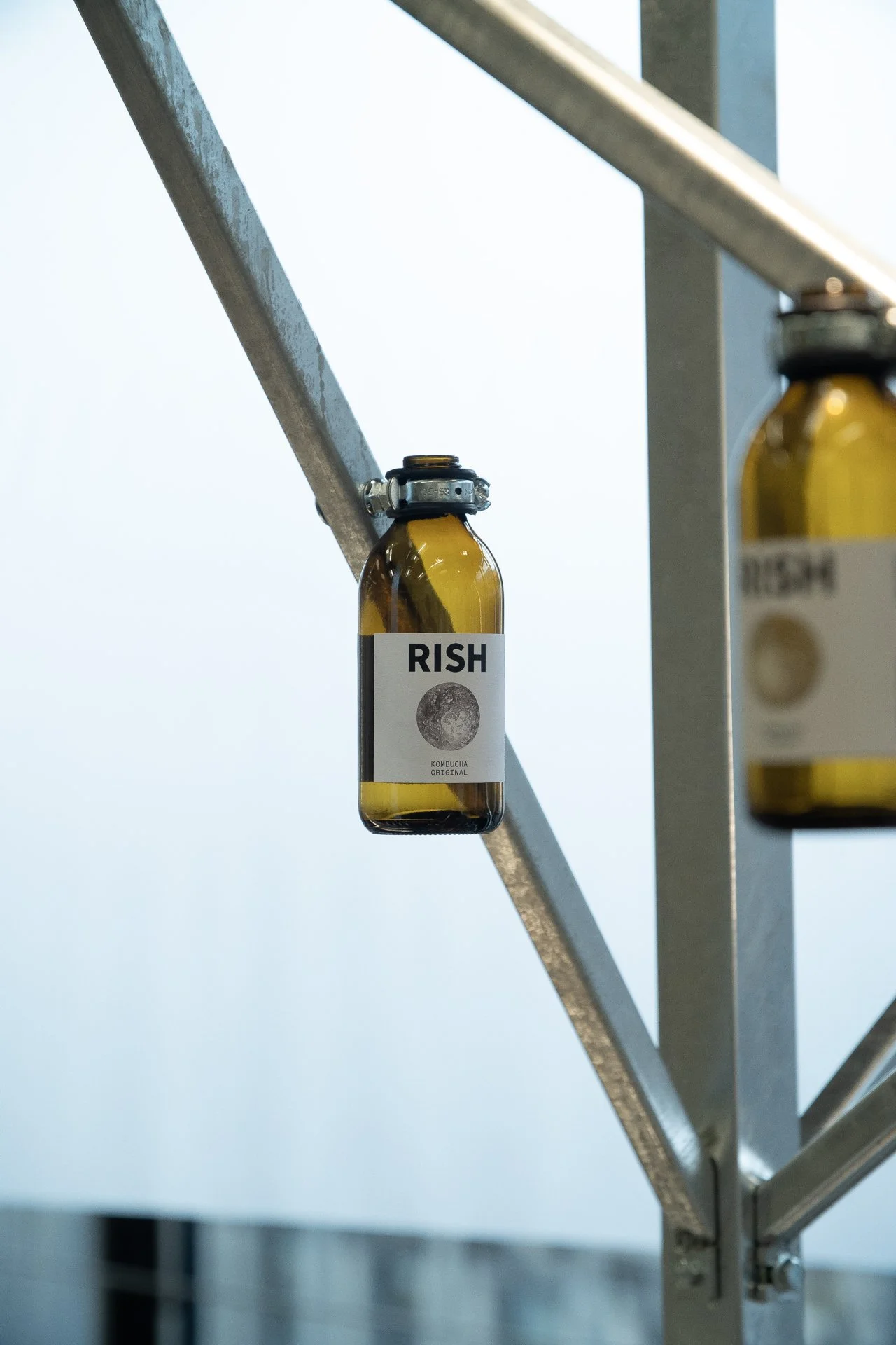
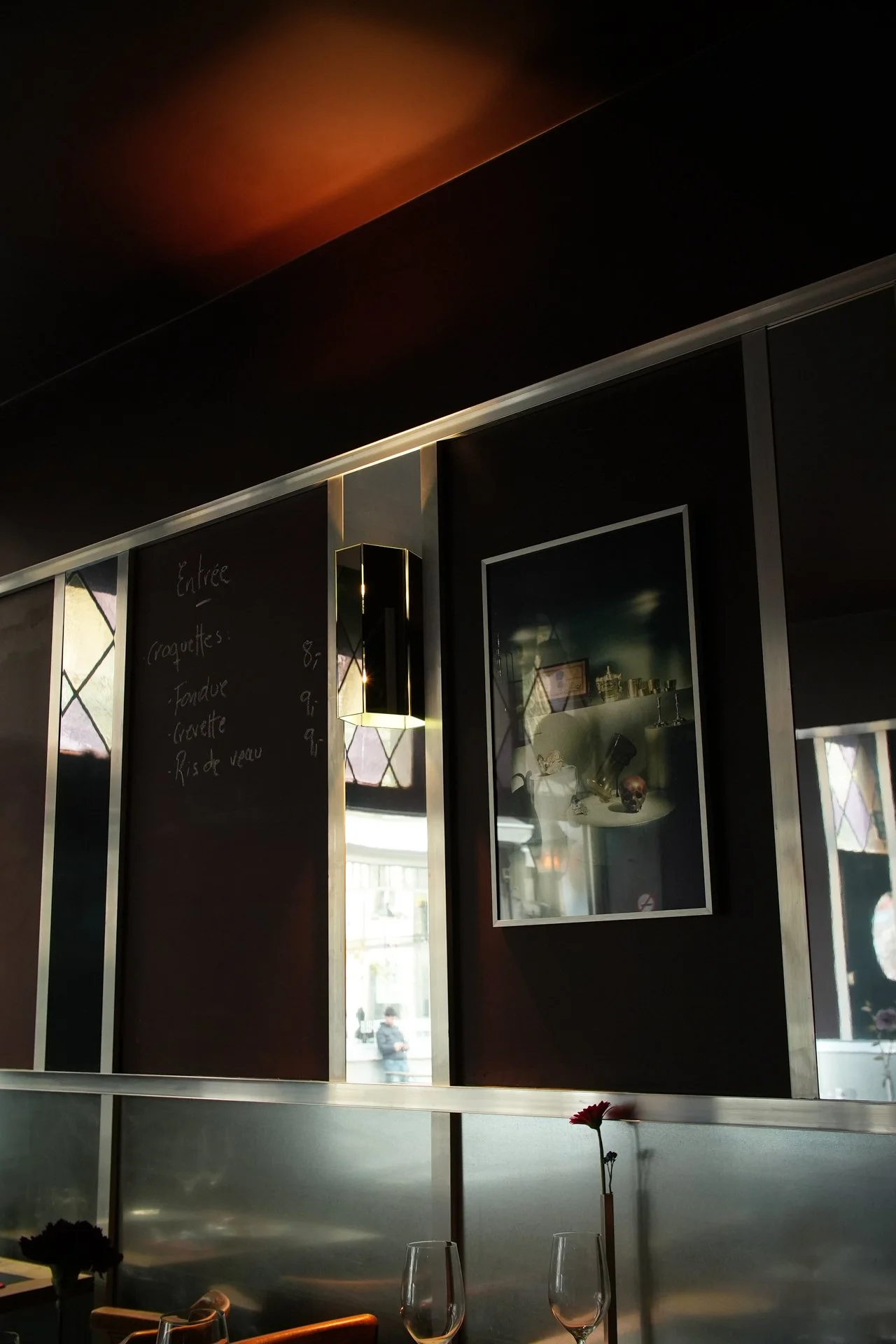
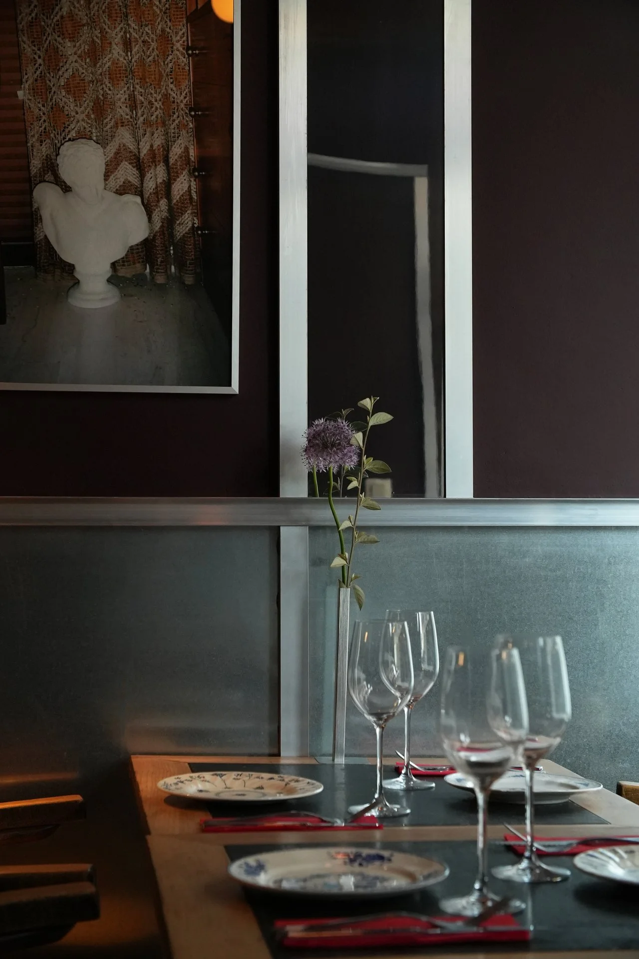
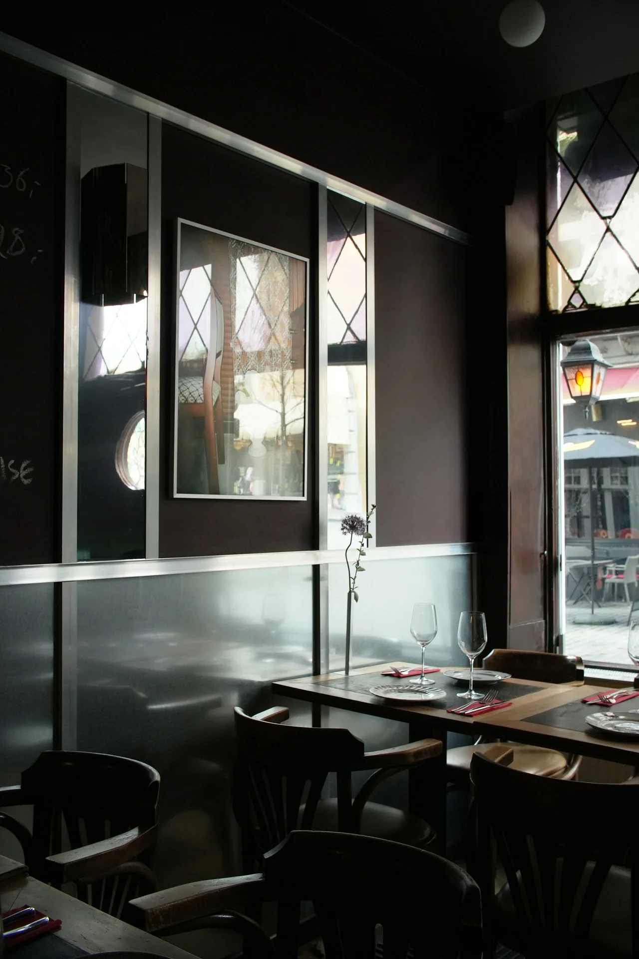
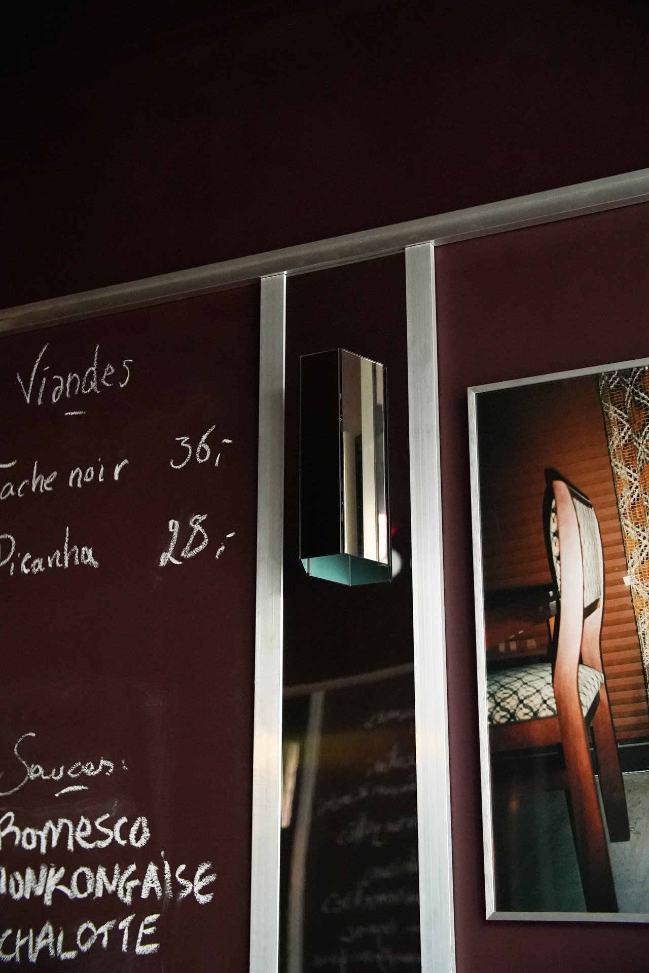
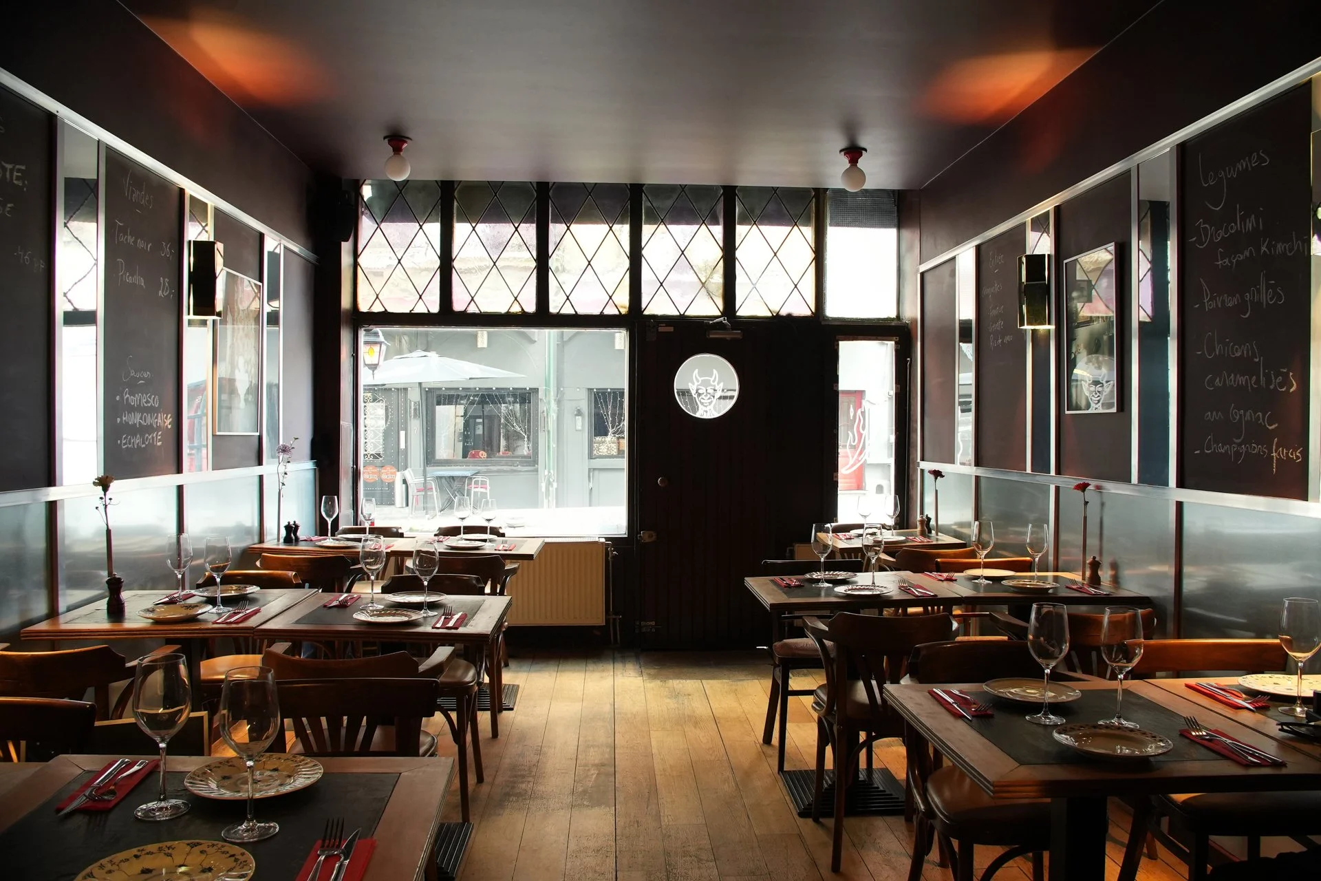
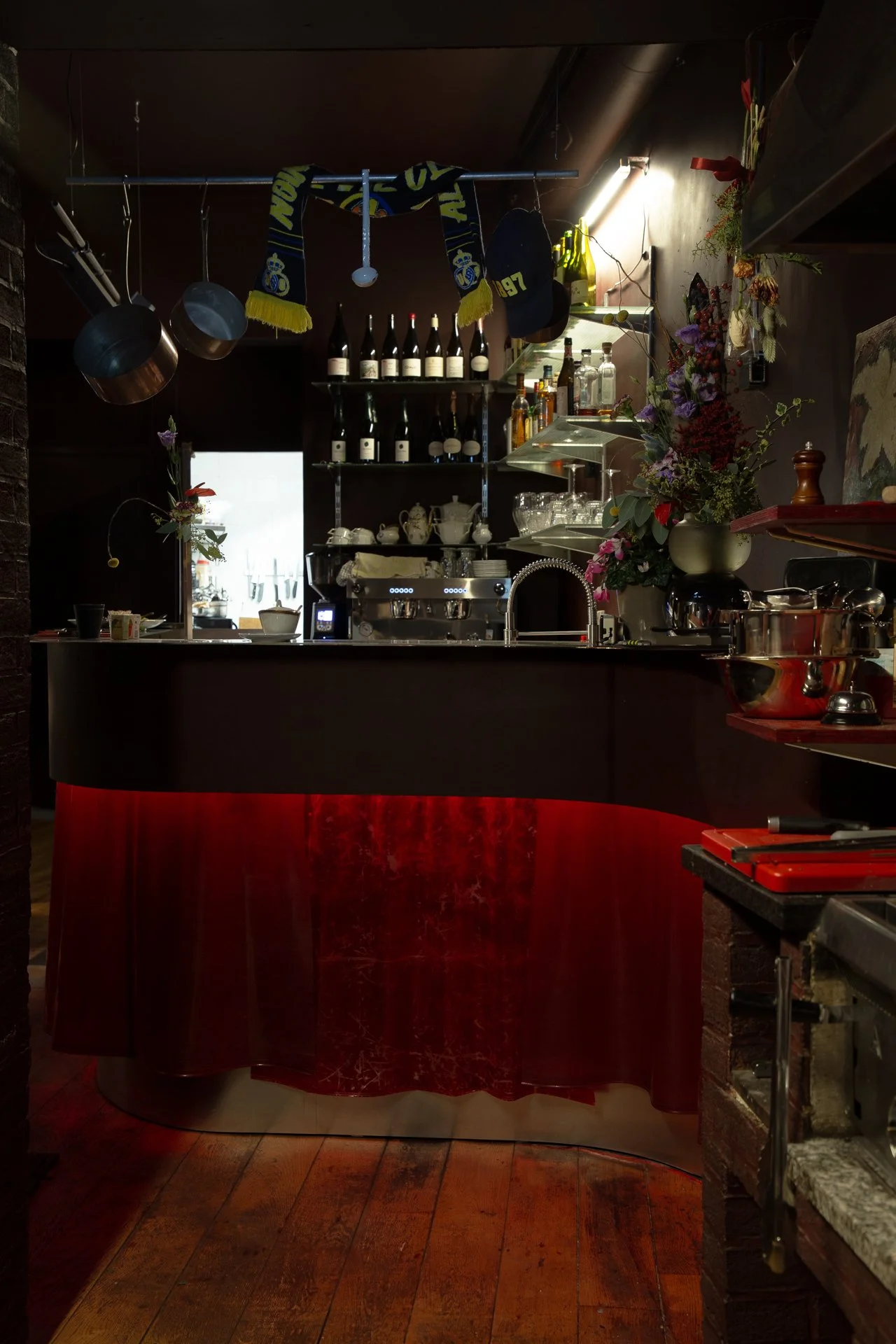
La Braise
A place of meat, a place to meet.
Where raw meets cooked, and old meets fresh new.
A bistro feel with an industrial twist.
A place of meat, a place to meet.
Where raw meets cooked, and old meets fresh new.
A bistro feel with an industrial twist.
Where wood, mirror and galvanised steel
mix to season this space for meat.
For colours, the mood is meat. From bloody to well done.
For the curtain of the bar, we went for a dying process that gives a veiny effect.
As for materials and ambiance, we thought bistro/butcher’s place. A mix between the warmth of the wood and the colour of the walls, and the metallic.
As for the walls of the space, we played with geometry, and lines to give structure to the space, and a retro vibe.

Blender
A cabinet of curiosities, where things of many sorts and brands, are found and blend.
Some things of daily use, and others, for occasions or as a gift: luxury is found at different scales, accessible and non-intimidating.
A cabinet of curiosities, where things of many sorts and brands, are found and blend.
Some things of daily use, and others, for occasions or as a gift: luxury is found at different scales, accessible and non-intimidating.
A heartwarming place, a bit domestic, and a tad urbain. Raw but crafted, with some elements found and integrated.
A place where different materials, textures and styles, mix and blend.


rayon belge custom-made yellow s.alu rack.
For Blender, we went for a blend of looks: the industrial, the vintage, and the in-between.
Some vintage elements are used as found. Others are hacked with an industrial addition to add a certain function to them. And as for the designed elements, they are composed of many materials. Some industrial, and others found in the reuse market. Balancing each other out, the old and the new.
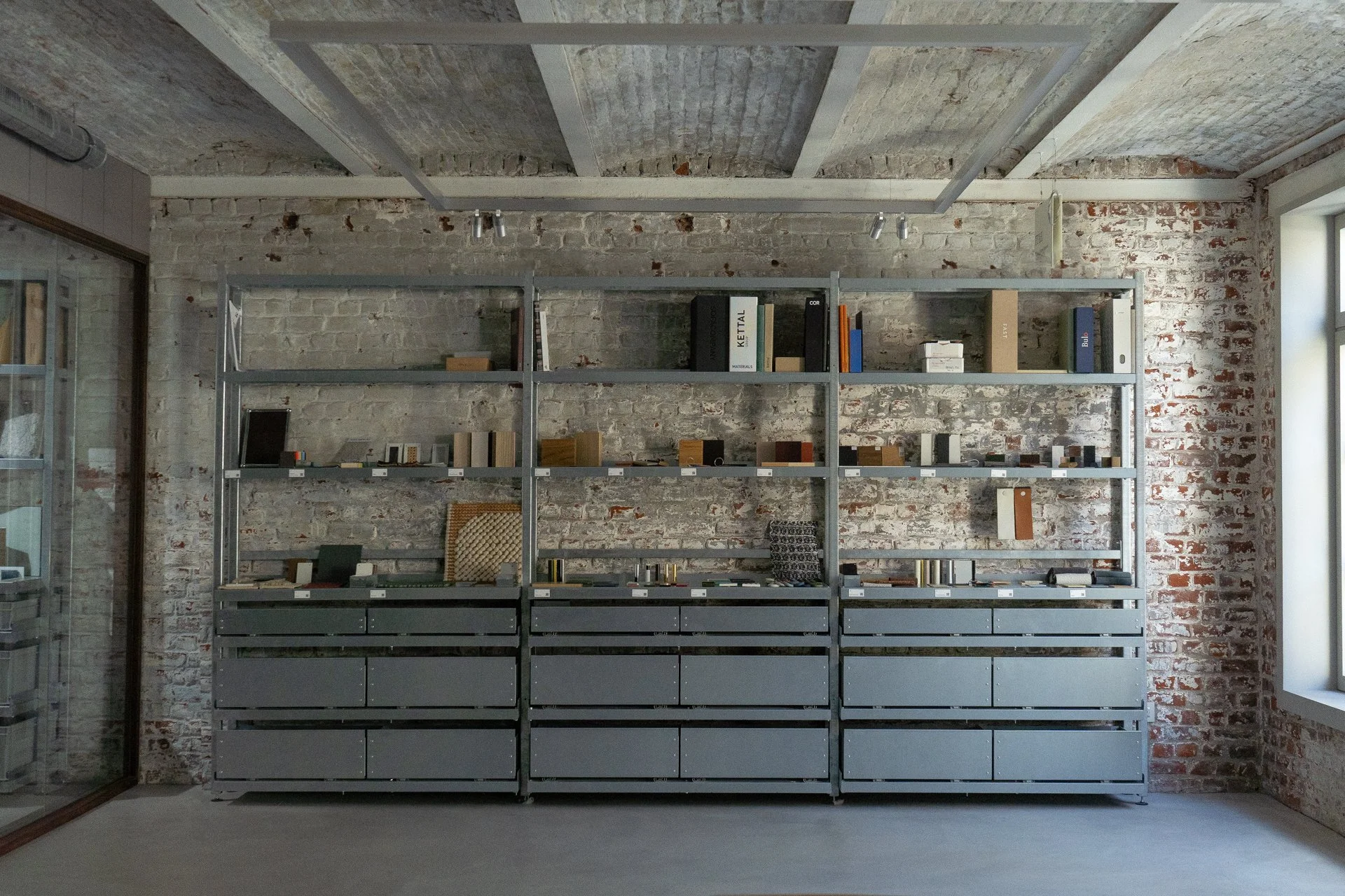
Materiatek
A material library, that is elegant, that is efficient, that is modular and flexible, that offers a multitude possibilities, for the display of samples and materials, of mood boards and words. A material library that is raw and simple.


A material library, that is elegant, that is efficient, that is modular and flexible, that offers a multitude possibilities, for the display of samples and materials, of mood boards and words. A material library that is raw and simple, that can handle weight without bulking, that is industrial, such as the space it lives in. A material library, as a space where all samples rest, waiting to be viewed or be picked up, and explored, compared, combined.
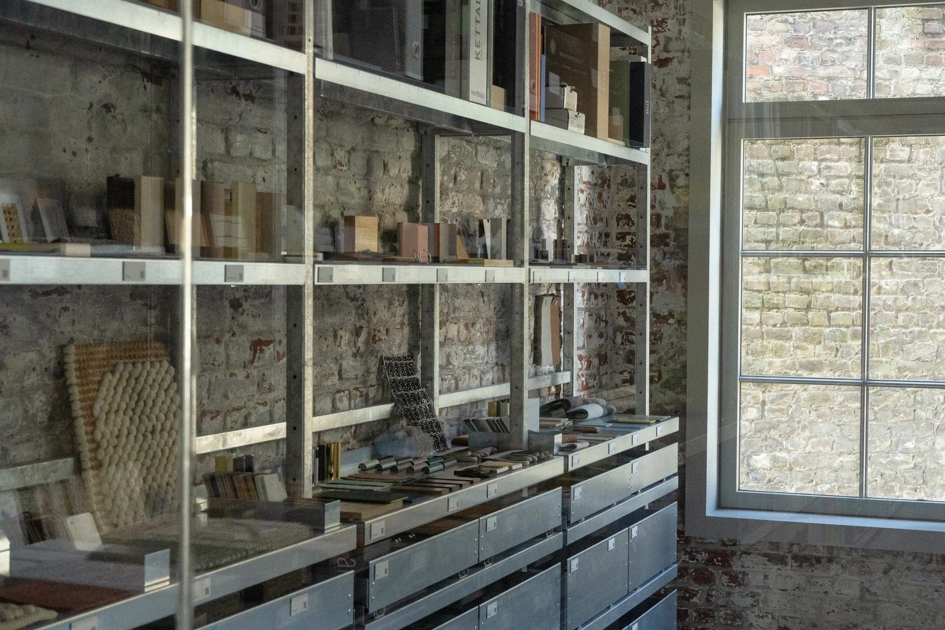


Commissioned project for @ncbham
JUST
In collaboration with Oilinwater Studio, who worked on the creative direction, graphics, and communication for the campaign, and we, HIER, developed the exhibition display systems with the idea of protest-like signs.

For the exhibition “JUST” campaign, the NGO Solsoc wanted to ‘highlight citizens and workers who are organizing and proposing innovative solutions to fight against polluting industries, develop production methods that respect the environment and human rights, and set up social protection systems that meet new needs.’
In collaboration with Oilinwater Studio, who worked on the creative direction, graphics, and communication for the campaign, and we, HIER, developed the exhibition display systems with the idea of protest-like signs.


Photos by Luciana L. Schutz
Graphic Design by @studio_oilinwater shot at @mad.brussels

SO POOL!
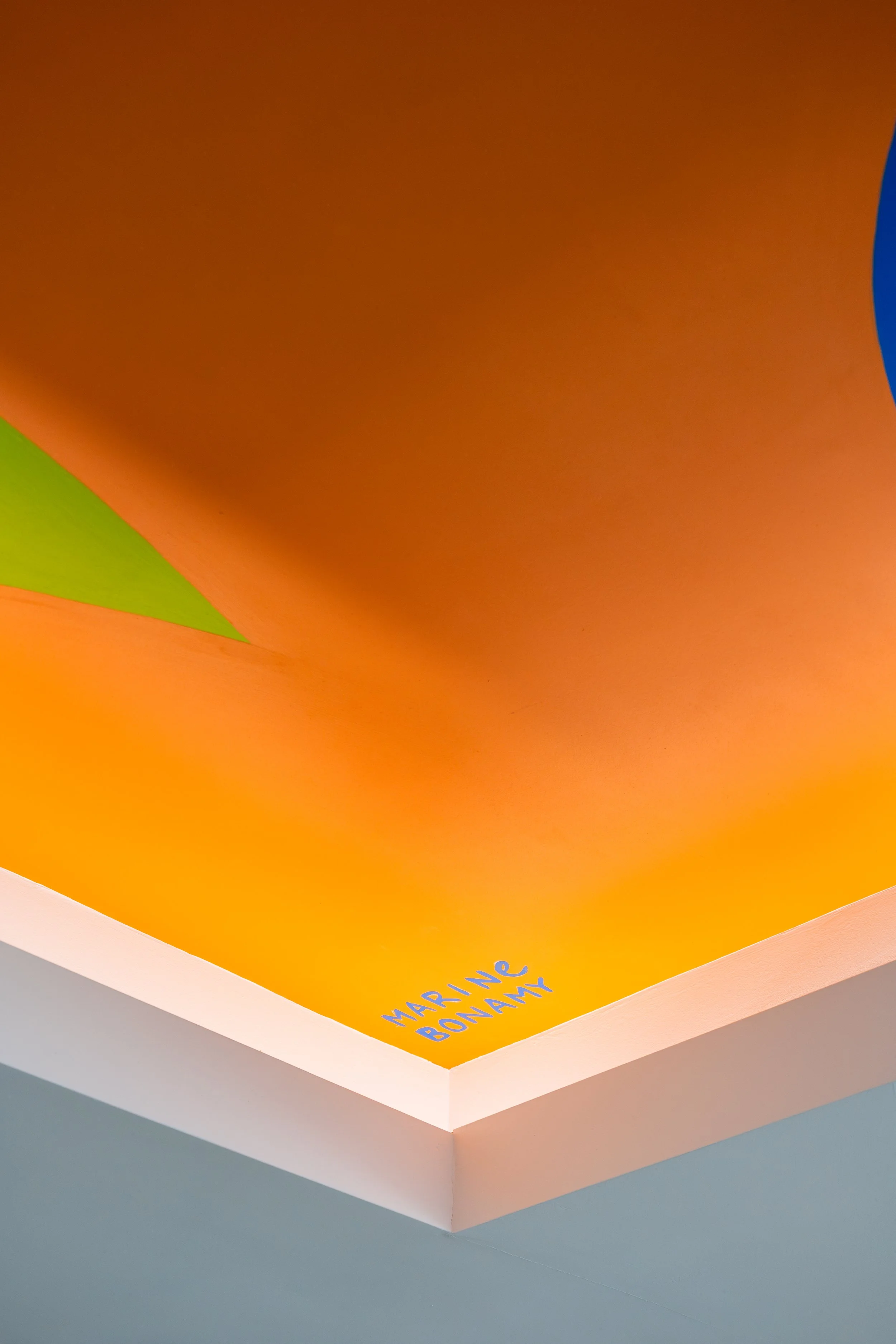
Ville de Tournai swimming pool. Project coordination led by us, artwork and painting by @marinebonamy
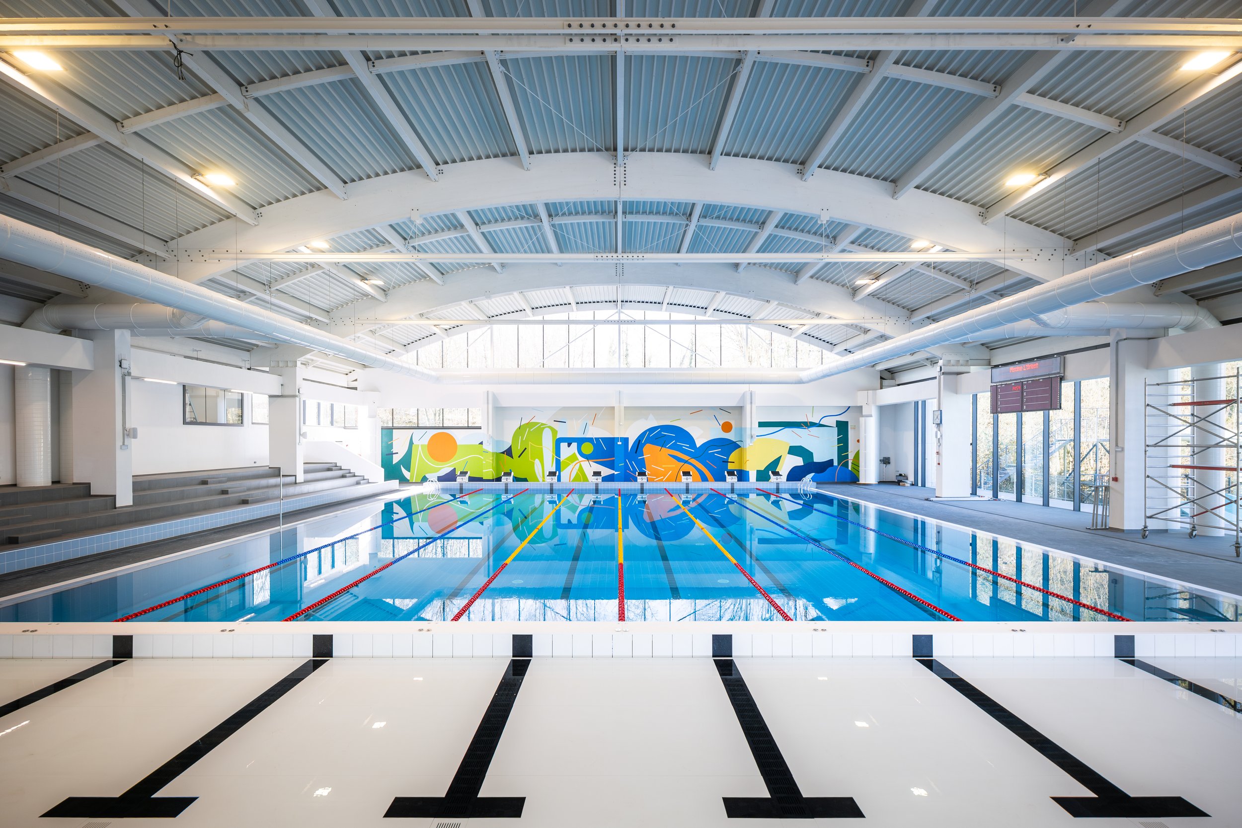
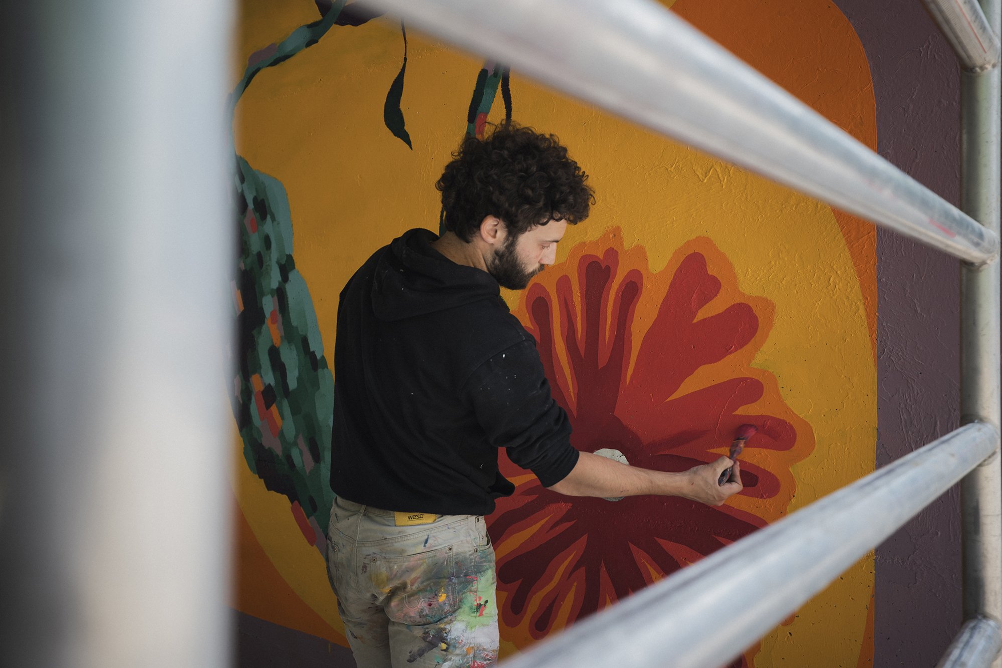
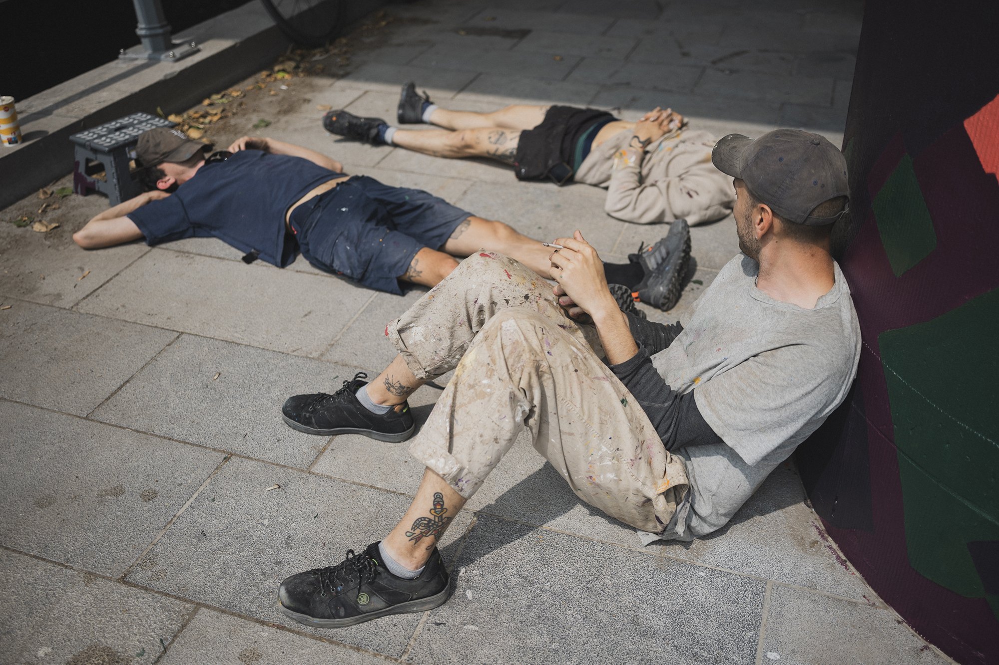
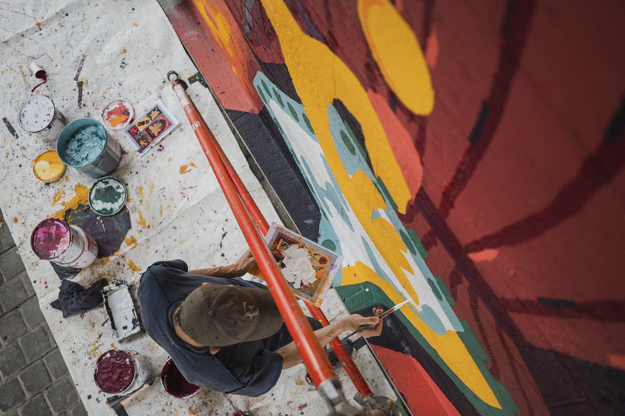
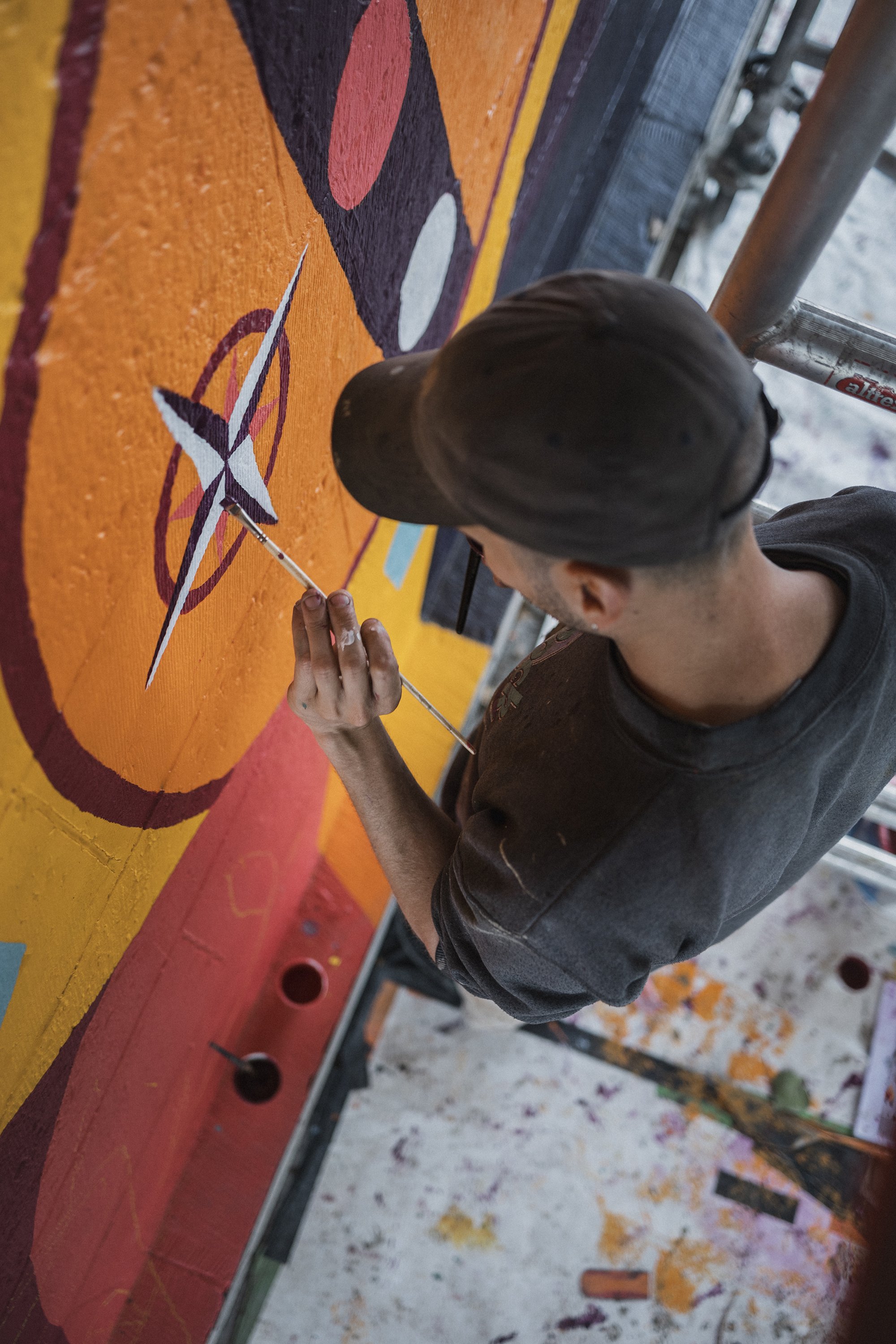
In Tournai, another season, another lieu, another mural. This time, it is the newly renovated swimming pool of Tournai, with a mural by the artist, Marine Bonamy, and us, HIER, managing, following-up and helping with the execution.
The idea was to have a colorful mural, that accompanies the visitors while swimming. With organic and floral shapes, with a graphic style using small lines to energize and give rhythm to the whole.
This story was told and painted with the help of an incredible set of hands of Hedi Baka and Wenc from Les Îles Mardi, and @emilie_delarbre.
Marine Bonamy, the artist, works around the themes of the organic, the mineral, and the aquatic. Her work is based on texture, superposition, and movement.


Thanks to @IDETA @TRADECO and @w_e_n_c @hedi_baka @emilie_delarbre for the help
Photos and video by @jules_cesure

Woven Whispers
Scenography for the Woven Whispers exhibition showcasing the best of Belgium’s textile design during Milan Design week, an event organised by Alcova Milano.

A whisper is often used for delicacy, for secracy, or to express a raw or unfinished thought, a work in process. Raw and and subtle are words to keep. Metallic clamps, gently embracing the wooden beams of the BS3 Scuderie ceiling of Villa Bagatti Vasecchi, holding wires. Wires serving as a delicate looking yet a structural support, to host hangers of differents types and sizes, tailormade to each displayed piece, catering for its best display: suspended vertically, while others, heavier object pieces, stand on a horizontal metallic surface. The exhibited pieces are tip-toeing, lifted off the ground, hovering, whispering. In such a historical, raw and charged space such as the Scuderie, we imagined lightness. Lightness achieved through the poetic confrontation between the metallic, the mechanical, the raw and the rigid, whispering movement in the fragile, elegant, light and flexible textiles. Just like a musical box with a mechanical move makes a skirt dance. As technical elements, we have lighting projectors, coming from the ceiling to enhance and highlight the feature and performance of every piece, and rotating mirrors, creating light deflections, and giving a glance at the pieces in reflection. In the entrance, along the counter information point we planted a rayonbelge shelving system serving as a material library, with samples to feel and touch and seeupclose, and as teaser for the main exhibition space.


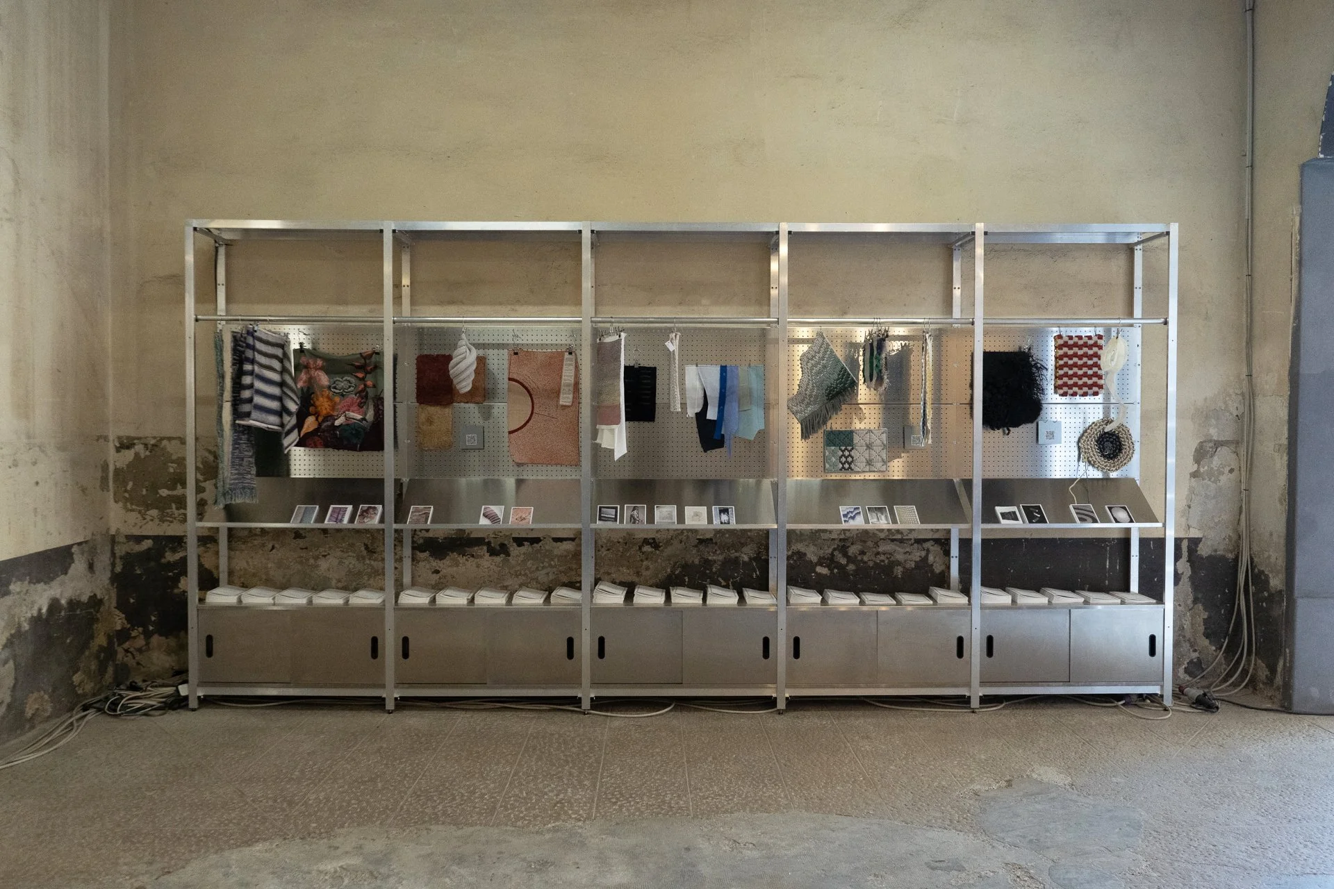


Textile-sample corner exhibited with Rayon Belge solutions.
Thanks to Wallonie Design, Mad Brussels, Flanders DC for Design, Belgium is Design and all the wonderful designers.
Photos by Luciana L. Schutz and Eline Willaert

Signs of LooOve
Since 2017, we love them, we make them.
You might not know it, but you need it


Since 2017


We love signs


We make signs
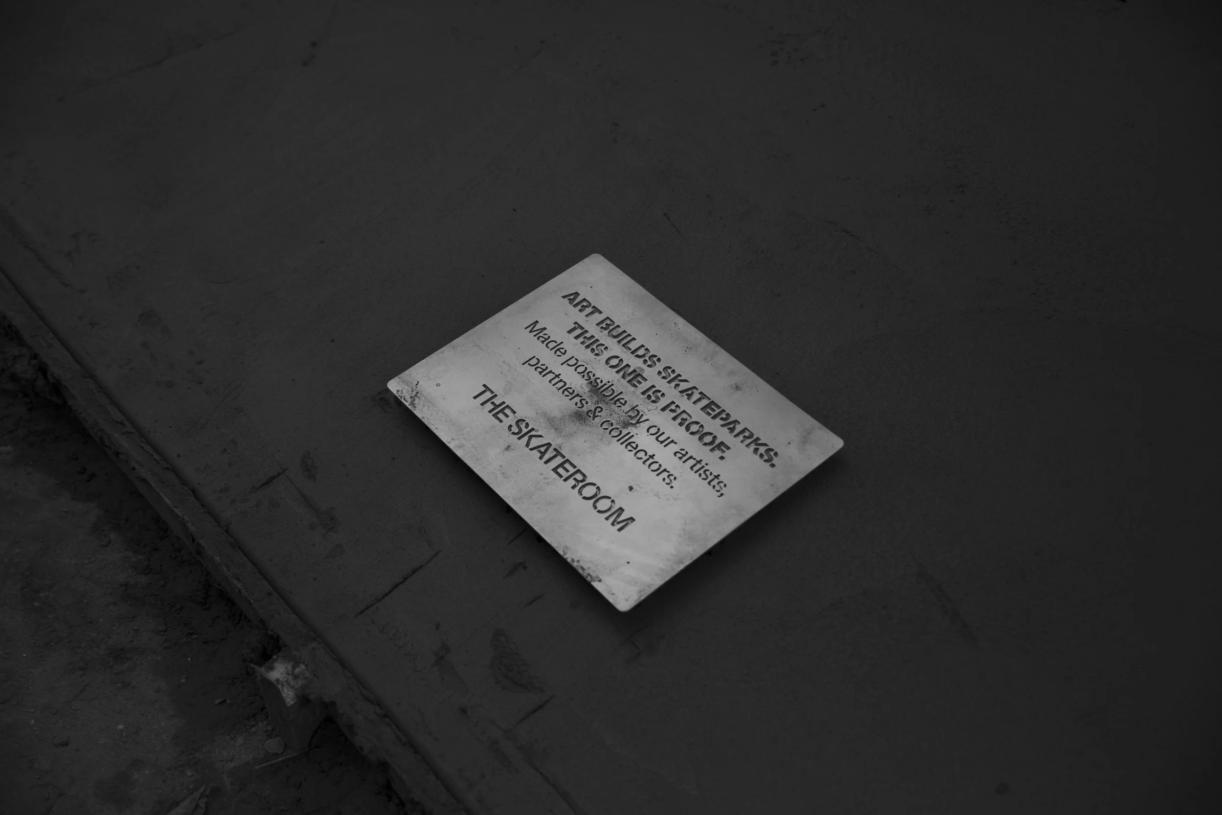
Photo by @campsjonas


CHEERS


50
Happy, happy to have been chosen by Sotheby’s & Mad Brussels to design a window display for Sotheby’s 50th anniversary in Belgium. And what a better way to celebrate than with a big, big, cake.
Happy, happy to have been chosen by Sotheby’s & Mad Brussels to design a window display for Sotheby’s 50th anniversary in Belgium. And what a better way to celebrate than with a big, big, cake!
Elevated on a pedestal, this cake of 150cm high is made of 5 layers, each representing a decade of Sotheby’s and a different sales category from Sotheby’s. Each category is represented by collected materials/objects, regaining thus value with the composition.
50 thanks to all our material collaborators: @thy_marcinelle @niyona @chezrosi @rotordc @oxfam.be & @jiji17_ for the graphic intervention.
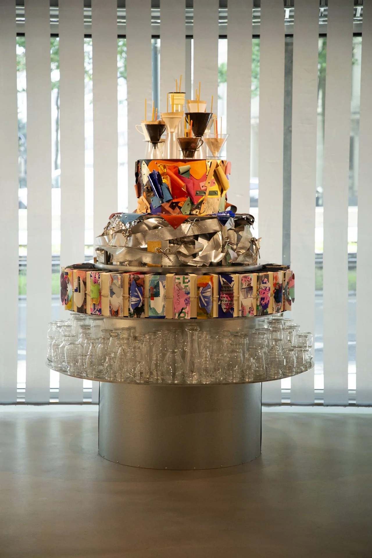


Photos & Video by Luciana L. Schütz AKA Lulu.

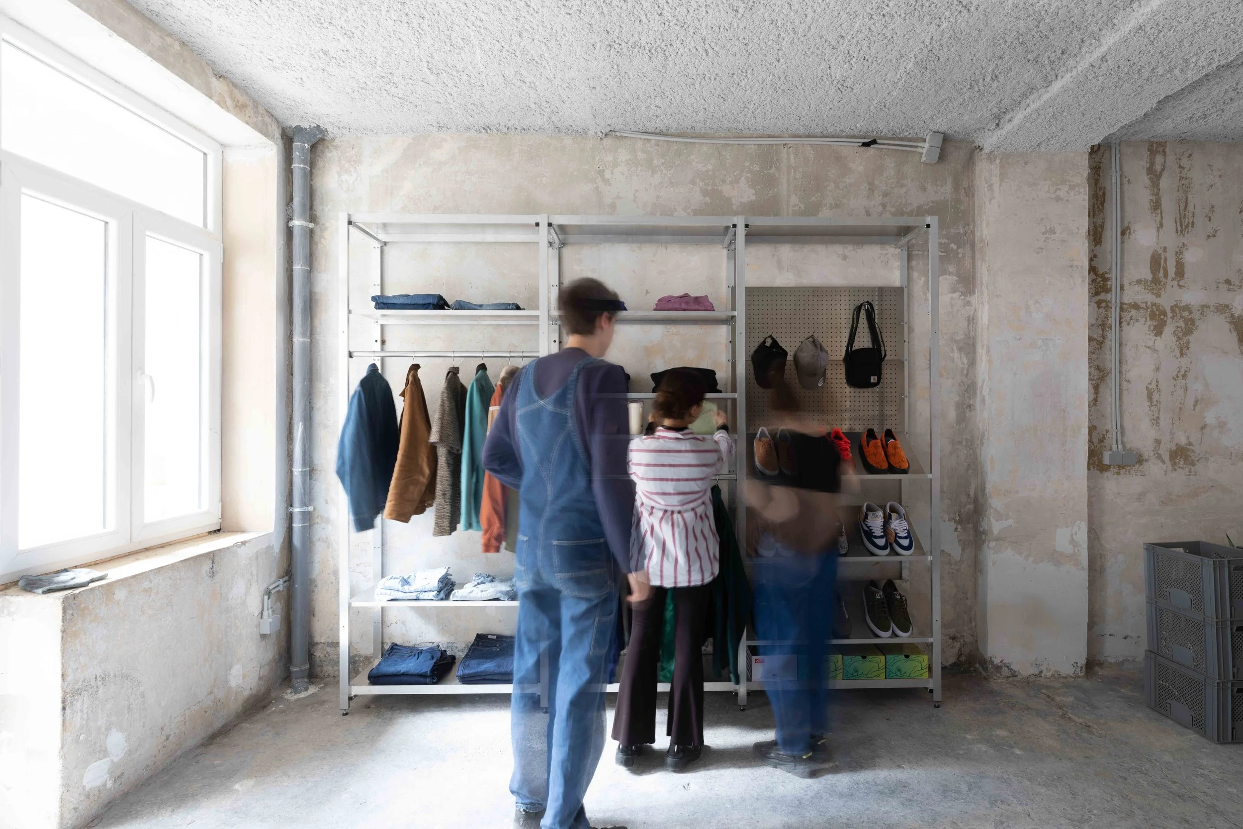
DOGUERIE – Canine XL
Where dogs and cats feel home. Our story with Canine started with a Bone, then another Bone facing it, to sign their cool presence in Saint-Gilles. The collaboration then expanded to cover the design of their new second store in Flagey.
Where dogs and cats feel home
Our story with Canine started with a Bone, then another Bone facing it, to sign their cool presence in Saint-Gilles.
The collaboration then expanded to cover the design of their new second store in Flagey.
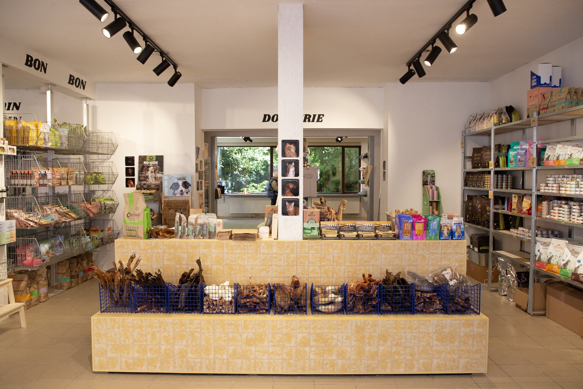
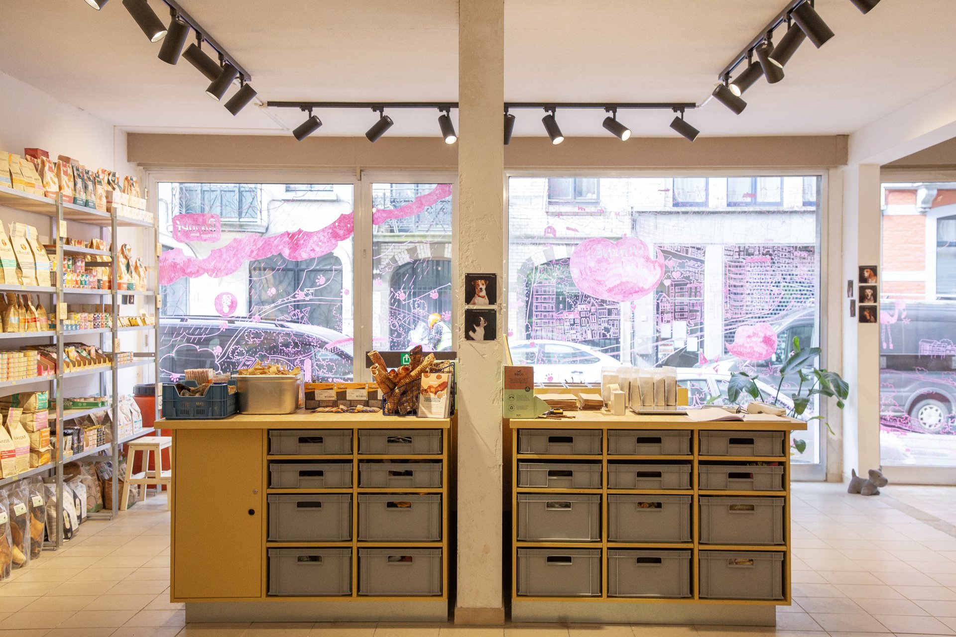
From identity to furniture to signage. And we had joy and we had fun, and with the yellow color we hoped to get the sun, to dog/cat paradise.
As for the shelving systems we placed, one system, s.alu, is rented from Rayon Belge for the back store. As for the shelves in the front, they are made from steel and reused scraps of wood.
And to pimp the store even more, decoratively speaking, and to add a touch of personal/animal to it, we went building customer loyalty approach. For that, a photoshoot of the clients was organized, their feedback on Canine was noted, and the result is proudly exhibited in the different corners of the Canine No.02 store in Flagey.


Photos & Video by Luciana L. Schütz AKA Lulu.

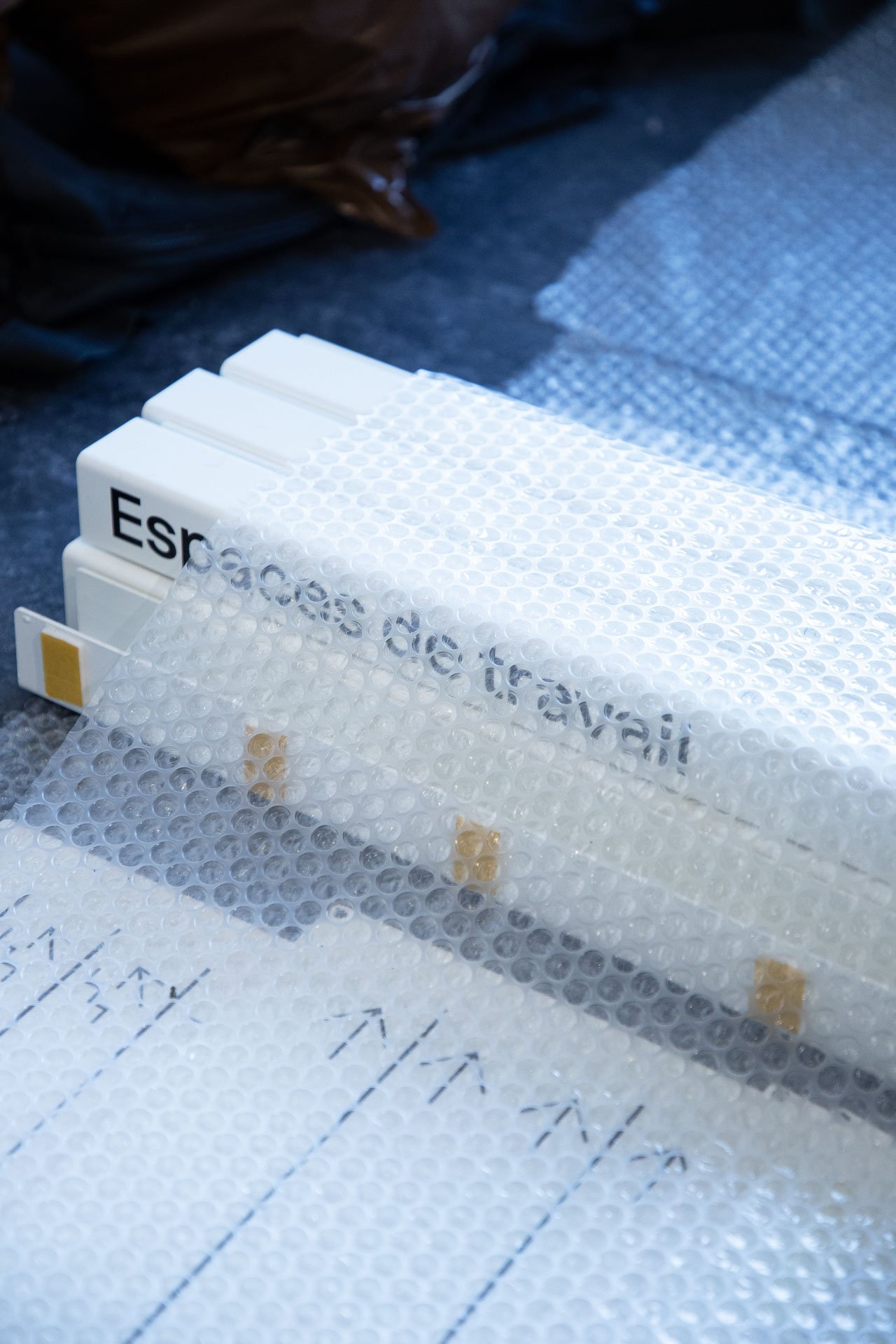
Rayon belge
Rayon belge is a family business that specializes in providing smart / elegant display solutions for shops, homes, work and cultural spaces.
Rayon belge is a family business that specializes in providing smart / elegant display solutions for shops, homes, work and cultural spaces. Our focus is on combining functionality with aesthetics, offering high-quality shelving systems, to store, organise and display, enhancing the look and efficiency of all kind of spaces. Our journey began with a mission to design shelving systems that meet the specific needs of Belgian shop owners. We offer a comprehensive range of shelving systems that are of superior quality and designed to adapt to the evolving market needs. Innovation is at the core of our approach, allowing us to propose futuristic solutions that address the ever-changing demands of the industry. What sets rayon belge apart are two things. First, as a team of architects and designers, we offer more than just product. We bring scenography expertise and advice to the table, we install the products, and we take care of maintenance: a full set of services to make the list of worries of business owners shorter. Second is our innovative rental approach for our display systems. Recognising the dynamic nature of Belgian shop owners and their evolving challenges, we have chosen to offer renting as an option to buying the systems. This unique approach provides businesses with the opportunity to benefit from new display solutions without making a significant upfront investment. It offers flexibility and room for growth, which is particularly valuable for starting businesses that are still discovering their needs or those of their clients.


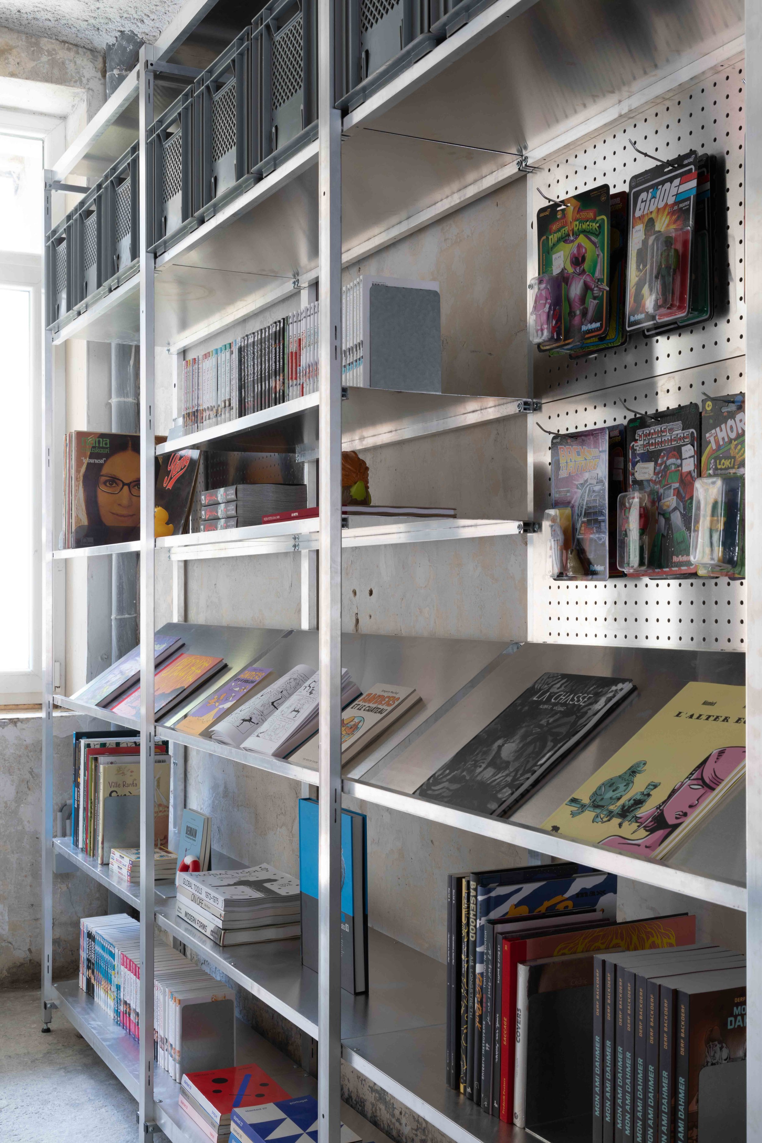

S.alu is our first shelving system, in raw aluminum, lightweight, completely recyclable and easily transportable on a trailer bike. It is designed to serve the needs of shops or cultural spaces, but could also be used for other kinds of spaces, such as a home or a workspace. S.alu is to be fixed on a wall or doubled, back-to-back, to free-stand. It comes in same depth and width but in four different heights, to best adapt to your space and user experience.
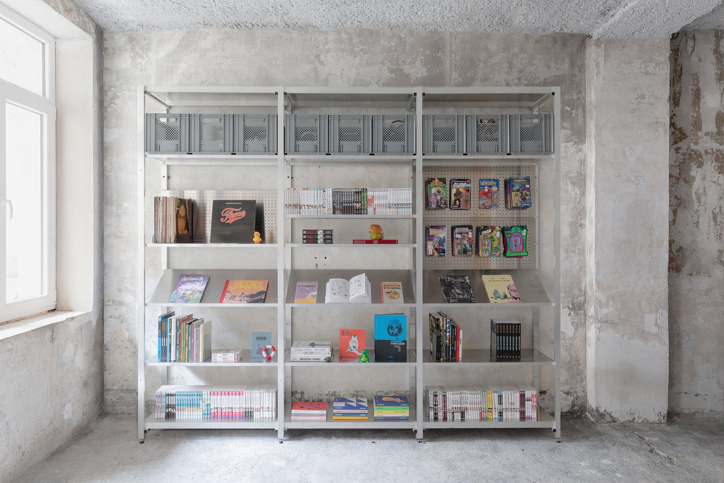
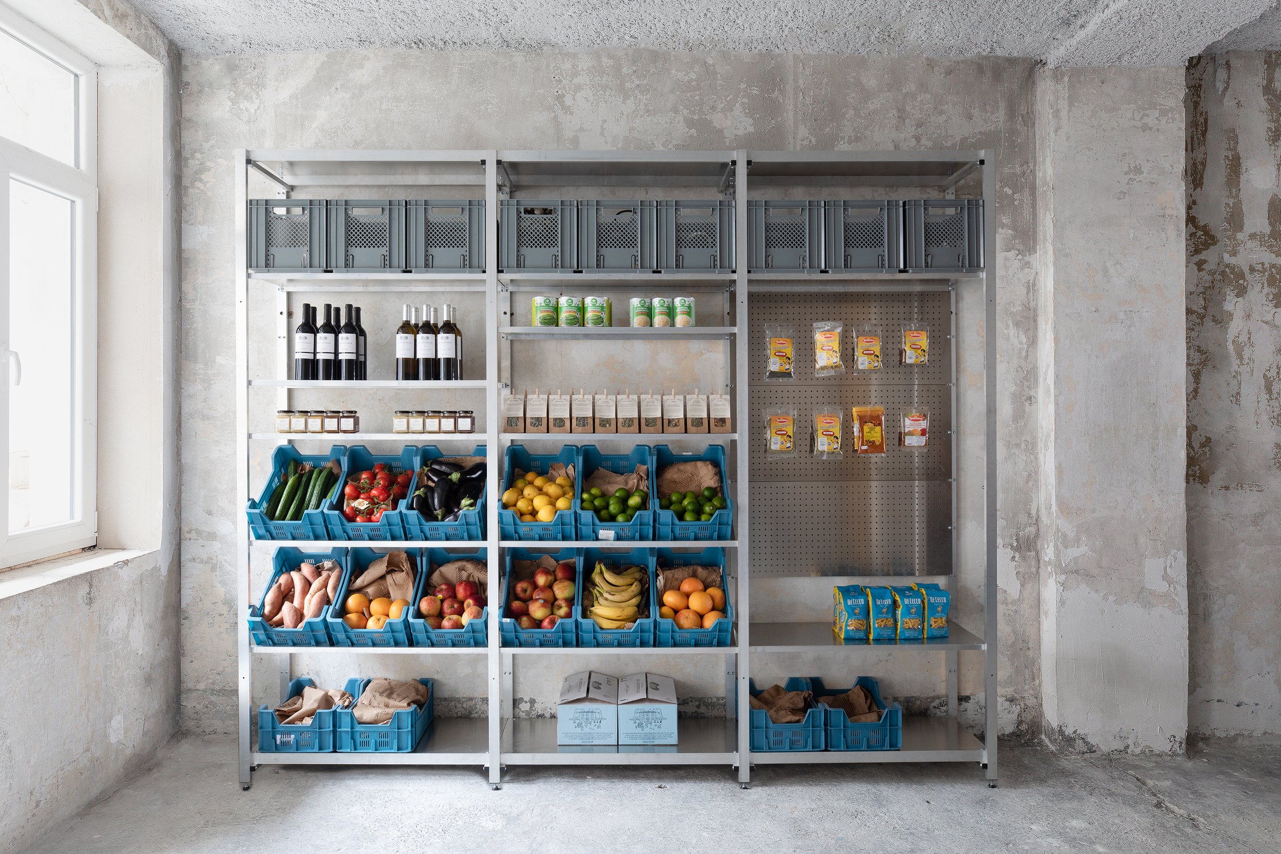
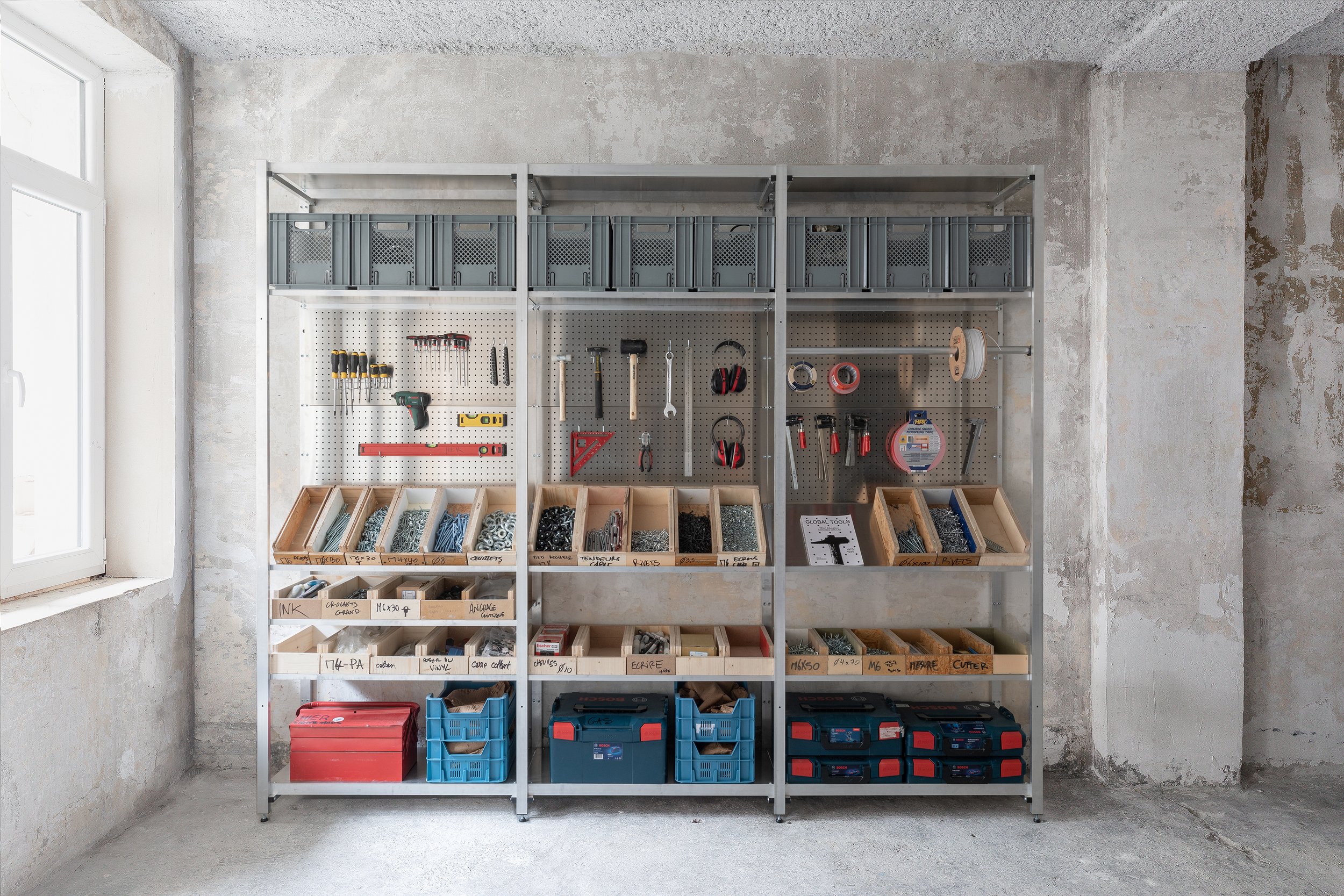
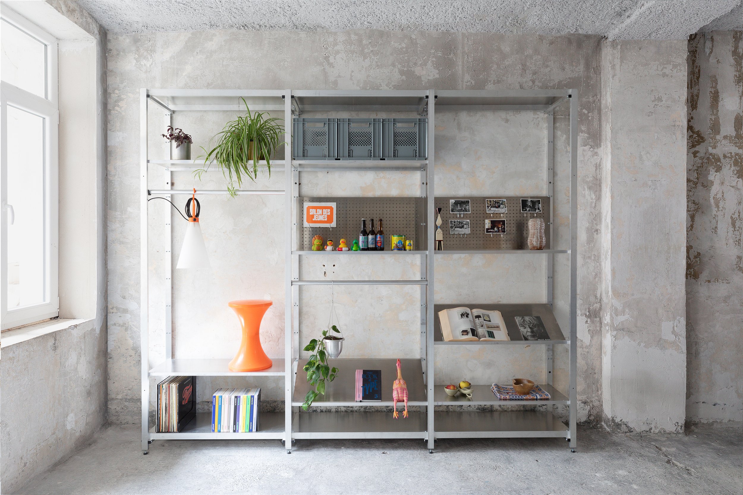
It is a modular and a flexible system, with a wide range of accessories that serve different and sometimes changing, display needs. As mentioned already, it is made in Belgium, available for sale and for rent.
When you buy, installation, display advice and maintenance are available, optional services.
When you rent, we come with our beautiful team of caring individuals, take care of the installation, maintenance, & display changes. And with every change of season, the team comes again, with a new set of accessories, for a new display, and goes with anything no longer needed, leaving you with no stock, no waste, and no stress.
Photography by Eline Willaert - Video by Joekhoury Studio.

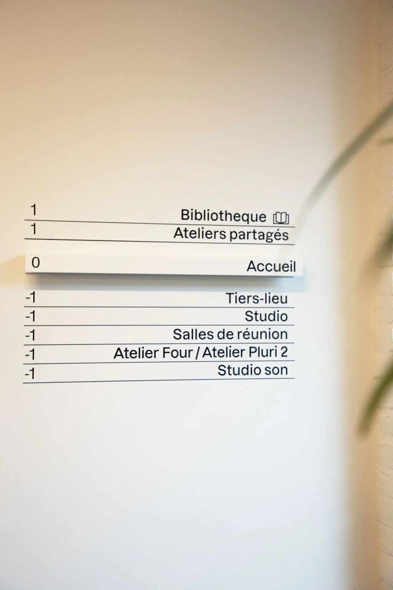
Find your way - Maison de la Culture de Tournai
For Maison de la Culture in Tournai we have collaborated, with Atelier Blink ( for we cherish collaborations).
They have designed, and we have developed, produced, and installed, signage.
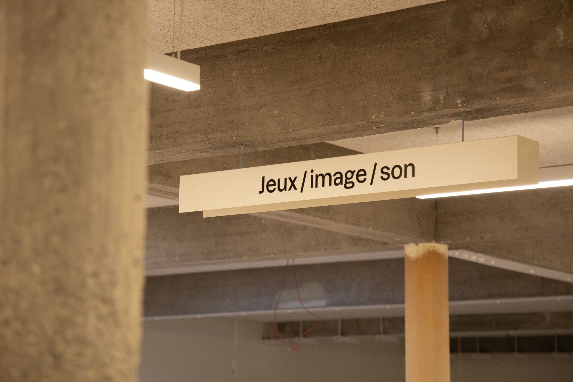
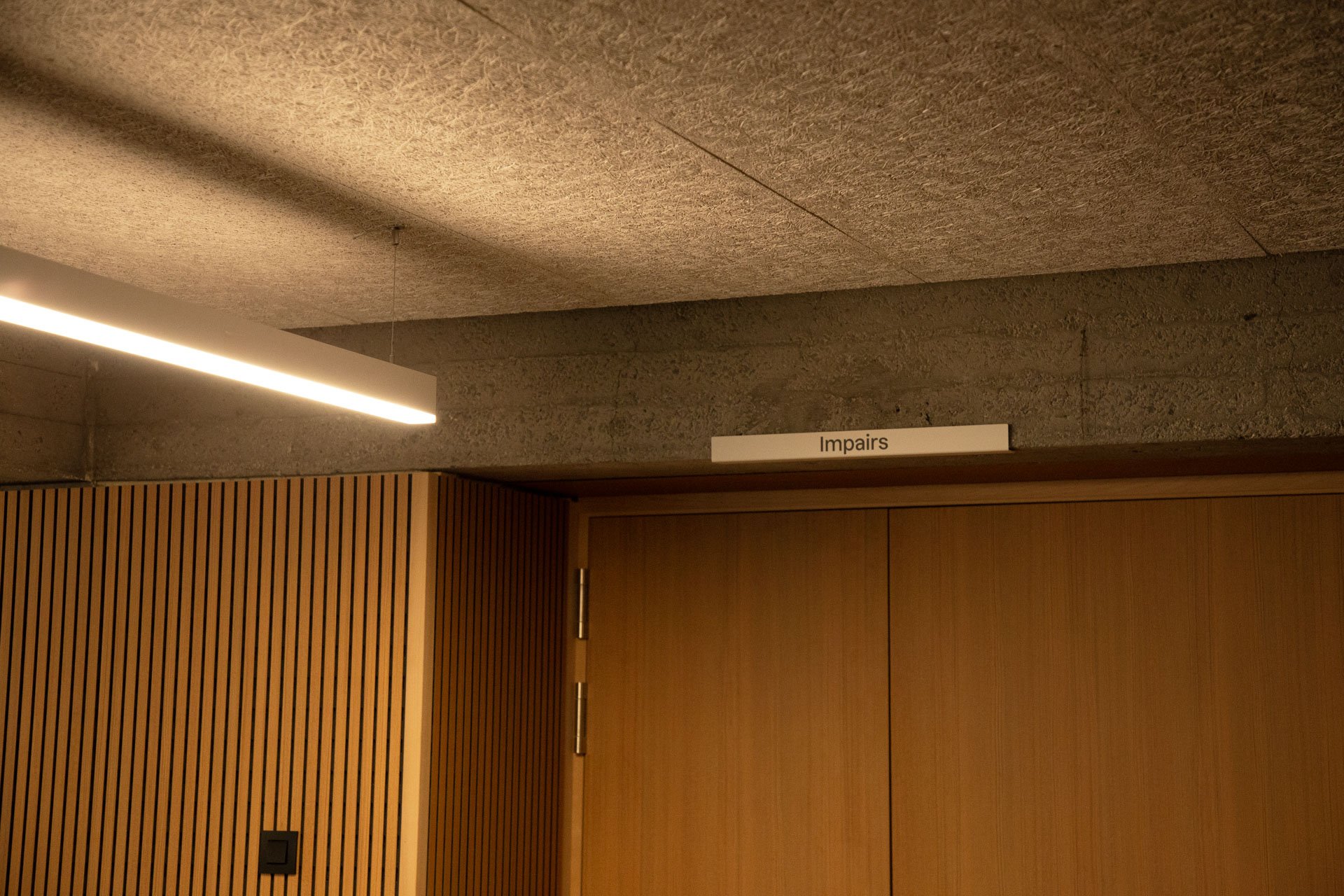
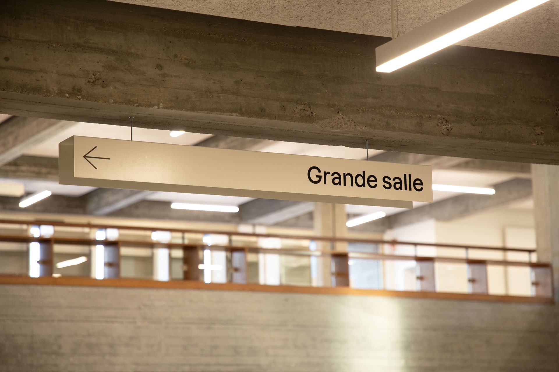
For Maison de la Culture de Tournai we have collaborated, with Atelier Blink (we cherish collaborations). They have designed, and we have developed, produced, and installed, signage.


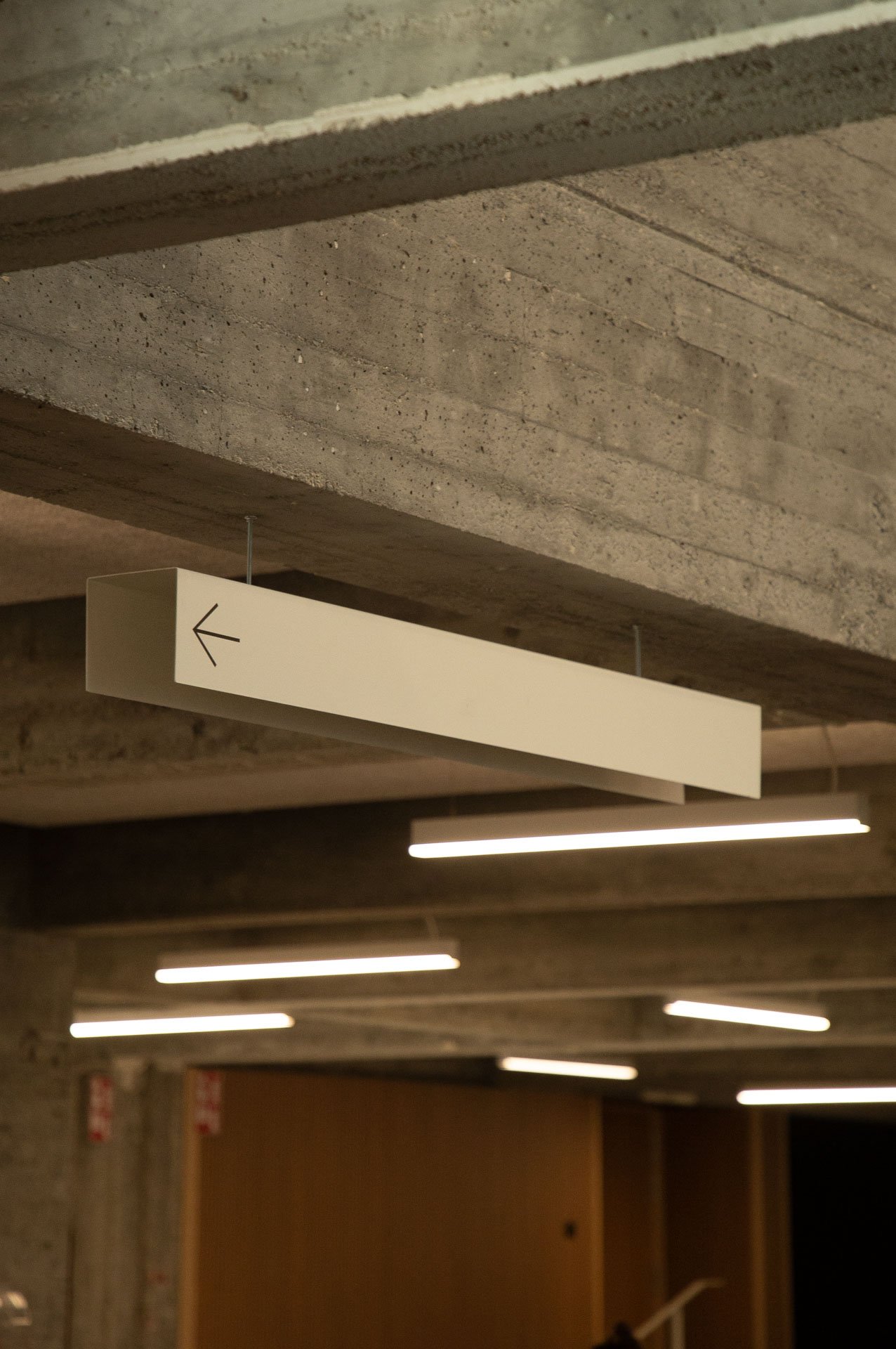


Signage as a mean to guide, to inform, and to improve, the experience of the visitor, by giving clear signs, and directions, pointing at the different areas and programs within the center.
That’s what we do.


Photos & Video by Luciana L. Schütz AKA Lulu.

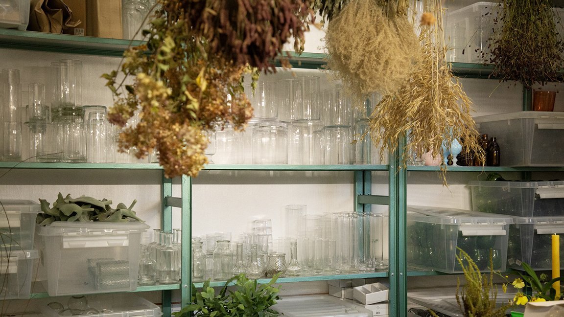
New / Nouveau
It’s new, c’est Nouveau! Well, not all of it. Only the part we designed, the one that lies in the backstage: the kitchen and the workshop. The main piece of the project is a chandelier piece roaming over the main atelier space, watching over it, with flowers hanging upside down, also a source of light.
It’s new, c’est Nouveau!
Well, not all of it. Only the part we designed, the one that lies in the backstage: the kitchen and the workshop. Green is the stem, the structure of the flower. And so is the new shelving structure we designed. The shelves made from galvanised steel, present in flower buckets. As for the tabletops, we reused terrazzo tiles for being cleanable, waterproof, and bringing a mix of colours.
Afterall, it is a place of flowers. Were they are cut but then live. Detached, filed, hung, dried or freshly assembled, composed, reunited, in a bucket of joy. Regardless the occasion, they bring light to it, like a chandelier. The main piece of the project is a chandelier piece roaming over the main atelier space, watching over it, with flowers hanging upside down, also a source of light. An analogy is drawn between meat and flowers. Both hanging, drying, waiting to be consumed. One for the greedy belly, and one for the needy soul.


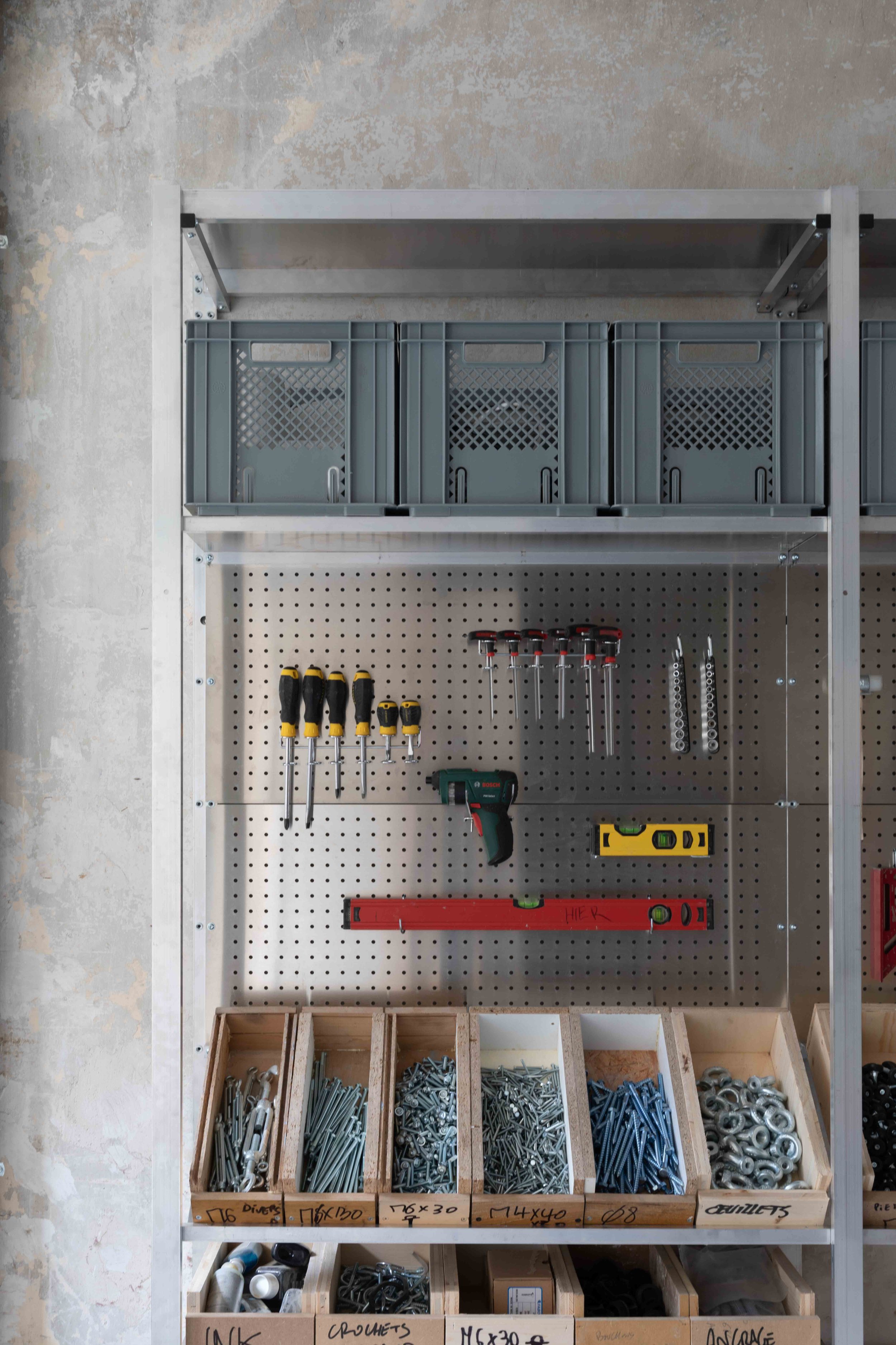
In this work space, hier are the needs that were addressed:
a surface for hanging tools
a space for storing materials: a functional library, with shelves and boxes
a space for hanging flowers with hooks
a space to store containers
a surface for working, movable or flexible
and lighting
Photos by Luciana L. Schutz.

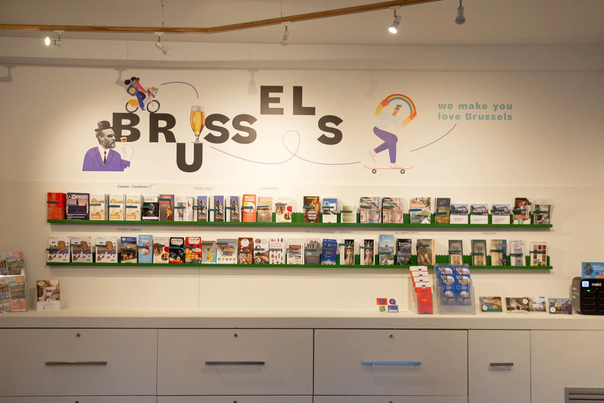
Revisit.Brussels
We have refreshed, revisited, updated and ugraded, the shop and info office scenography for Visit Brussels. We have added in place of an older system, a shelving design that is both colourful and playful, while being practical and functional.
We have refreshed, revisited, updated and ugraded, the shop and info office scenography for Visit.Brussels. We have added in place of an older system, a shelving design that is both colorful and playful, while being practical and functional. What could be renovated in the space was simply renovated. The new additions reflect needs that developed over time, and that needed care and new solutions.


Photos by Luciana L. Schütz AKA Lulu.

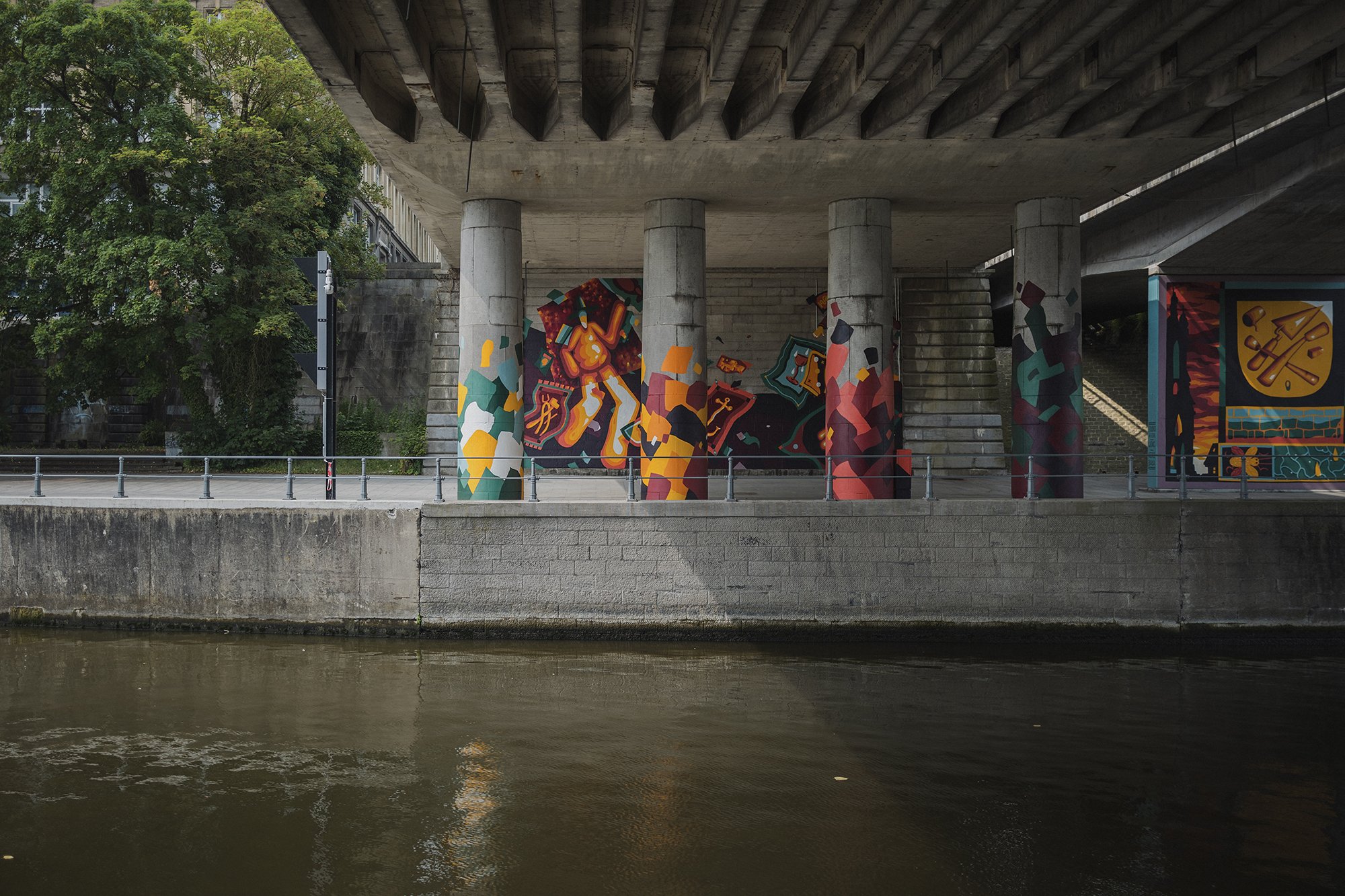
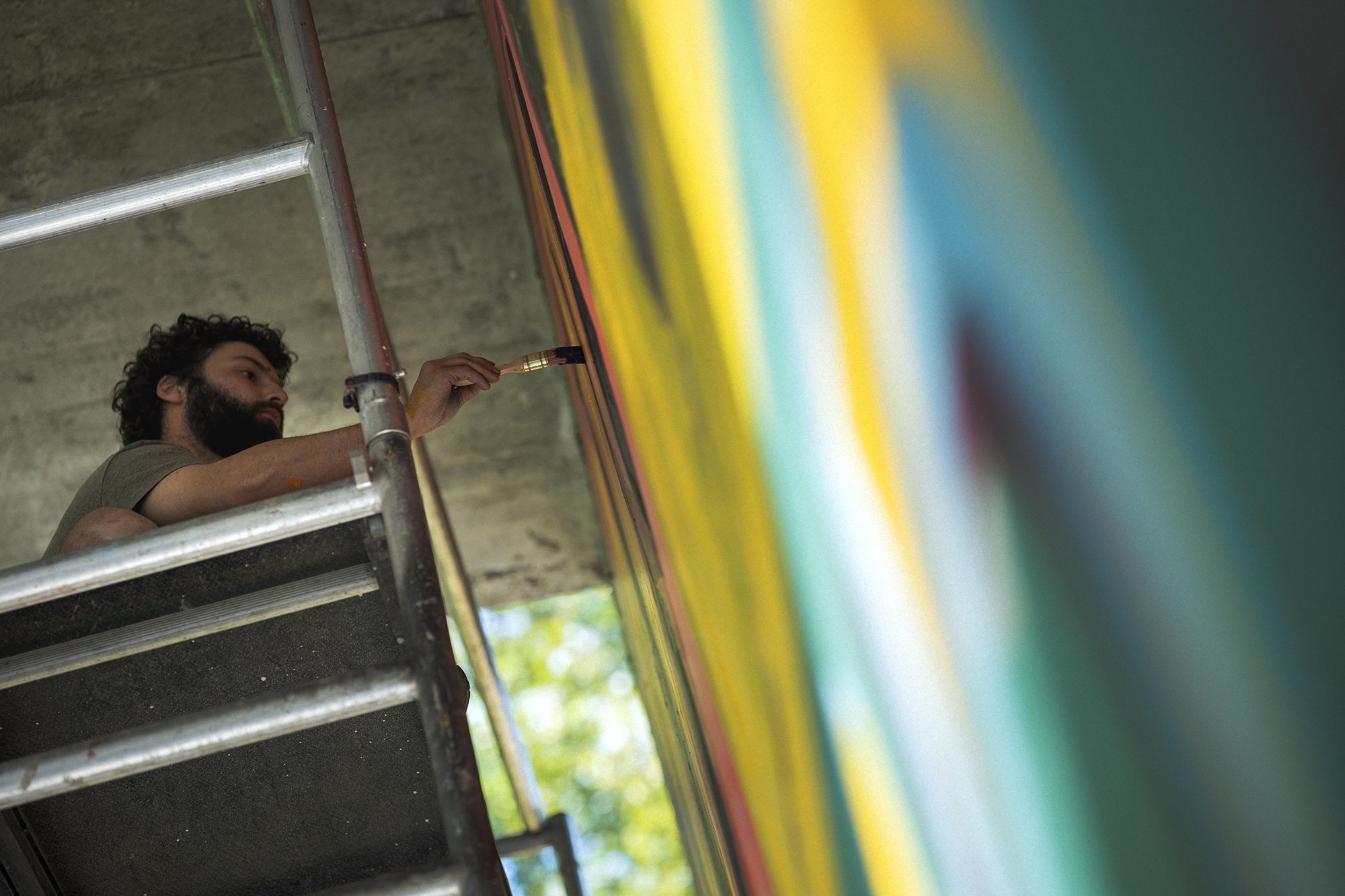
Tournai Général
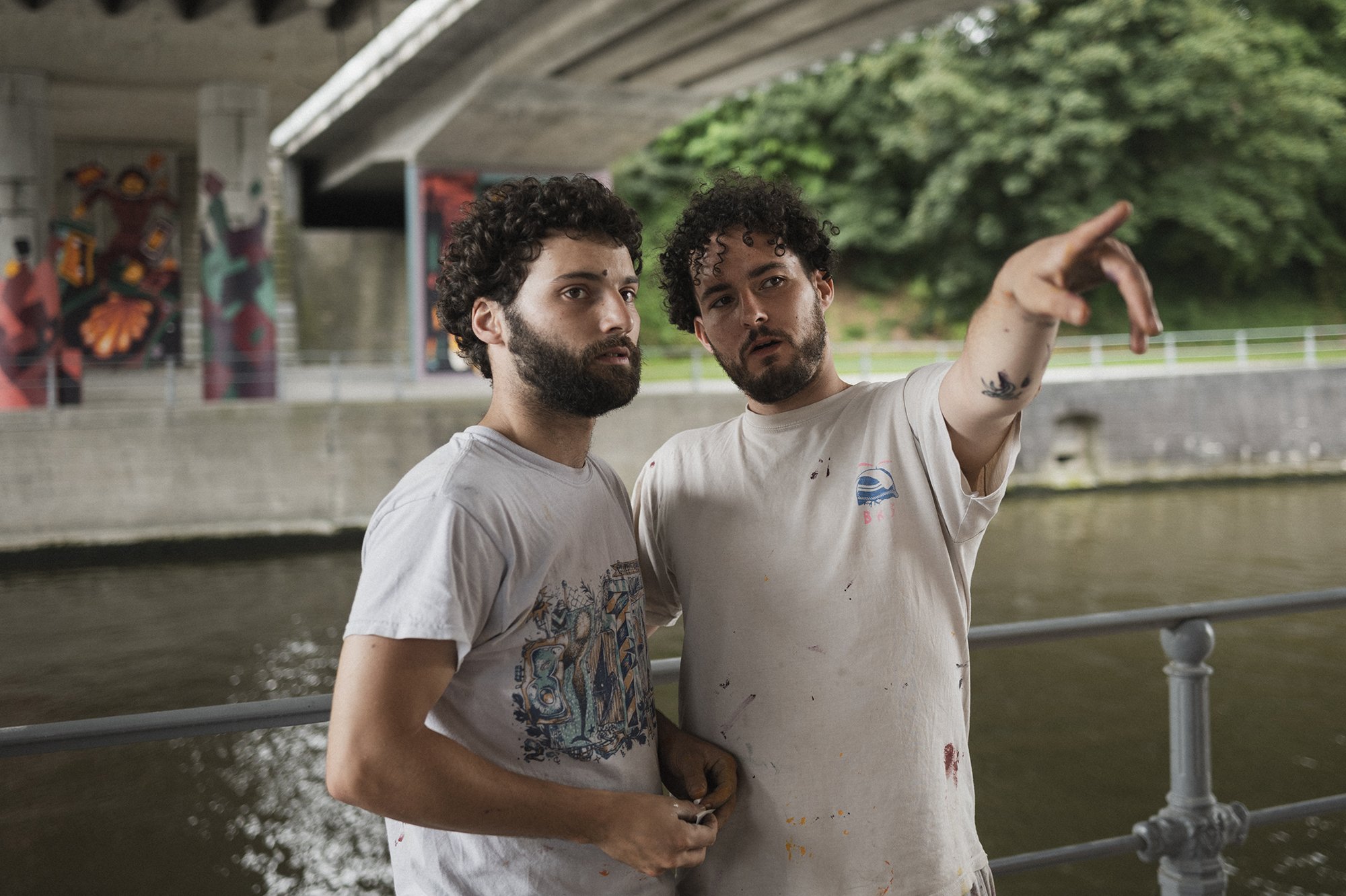
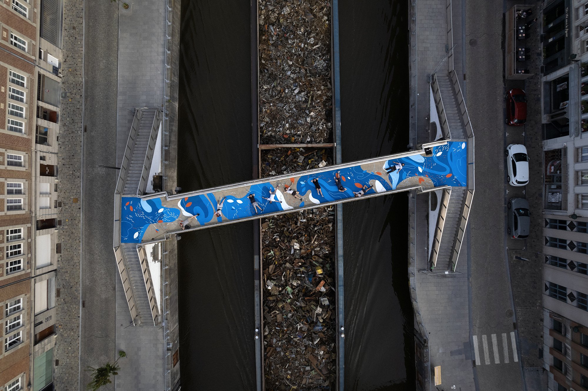
One city. Two interventions. Three artists, and HIER, us.
Branding Tournai this time, branding both sides under a bridge, and one over another, both alongside the canal de l’Escault.
One city. Two interventions. Three artists, and HIER, us.
Branding Tournai this time, branding both sides under a bridge, and one over another, both alongside the canal de l’Escault.
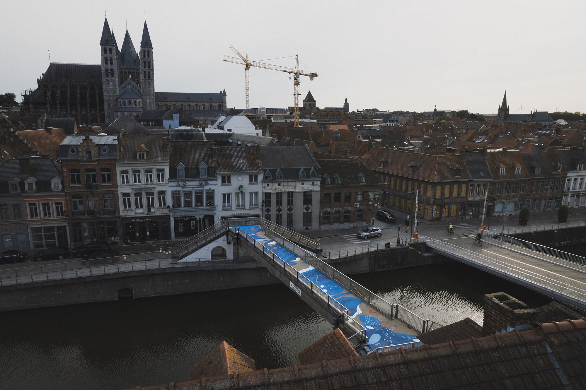
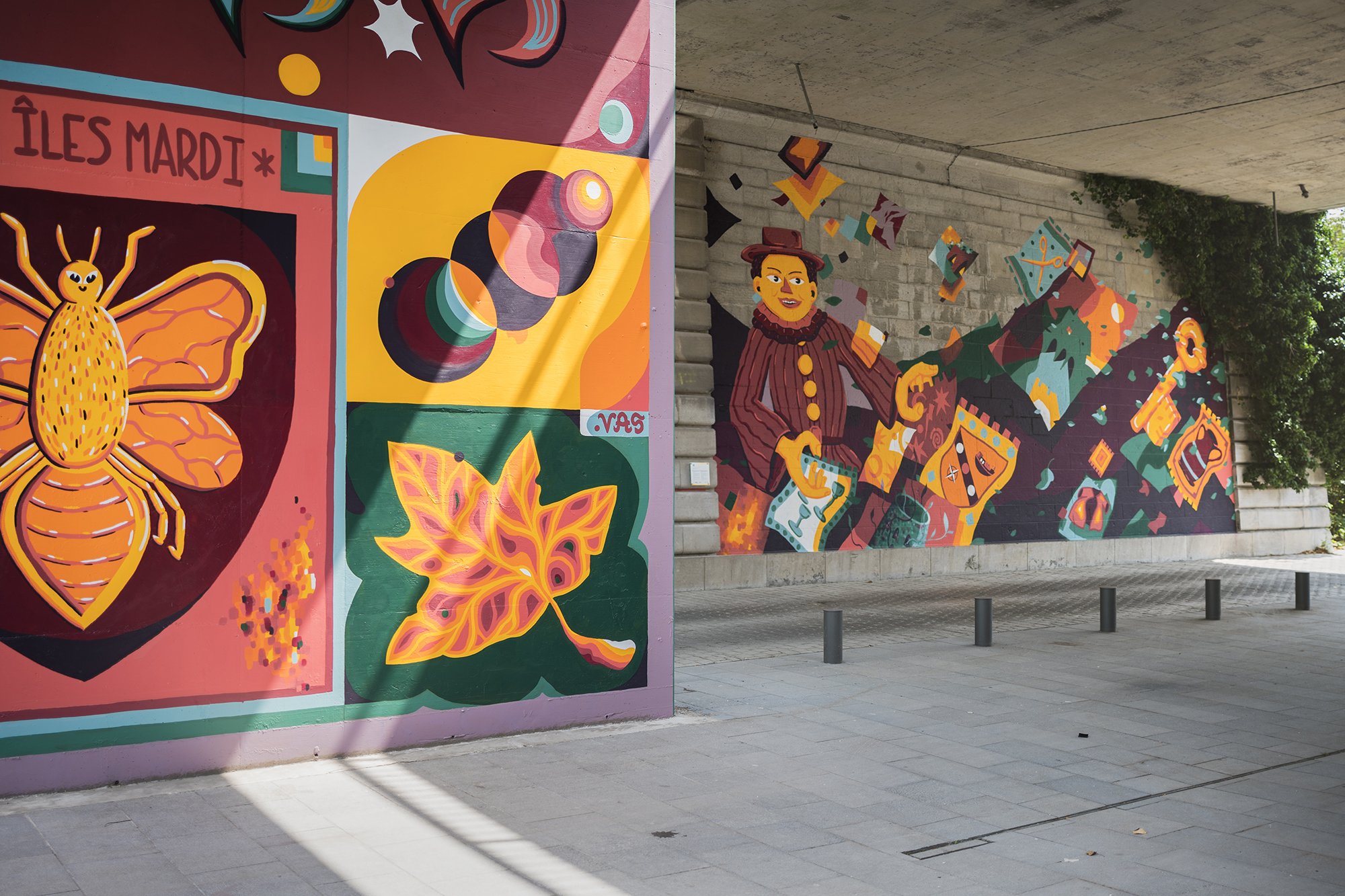
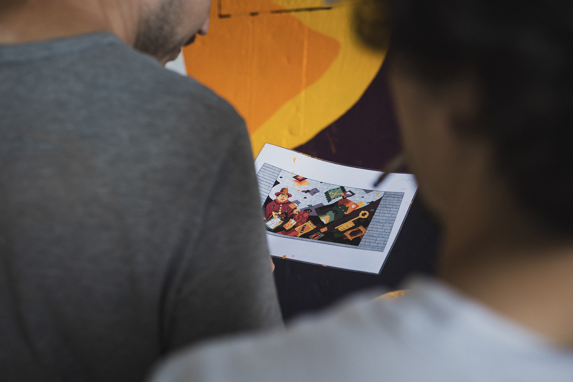
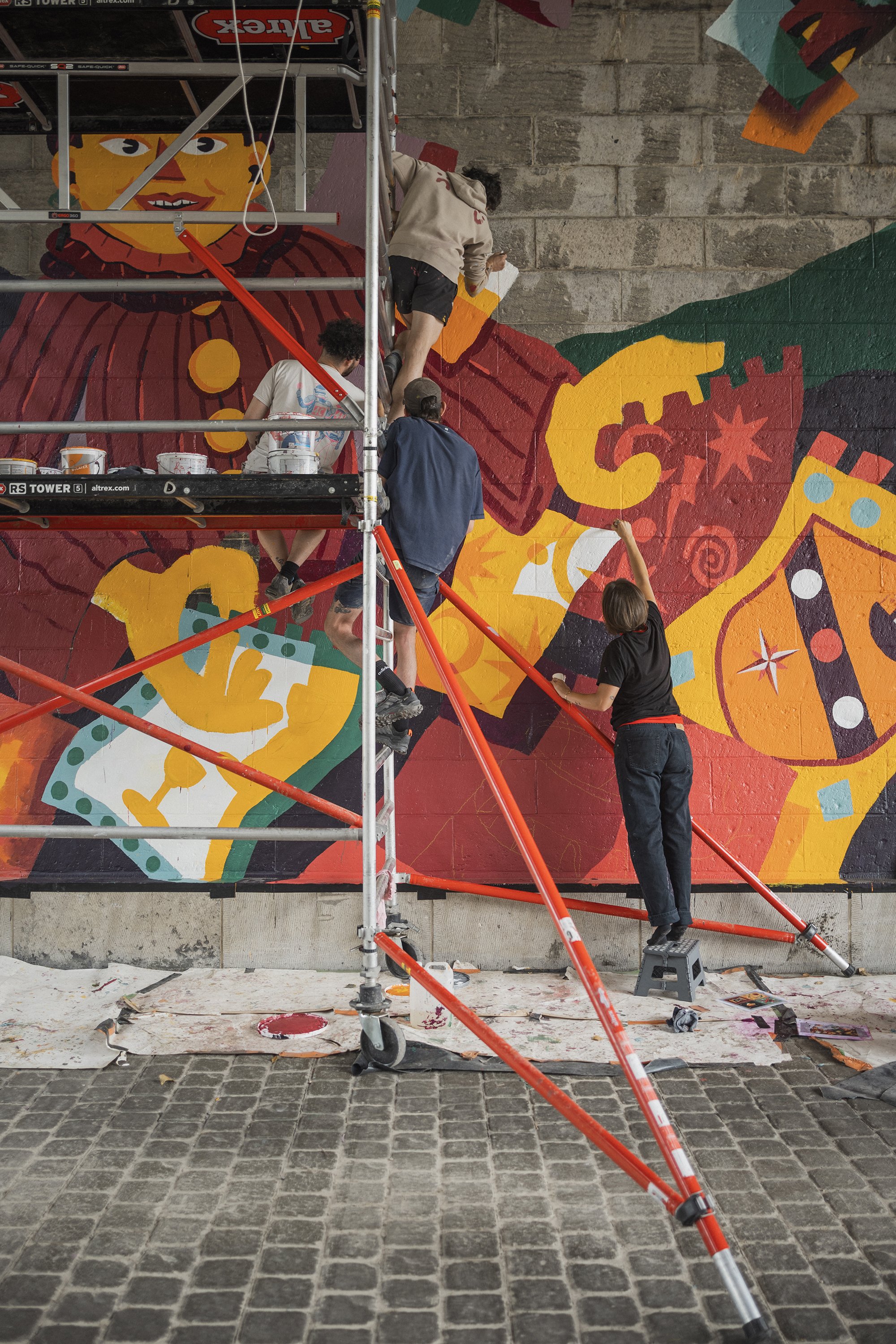
Murals telling the story of the city, of its architecture, folklore, and personas, under Pont A. Devallée. A story told by two different artists: Hedi Baka and Wenc part of the collective Les Îles Mardi.
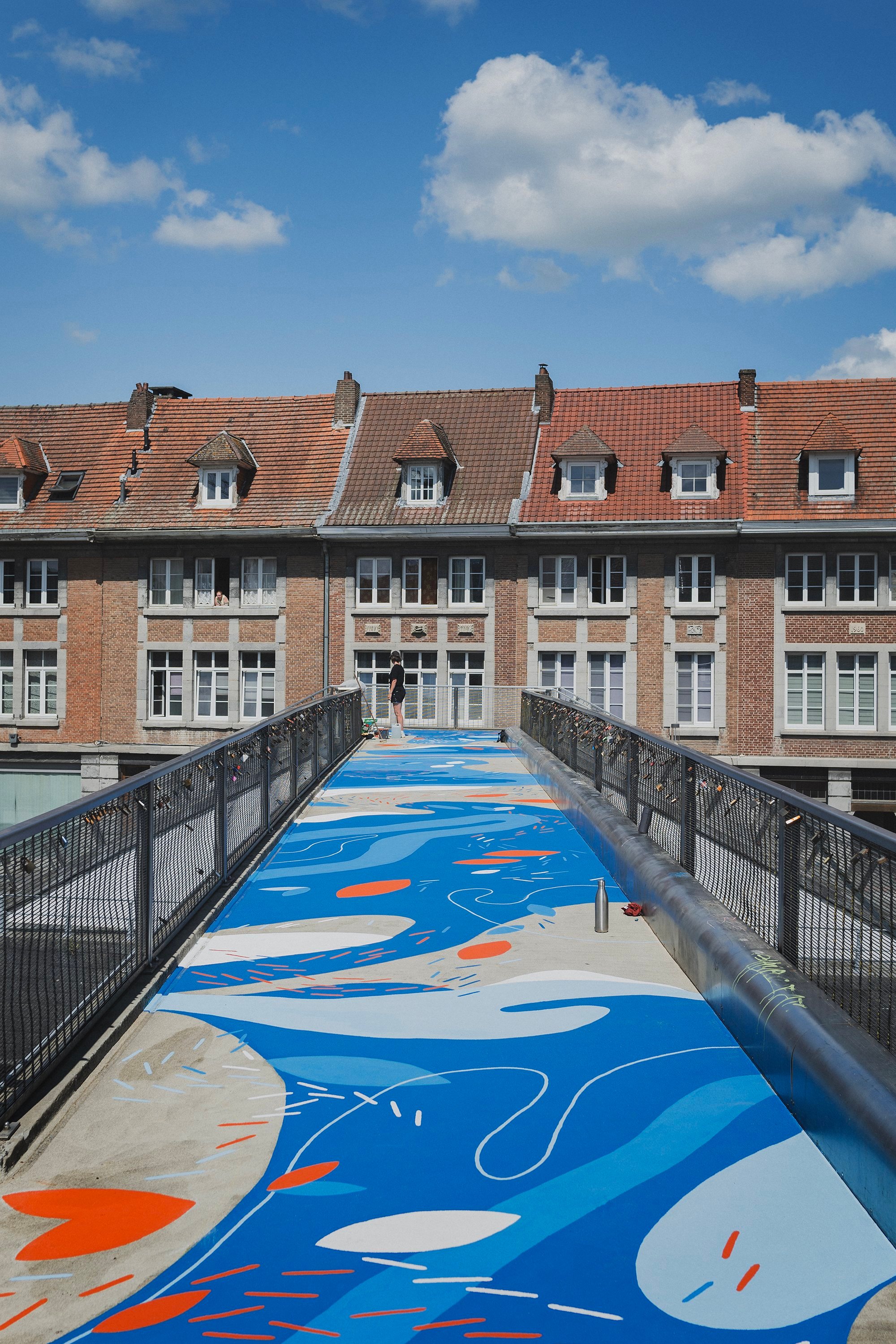
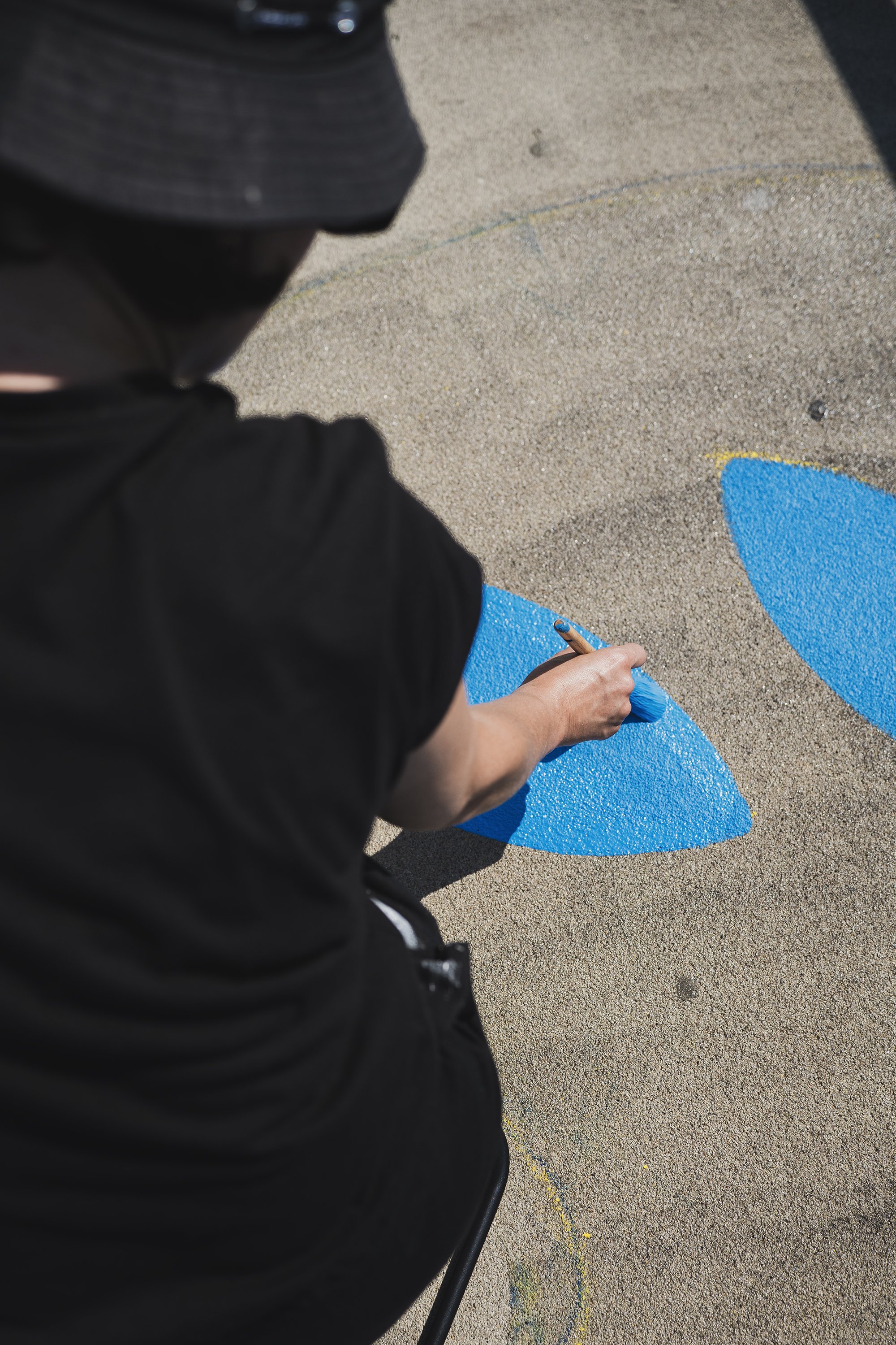
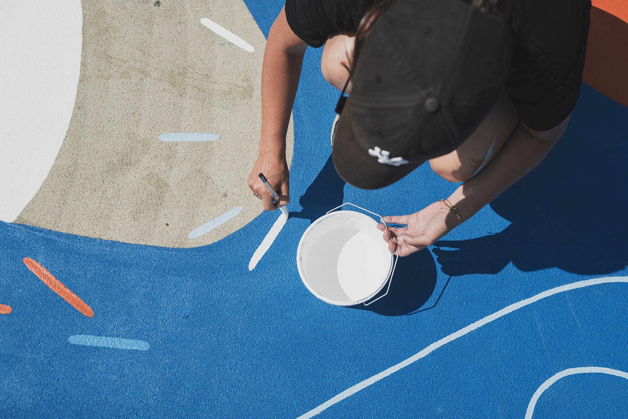
A ground mural telling the story of the intersection between water, earth and stone, over the passerelle Notre Dame, by the artist Marine Bonamy.
These stories were told and painted with the help of an incredible set of hands @cocolaurens @olwesto_paobar @antoine_moustie @octaviolimaa @rammouk

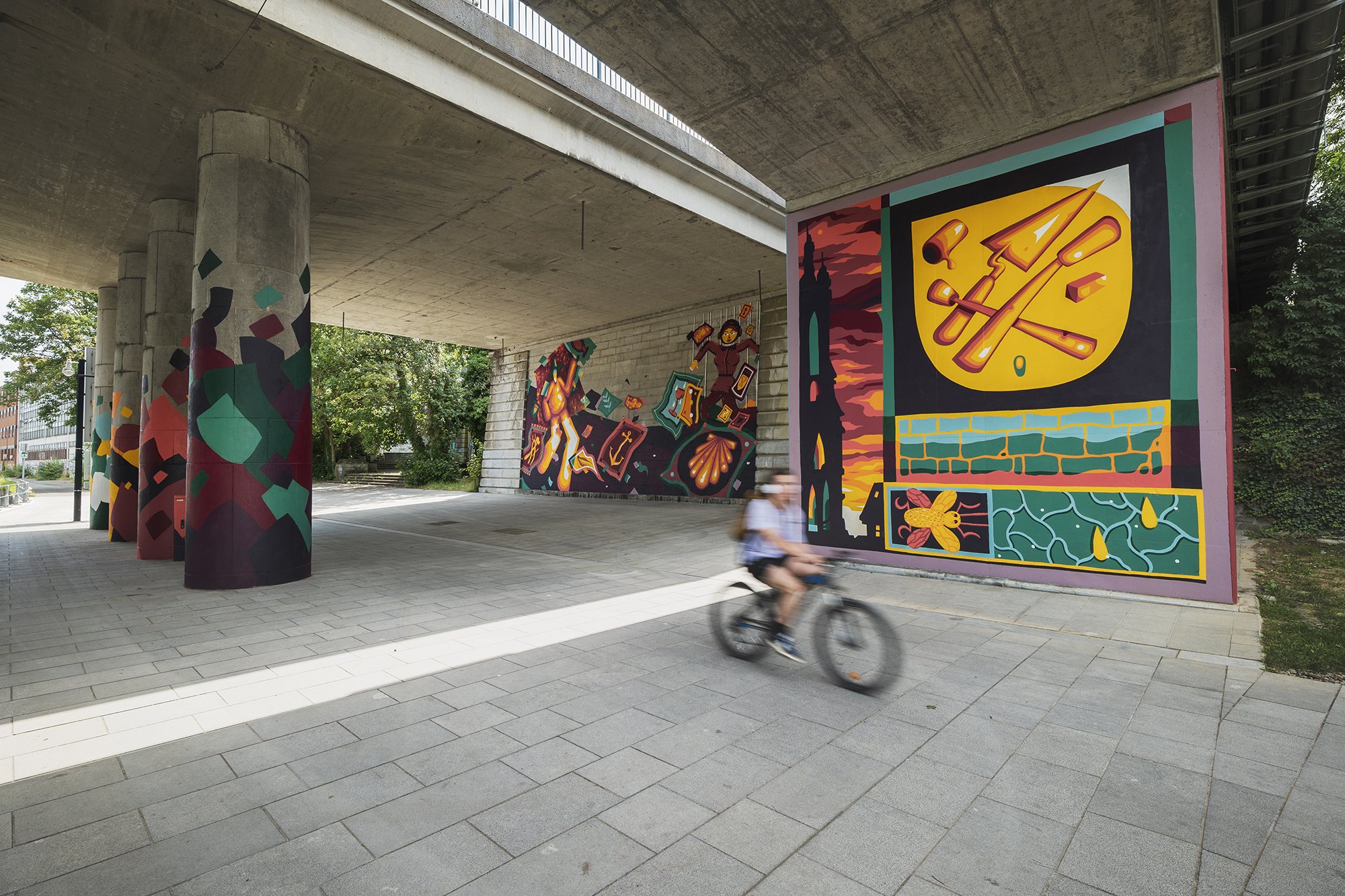
Les clés de la ville - Pont A.Devallée
This mural is an invitation to discover the story of the city and its heritage through flags, pictograms, iconic characters. Its content is inspired by local craftsmanship, folklore, and the architecture of the city.
The artwork here is a collaboration between two who collaborate a lot: Wenc and Hedi Baka. A lover of architecture and captured instances, and the other passionate about energetic and vivacious characters.
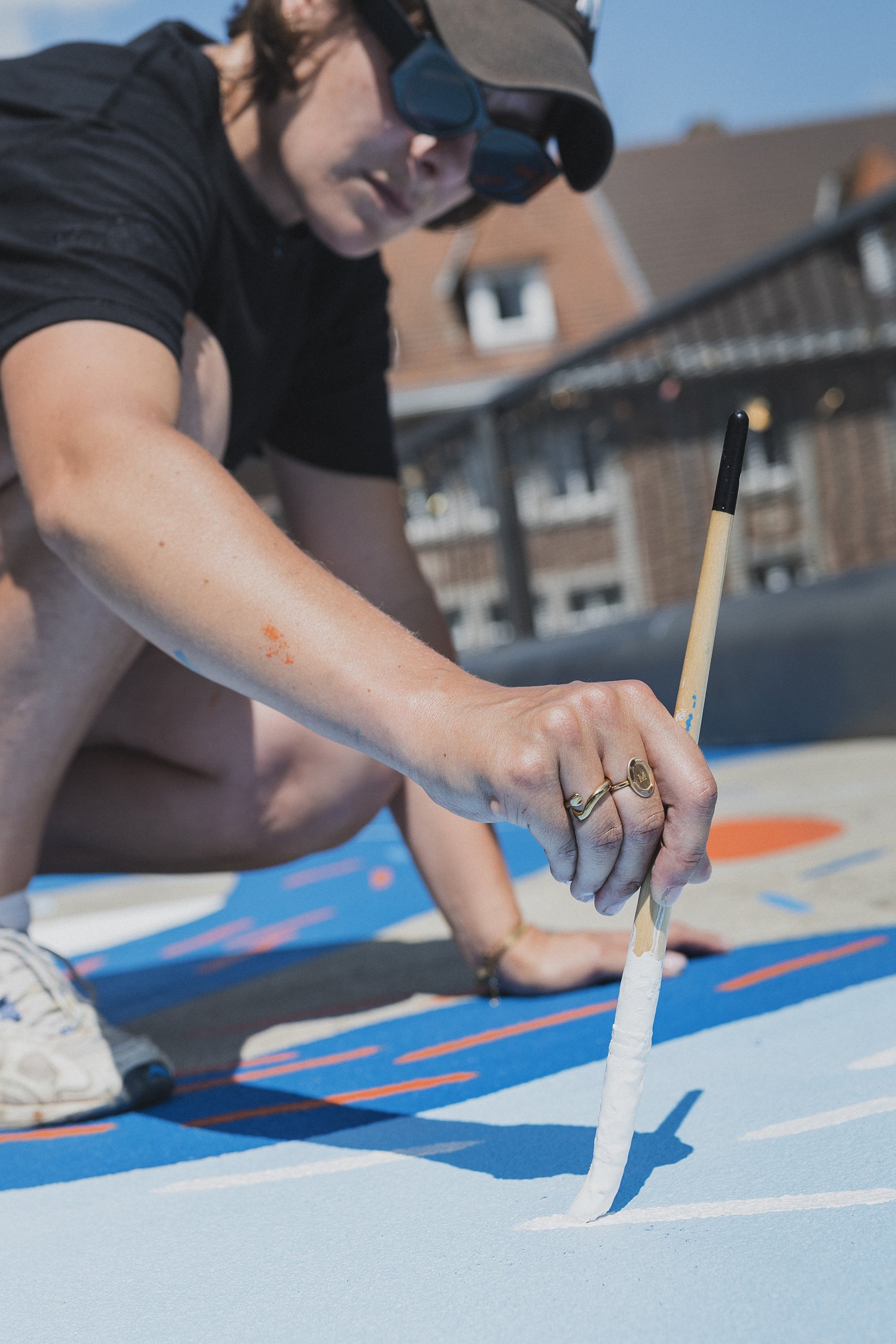
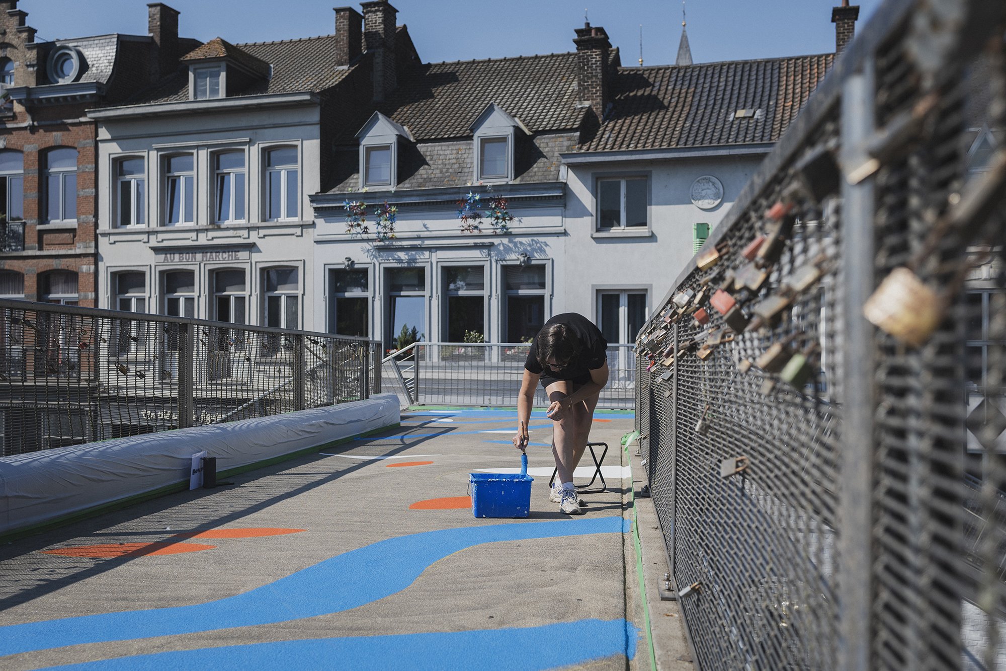

La passerelle aux reflets - Passerelle Notre Dame
This floor mural echoes with the canal, with the passers by and with the boats crossing beneath it. It aims to create a social link, a place for exchange of words, of love, of looks towards the city. The painted shapes and their colors reference the worlds of water, of earth and of stone.
Marine Bonamy, is the artist of this work. Her universe is organic, mineral, and aquatic. Her work is based on texture, superposition, and movement.
Project powered by Colora Zaventem
Video and photos by Jules Cesure, the only one.
So happy and proud with this collaboration.
And if you drive by Tournai, take a Tournai by the canal and wander through a graphic novel of the city.

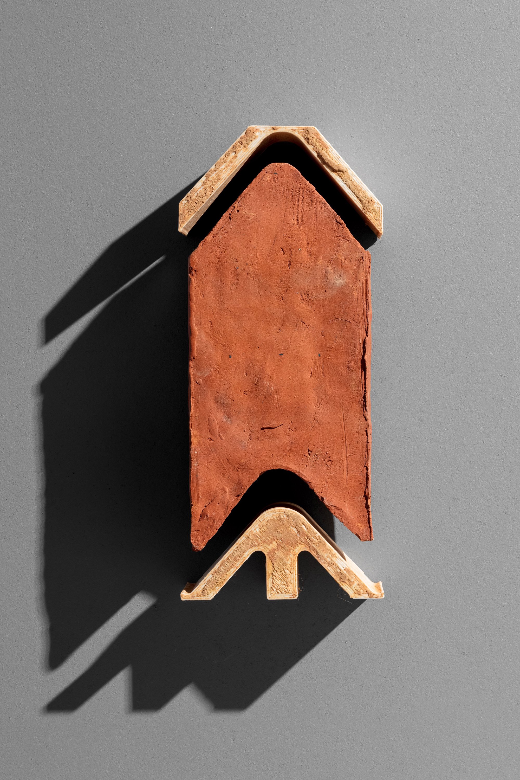
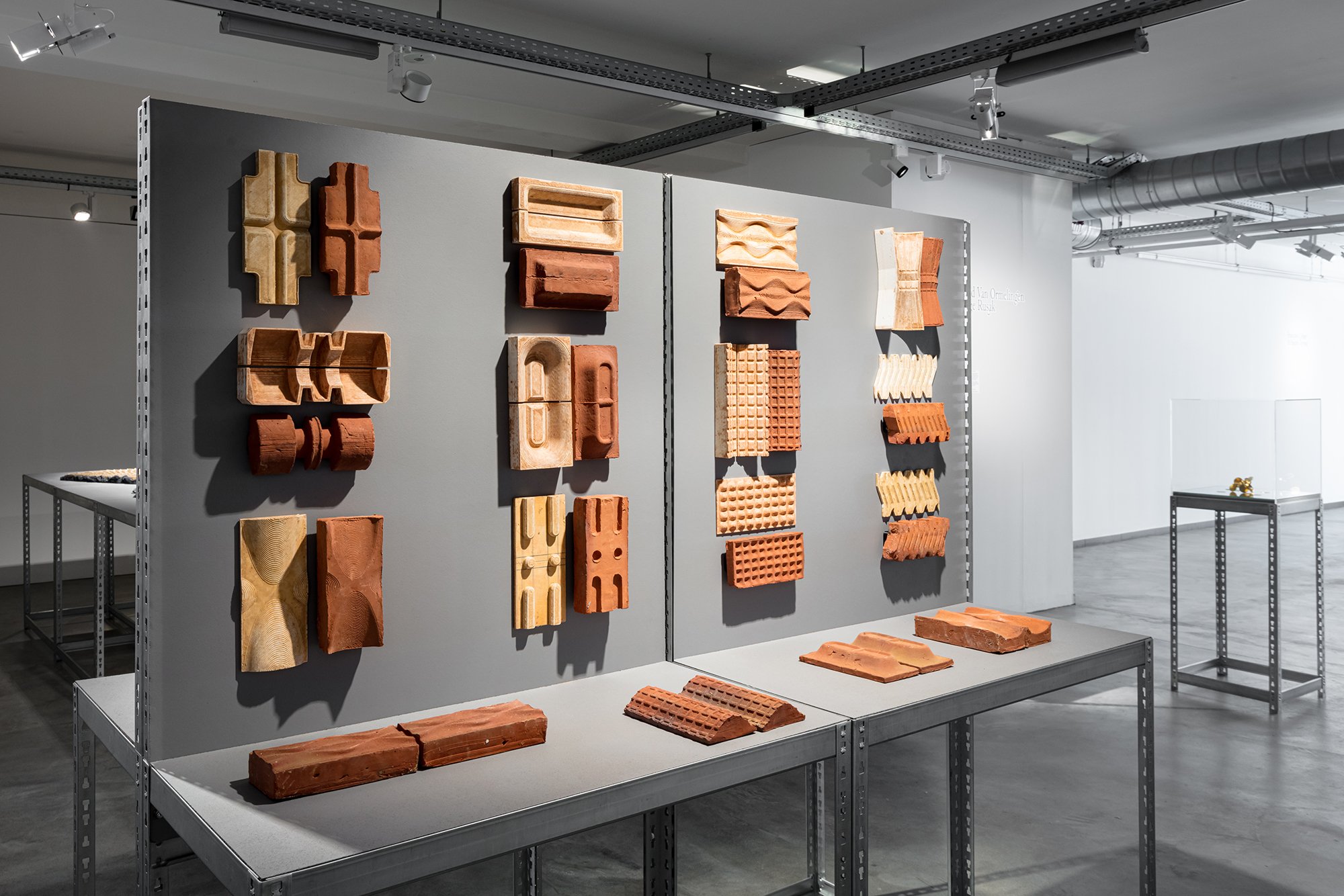
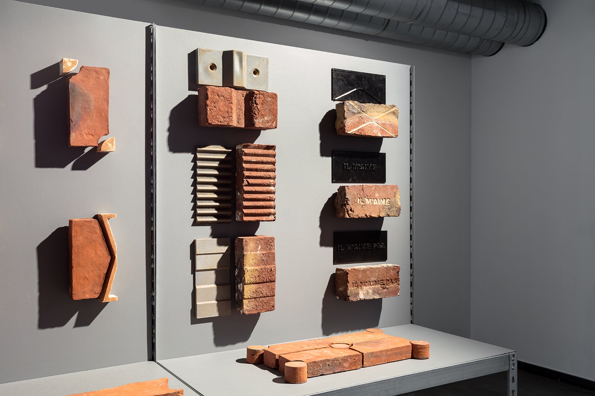
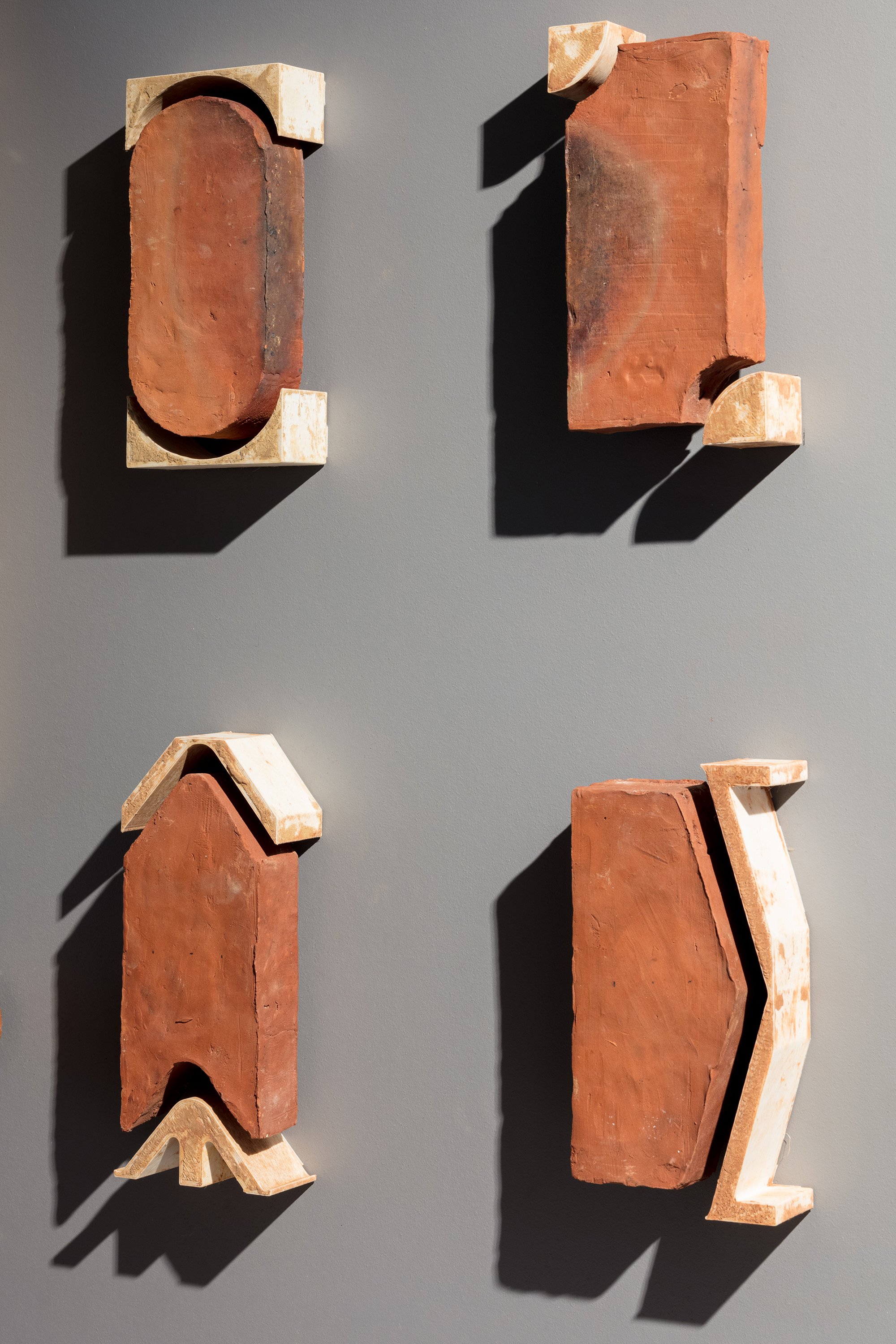
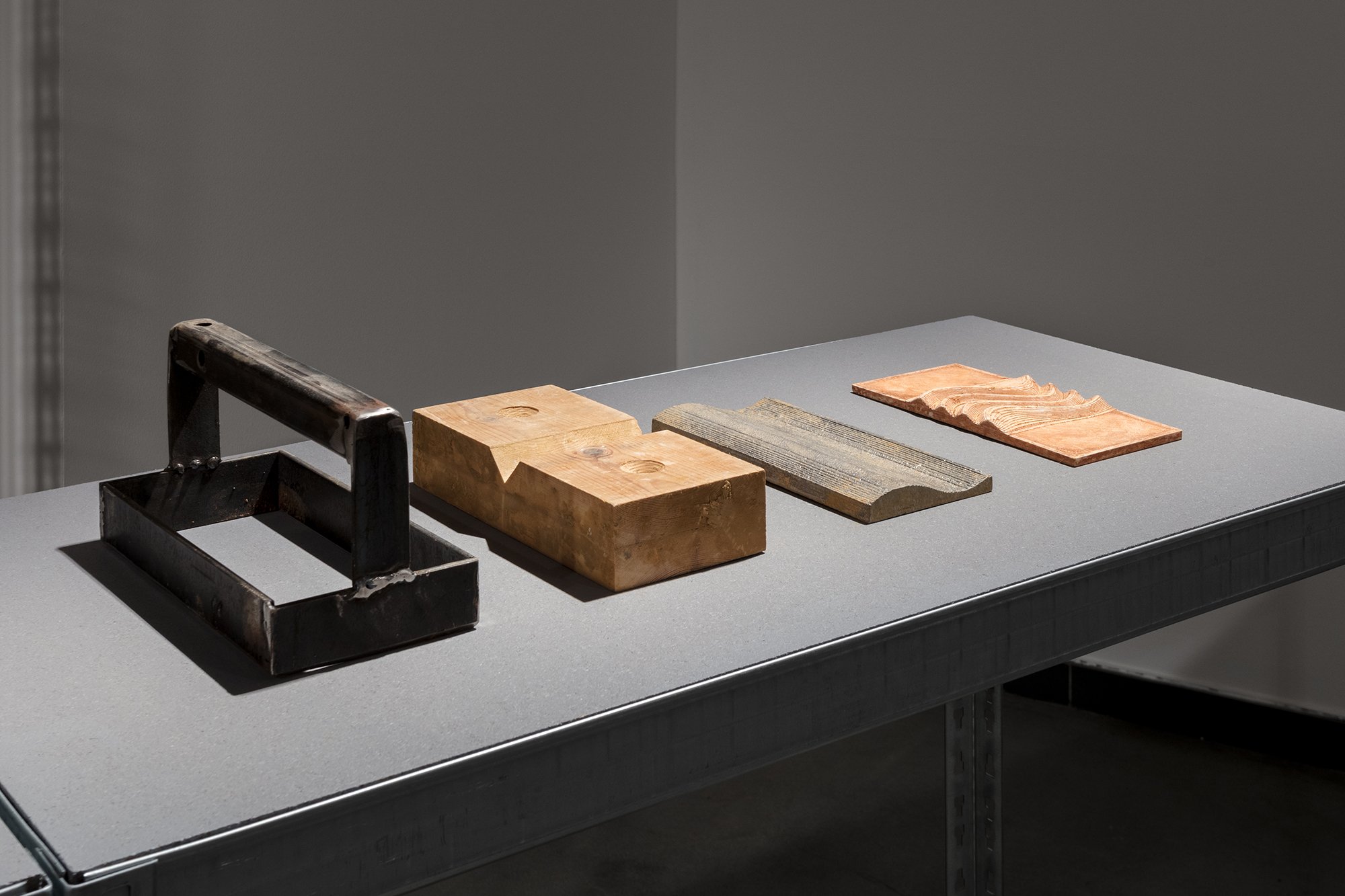
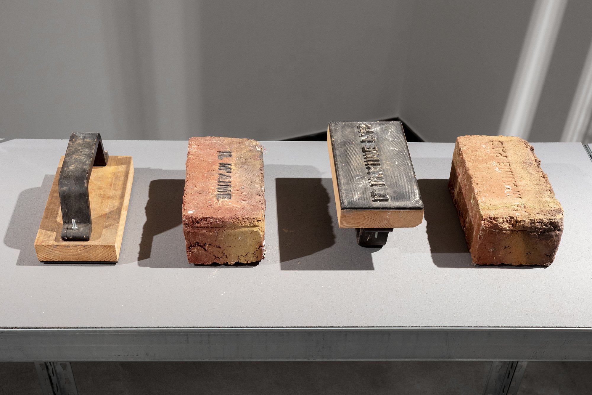
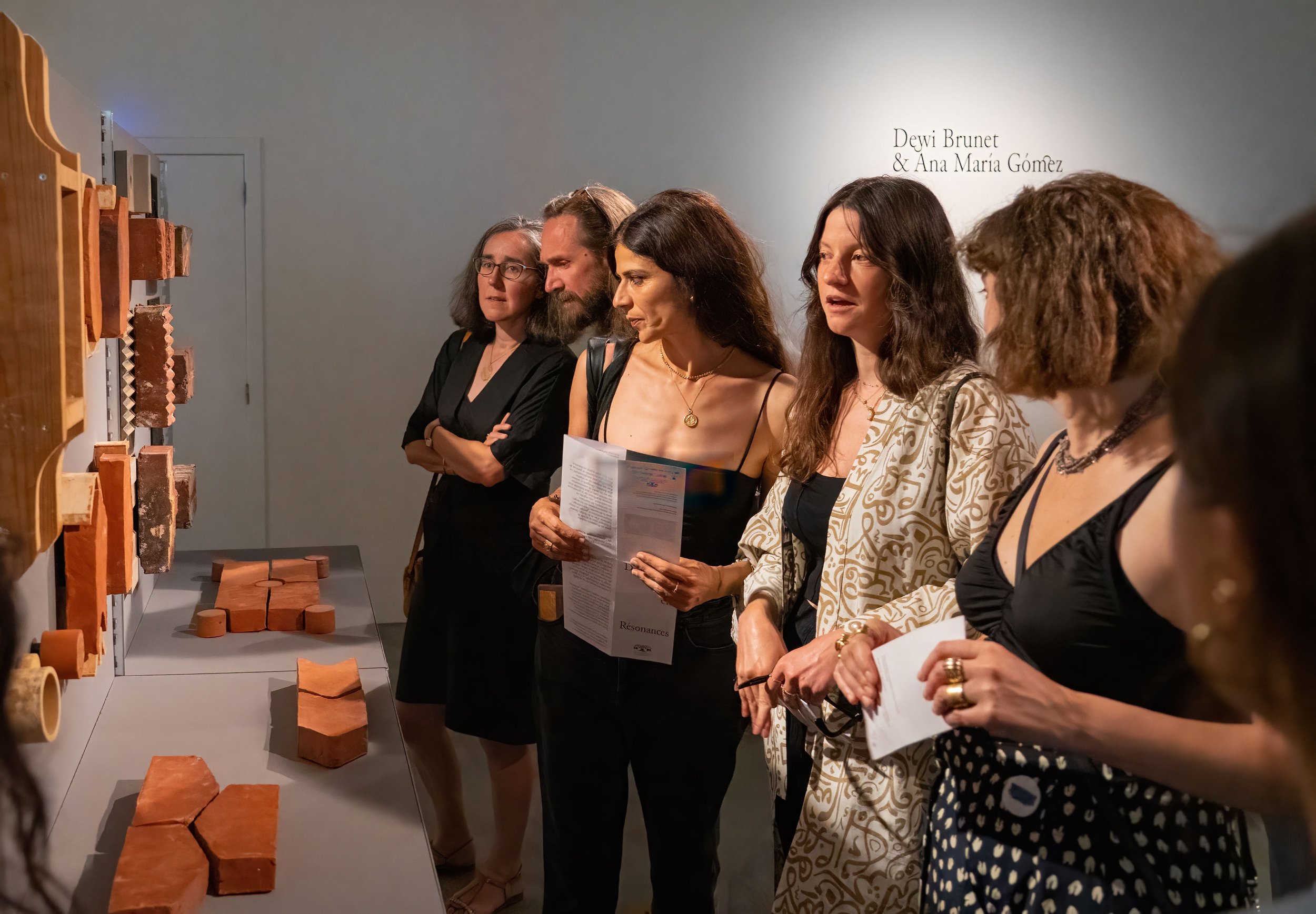
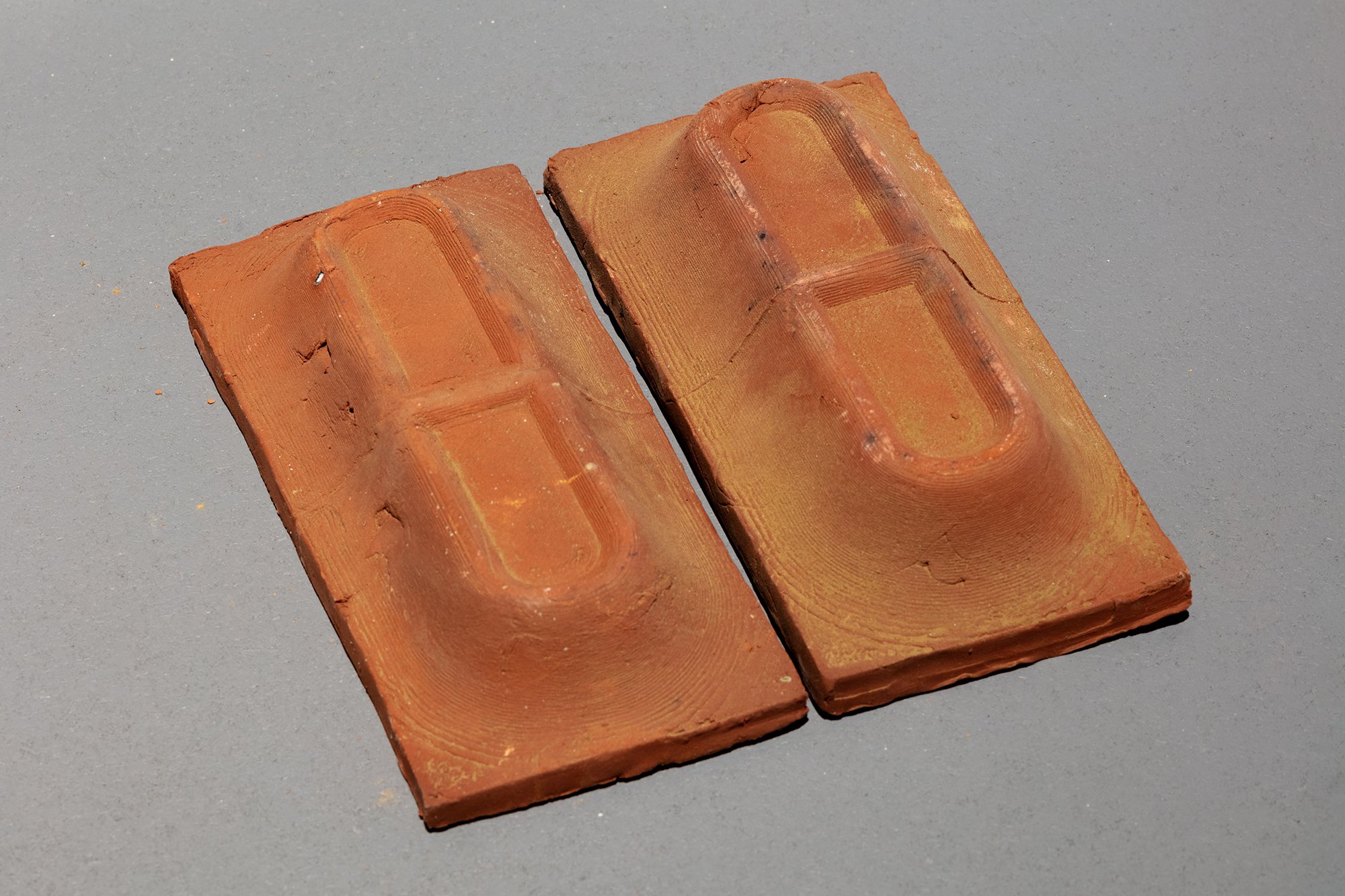
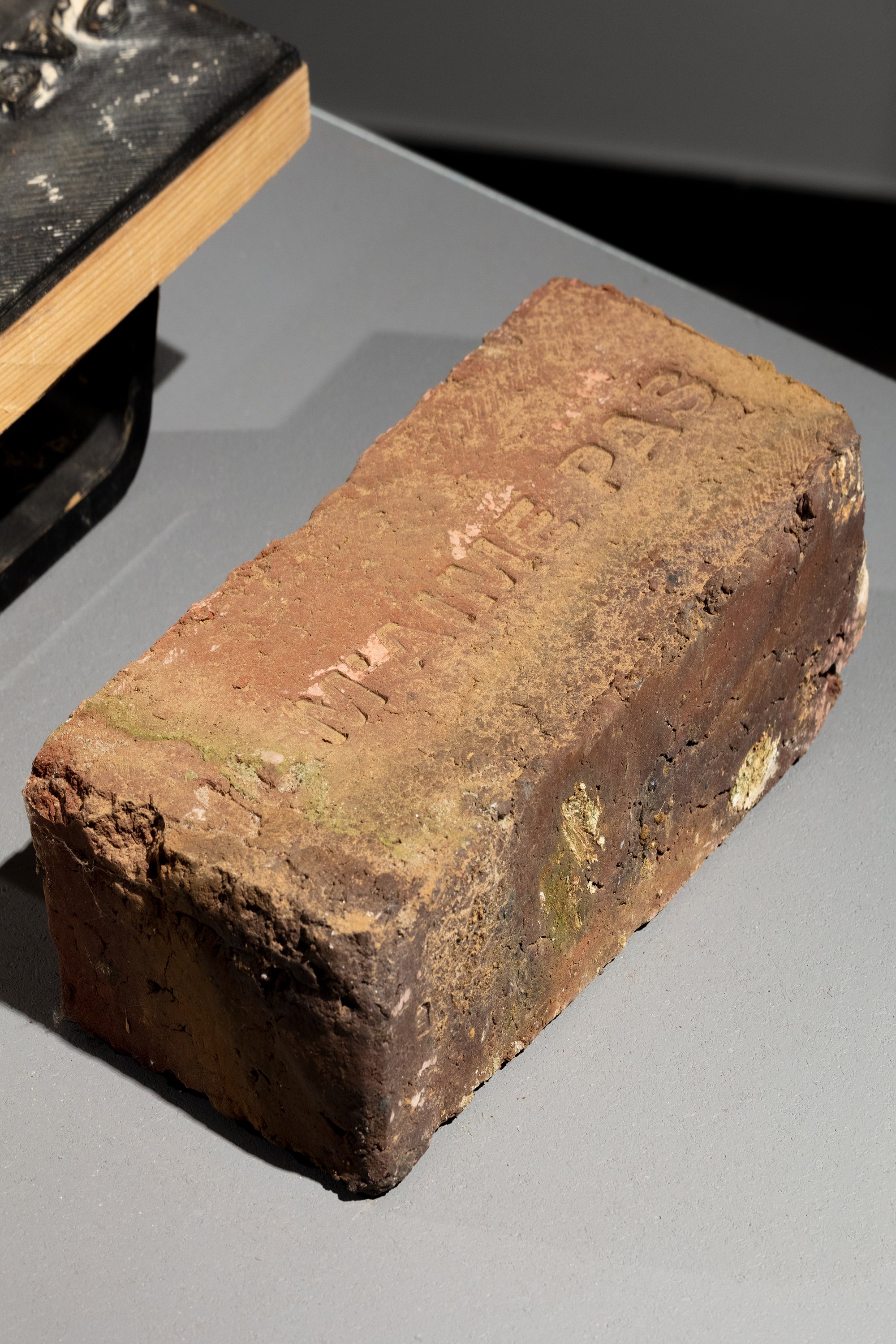
BRICKS
The collaboration HOULÉ x HIER is a research project, a work in progress and a story of process, of exchange, of adding and subtracting. A journey of words, drawings, textures, and samples.
Here, the results of a one year collaboration, between HIER and briqueterie HOULÉ.
You can check out the feel of each brick made @fondationboghossian in the exhibition Duos in Resonance up to the 20th of august 2023.

The collaboration HOULÉ x HIER is a research project, a work in progress and a story of process, of exchange, of adding and subtracting. A journey of words, drawings, textures, and samples. A process generating multiples possibilities, some explored, and others yet to be explored. A process where mold and brick form a duo, and are a result of a duo.
in PROCESS we trust
We have met. We have talked. We have listened.
On one side, there is the artisan, Mathieu, and his machine, semi manual semi automated .
On the other side there is the design party, HIER.
Mathieu Guitoun, a brick maker/artisan, produces bricks using the same techniques, machines & process as the old brick factories from 19th - 20th century.
That philosophy and respect for tradition offers an authentic look but also a quality that you no longer find with the industrial bricks. The same could be said about the colours: they are not to compare with those of the industrial brick.


Concept and approach
From the different approaches we could have chosen for this project, the duo decided to use Mathieu’s machine to produce more of his product, the ornamental brick. But more textured, deformed, or stamped.
Our approach is to use the same machine, make use of the freshness and malleability of the product before its drying and then cooking, and find low-budget solutions such as additions to the existing mold or stamps.
End game
to develop something that could be added to his catalogue of products.
develop something smart and efficient that tweaks the standard brick, adds variety to the collection.
Game plan
Modifying the pressing mould: add pieces, corners, or layers of textures
Manipulating after pressing: explore different stamps and enamelling techniques


Cheers to Wallonie Design. And thank you for this great opportunity and for pairing us together :)
Process photos by @heloiserouard & us. Photos of the exhibition by @silviacappellari and Maxime Legrand - Fondation Boghossian – Villa Empain, exposition Duos in Resonance, Brussels, 2023

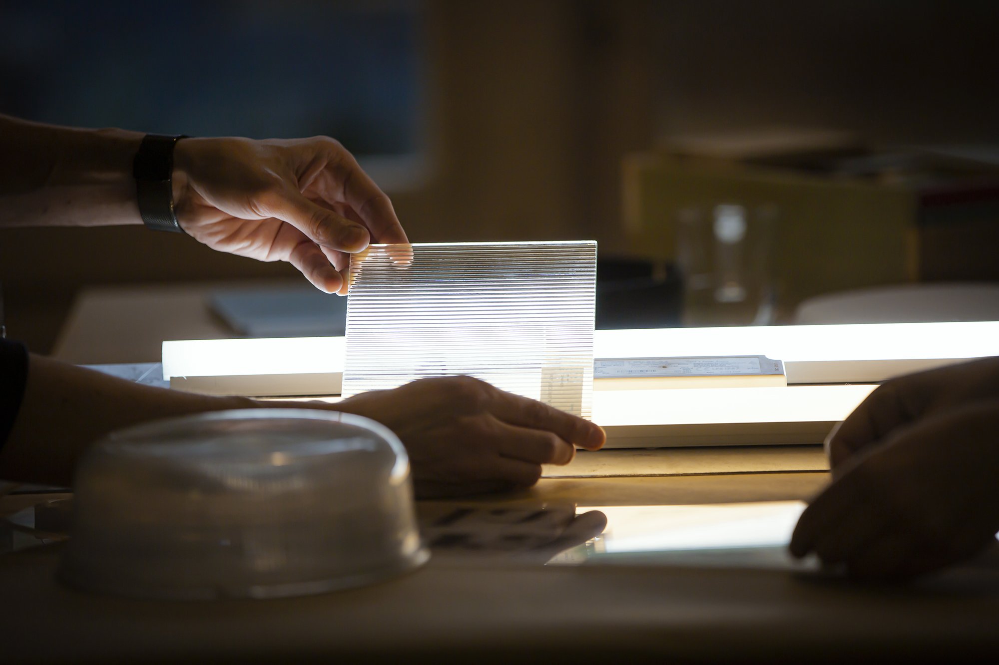
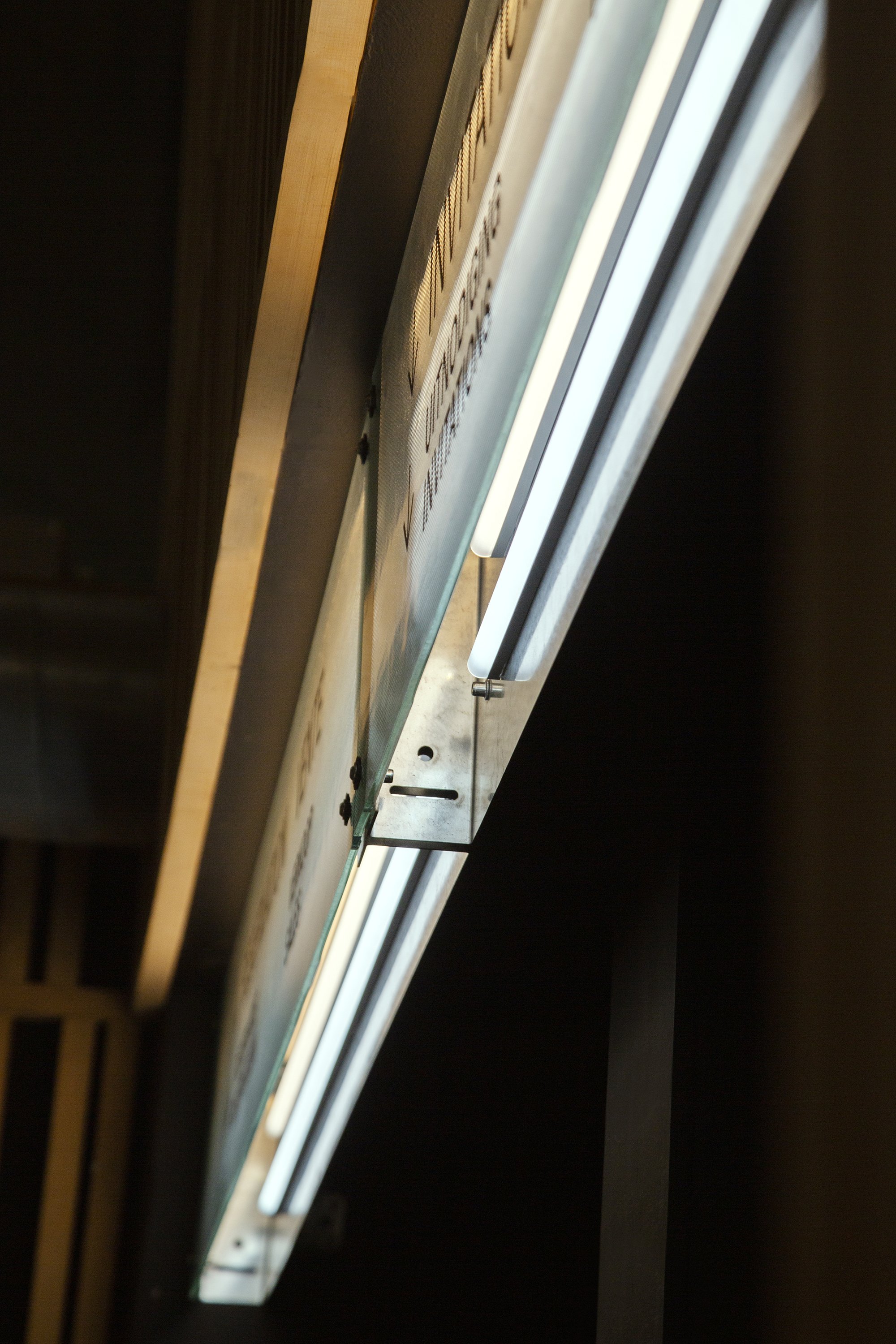
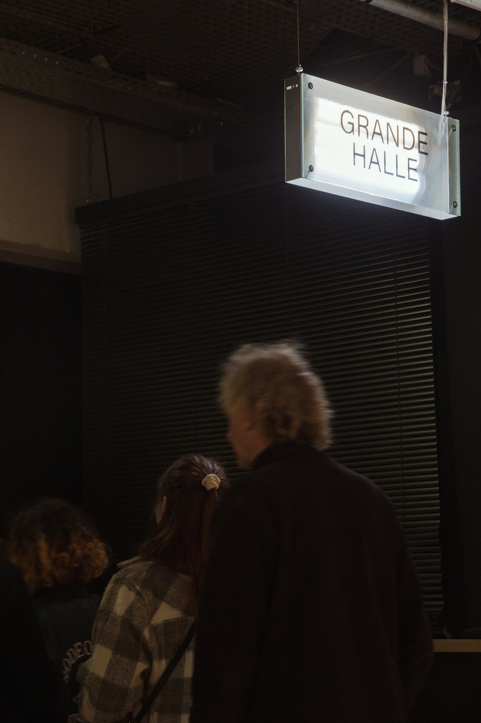
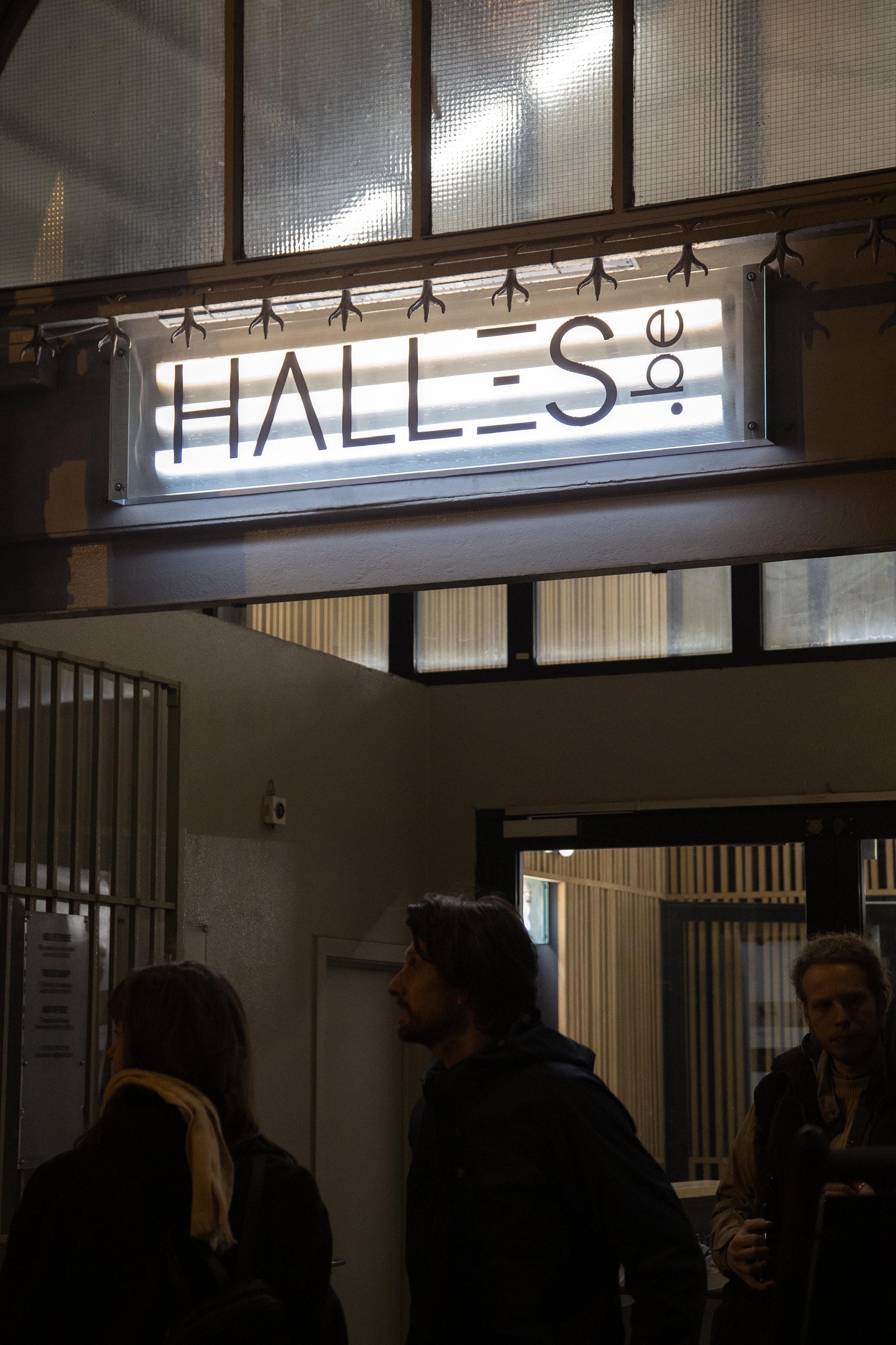
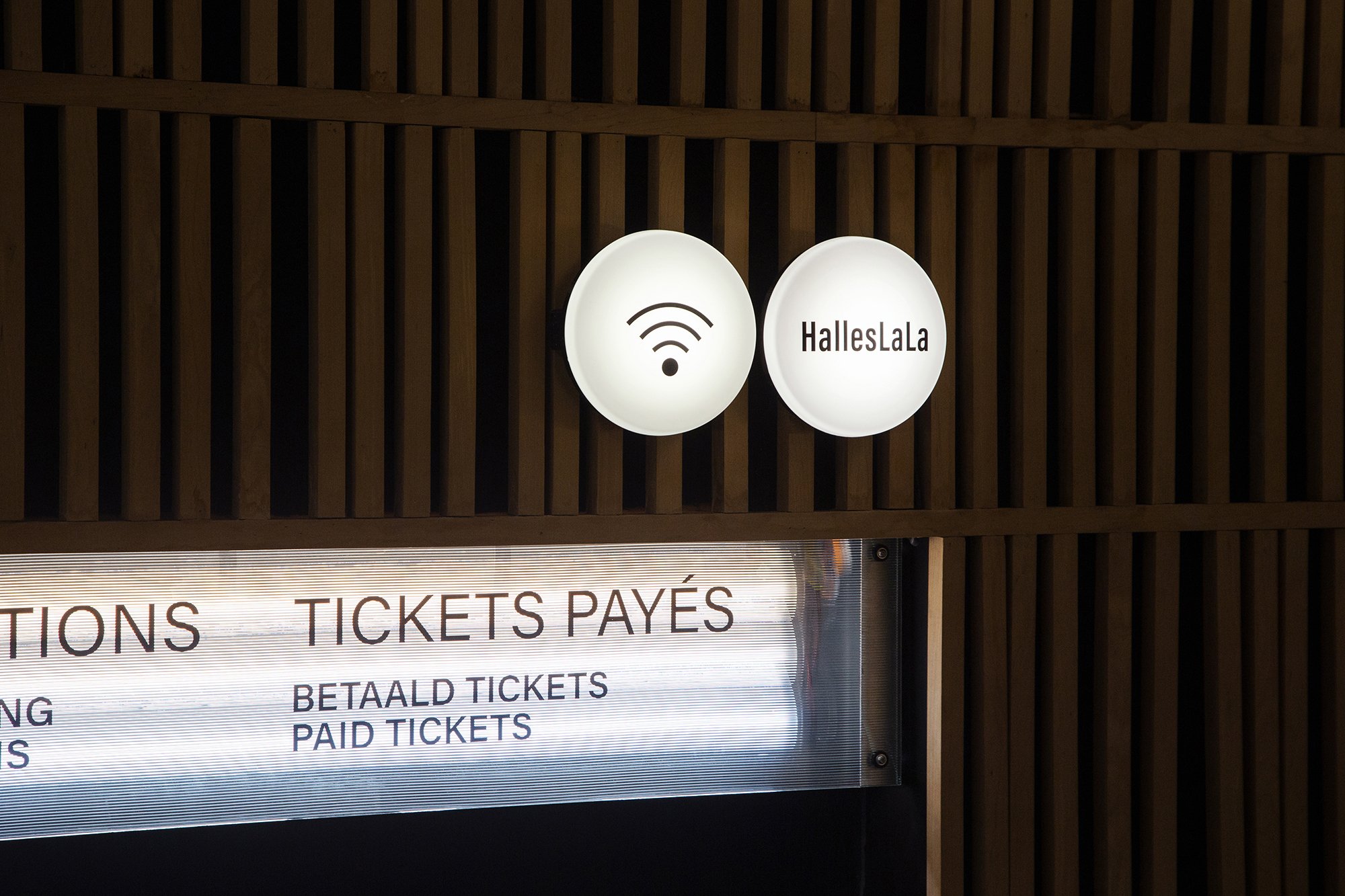
La Grande Halle
From light to language to signage, we used boxes of light to indicate the way and the services throughout the halls of the Halles de Schaerbeek.
This project commemorates a first collaboration with Studio Alvin. One amongst many hopefully. As we were delighted, to work with them.
Alvin are the masters of the graphics for this project, and we were commissioned the signage system for the Halles. For that, a word popped: light.
Light. Well. It lights.
It sets an ambiance, or emphasizes, elements over others.
Light. Well.
It glows and it shows.

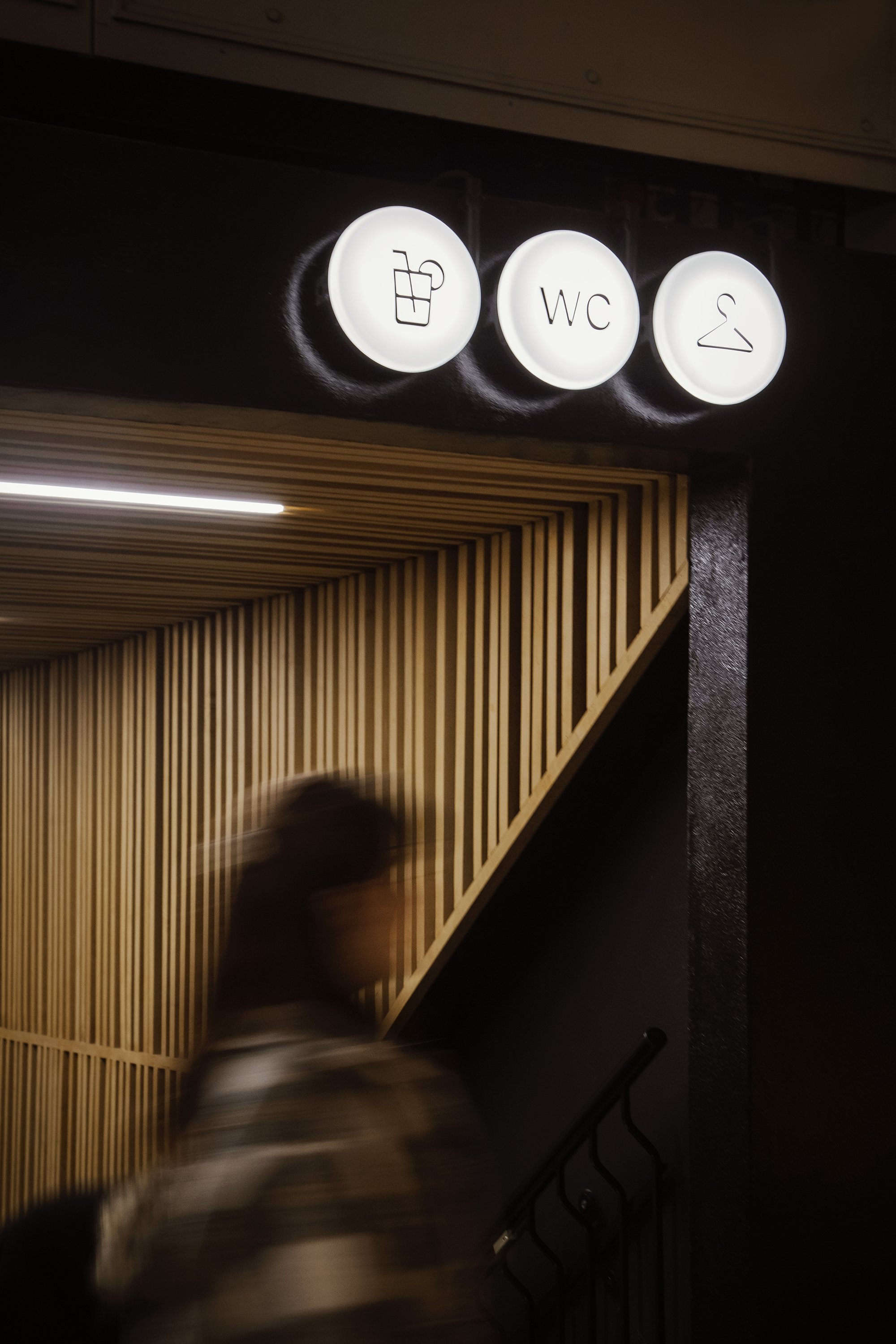
It tells. the start, the end, of a show. It transitions, also.
There is a moment where it dims to black to then light specifically, something intended to be seen, leaving the audience in the dark. Literally.
Light is a language communicating queues. Indicating, time, and things.
It is a sign.
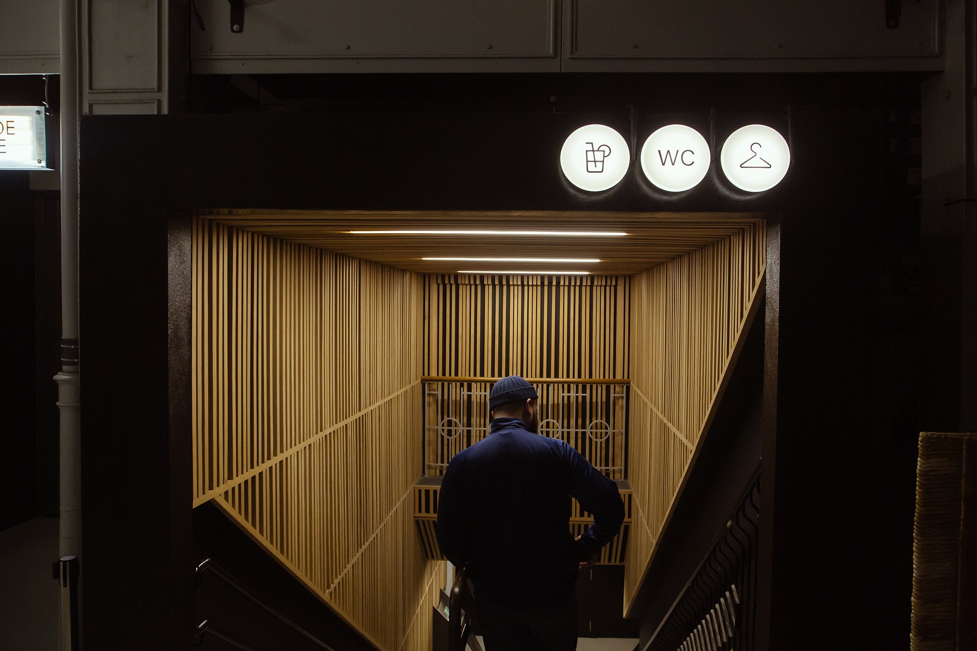
From light to language to signage, we used boxes of light to indicate the way and the services throughout the halls of the Halles de Schaerbeek.
The boxes are open, revealing what is happening in the backstage of the signage. Other signs are indicated on reused light globes, with a customized support, that brings back their purpose. To diffuse light.

Pictures and video by Joe Khoury Studio
Big up to Justine and Antoine ;)