SPACES
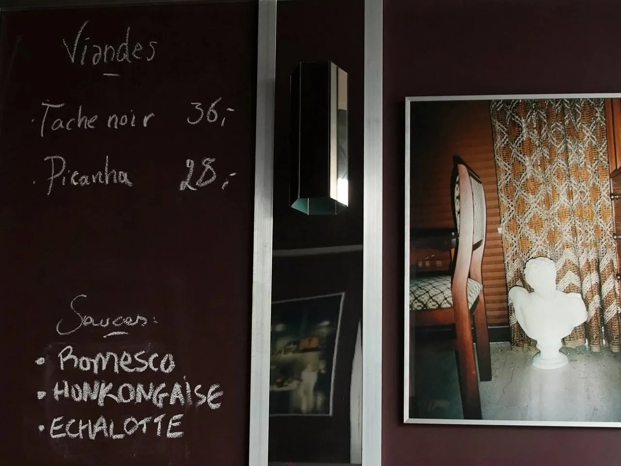
A place of meat, a place to meet.
Where raw meets cooked, and old meets fresh new.
A bistro feel with an industrial twist.
A cabinet of curiosities, where things of many sorts and brands, are found and blend.
Some things of daily use, and others, for occasions or as a gift: luxury is found at different scales, accessible and non-intimidating.
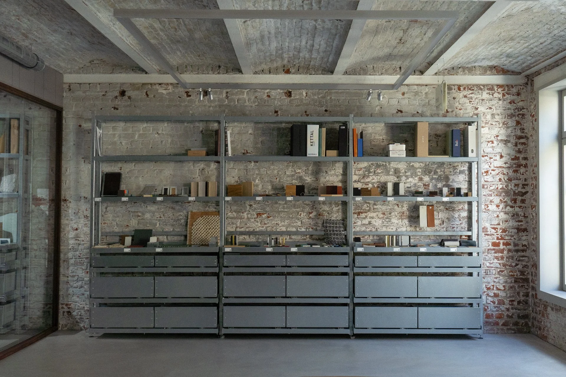
A material library, that is elegant, that is efficient, that is modular and flexible, that offers a multitude possibilities, for the display of samples and materials, of mood boards and words. A material library that is raw and simple.
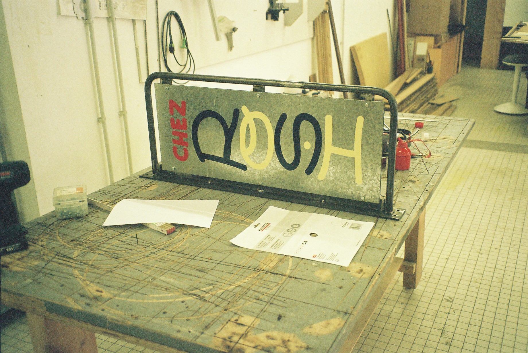
In collaboration with Oilinwater Studio, who worked on the creative direction, graphics, and communication for the campaign, and we, HIER, developed the exhibition display systems with the idea of protest-like signs.
Scenography for the Woven Whispers exhibition showcasing the best of Belgium’s textile design during Milan Design week, an event organised by Alcova Milano.
Happy, happy to have been chosen by Sotheby’s & Mad Brussels to design a window display for Sotheby’s 50th anniversary in Belgium. And what a better way to celebrate than with a big, big, cake.
Where dogs and cats feel home. Our story with Canine started with a Bone, then another Bone facing it, to sign their cool presence in Saint-Gilles. The collaboration then expanded to cover the design of their new second store in Flagey.
It’s new, c’est Nouveau! Well, not all of it. Only the part we designed, the one that lies in the backstage: the kitchen and the workshop. The main piece of the project is a chandelier piece roaming over the main atelier space, watching over it, with flowers hanging upside down, also a source of light.
We have refreshed, revisited, updated and ugraded, the shop and info office scenography for Visit Brussels. We have added in place of an older system, a shelving design that is both colourful and playful, while being practical and functional.
HIER was asked by MAD Brussels to design the common and public spaces of the new residents’ ateliers in Rue du Vautour, a space dear to HIER’ heart, as it was founded in that very space, in 2017, when we, Thea and Thomas were residents at MAD.
Pink is for fabric. White is for metal. Wood are for surfaces. And green are the plants and pots.
A window of windows, of Inside Stories.
One of translation, transcription and essentially transmission.
This scenography, commissioned by MAD Home of Creators, is designed to host a series of fortunate events, from master classes to conferences and workshops.
In conversation with IMAL's Fablab team and the architect’s plans for the new space, we designed the furniture for Fablab present. All furniture is thought of within a system of pieces that are: easily assembled, thus dismantled and repairable, efficiently reproduced for possible future expansion, and as reusable as possible.
This place is your place. A hundred times.
It is redefined. Limited by walls, and edges.
Dispossessed.
Some even call it a non-territory of the multidisciplinary.
On the first day there was Duvel. A gift to Bar Rodin they wanted to make.
When HIER began to design the benches and the bars— the courtyard was without straight floor, and it was dark over the night— HIER said: Let there be also light.
MAD LAB, funded by the public sector, is an incubator for young designers in Brussels.
Now, MAD LAB and its residents occupy the 13th and last floor of the highest social housing tower in Rue Haute, Brussels, Belgium, Europe, Earth.
1000 Lira w Lira we revisited the “1 Dollar Shop” concept and adapted it to the Lebanese Lira, an inflated currency that looses its value as we go, for value is a controversial topic.
SIGNAGE
Where dogs and cats feel home. Our story with Canine started with a Bone, then another Bone facing it, to sign their cool presence in Saint-Gilles. The collaboration then expanded to cover the design of their new second store in Flagey.
For Maison de la Culture in Tournai we have collaborated, with Atelier Blink ( for we cherish collaborations).
They have designed, and we have developed, produced, and installed, signage.
From light to language to signage, we used boxes of light to indicate the way and the services throughout the halls of the Halles de Schaerbeek.
HIER was asked by MAD Brussels to design the common and public spaces of the new residents’ ateliers in Rue du Vautour, a space dear to HIER’ heart, as it was founded in that very space, in 2017, when we, Thea and Thomas were residents at MAD.
While the main sign is composed of floating letters slightly offset from the facade surface, the secondary signage uses the same material, brass, as a sheet, more like three of them spreading along the grid of the elevation, caressing the entrance of the school.
While KOKOTTE is a food incubator, L’Auberge Espagnole is a retail incubator. Both are projects set by HUB Brussels to help businesses test their ideas before investing big. Both are constant spaces, with shops and restaurants varying throughout the year.
Need for a sign without plastic and entirely recyclable for the “zero waste” restaurant Le Local
1000 Lira w Lira we revisited the “1 Dollar Shop” concept and adapted it to the Lebanese Lira, an inflated currency that looses its value as we go, for value is a controversial topic.
Culture market is an event that brings together art institutions from the Brussels region to meet and be able to present themselves to a wider public.


