A galvanized Era, chapter 2 - MAD LAB
HIER was asked by MAD Brussels to design the common and public spaces of the new residents’ ateliers in Rue du Vautour, a space dear to HIER’ heart, as it was founded in that very space, in 2017, when we, Thea and Thomas were residents at MAD.
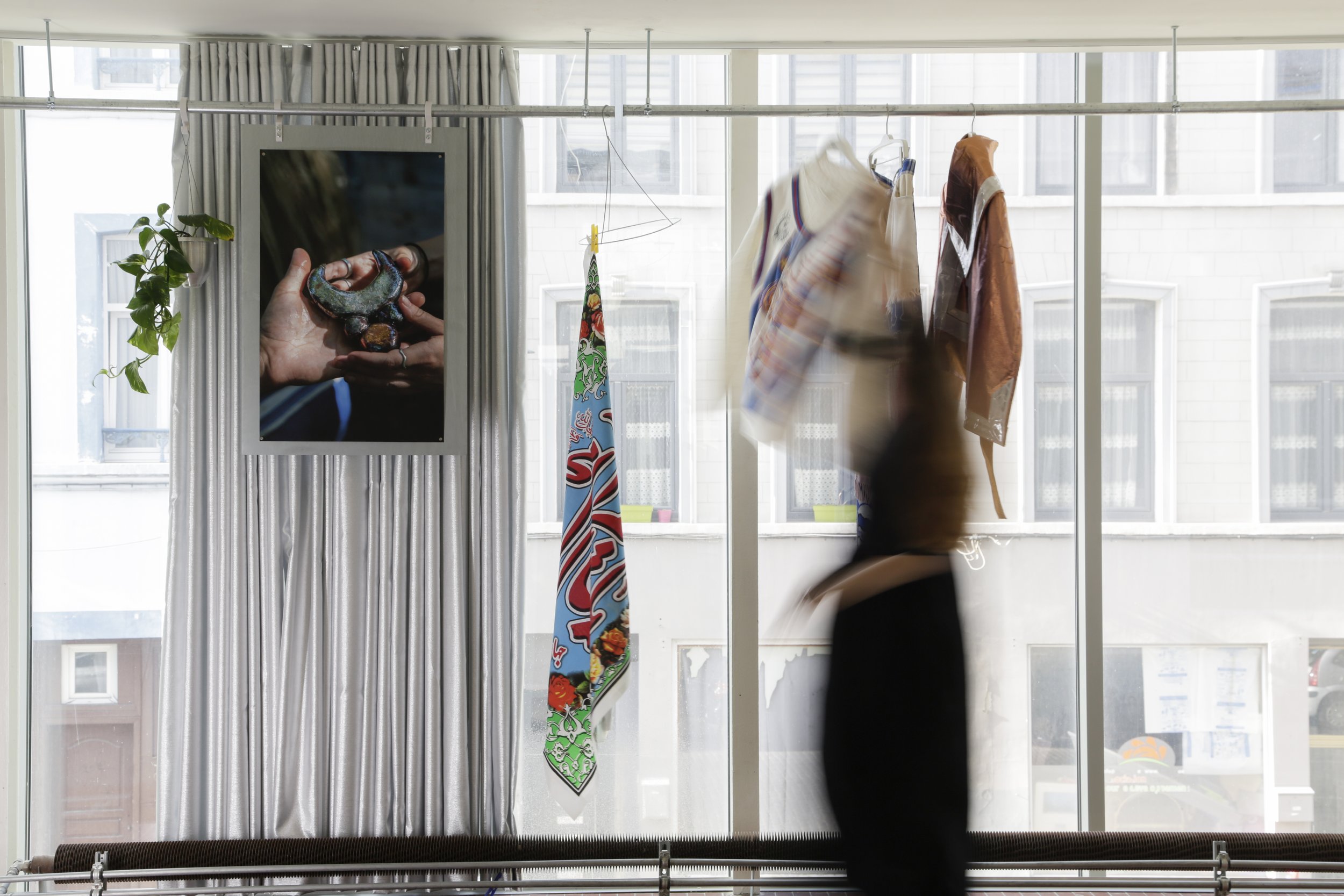
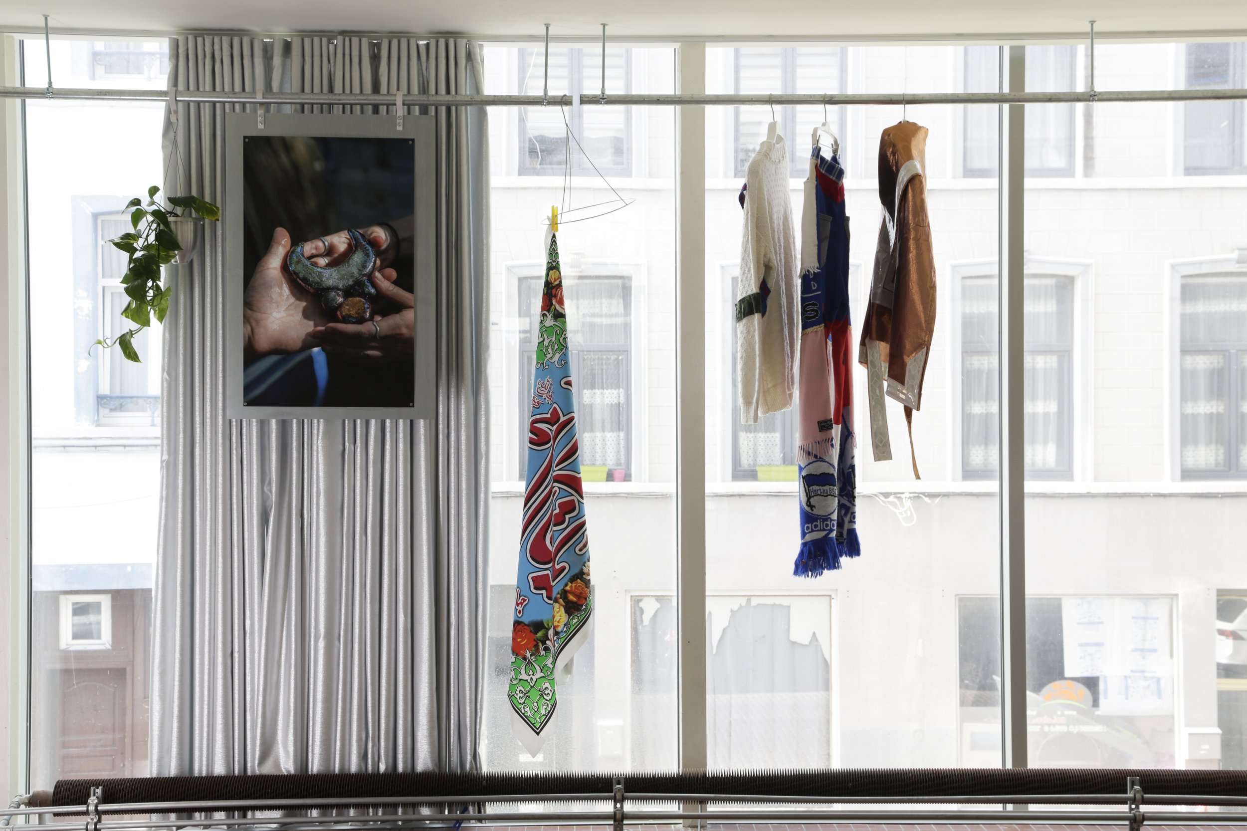
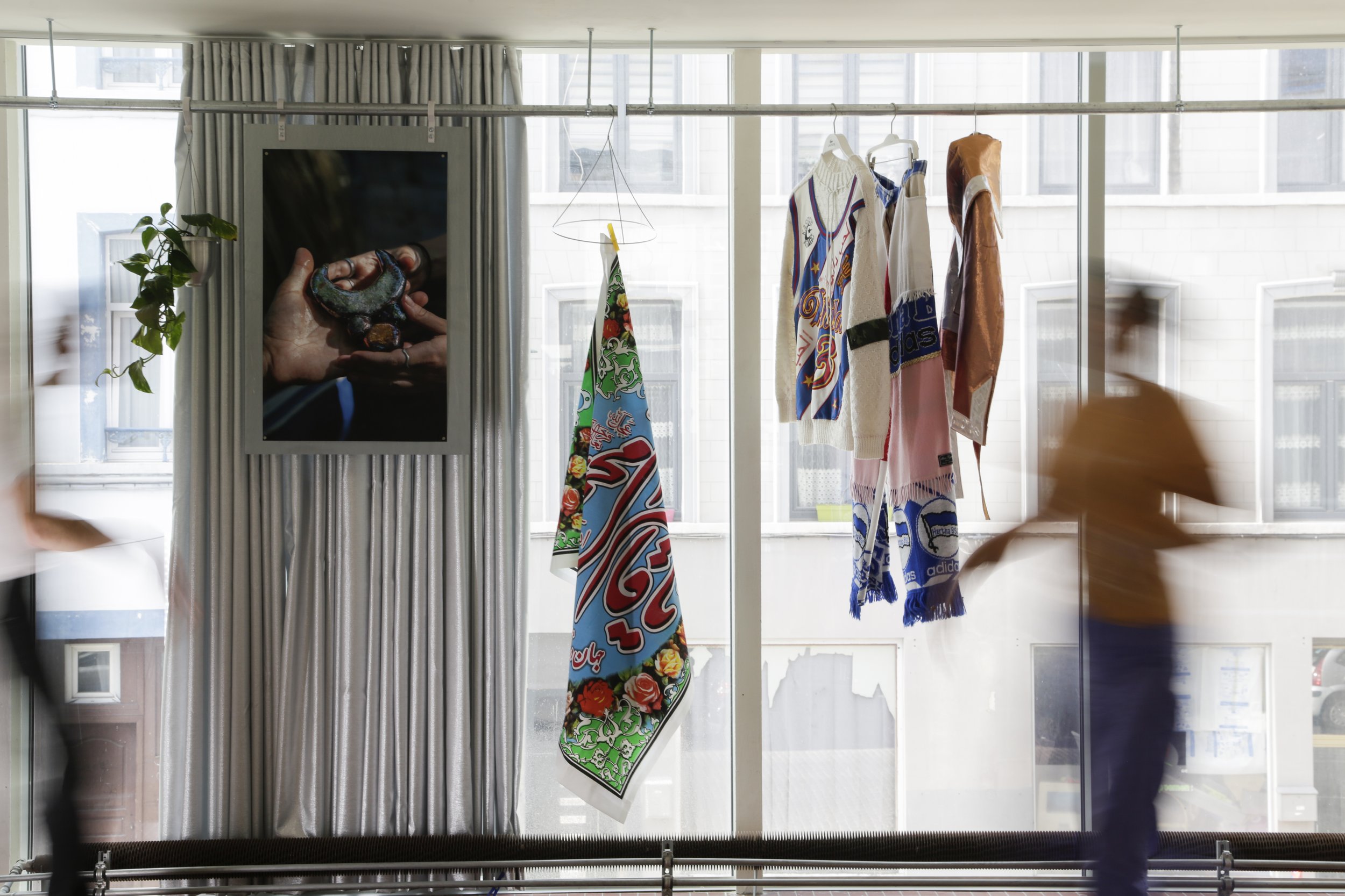
HIER was asked by MAD Brussels to design the common and public spaces of the new residents’ ateliers in Rue du Vautour, a space dear to HIER’ heart, as it was founded in that very space, in 2017, when we, Thea and Thomas were residents at MAD.
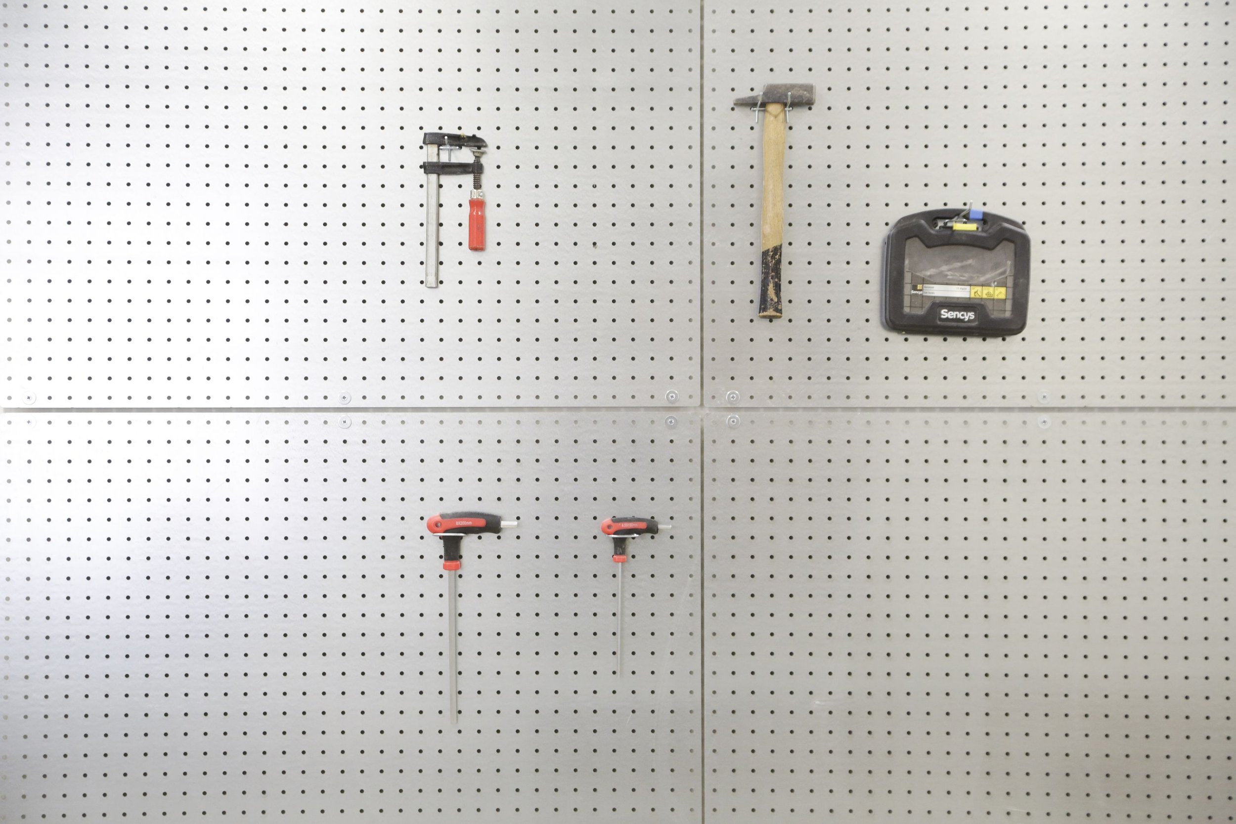
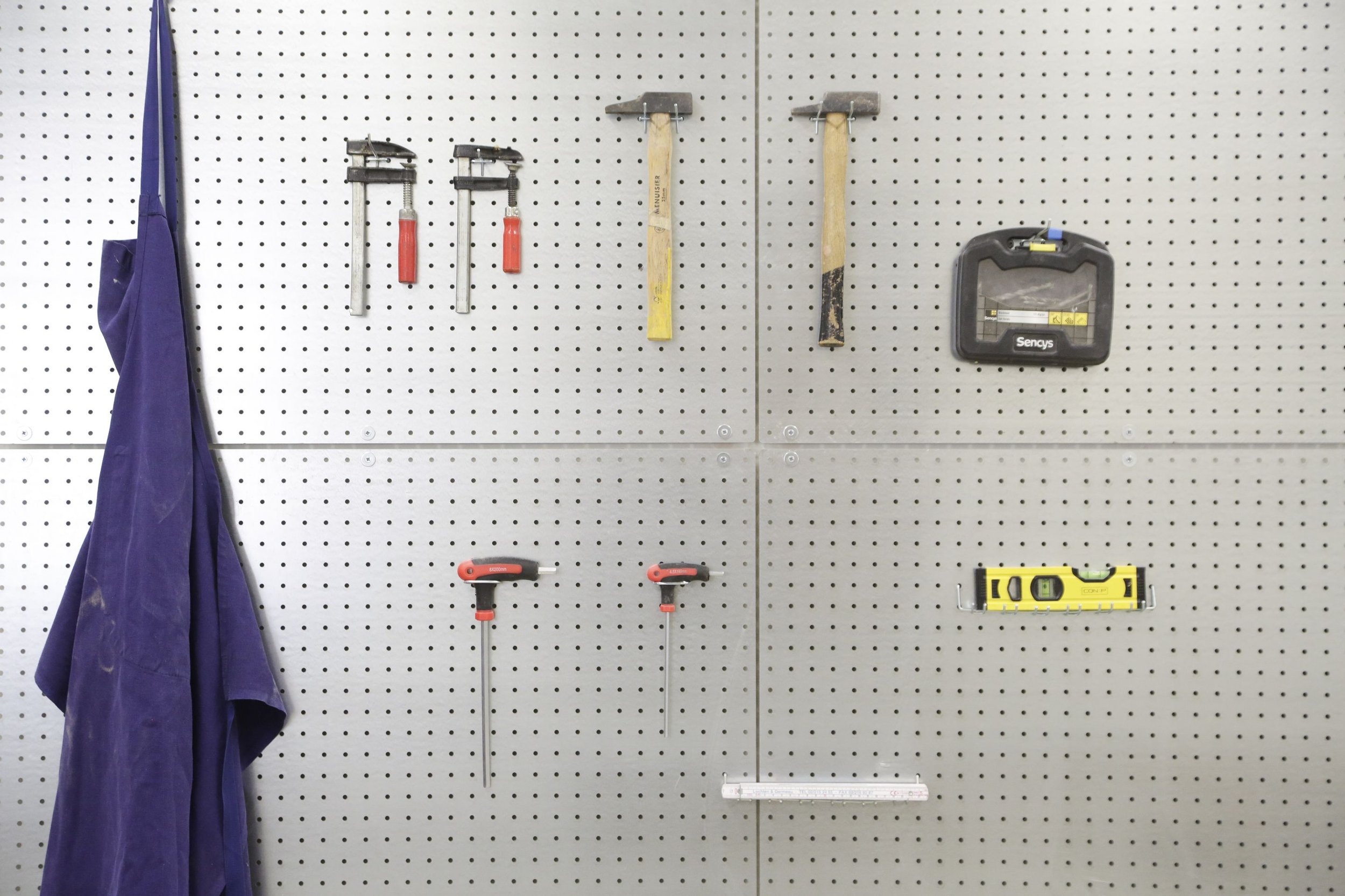
A space reminiscing in traces, layers of time, renovations, additions, subtractions, now all merged, in one space, visible through a shift in tiles. A collage of moments in time reflected through a difference in language and materiality. An era of tiling of many sizes and colours, one of subtraction of walls and patching with concrete, one of additions of steel and glass separators. HIER wanted MAD too, to leave a trace in the space. To mark their presence with a galvanised language. As the space is made of a patch work of materials and colours itself, we wanted the additions to be monochromatic. A silver metallic look, that homogenises, modernises, lightens the space, and comes in many different specifications.
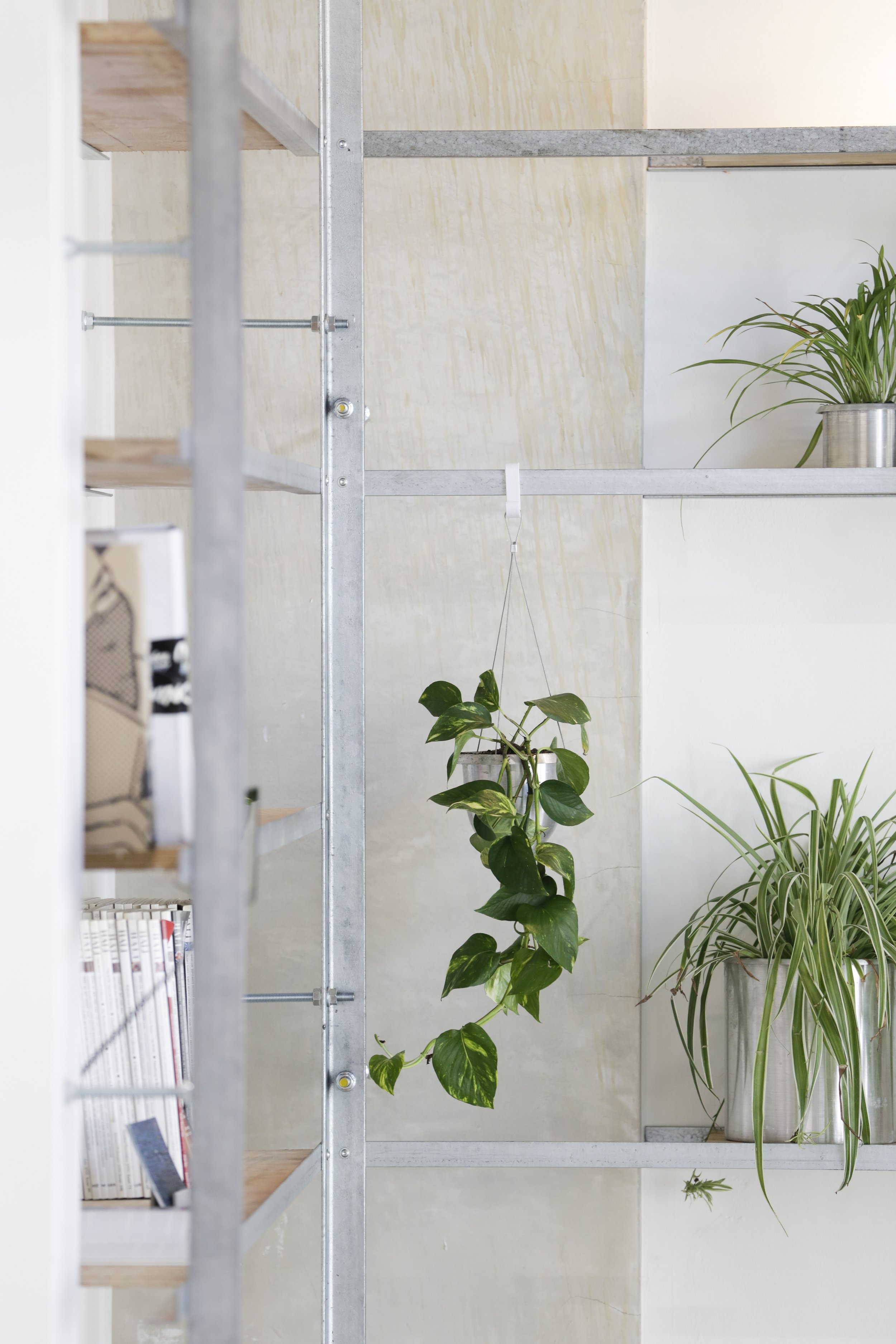
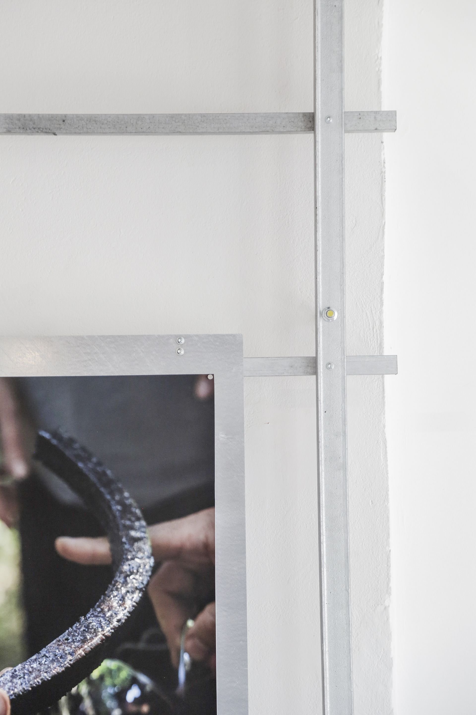
To source ourselves with materials, we dove into MAD Dansaert’s basement, full of relics, of projects past. We reclaimed all the wood we could and need, galvanised metal tubes from INSIDE STORIES, a past vitrine project HIER did for MAD, and other left-over galvanised metal sheets. All were part of a context once, that is lost, and now lie as orphans in the basement, ready to be found, in a new context. This idea of basement shopping was an obvious one, to avoid waste, to bring back elements from previous installations into the design loop, as a responsible choice, and because it allows us to actually build everything needed for the space even within the relatively small budget.
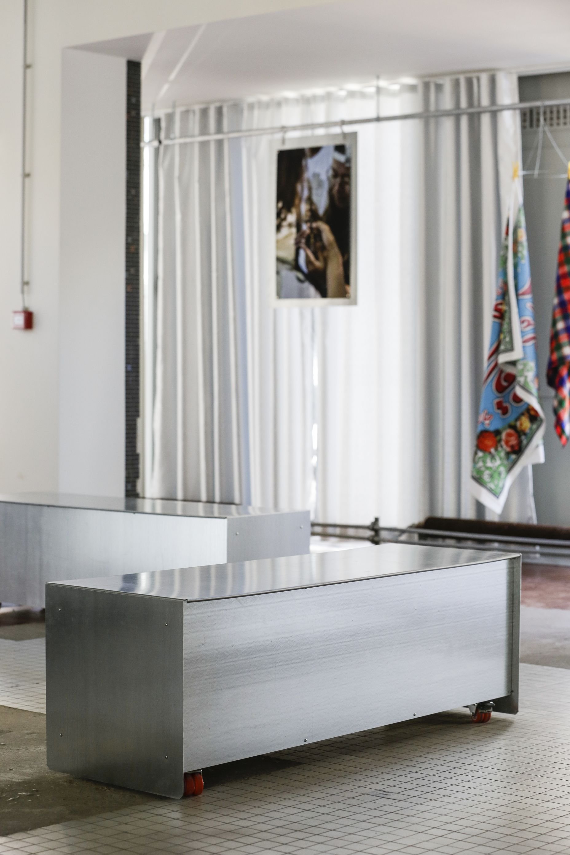
Formerly a day-care for the building, the space caters now for or a small entrance, and a design workspace at the ground floor, a fashion workshop, studios for the residents and a big common space on the first floor. The big common space has an open kitchen with a bar and is meant to have a double programme: a cantina on most days, and an exhibition on occasions. With an open programme comes the need for flexibility and various possibilities.
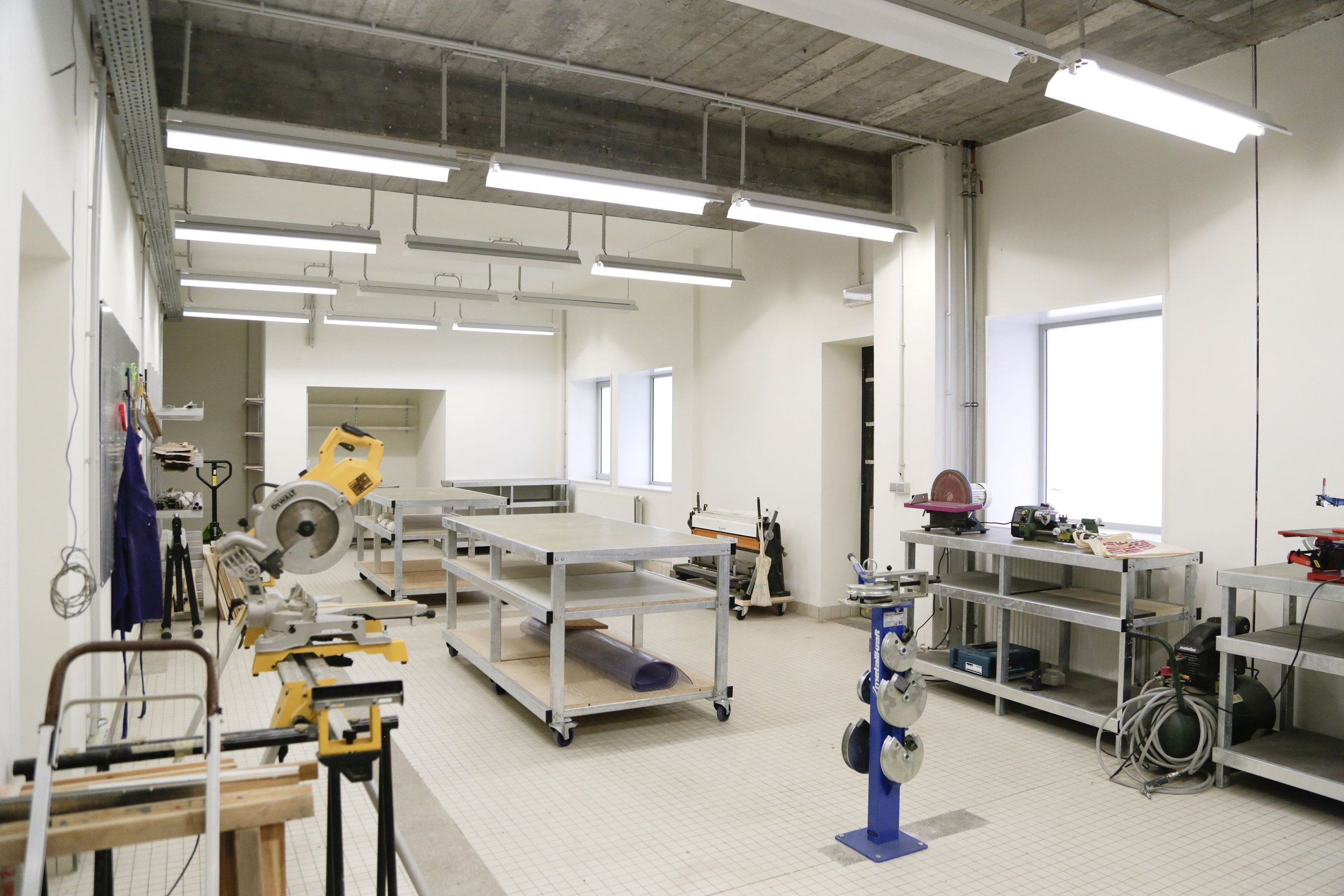
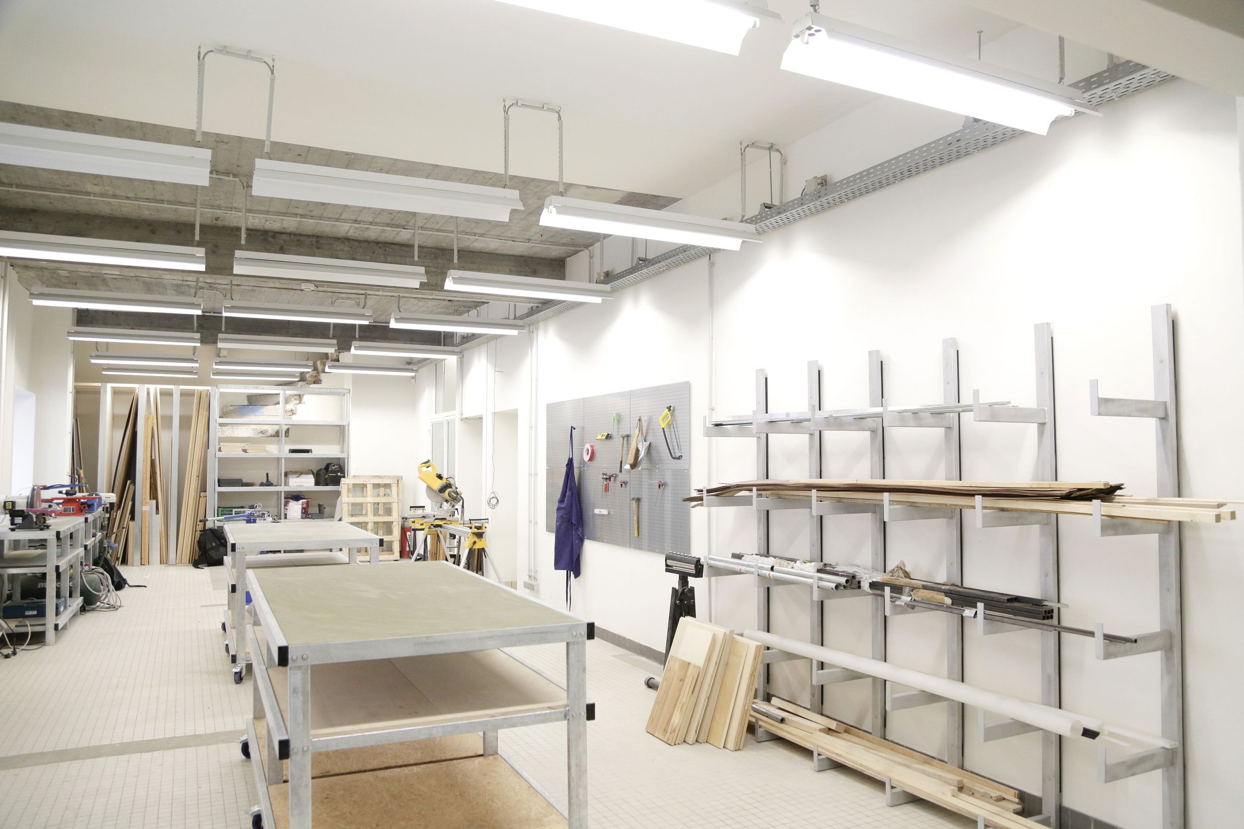
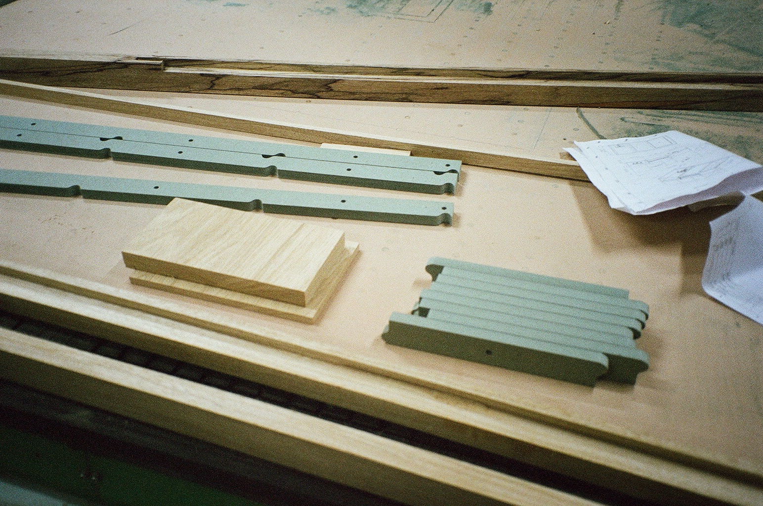
For the design workspace, we designed, produced, and installed a system of furniture, with rectangular galvanised metal tubes, some on wheels and some fixed. The surfaces were ones of reclaimed wood.
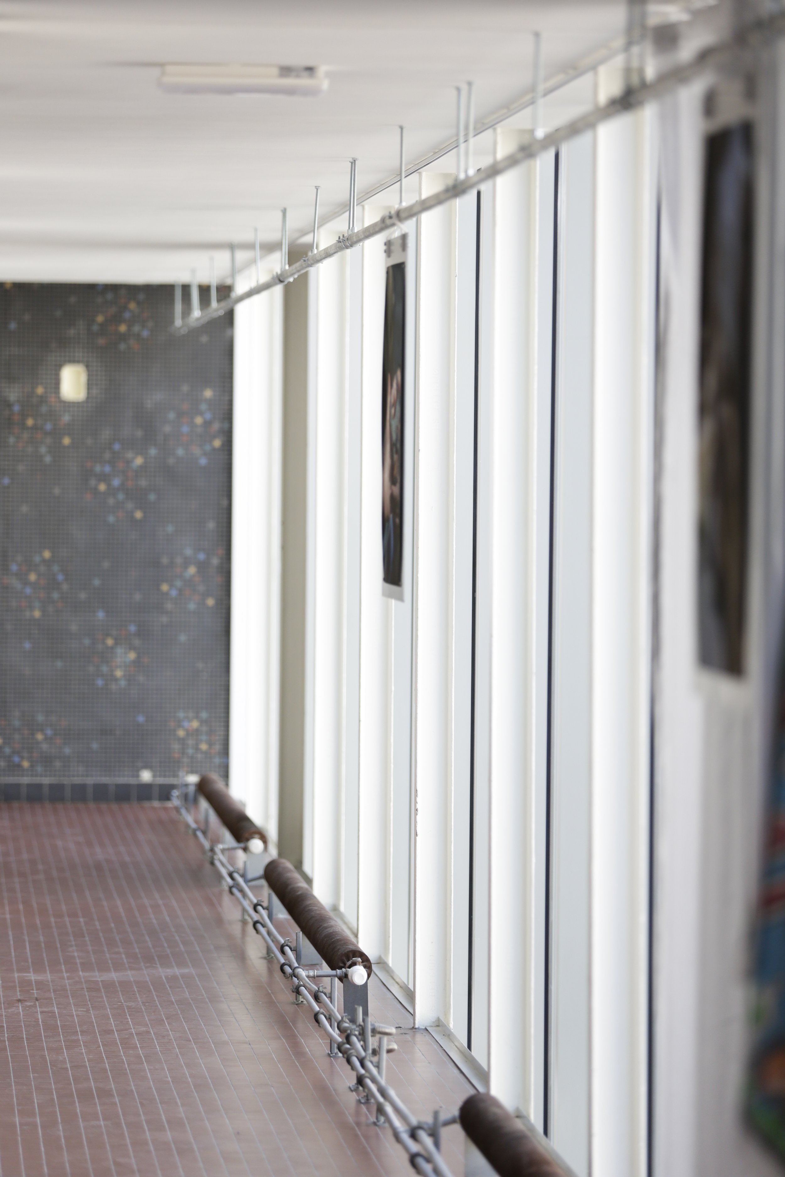
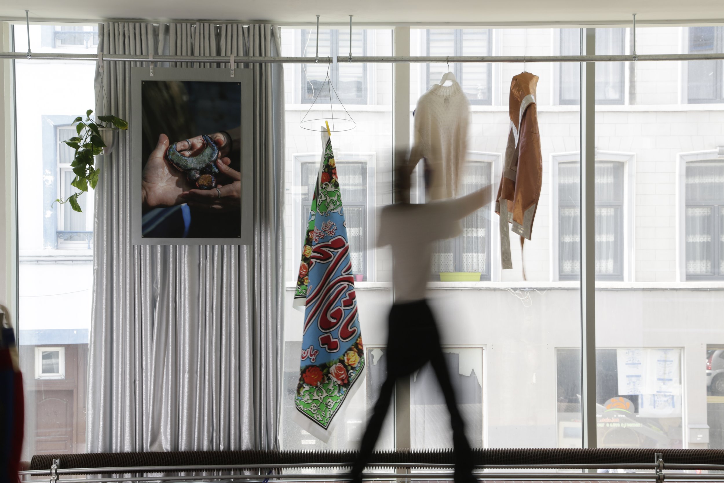
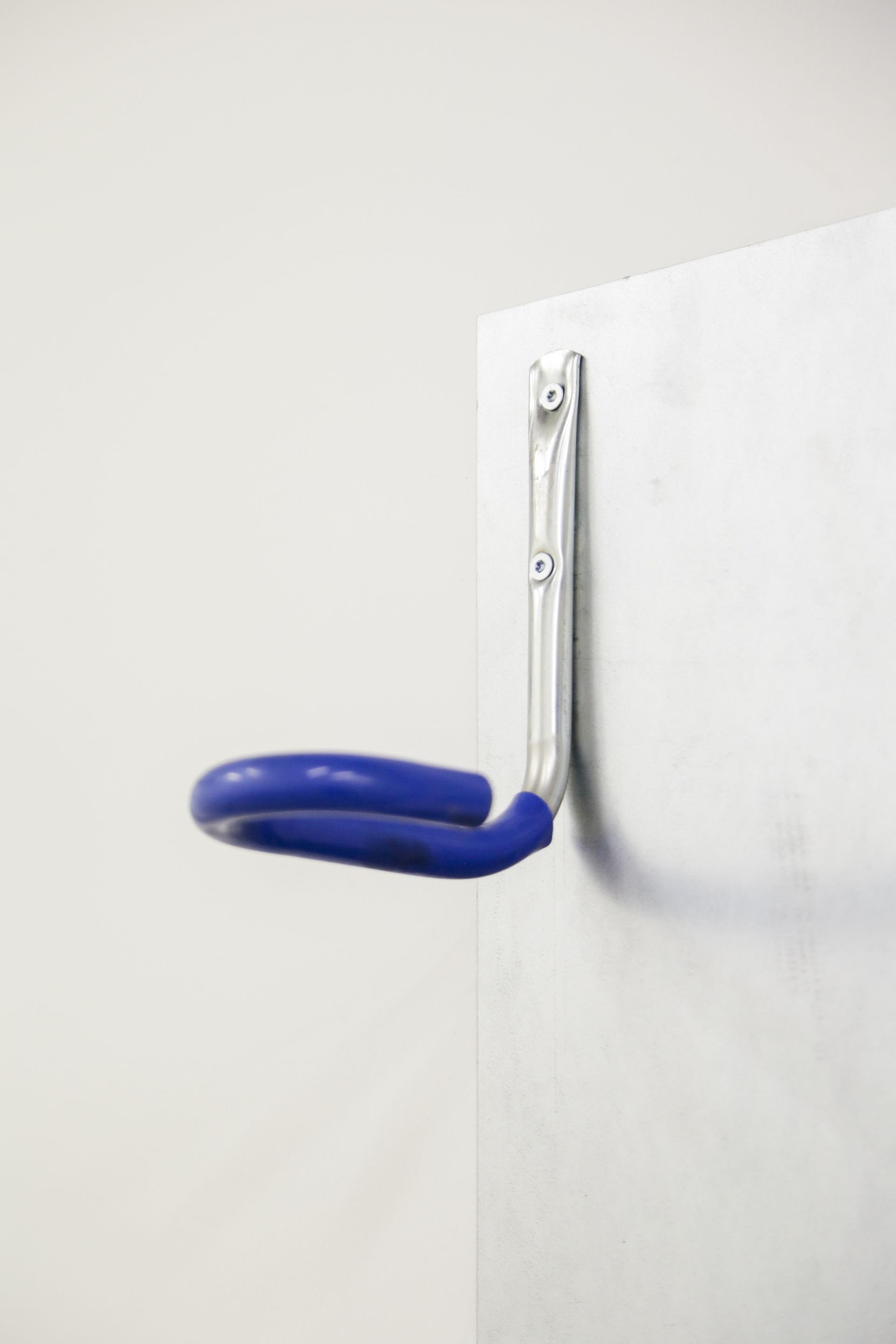
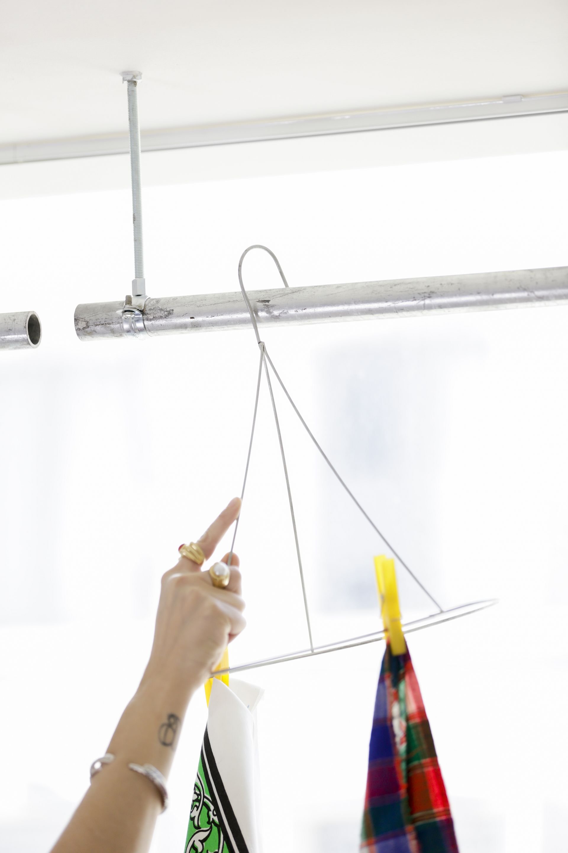
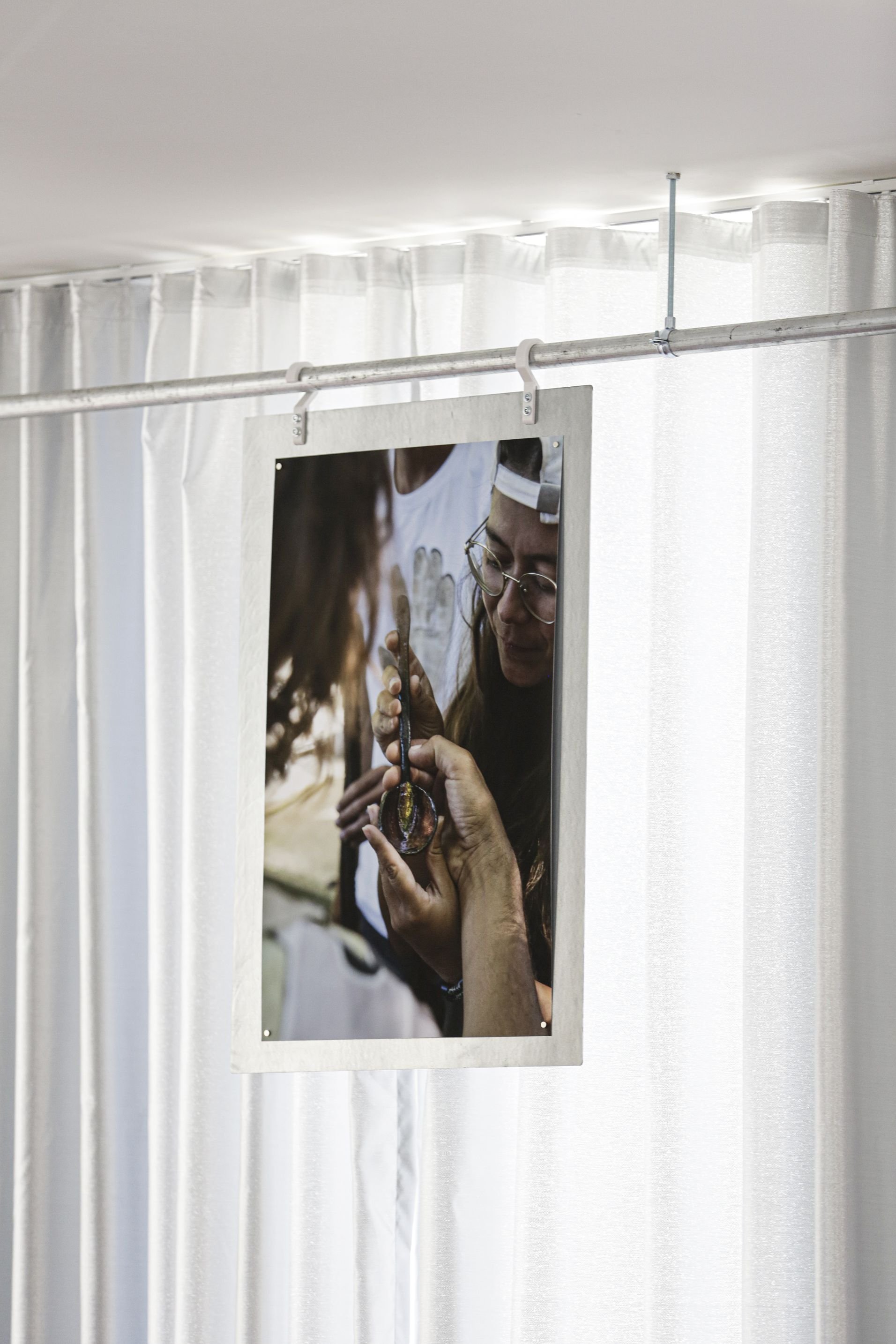
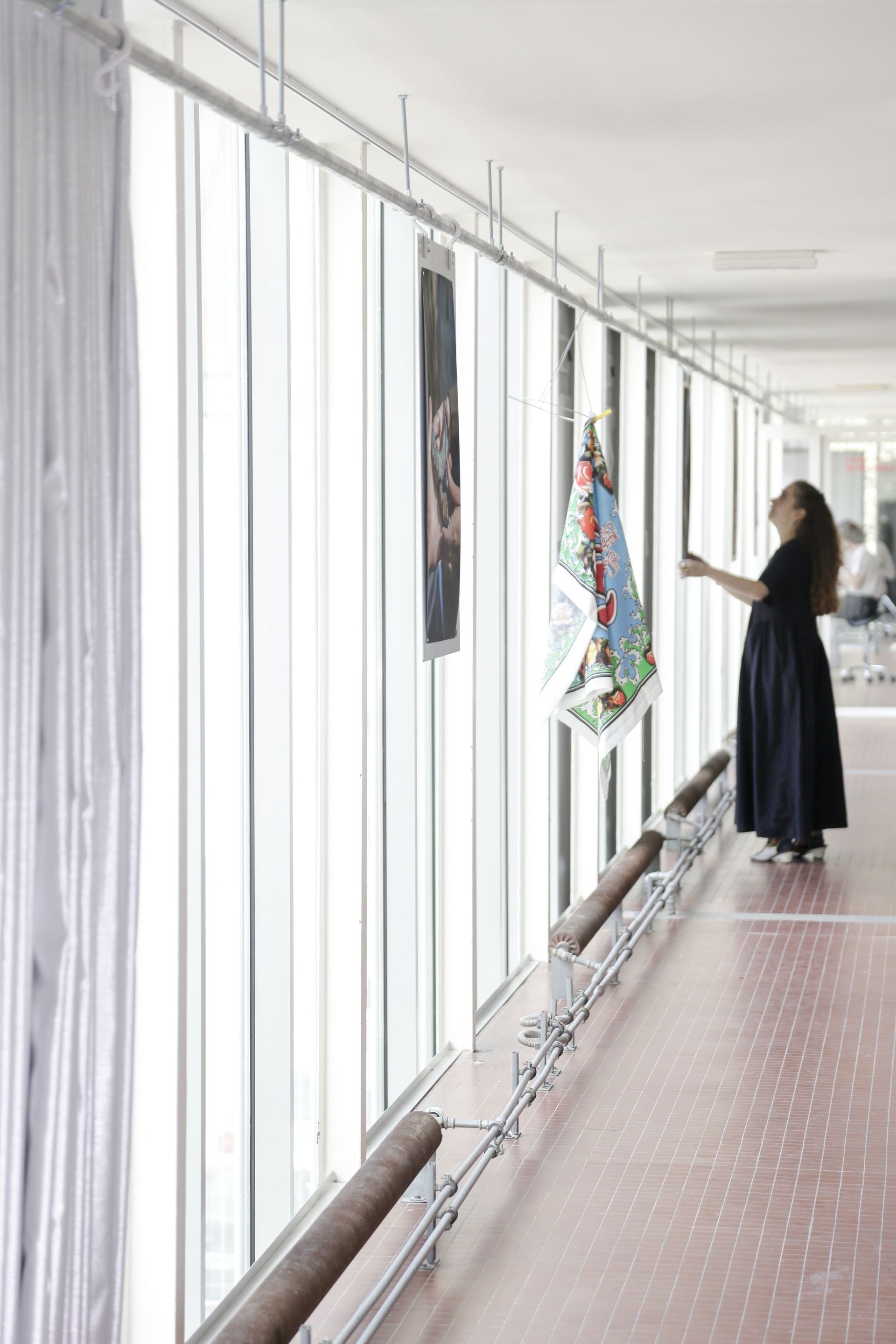
In the big common space, as a display/exhibition support, we installed a 50-meter-long rail running through the red- tiled circulation path, with curtains, hooks, and hanging metal sheets for display of mood boards or other prints. The rail came from the reclaimed basement steel.
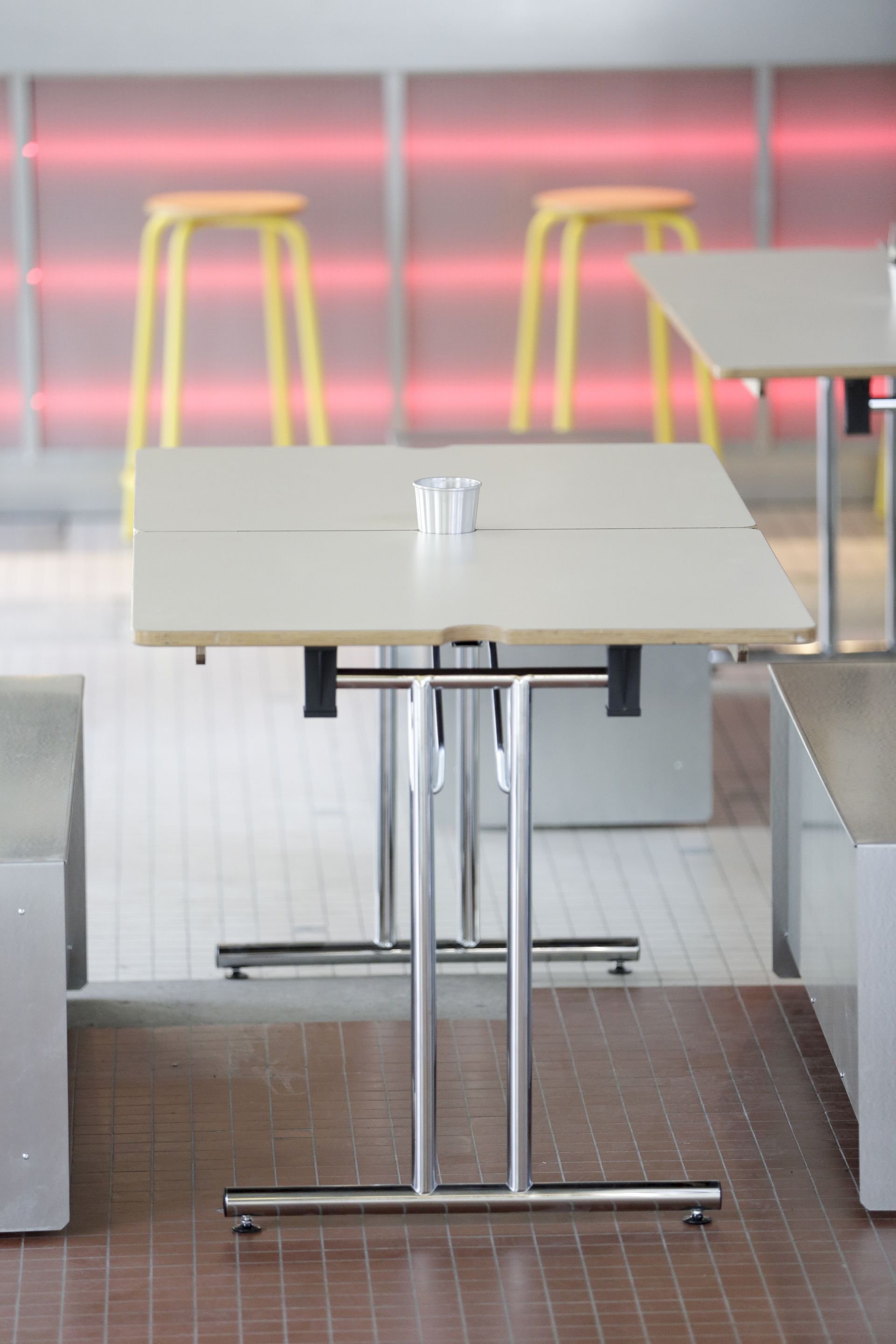
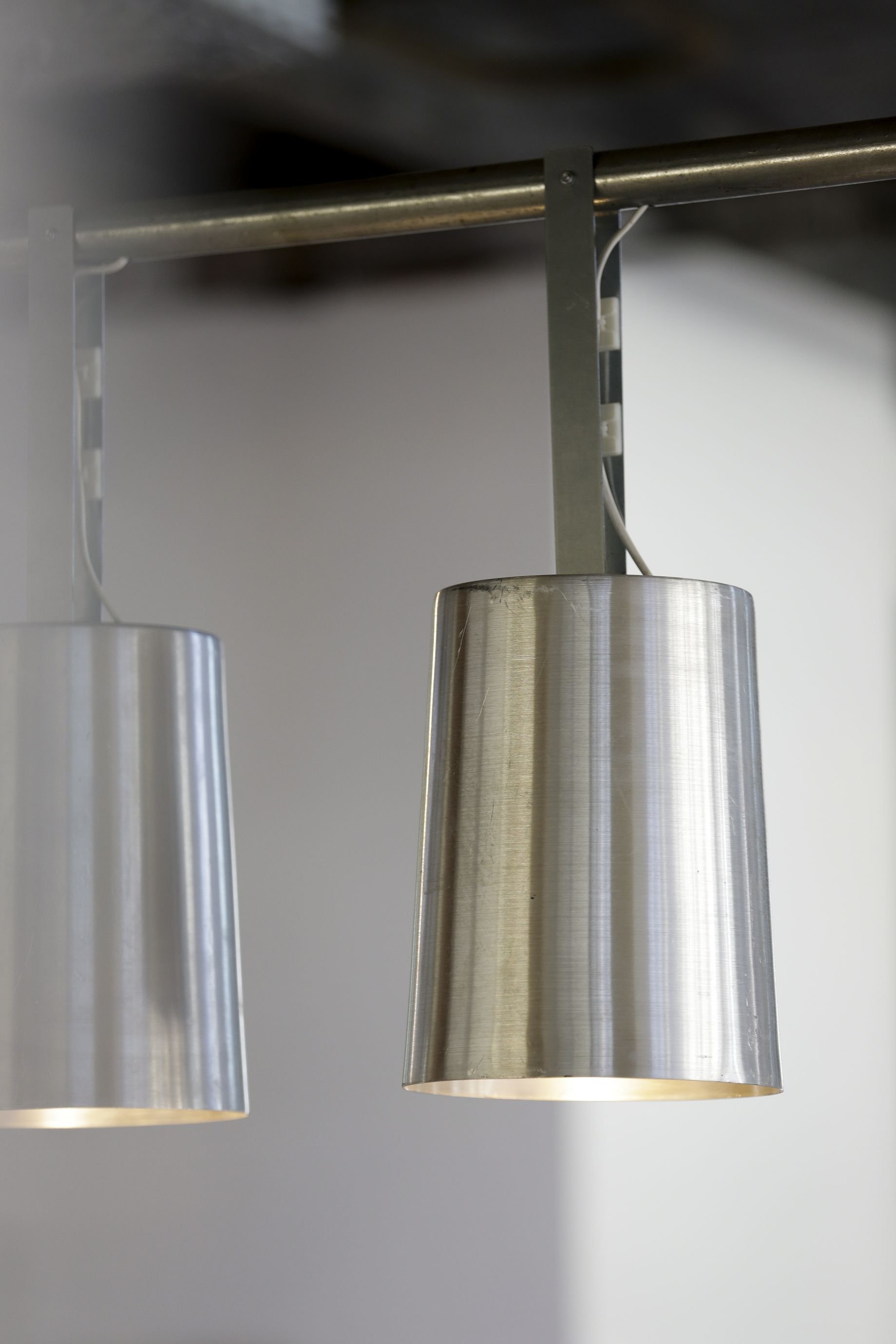
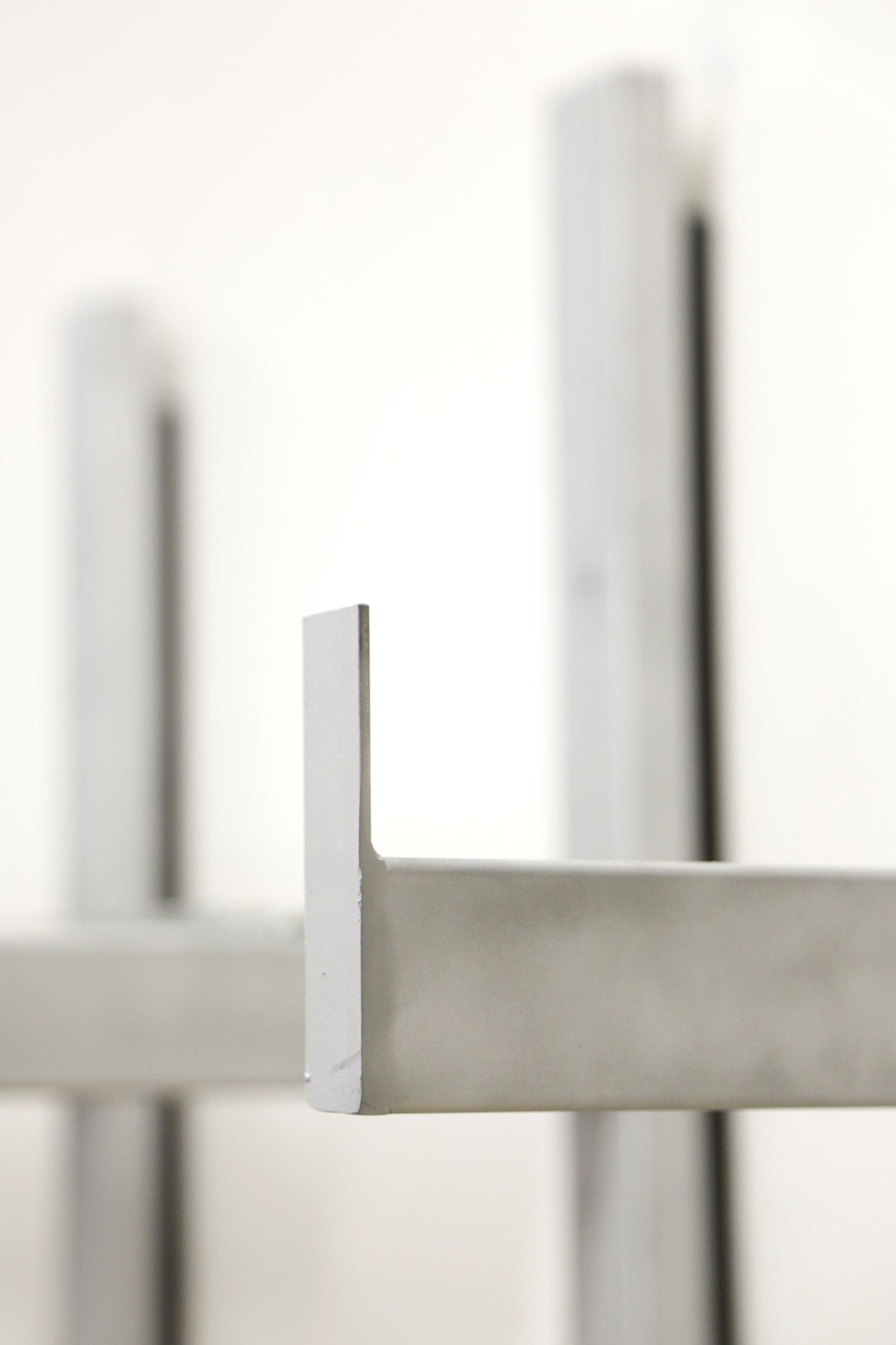
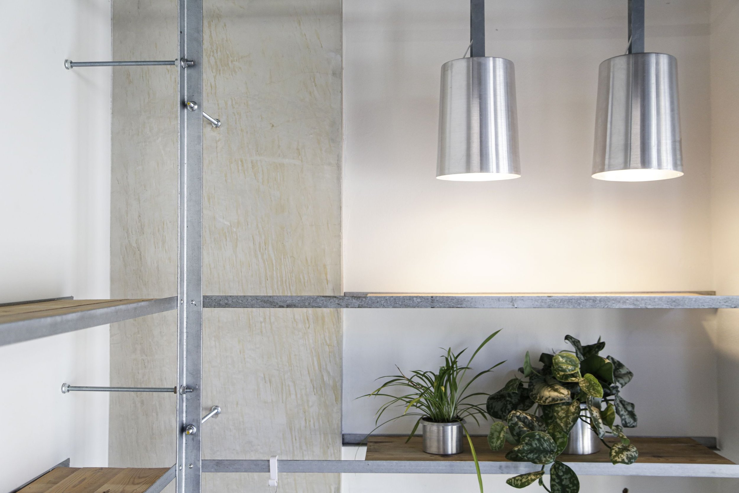
The library was built with a different profile of the same material of finish: it is an assembly of two sizes of L-profiles juxtaposing and reclaimed wood for the surfaces, with lighting and pots designed by us but made in Beirut, by Coco El-Ballis, an artisan in metal turning. Tables for the cantina have foldable legs for flexibility and reclaimed laminated wood found at Rotor for the surfaces. We designed and produced benches on wheels from folded galvanised metal sheets, to serve both as seating for the canting or moving pedestals for exhibitions.
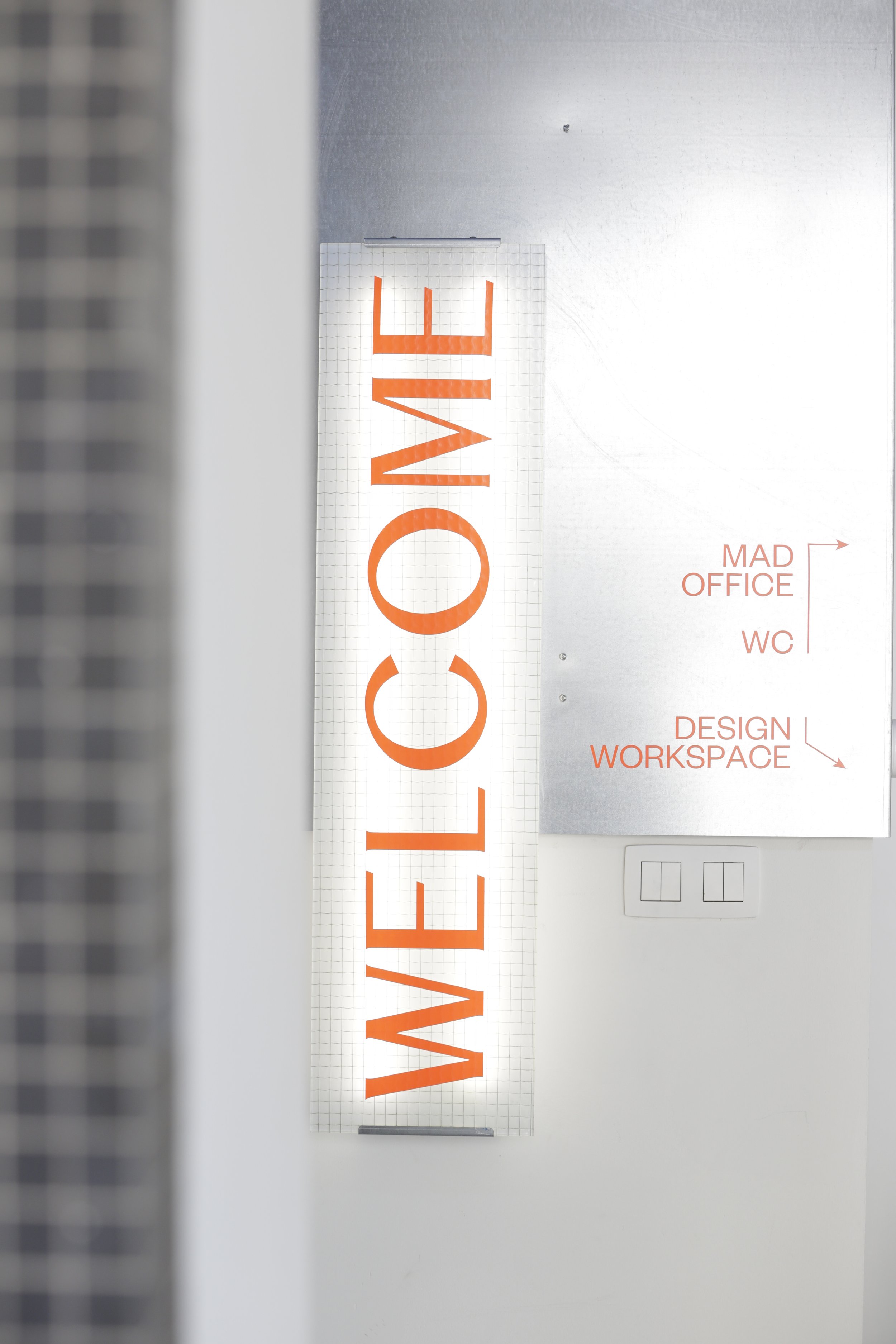
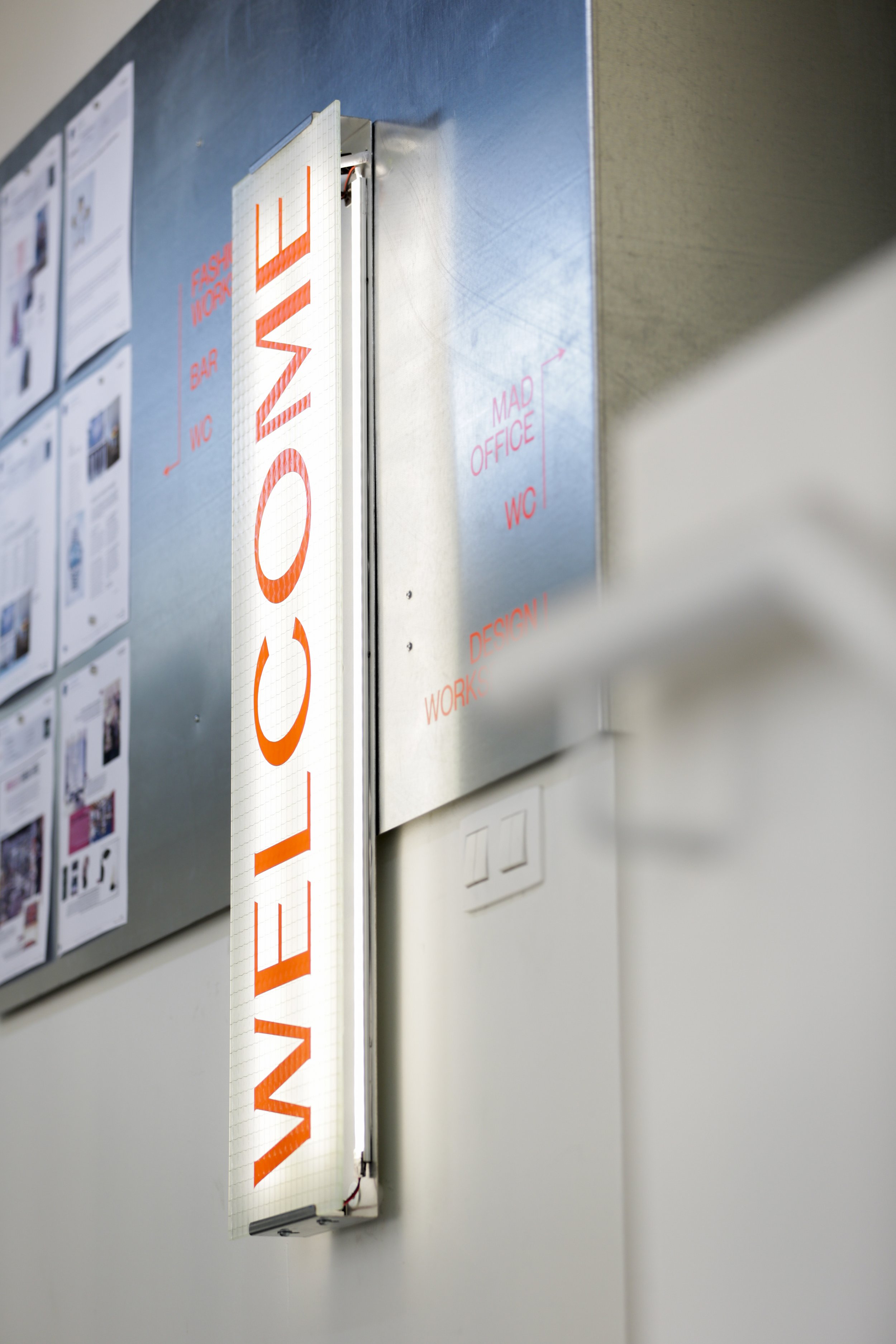
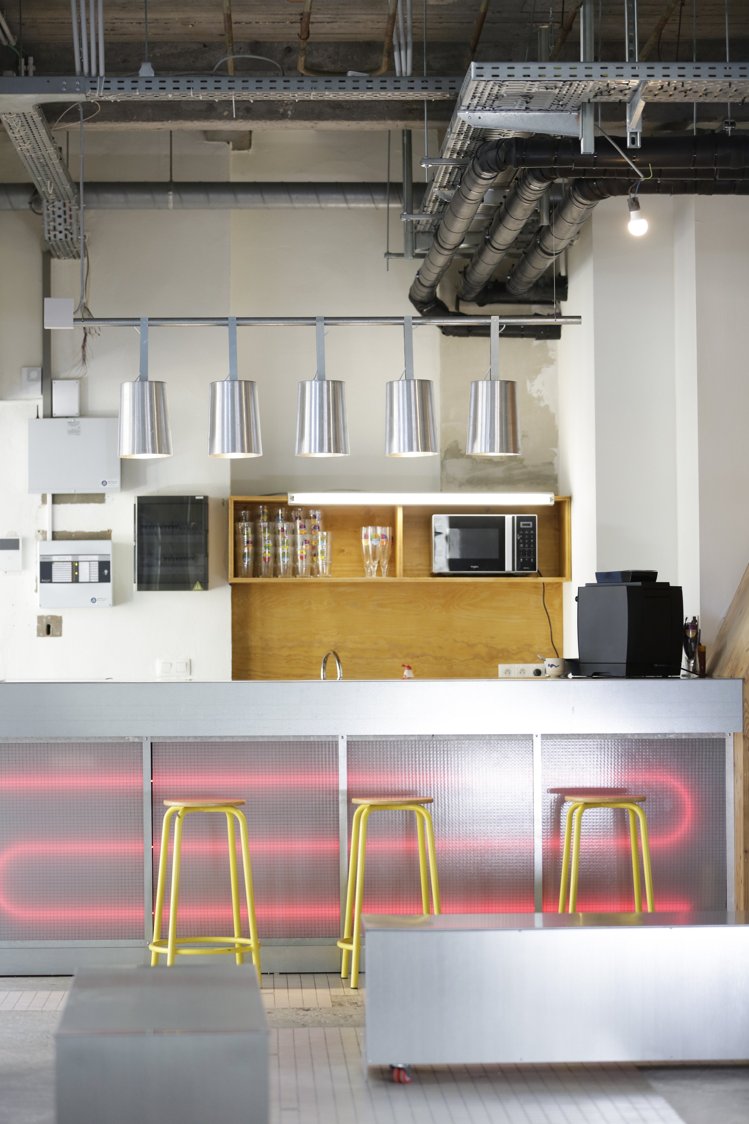
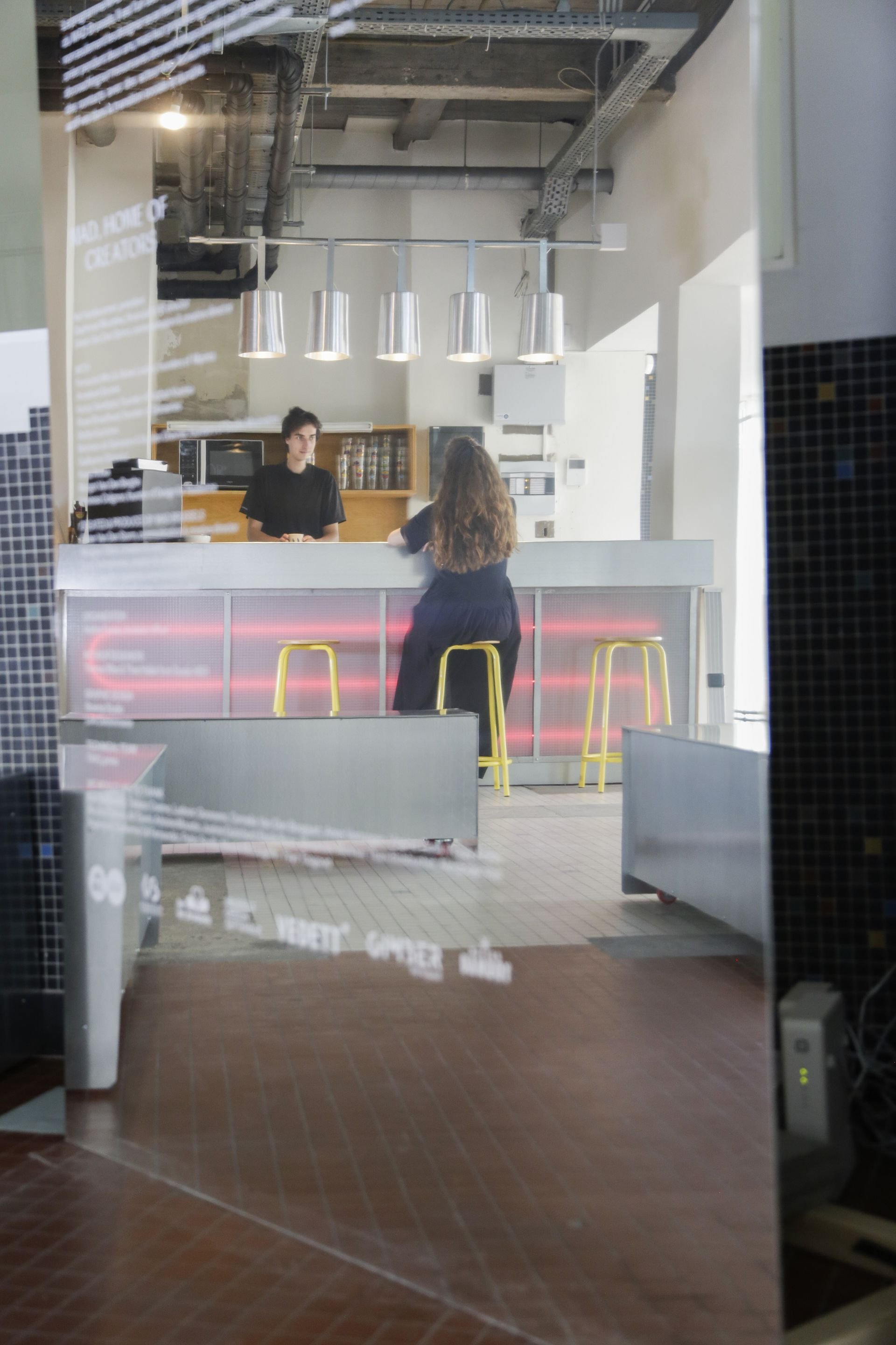
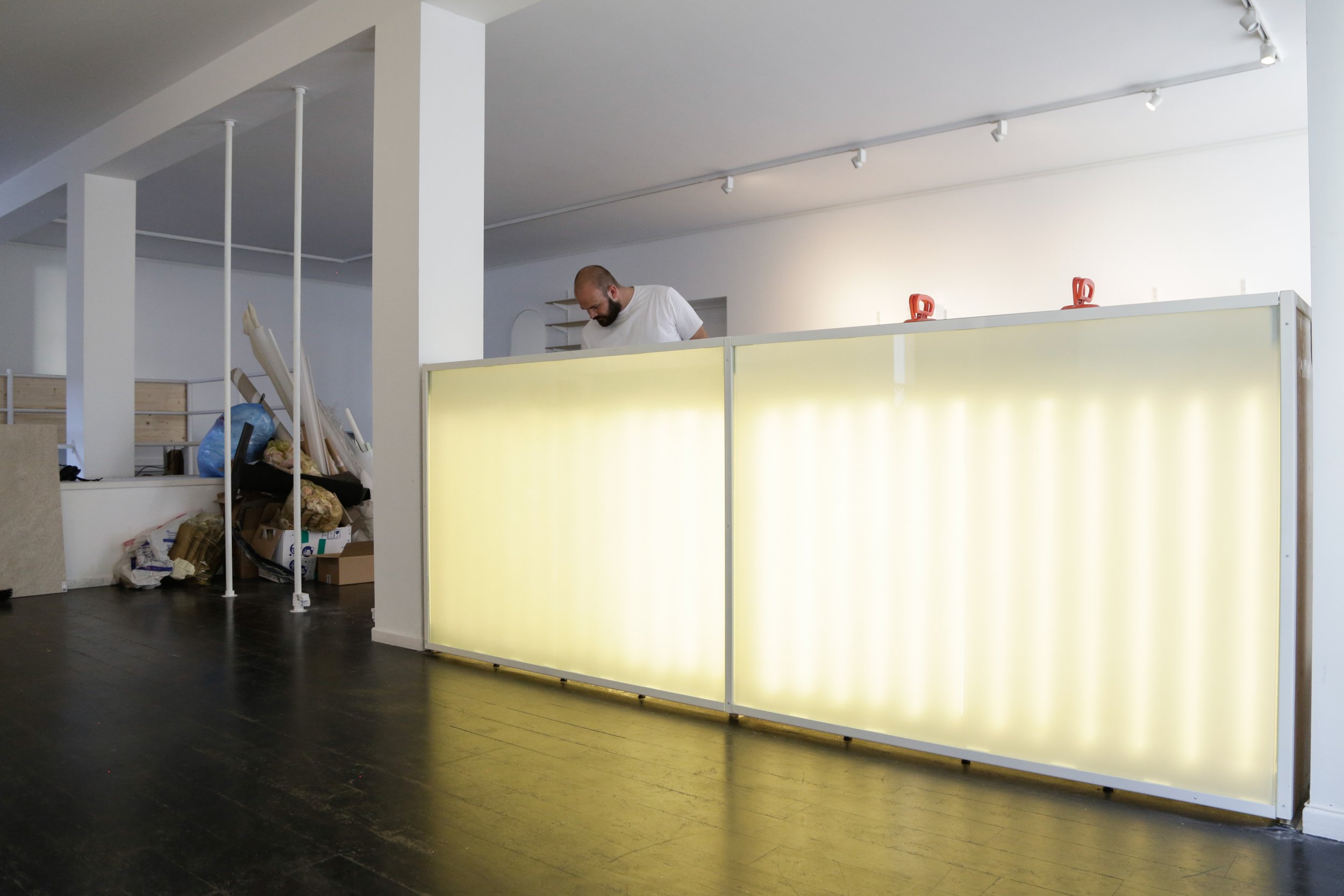
We freshend up the kitchen bar with a coat of galvanised sheets and wired glass. The movement in the red lighting is a wink to the graphic ceiling, noticeable by its maze of heating tubes running through. That same folded metal and wired glass appear again on two other occasions, up and down, as welcome signage walls.

We design knowing that we ourselves are producing and installing. Every detail is crafted and refined, to tell the same story, and for a logical assembly. In this project we handled all phases from design to production to installation; there, a hand-to-hand approach.
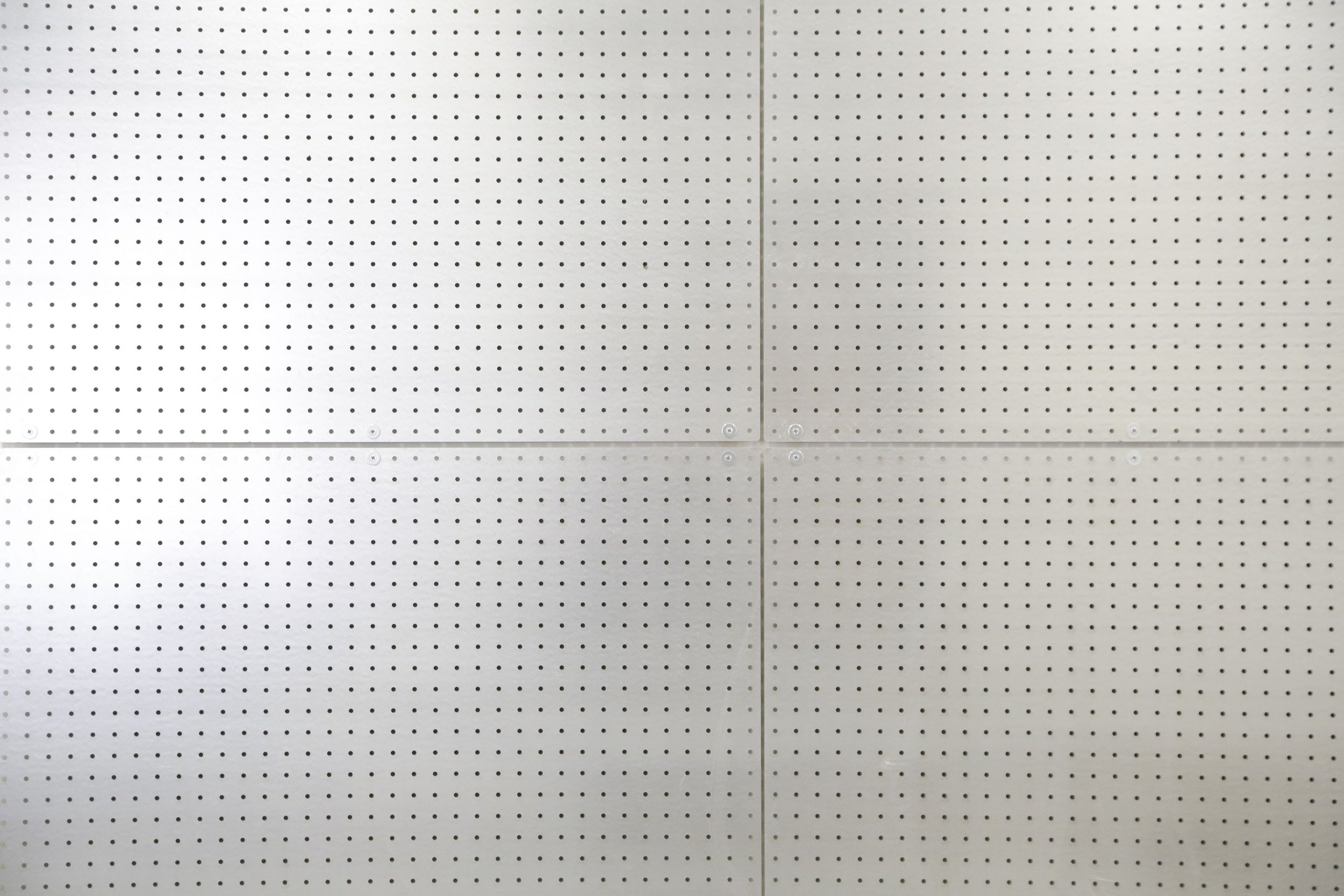
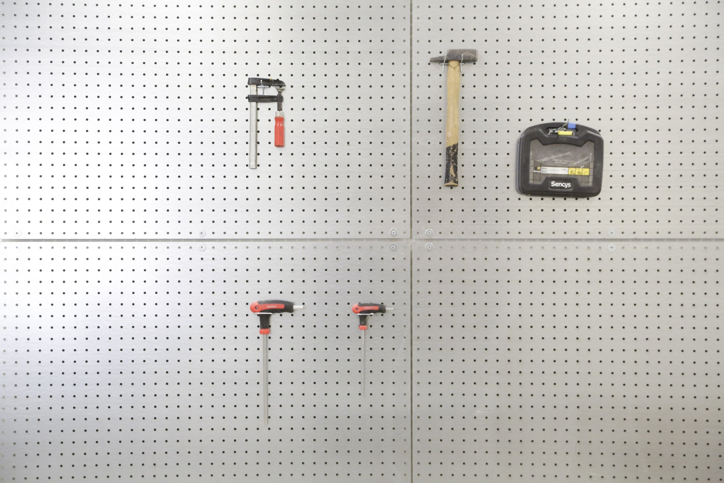
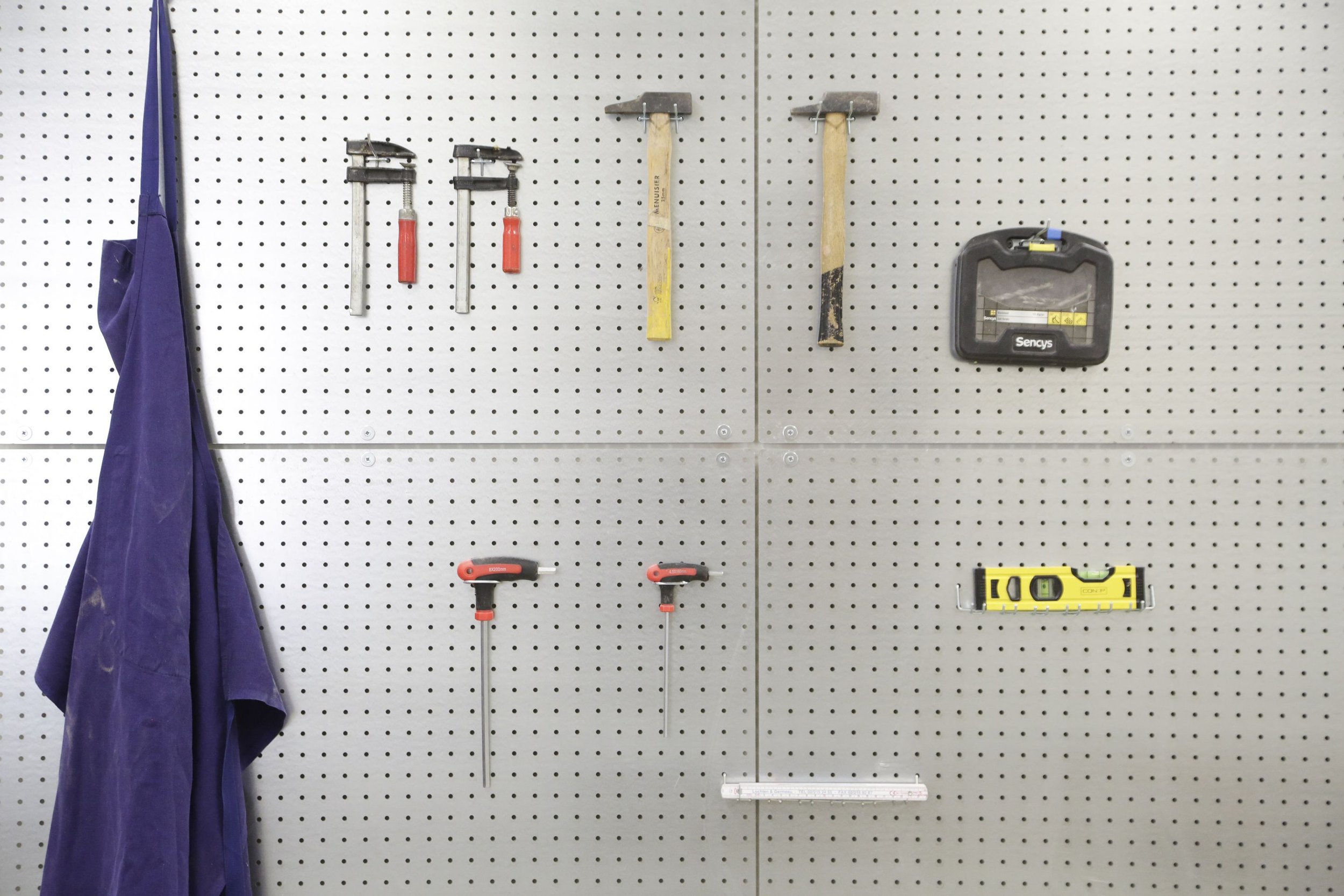
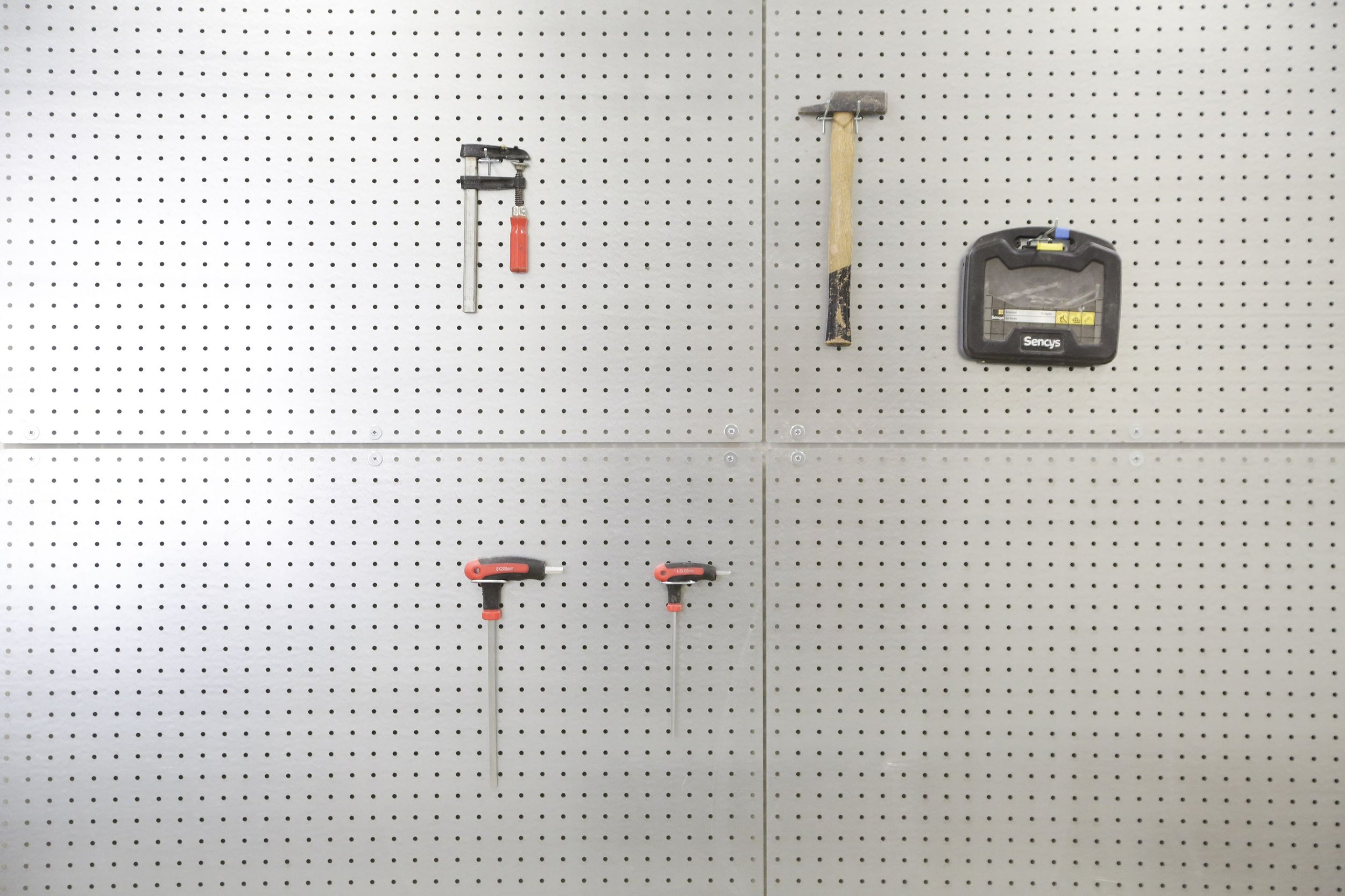
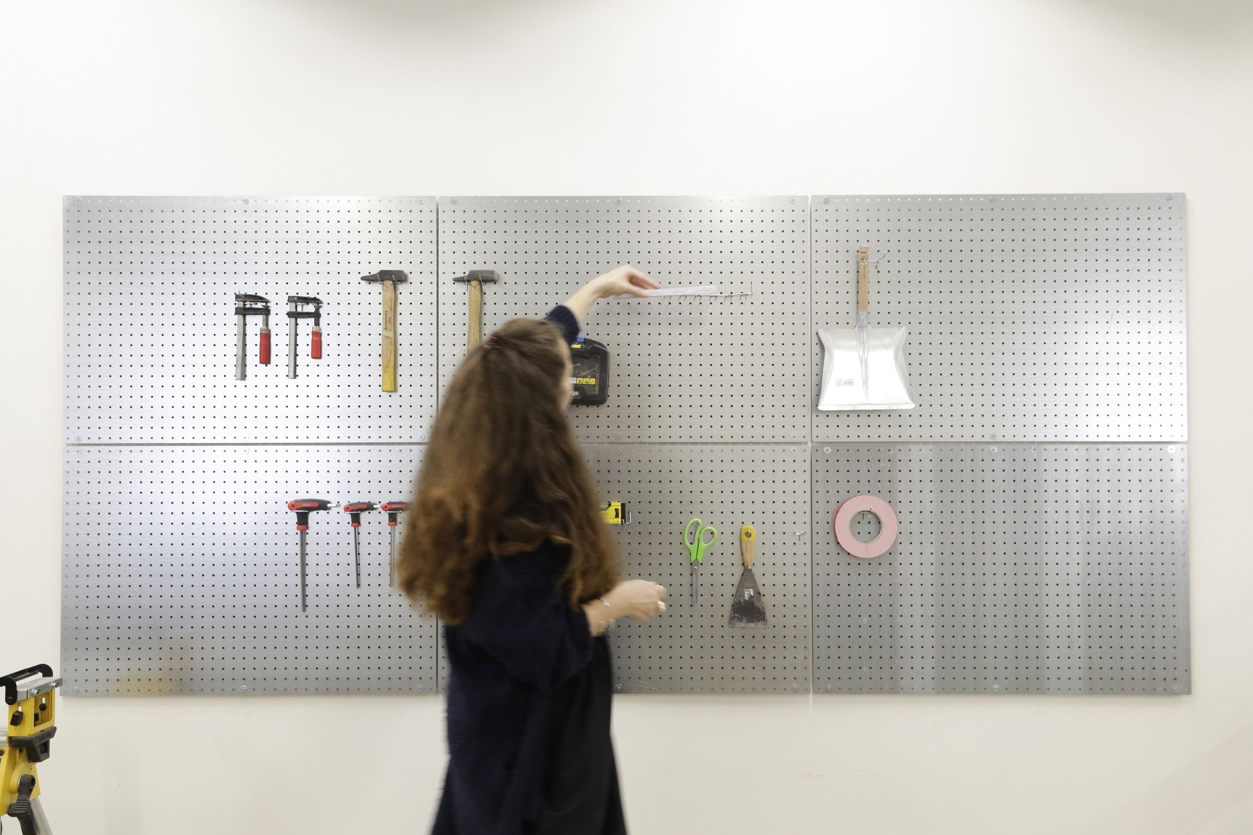
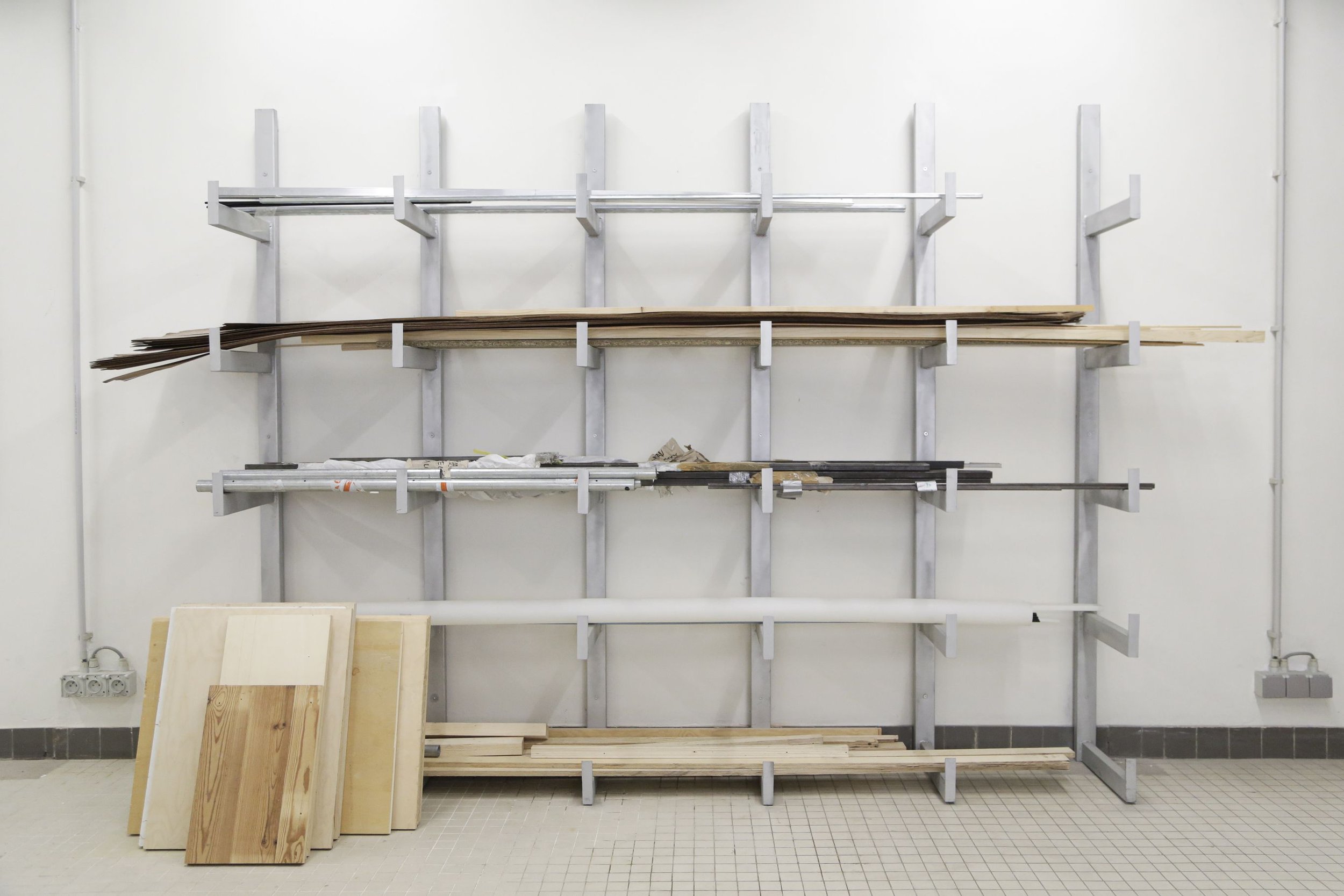
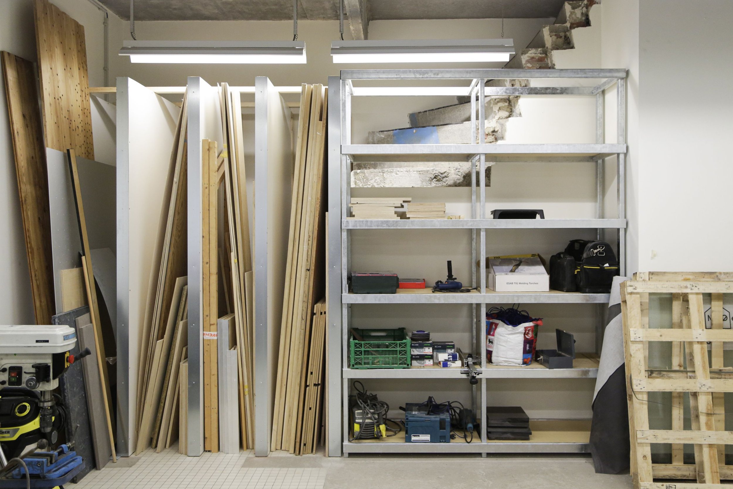
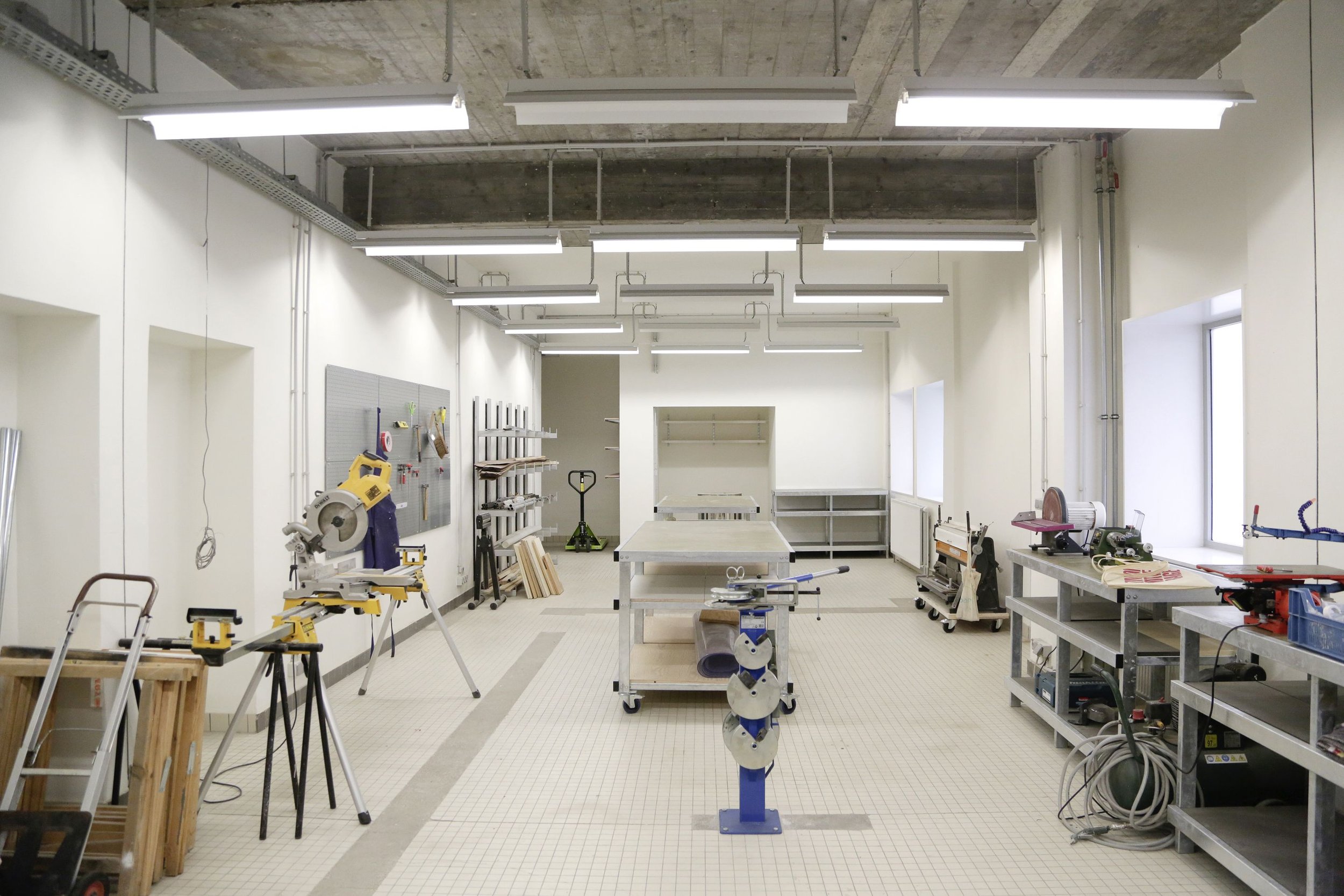
Pictures done by the handsome Joe Khoury

Another sample in the wall - Firmax
We were commissioned by Firmax to design, produce, and install, an acoustic wall, separating the office from the showroom space, and serving as a sample library.

We were commissioned by Firmax to design, produce, and install, an acoustic wall, separating the office from the showroom space, and serving as a sample library.
We took as a reference the sizes of the kitchen cabinet doors to compose a grid, built with square steel tubes and u-channels, carefully and minimally assembled, with the u-channels inviting the different samples to rest in them.

Materials: square steel tubes and a u-channels, Archisonic acoustic panels made from the upcycling of single-used plastic bottles
Pics by the greatest Eline Willaert

Time machine - La Yourte
An hourglass. An hour-tree. Sand running, leaving empty, the branches of that tree. Showing the time that has passed.


For a video of the project, please click hier.
Or check Auvio
Thank you @tipikrtbf + @andriendevyver_ for the images and footages.
On <3 la RTB


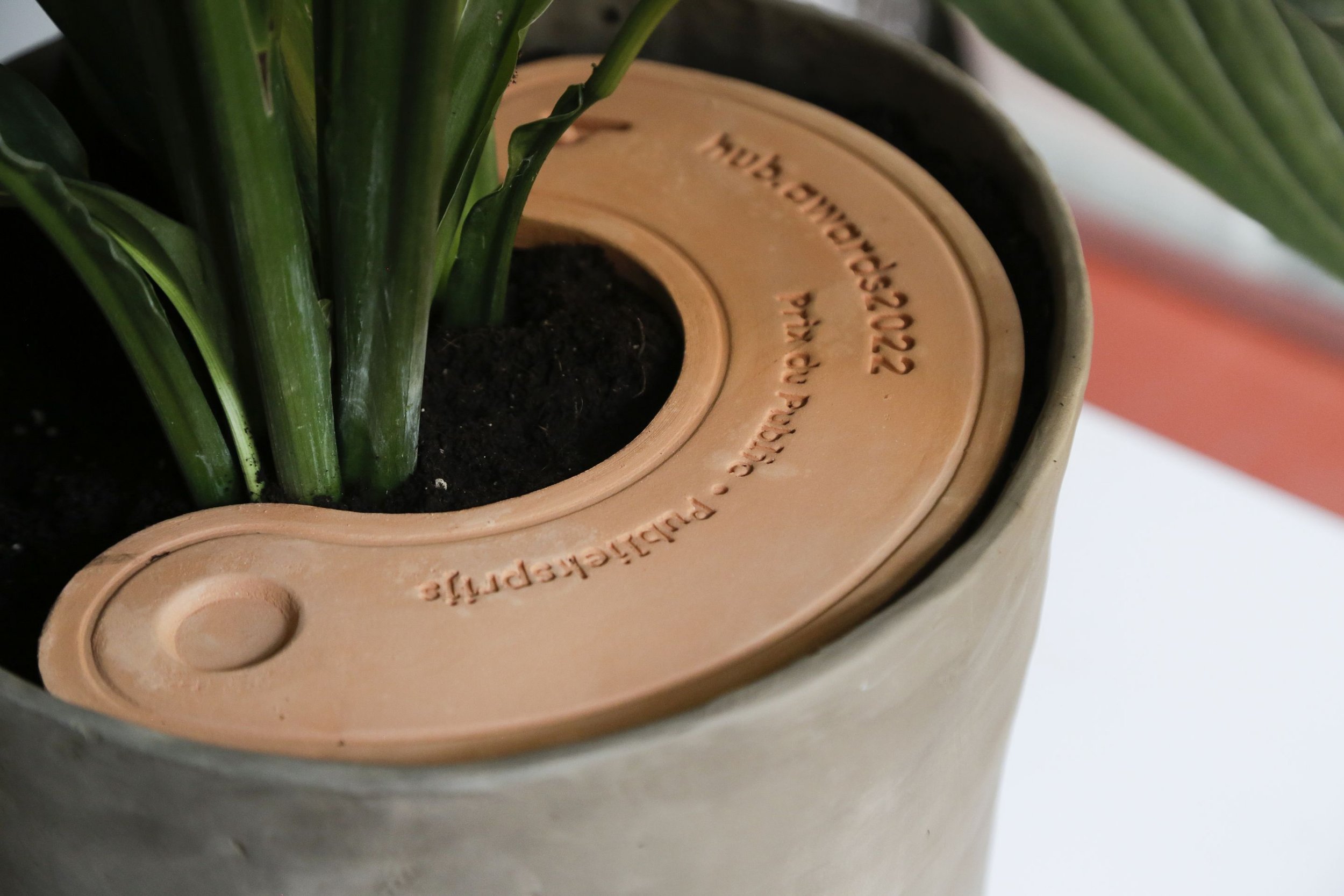
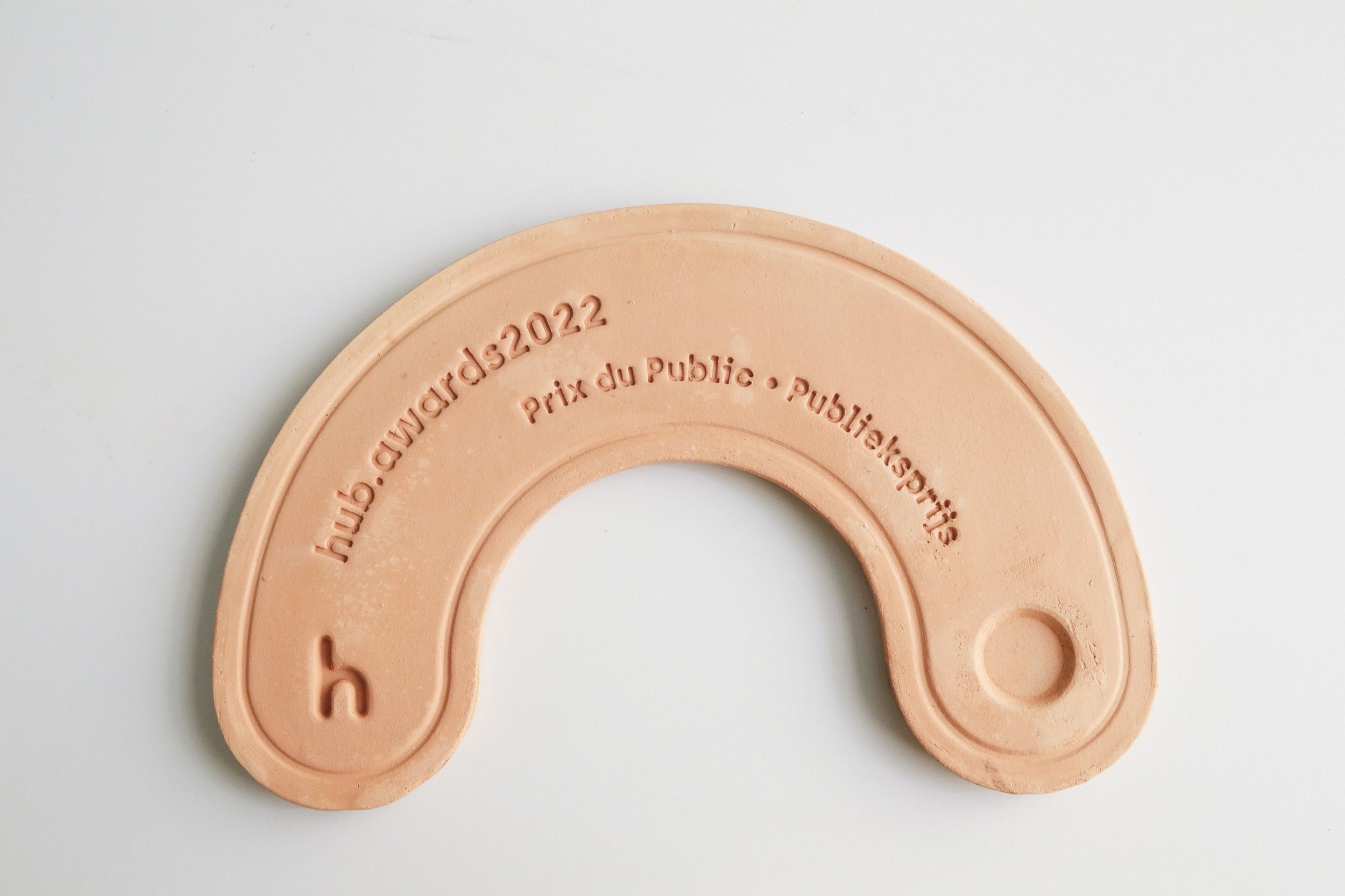
hub.awards2022
This is not a trophy. Not in a traditional sense anyway. It should not gather dust. It does not die on a shelve. It lives. It grows. It glows. Well no. It does not glow. But for sure evolves.
This is not a trophy. Not in a traditional sense anyway. It should not gather dust. It does not die on a shelve. It lives. It grows. It glows.
Well no. It does not glow. But for sure evolves.
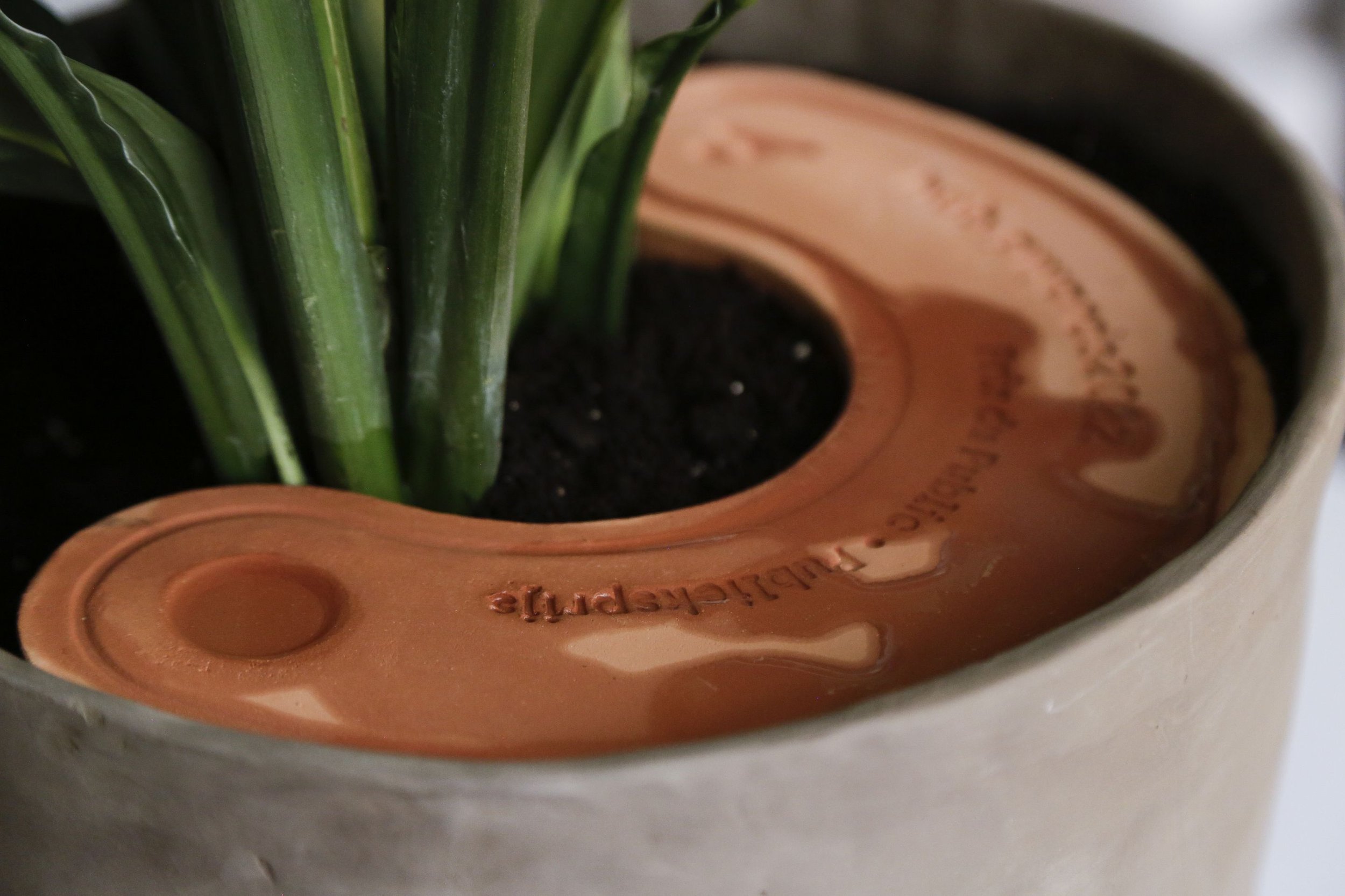
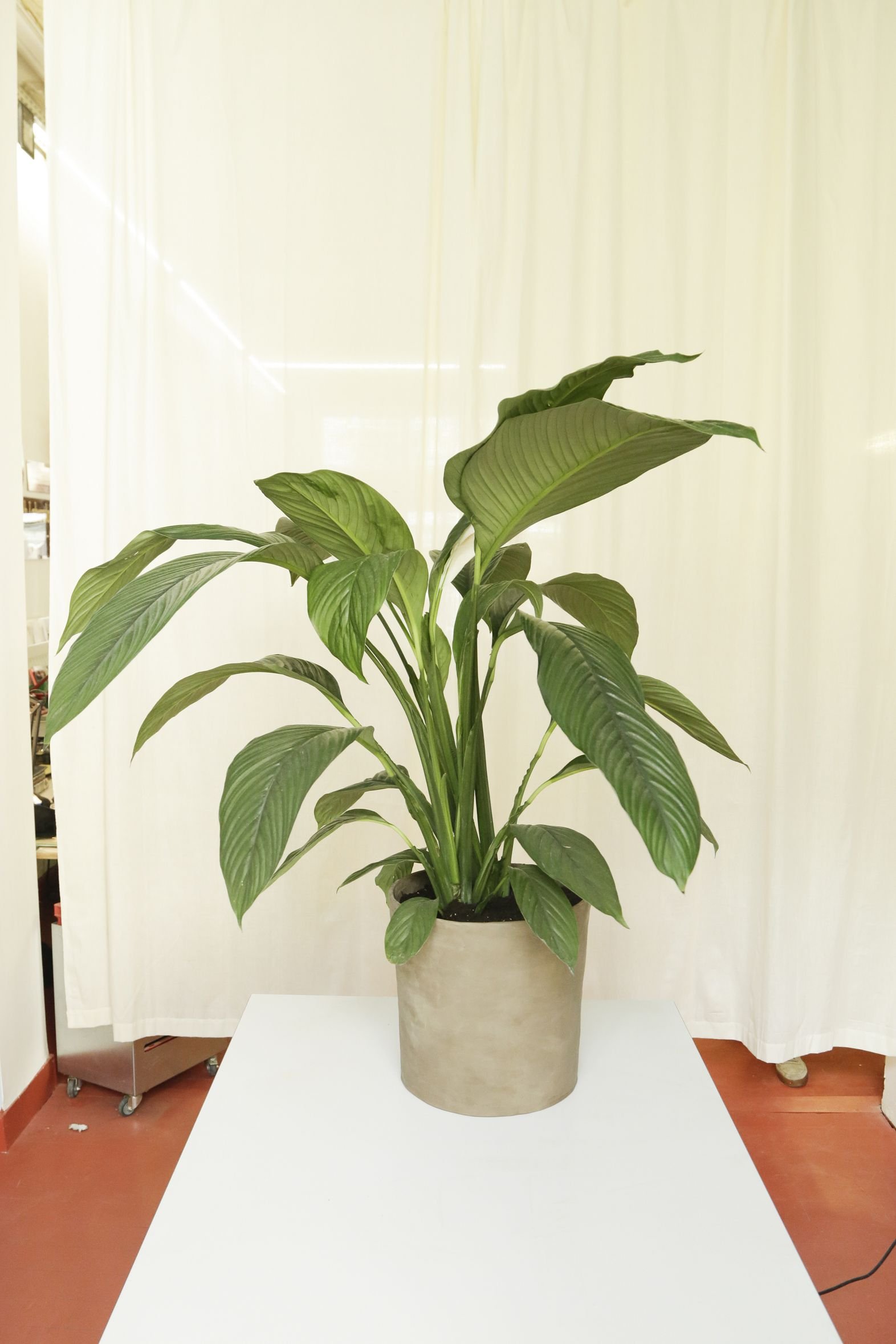
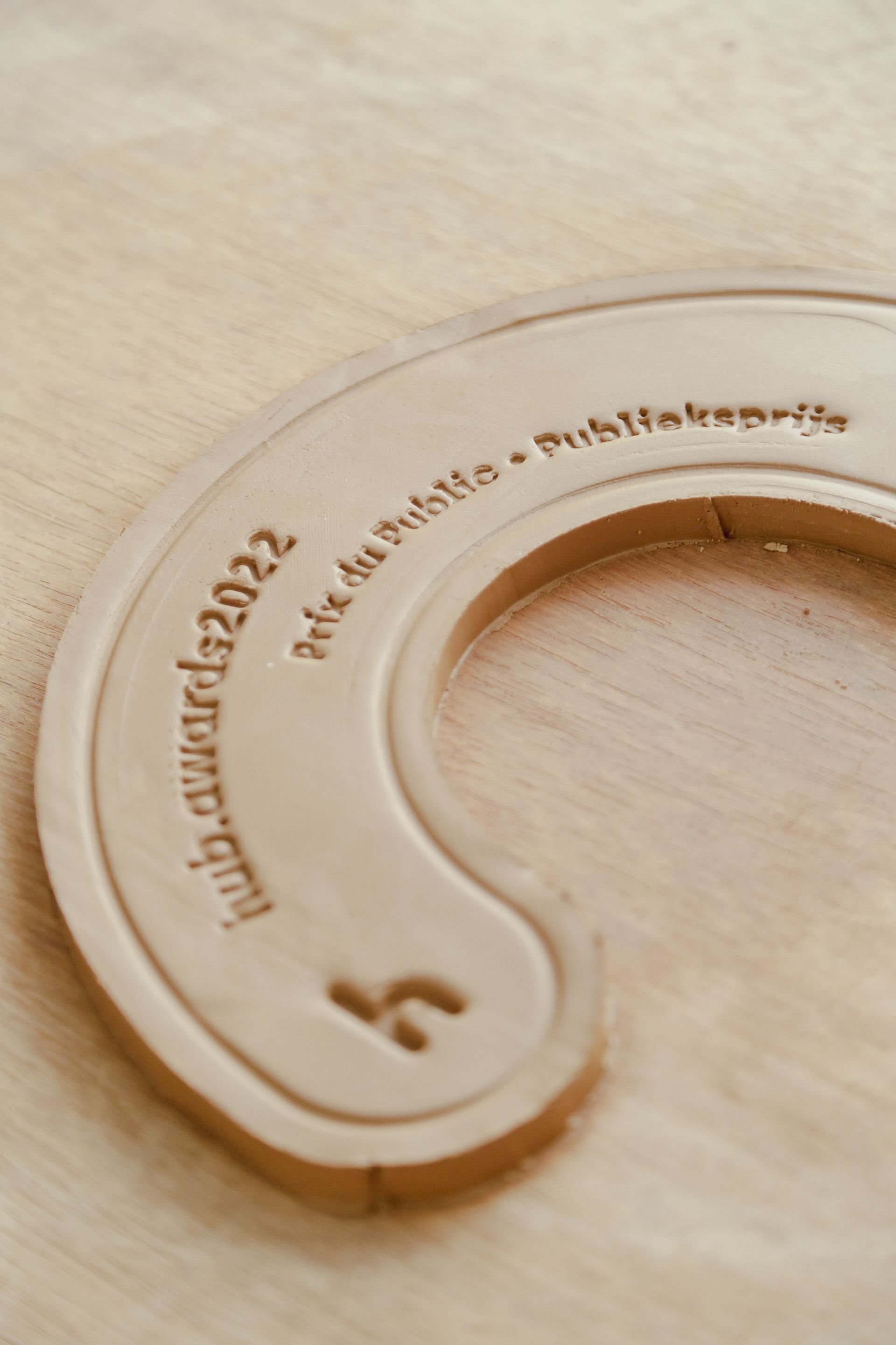
3 parts it gathers. The pot/container. The personalised mini trophy/retainer. And the plant/of life.
To each category a symbolic plant. Carefully chosen.
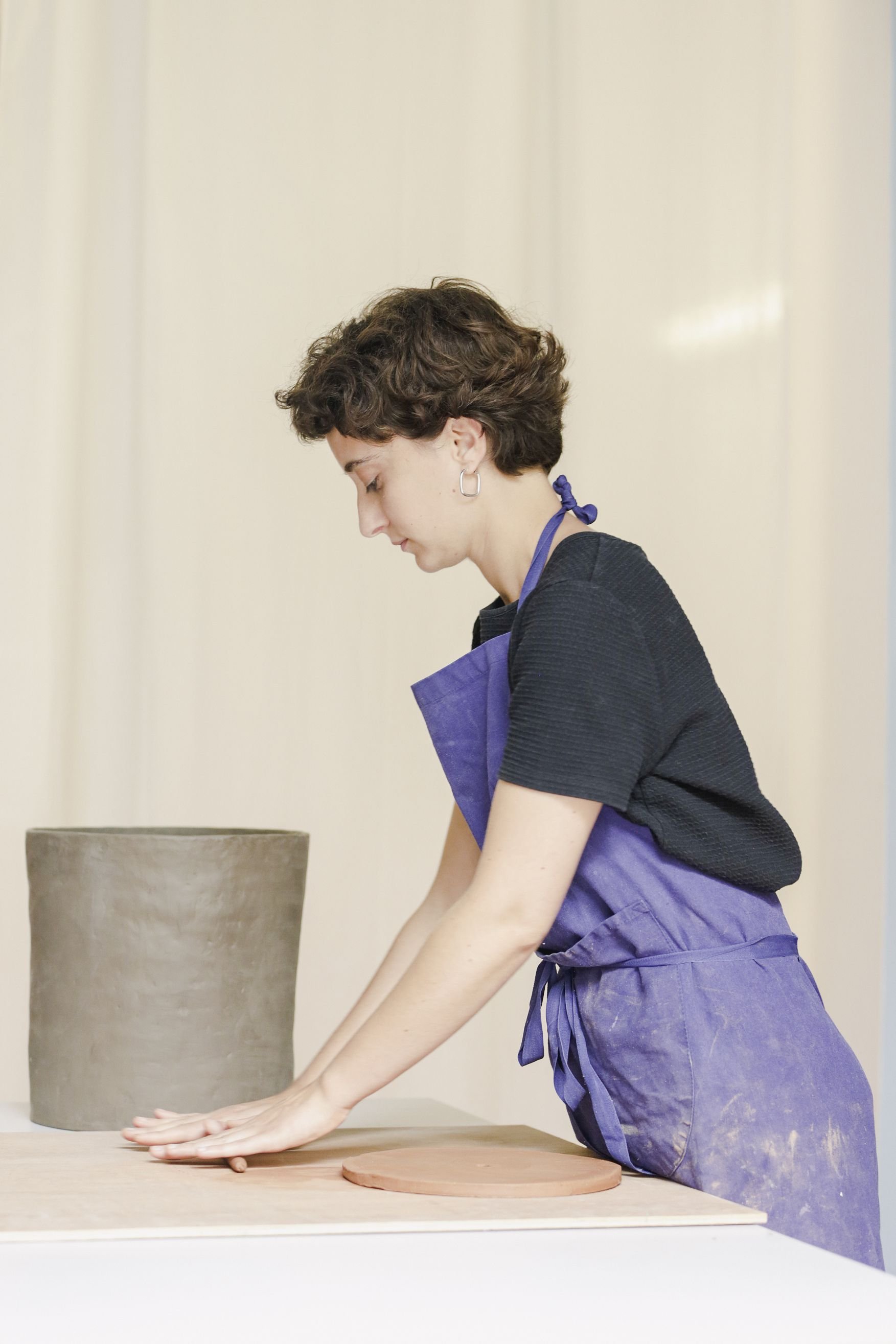
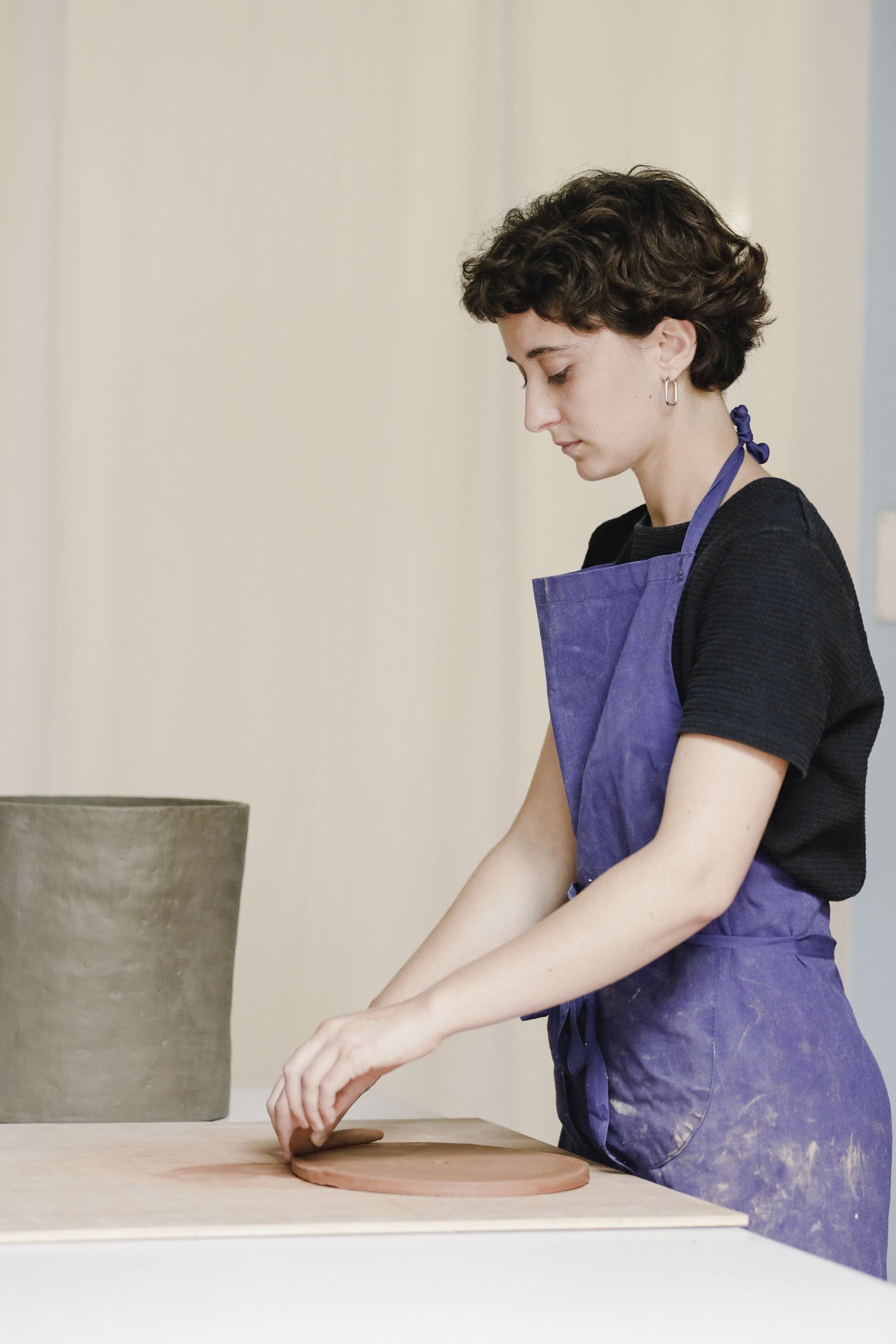
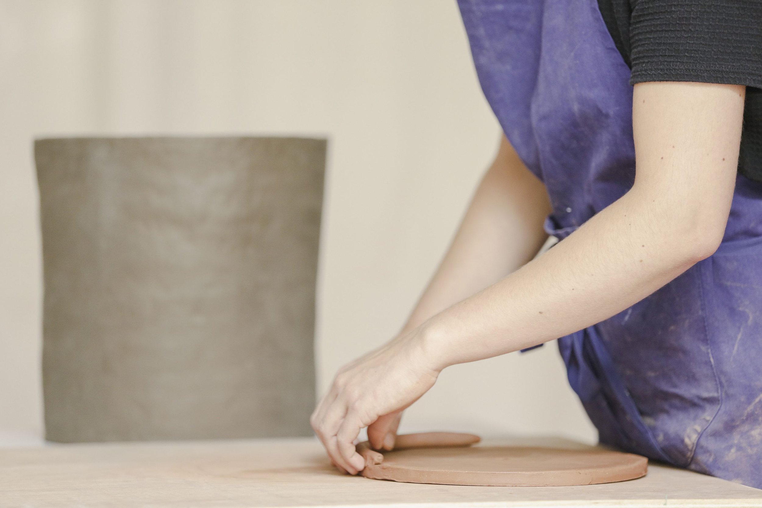
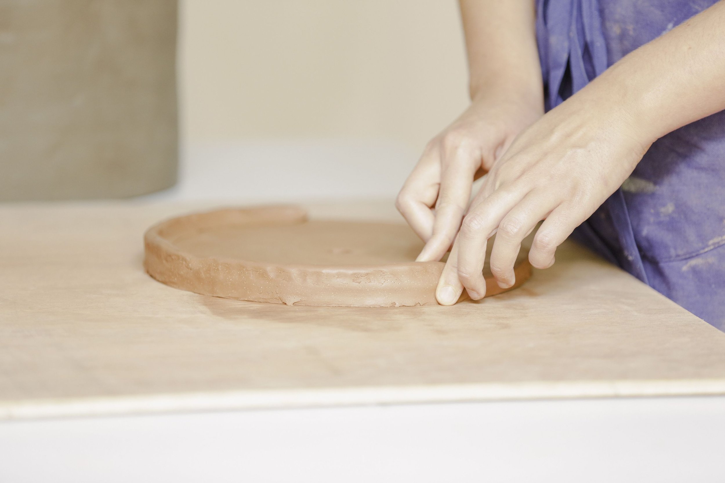
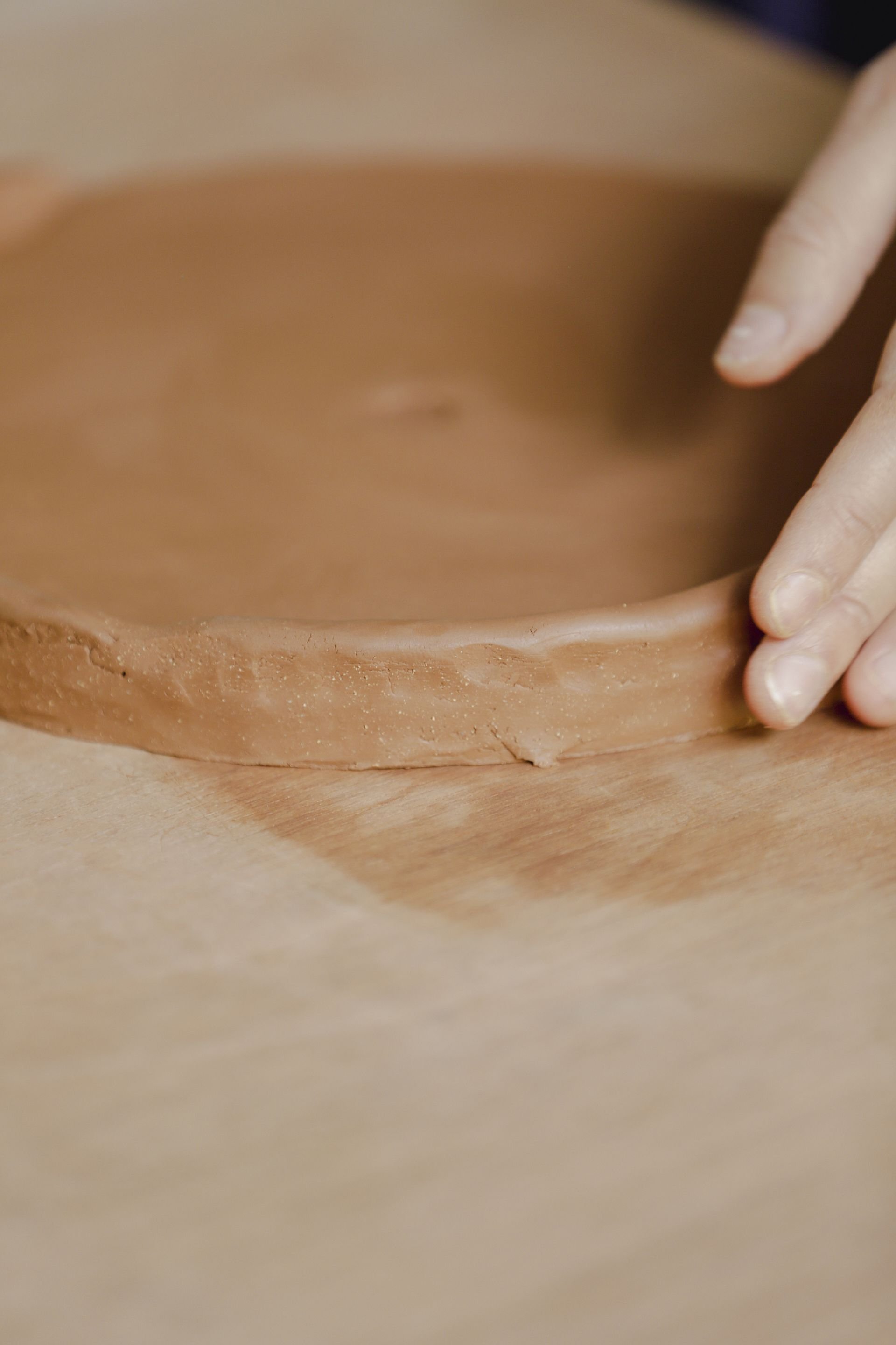
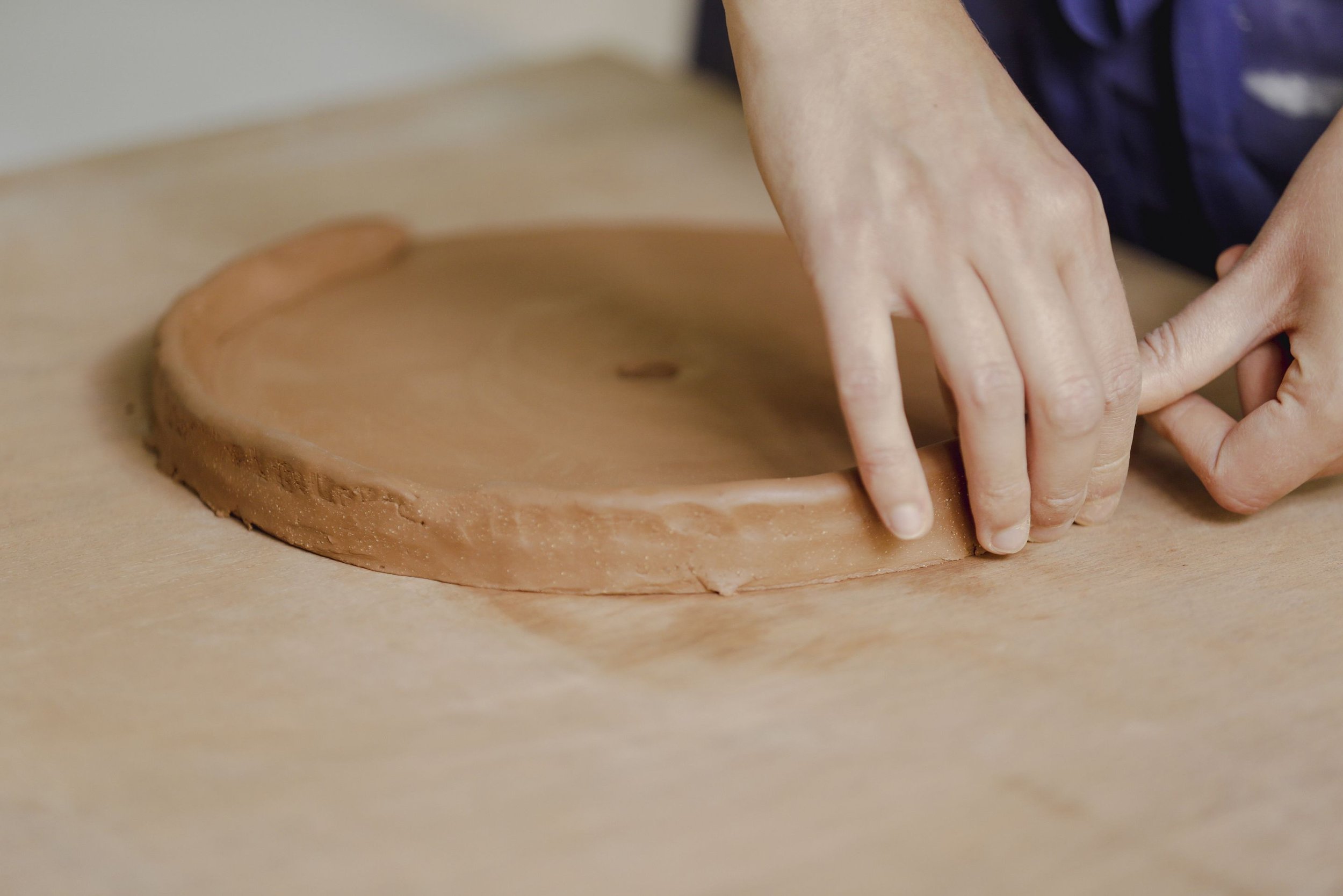
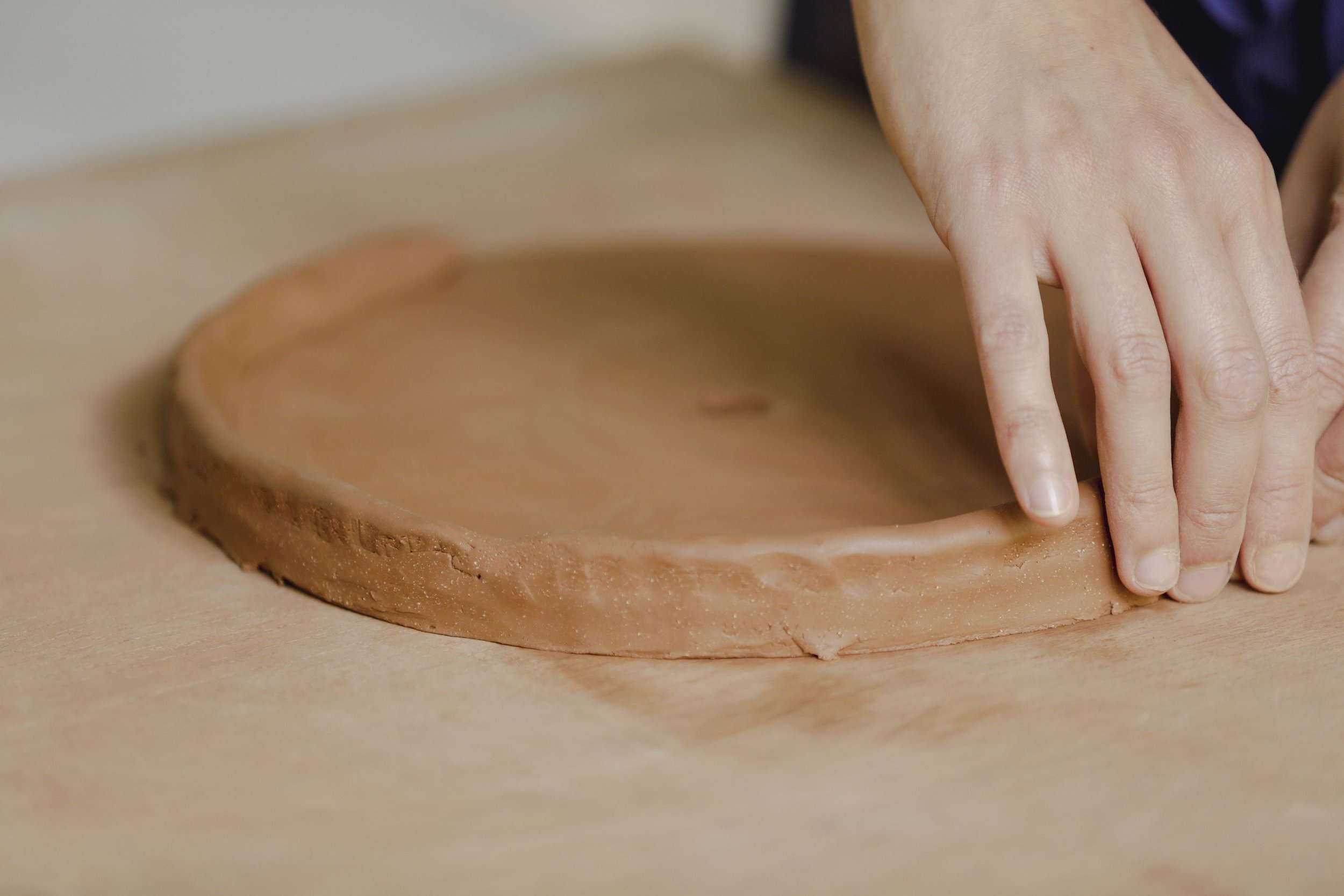
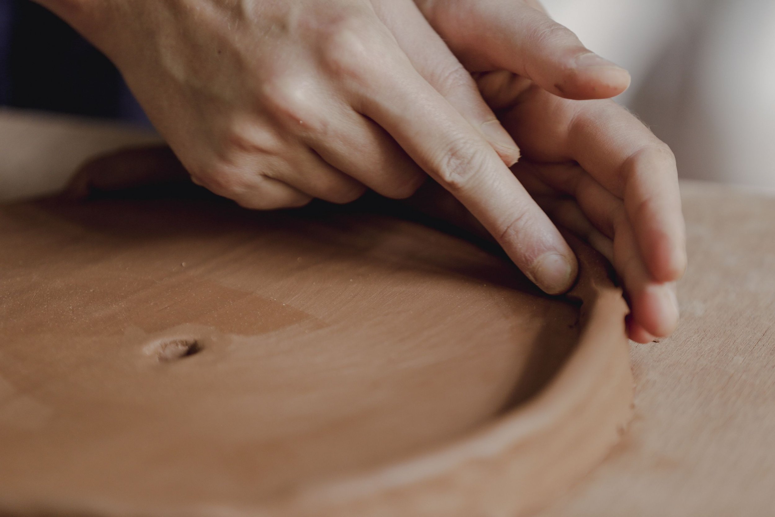
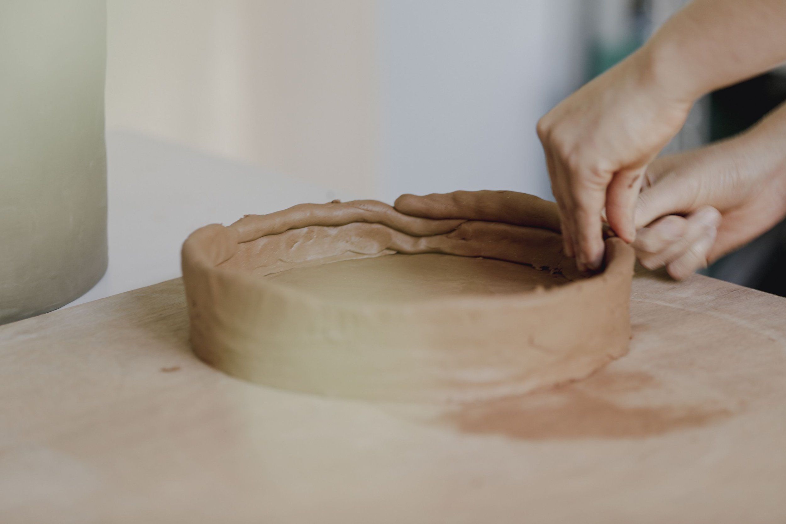
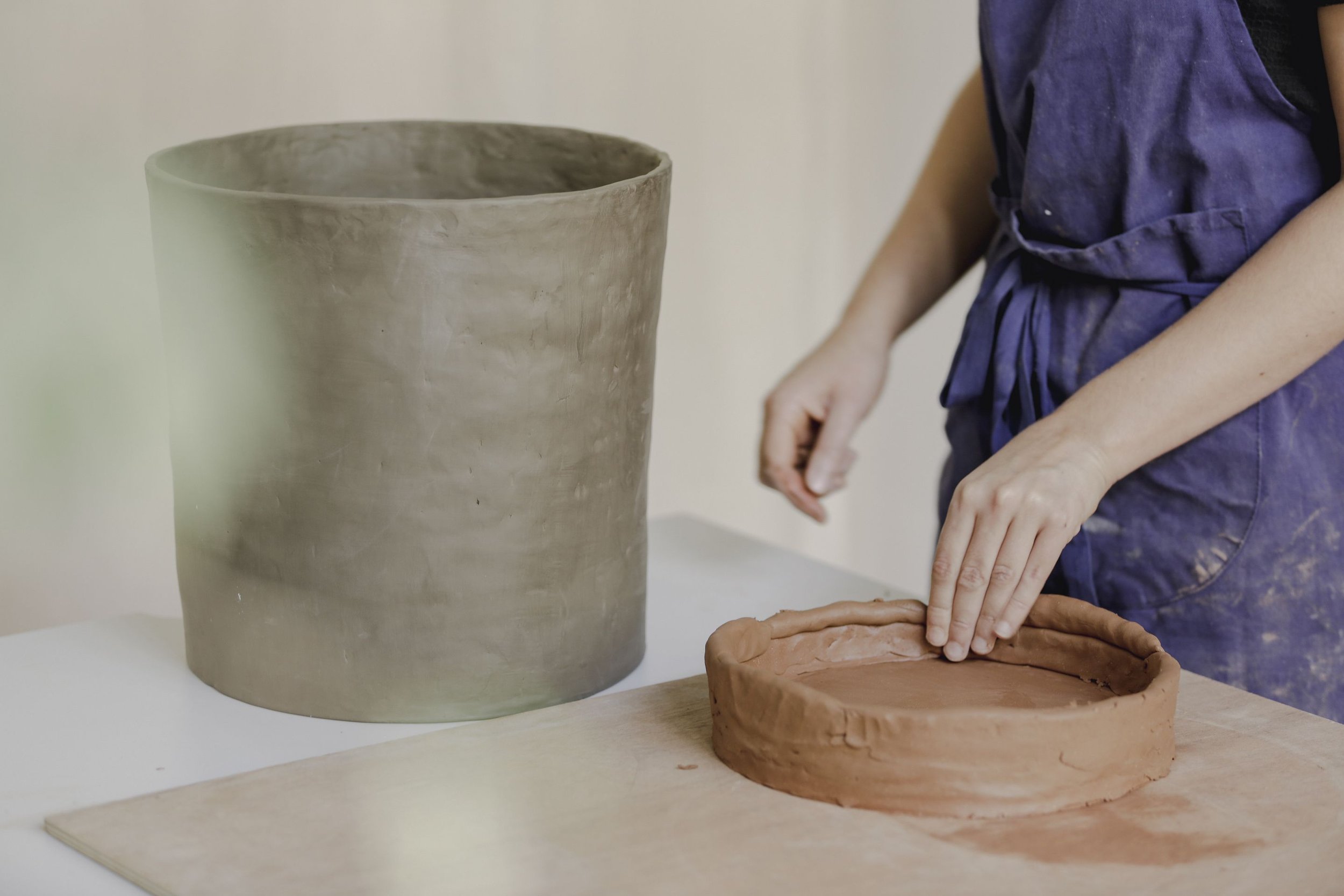
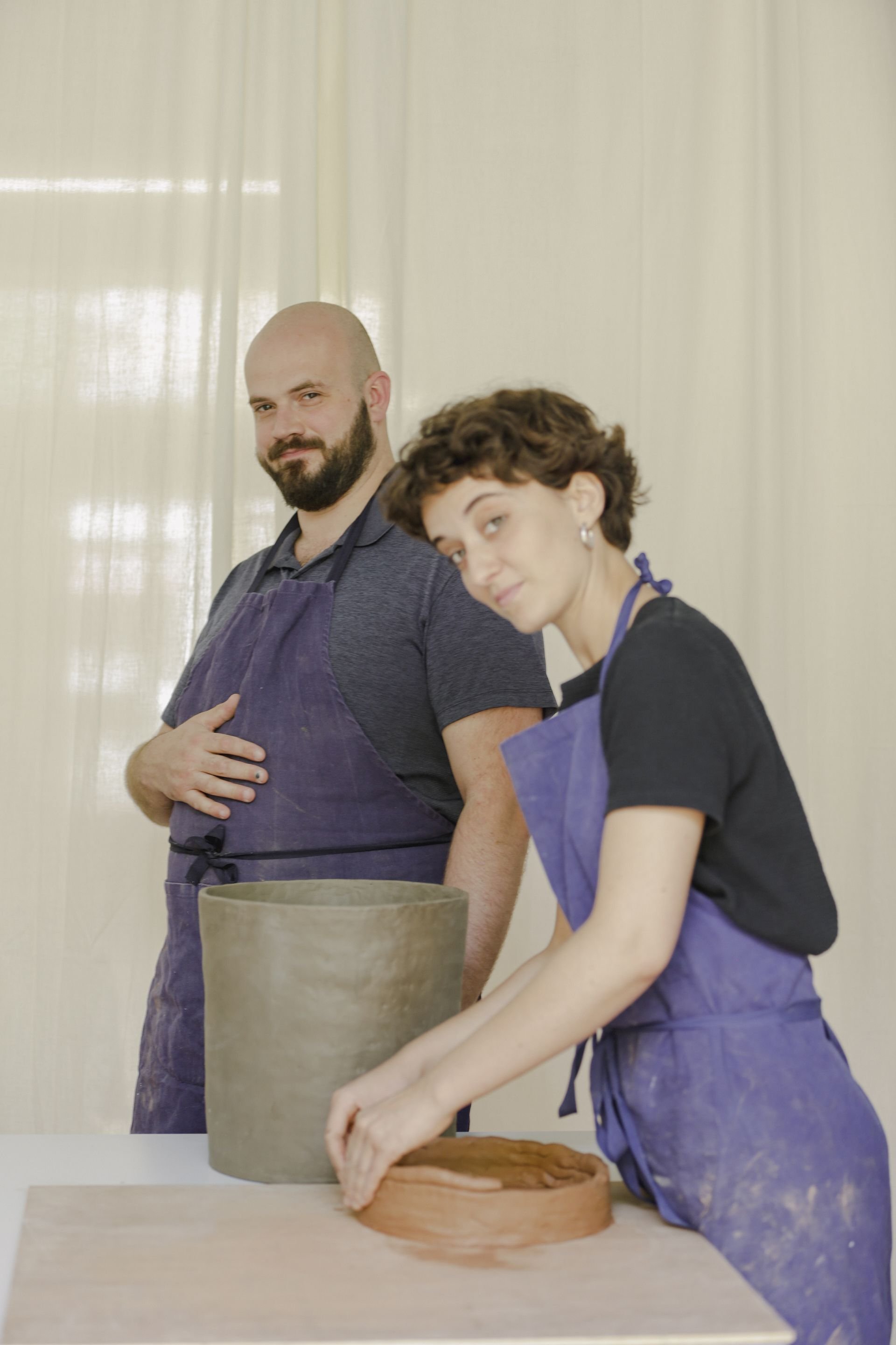
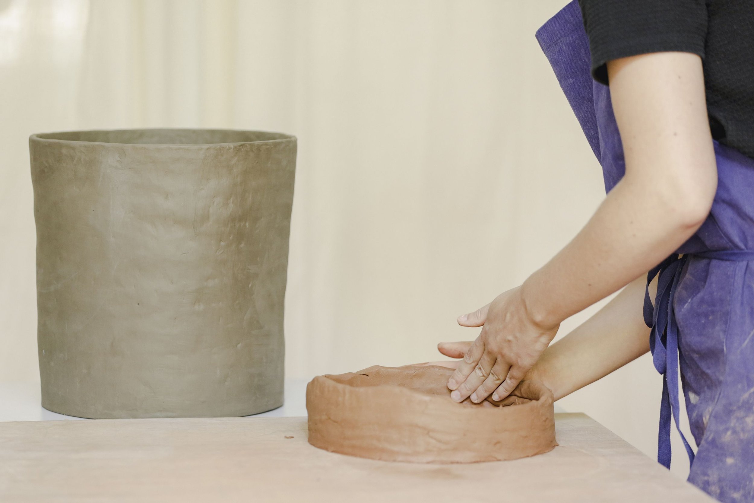
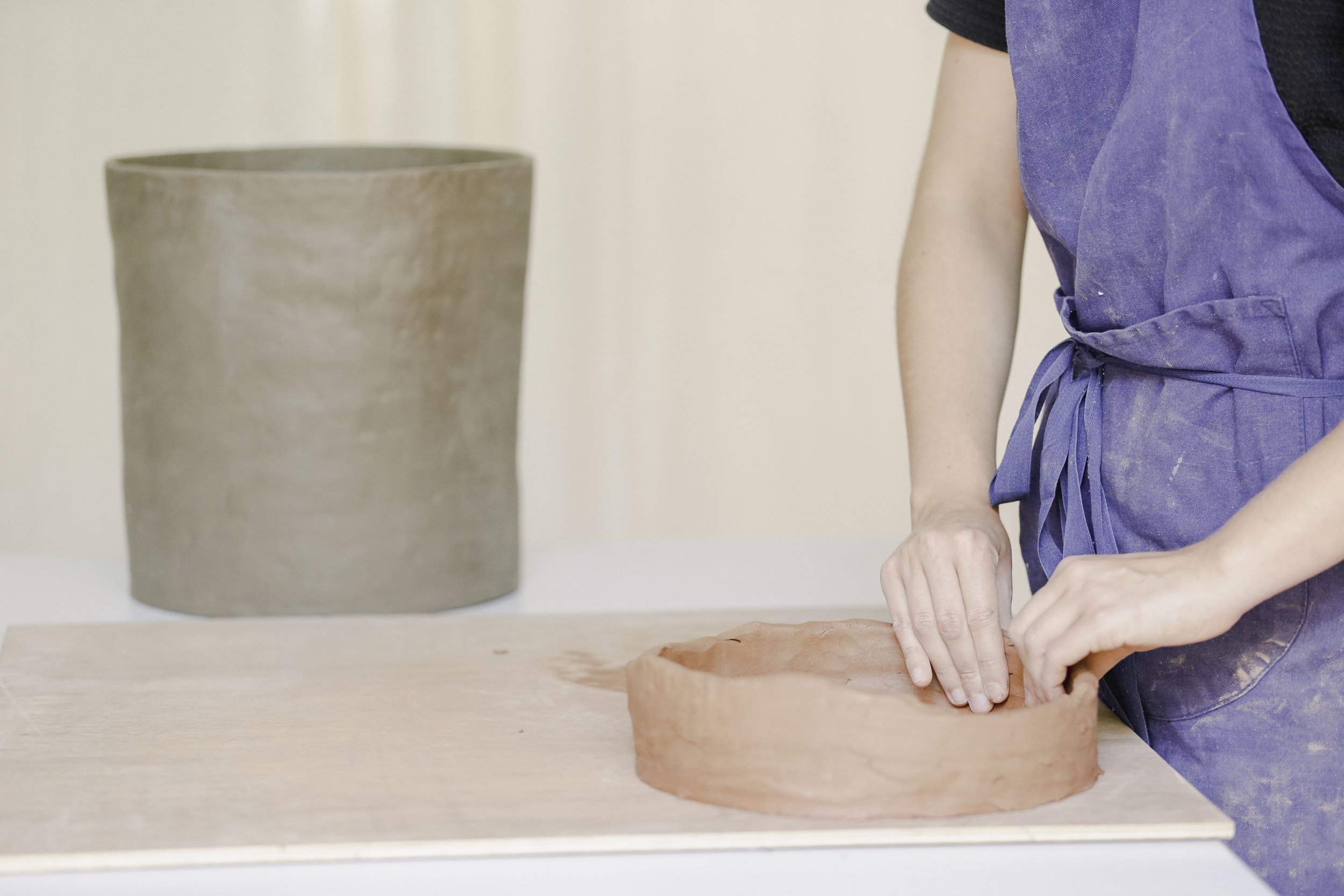
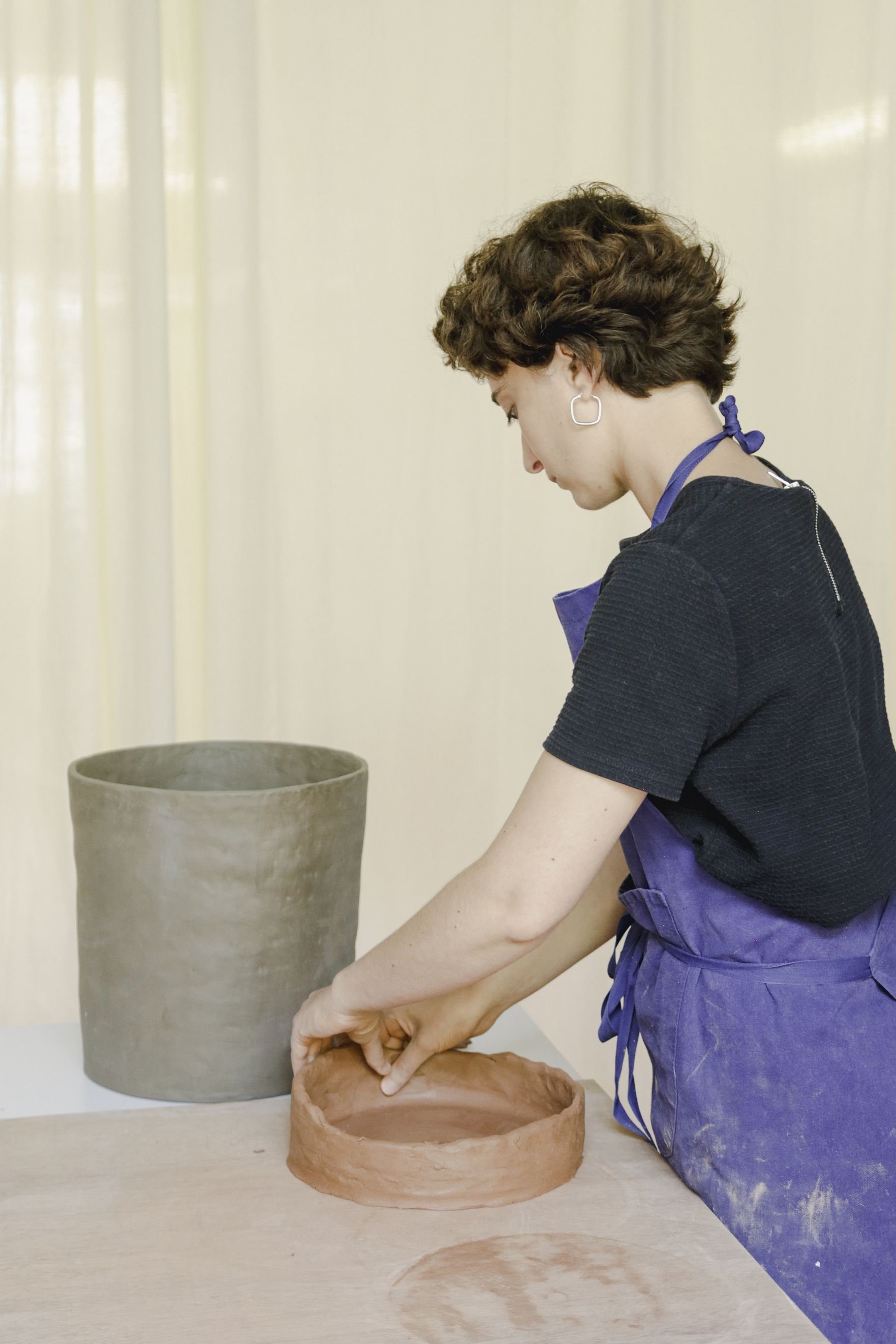
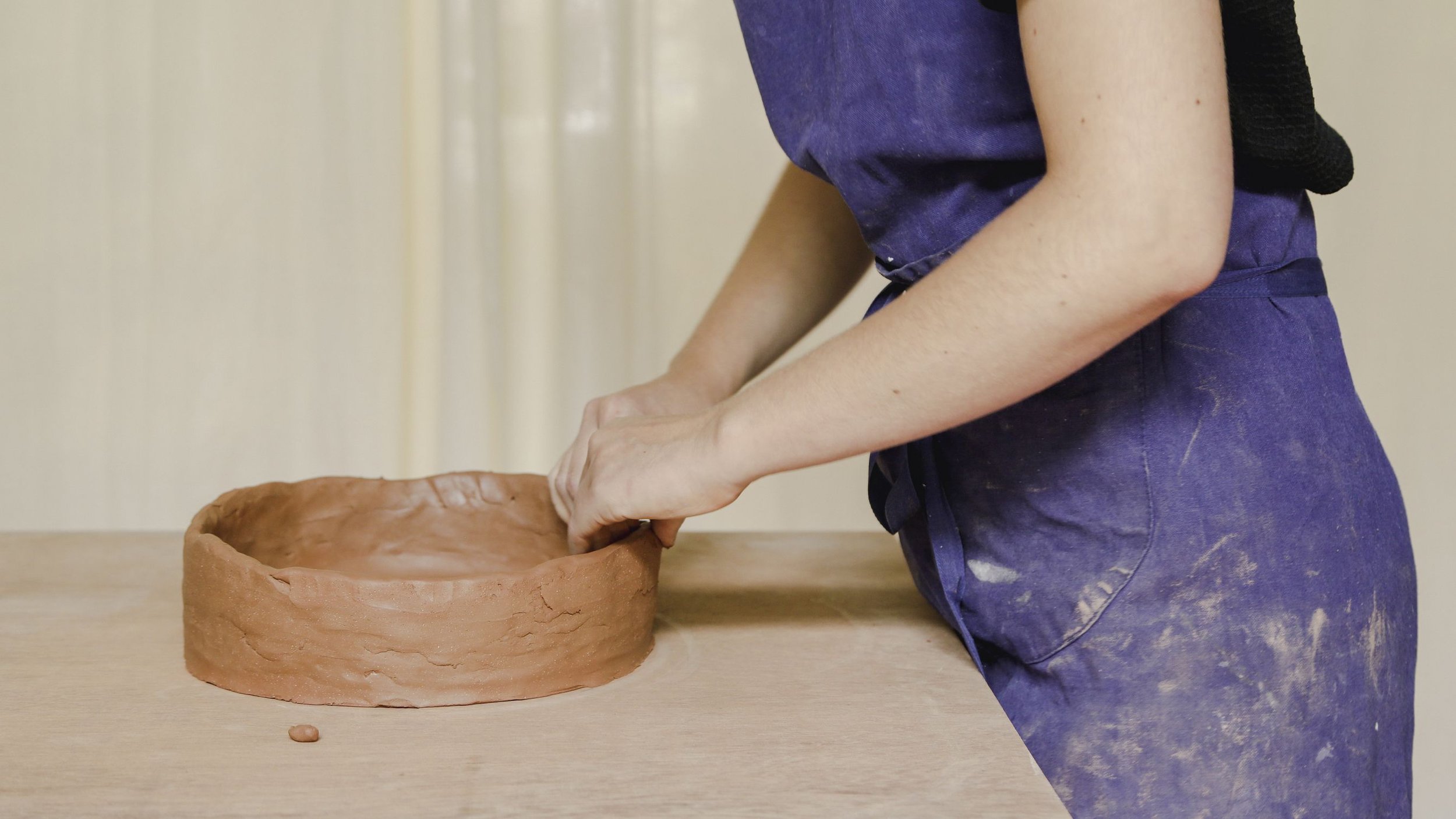
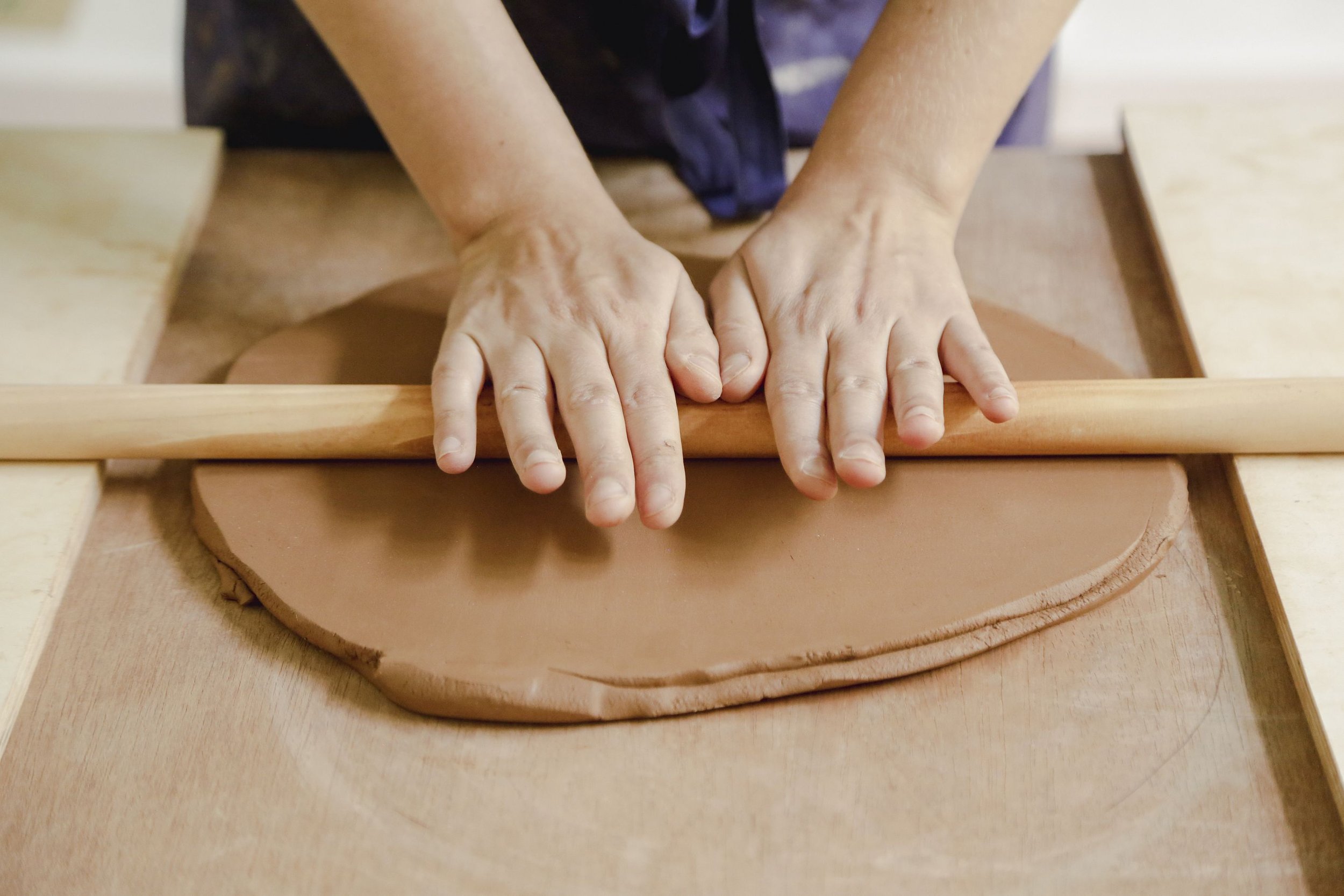
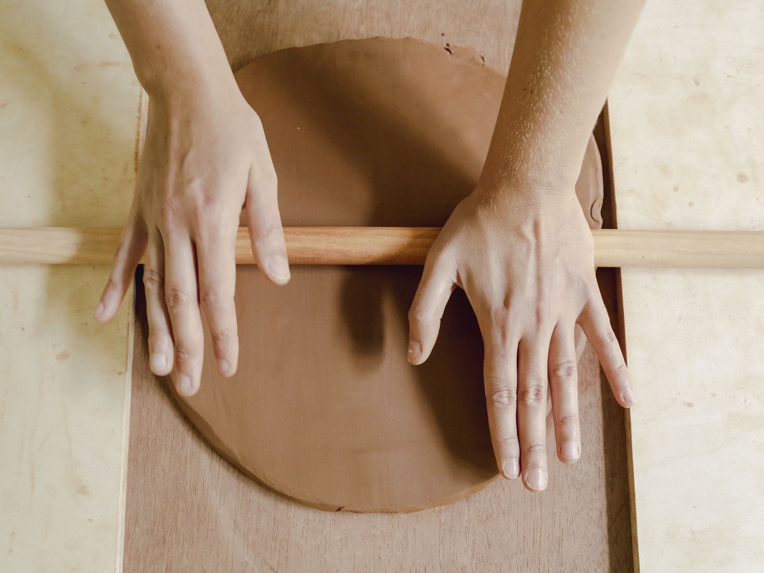
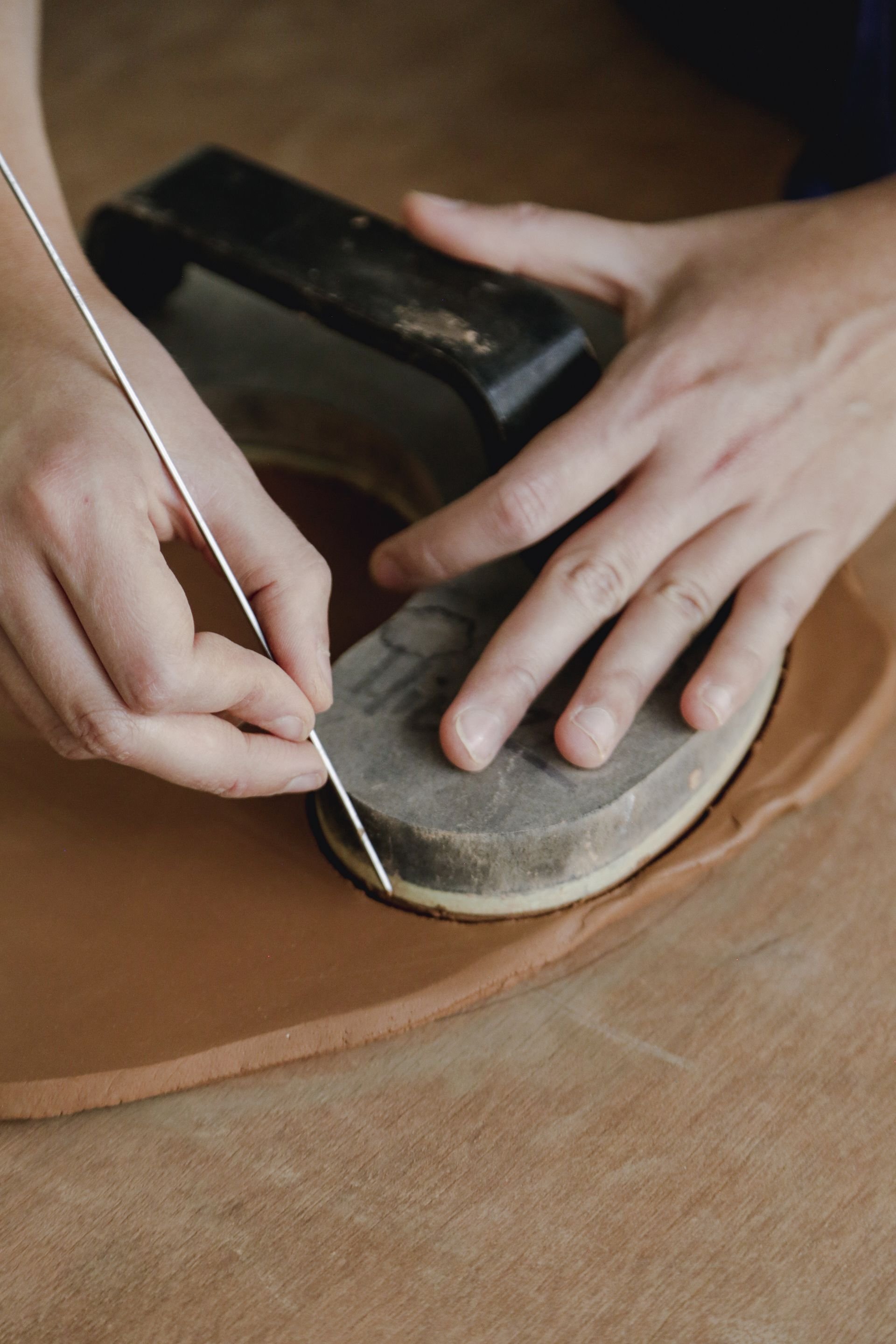
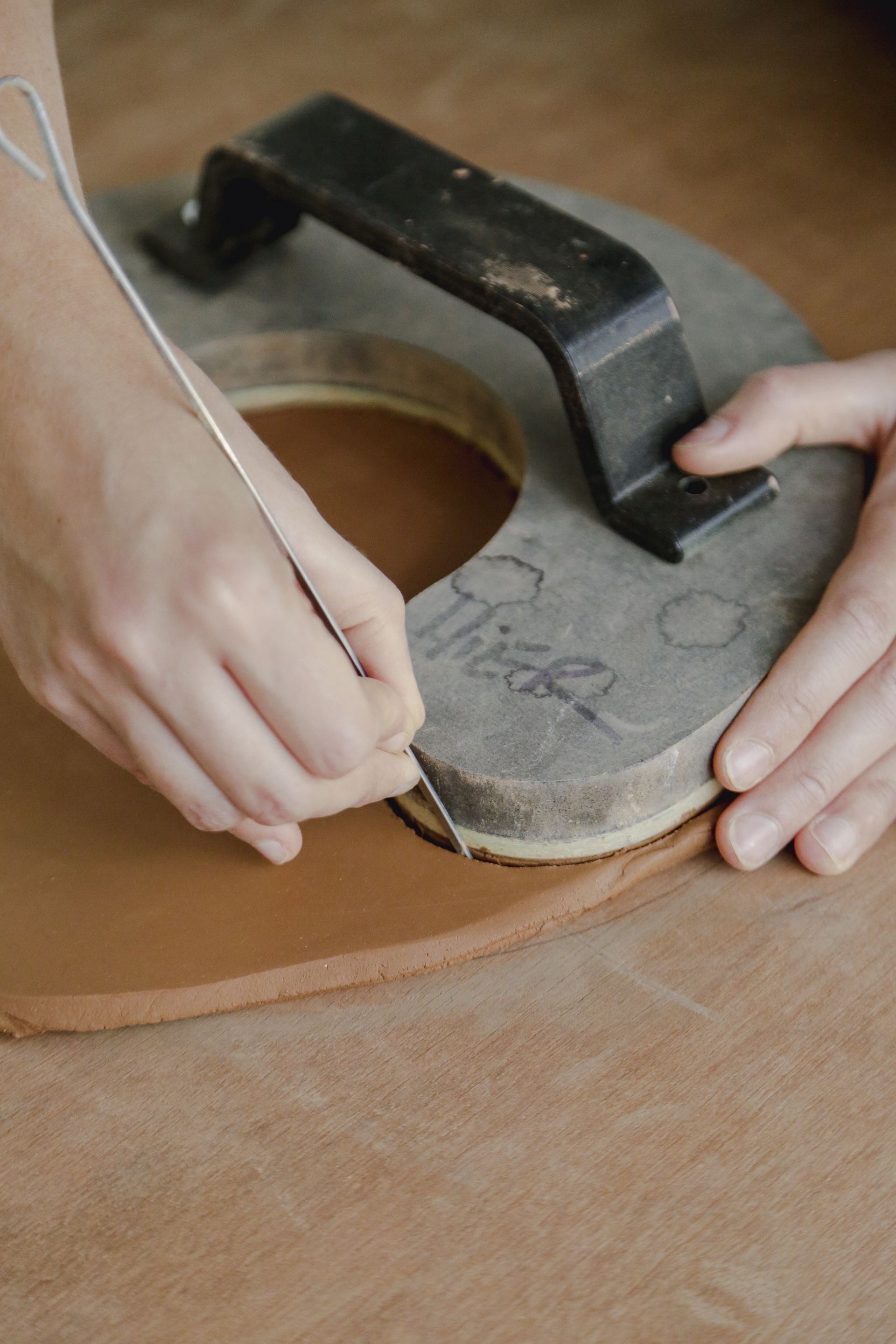
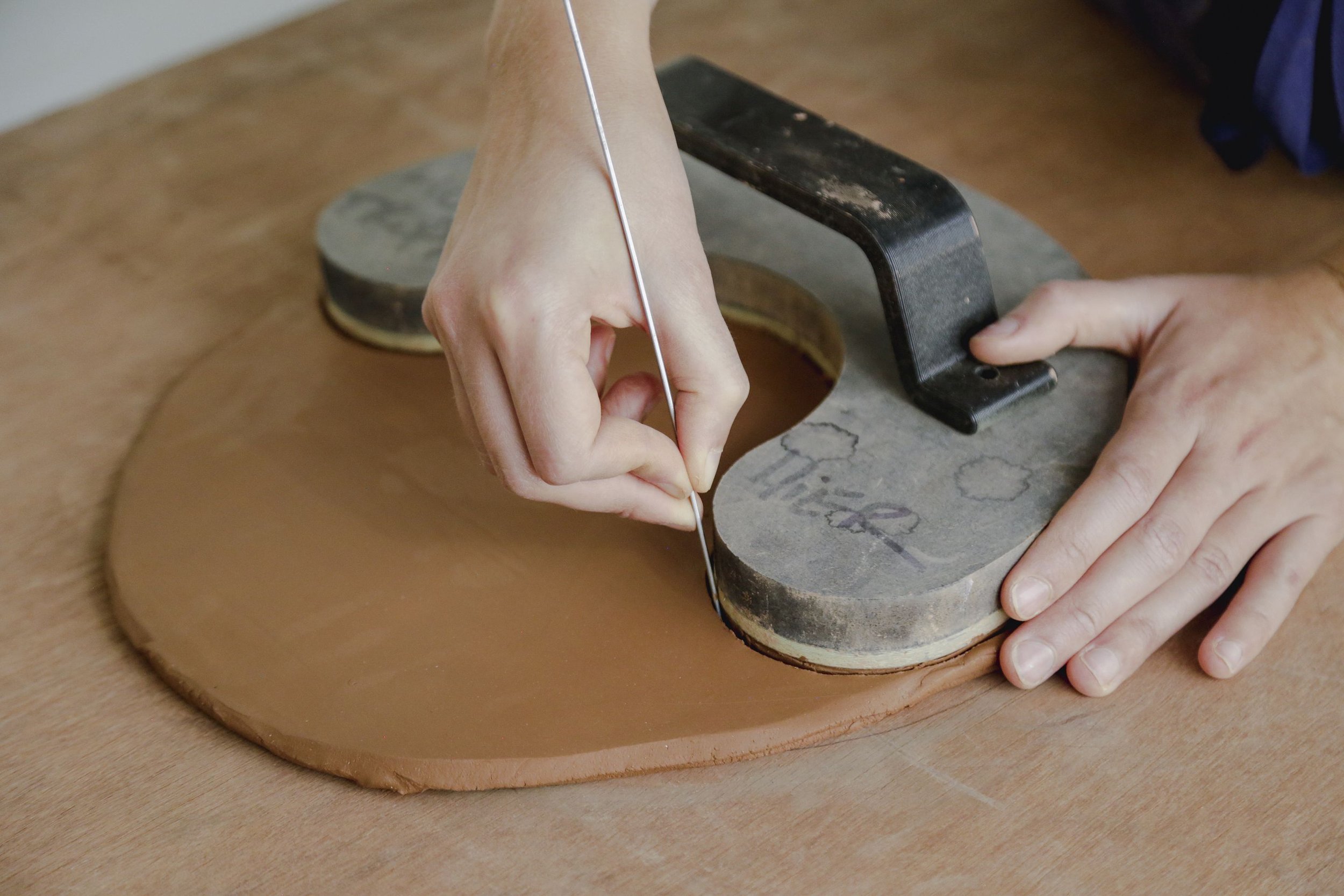
Each plant grows in hand made pot, made in Brussels, with Belgian earth.
Around each plant's neck sits a mini personalised trophy, that retains water and feeds the life. Made just like the pot. With Belgian earth.
A project for hub.brussels
Ceramics: Esther Bapsalle
Pics and video: Joe Khoury Studio
Special thanks: Justine Guichard
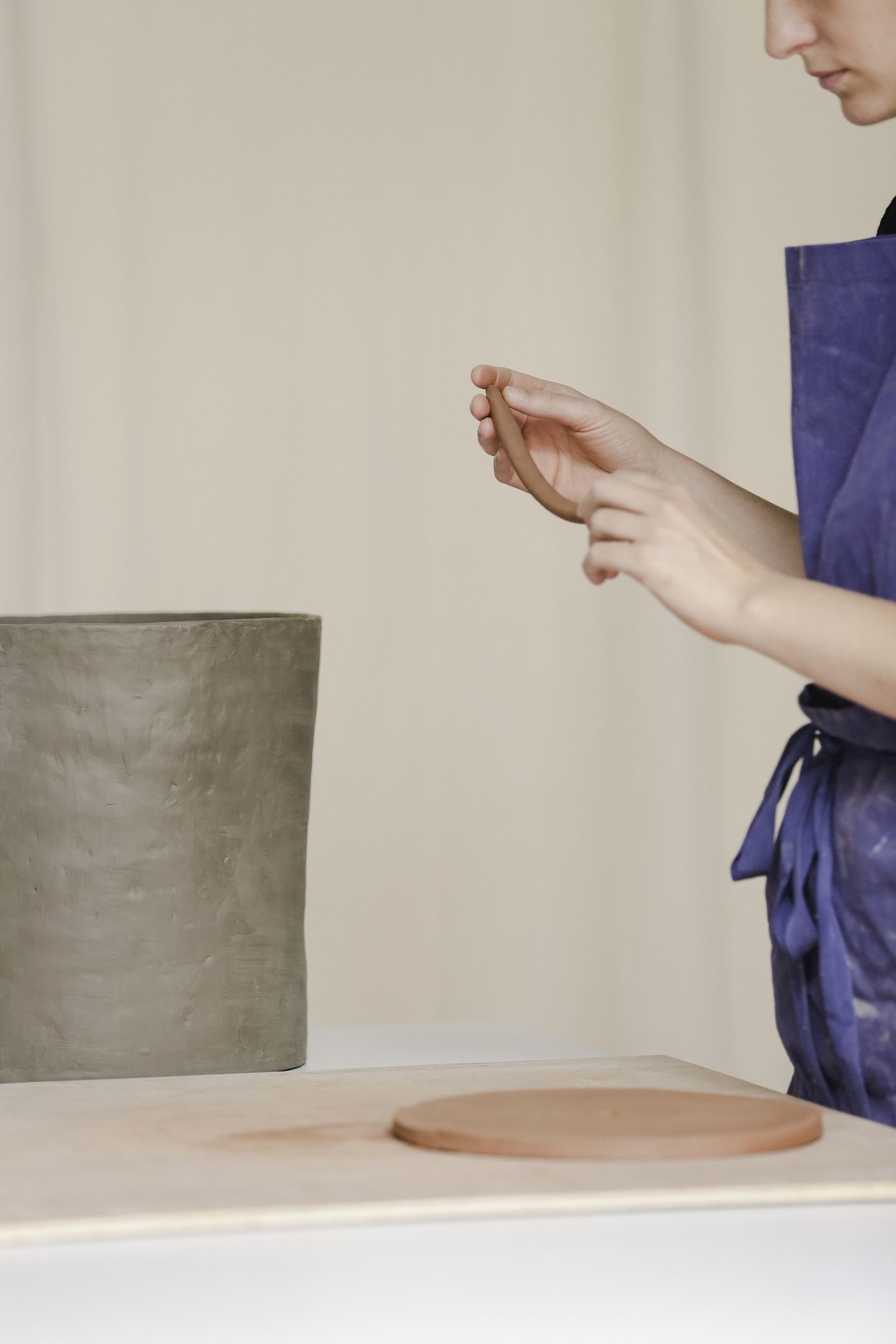
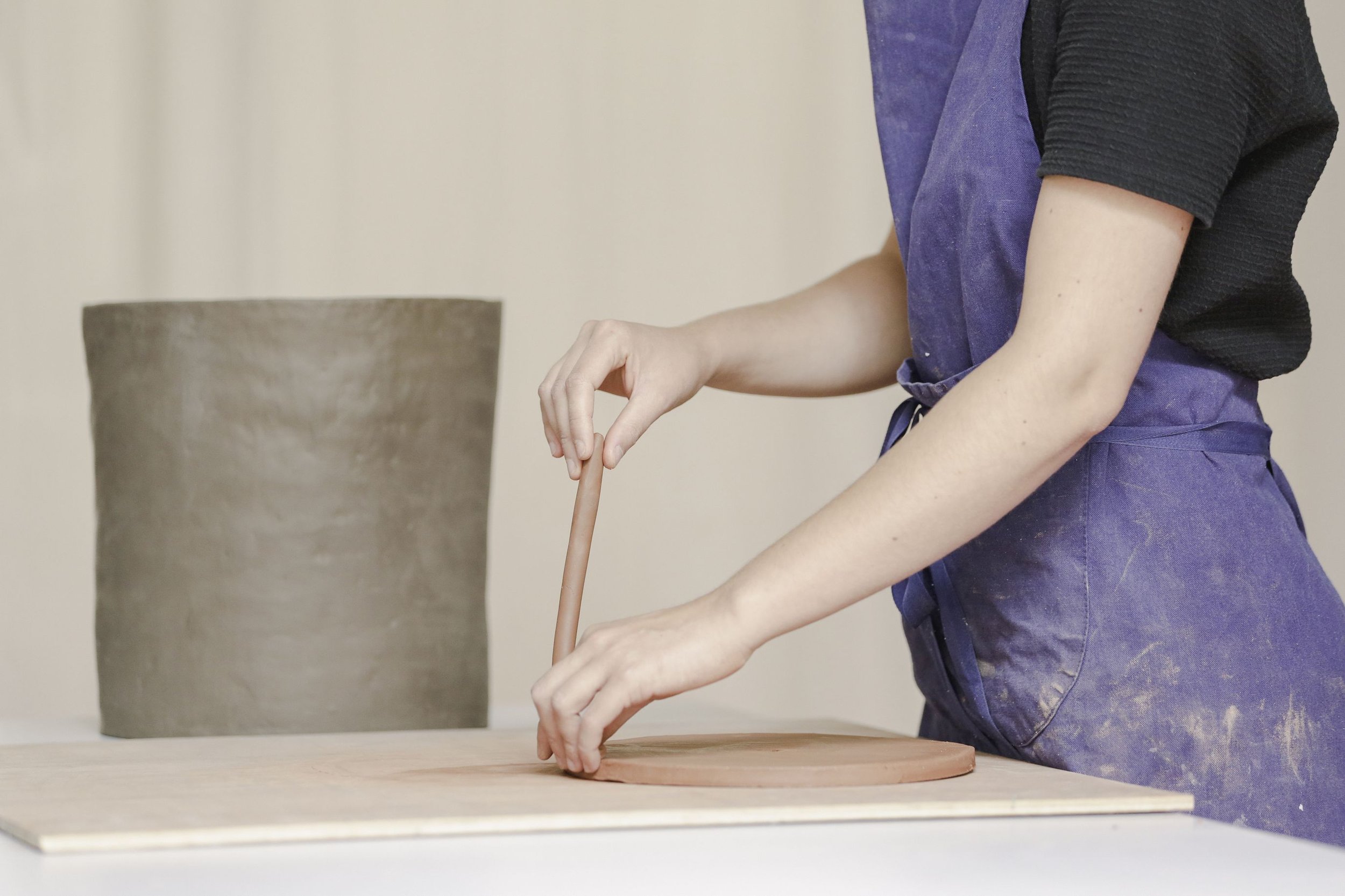
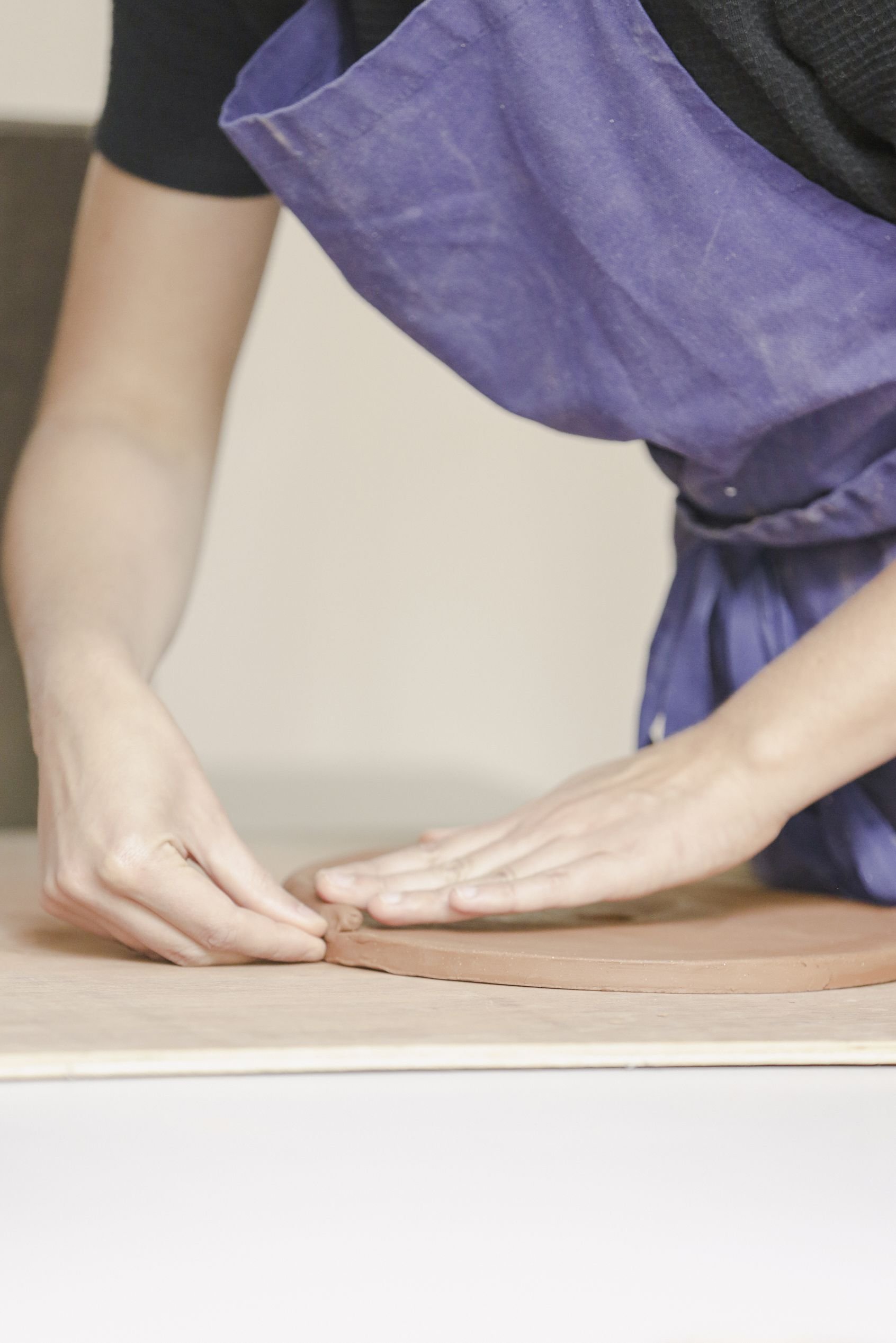
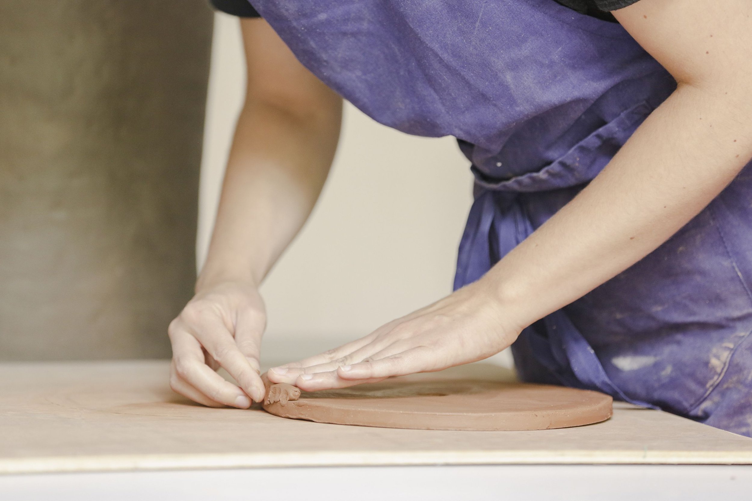

The NeverEnding Story - L'Auberge Espagnole
A modular system for a flexible shop.
A shelf. A pegboard. A hanger.
Assemble. Dismantle. Re-mantle.
HUB-TOP-POP!
ONE SHOP FOR ALL.
Assemble. Dismantle. Re-mantle.

We were commissioned by hub.brussels to design, adapt and install, a system for a series of 12 pop-up stores, in different neighbourhoods in Brussels.
A modular system for a flexible shop.
And so we thought, defined the rules to the system, drew, developed and prototyped, to finally reach a first version, suitable for all:
A shelf. A pegboard. A hanger.
1 Structure. 3 Connectors with 5 add-on details. # Types of Merchants. 3 Display possibilities. In 1 Shop.
1 pop-up built. 11 more to go.
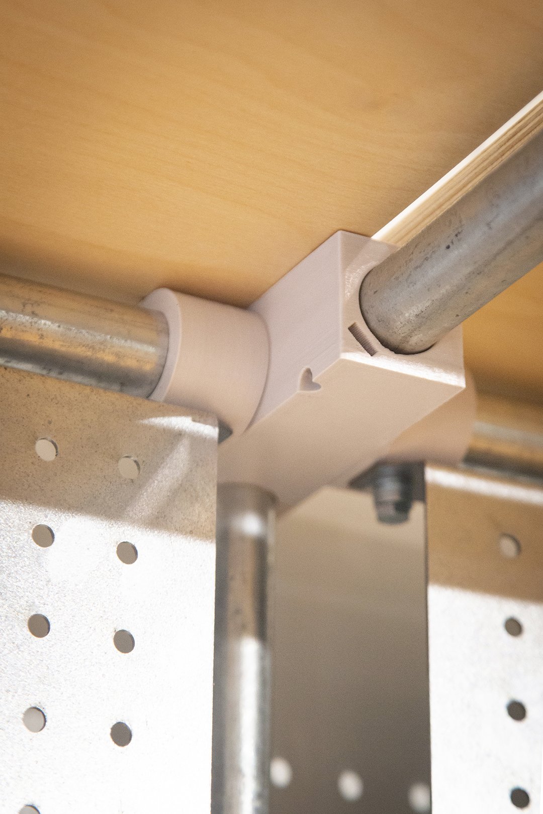
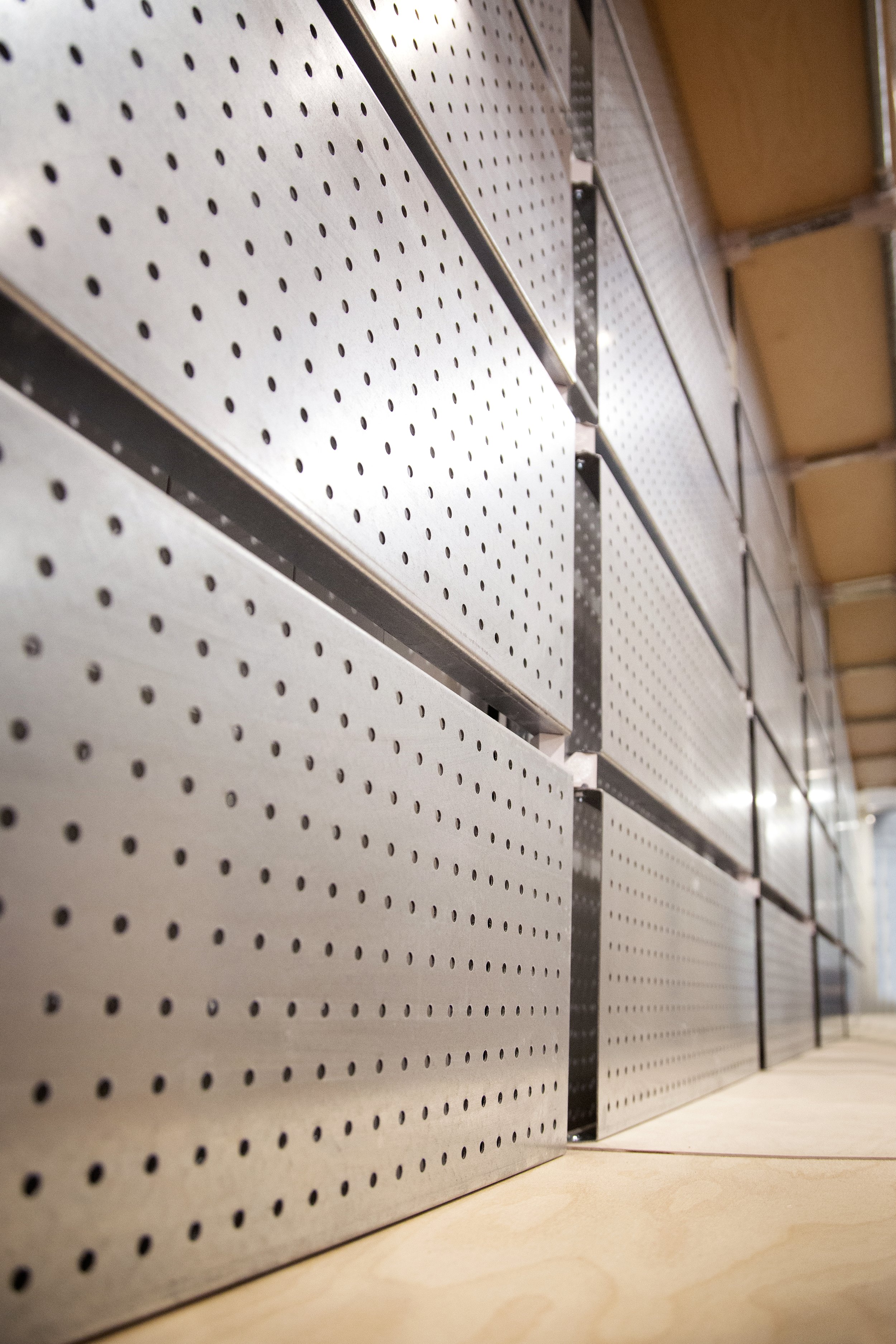
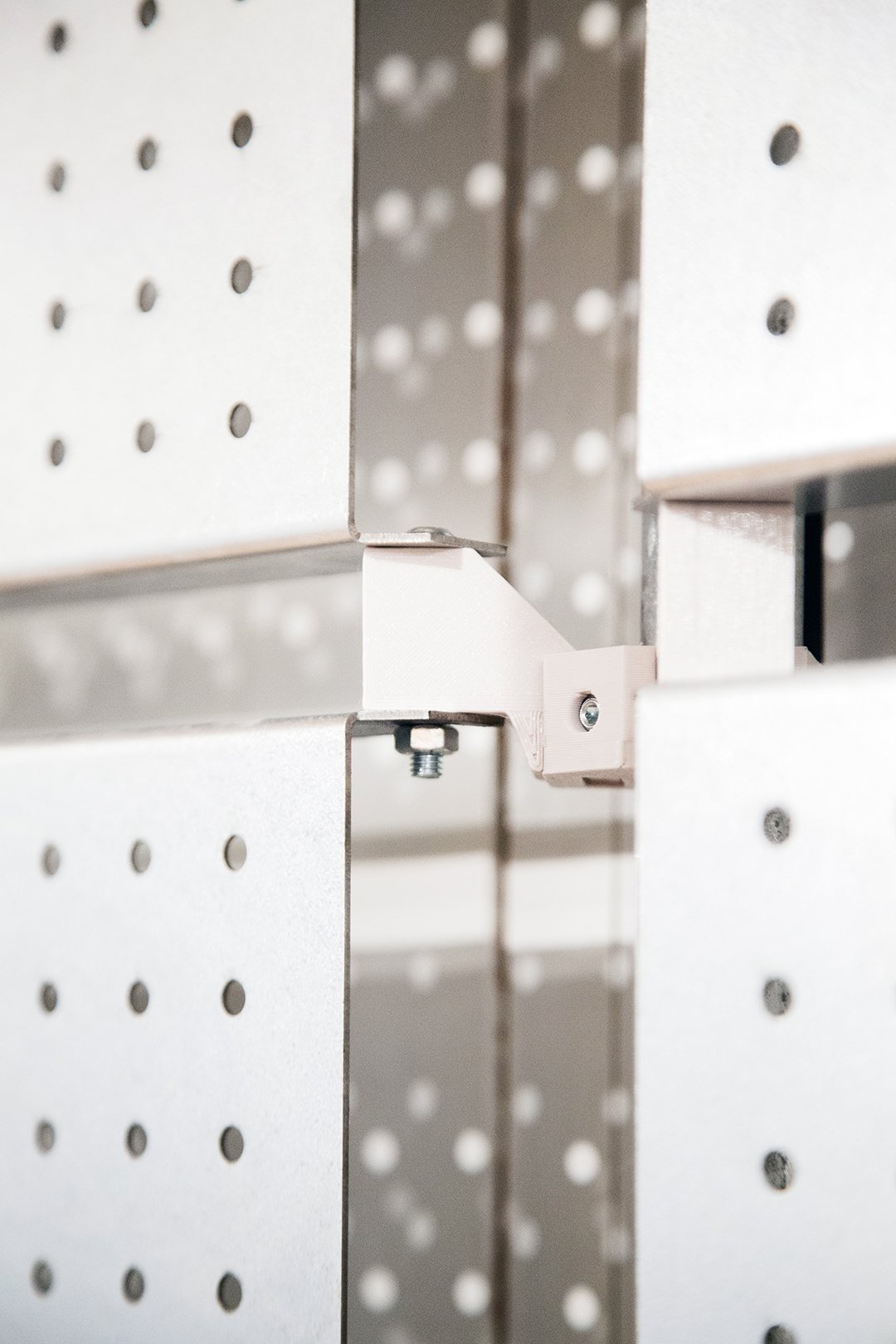

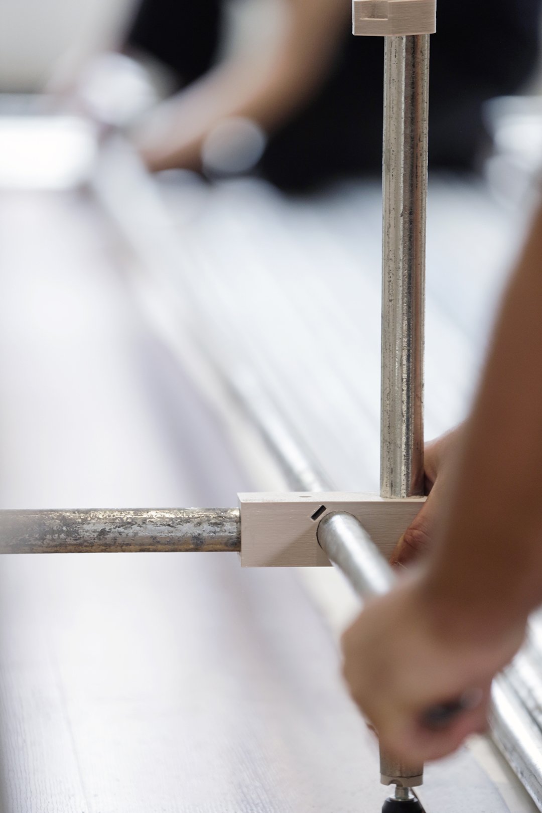
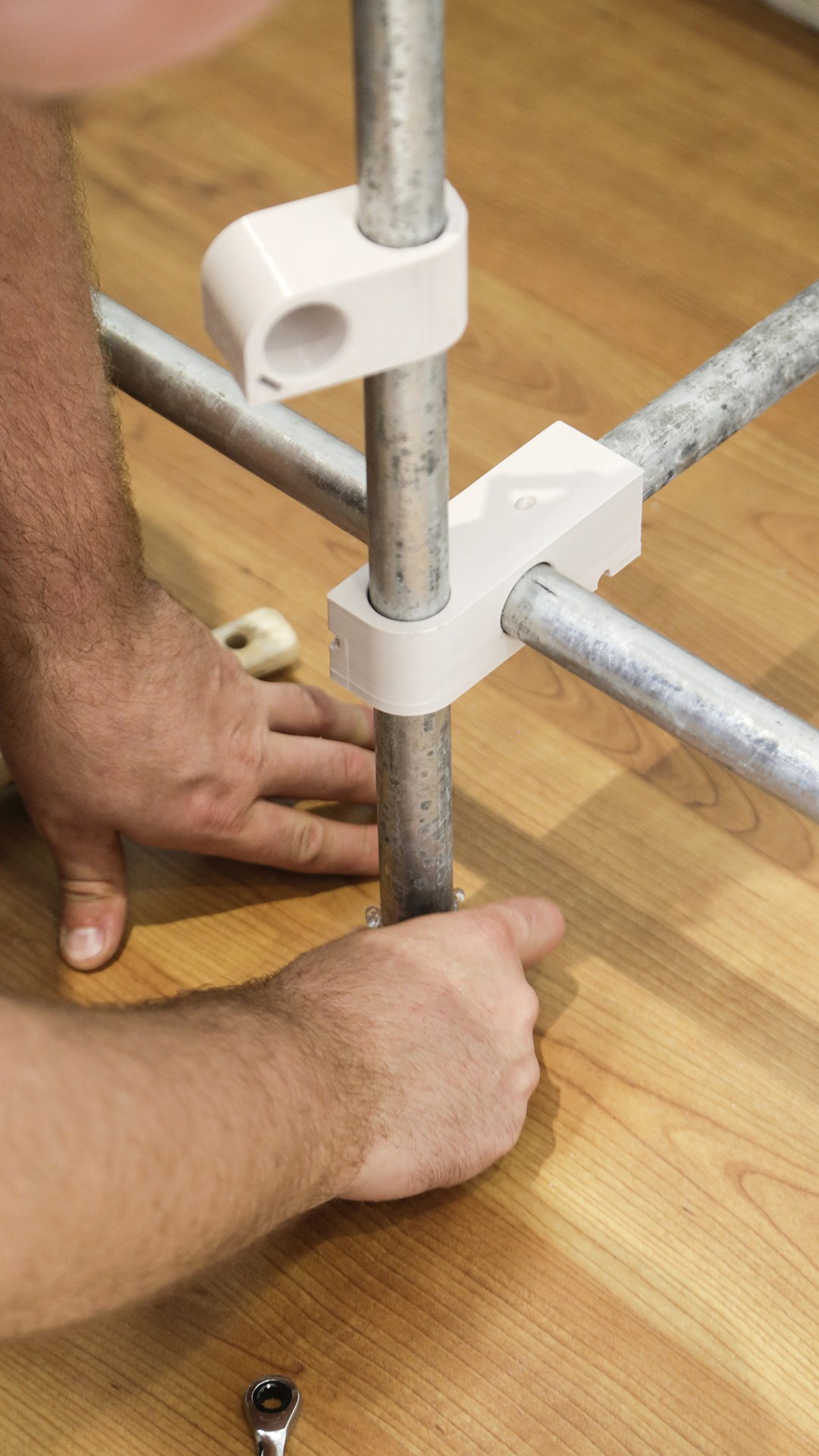
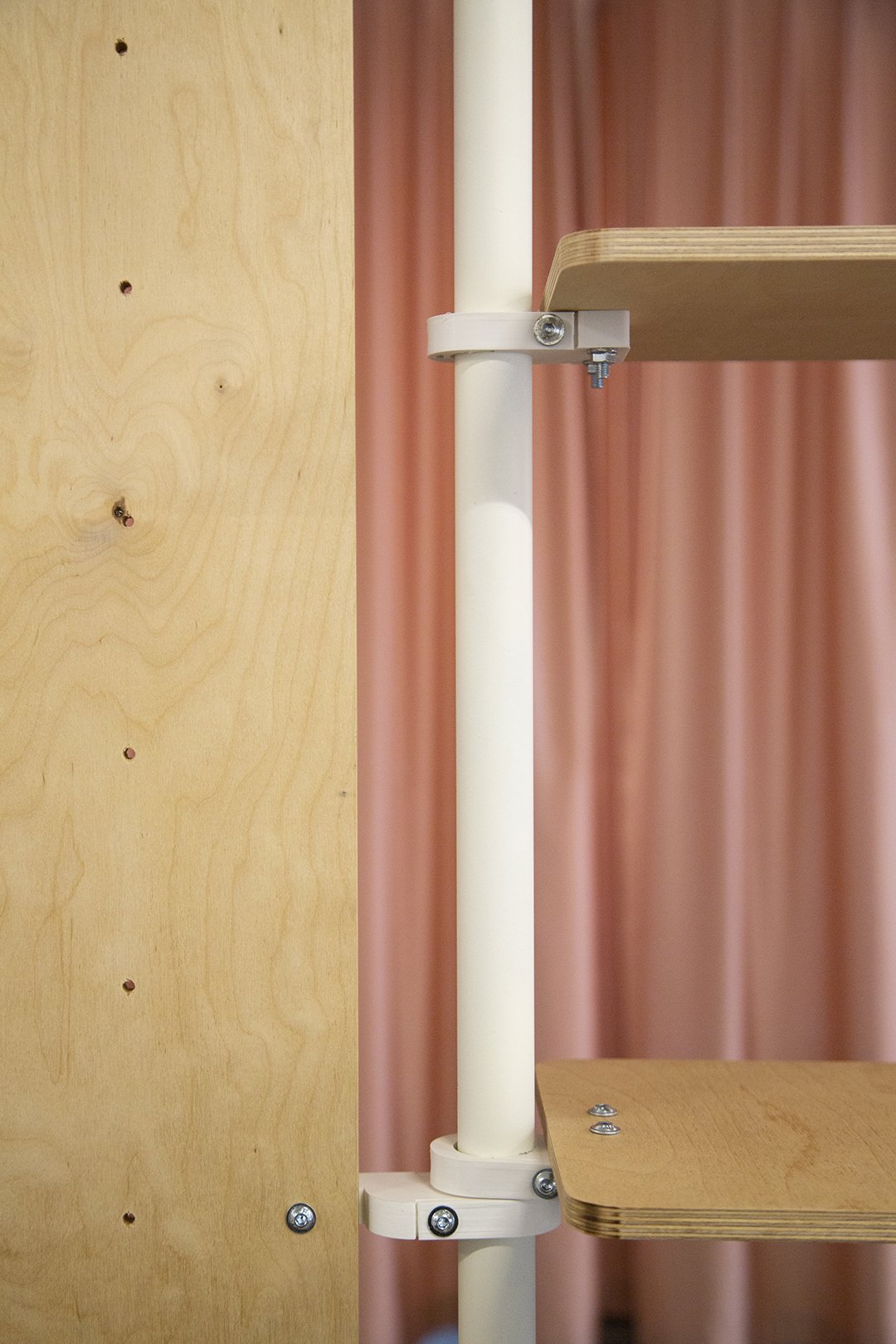
In POP-UP #1, structure is made with galvanised tubes, connectors and details printed with recycled PET, shelves are made of birch plywood, and pegboards out of laser cut and folded galvanised sheets.


For POP-UP #2, we left room for modifications. After all, we learn from POP-UP #, to then adjust, and improve.
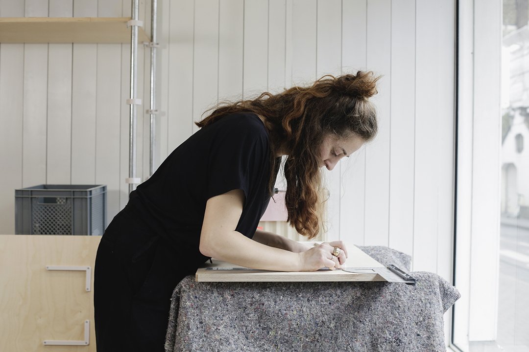
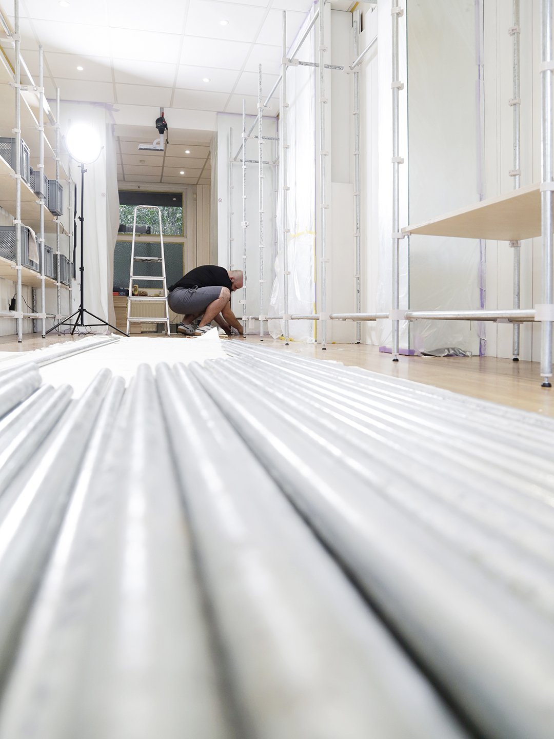
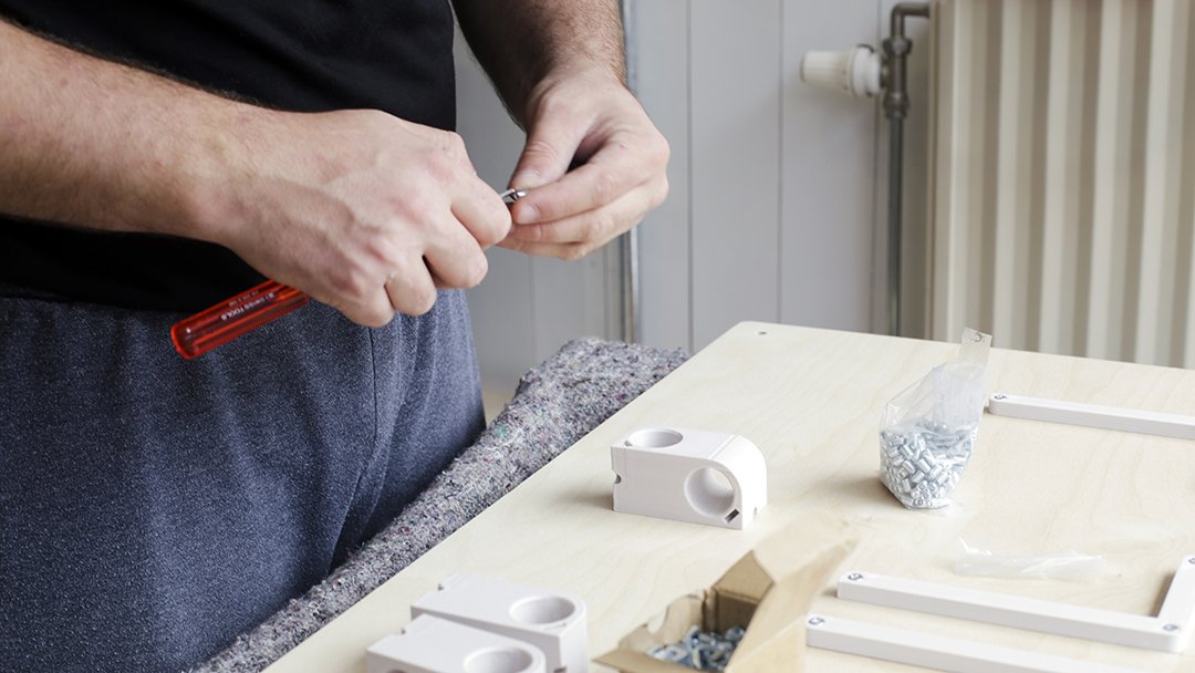
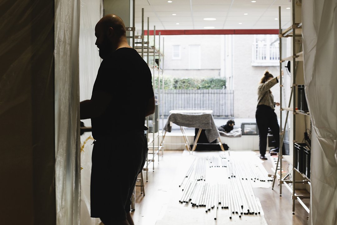
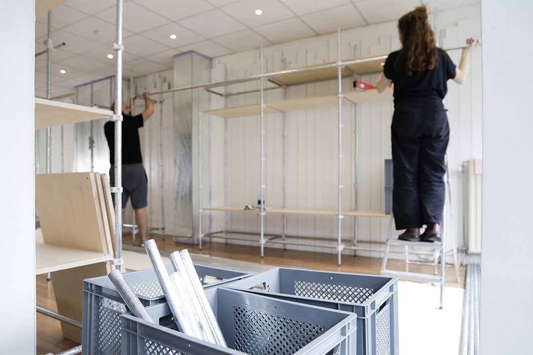


In POP-UP 3 #, L'auberge Espagnol in Forest.


Pictures by Joe Khoury Studio and Luciana L. Schutz, video by Joe Khoury Studio

Rose Mécanique - Tattoo Studio Because
Pink is for fabric. White is for metal. Wood are for surfaces. And green are the plants and pots.
Pink is for fabric. White is for metal. Wood is for surfaces. And green are the plants and pots.
Because we wanted a friendlier tattoo studio. Because it is an open space with a visibility on the whole. Because there are five tattoo artists on the ground floor and two on the lower floor. Because it needs to be neat and clean. Because the concept is the Rose Mécanique. Because it suits the place and because it is a different tattoo experience. One of slickness and refinement.


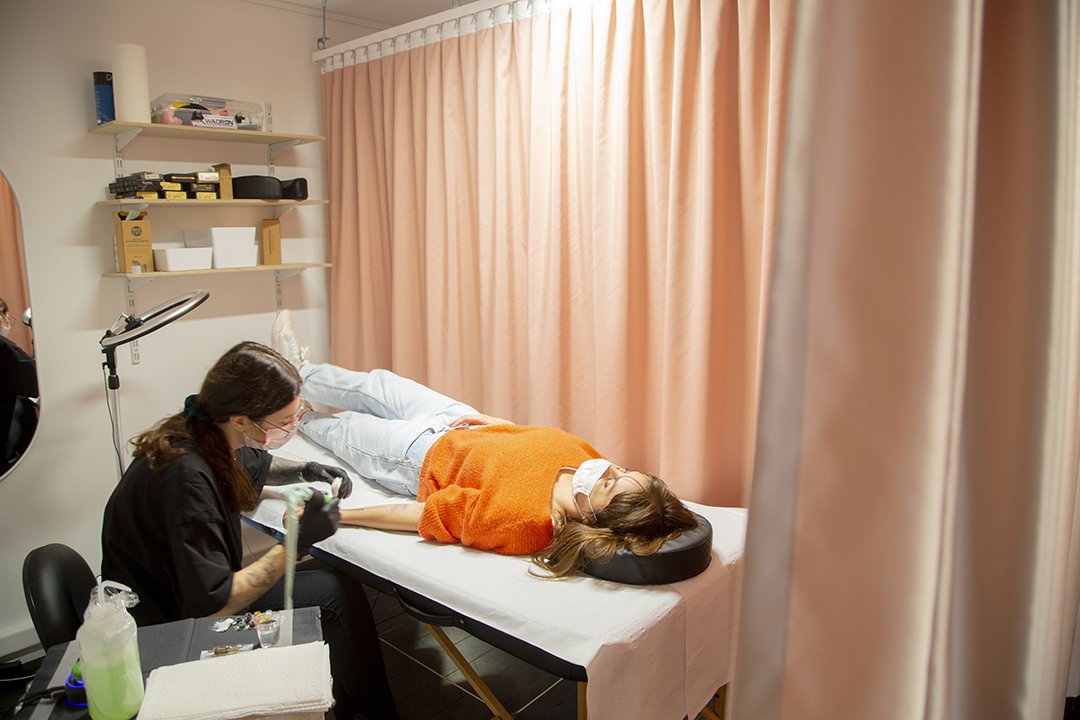
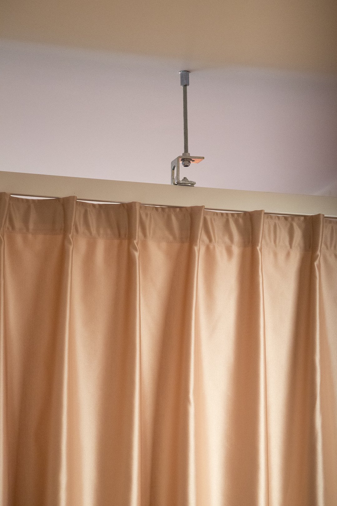

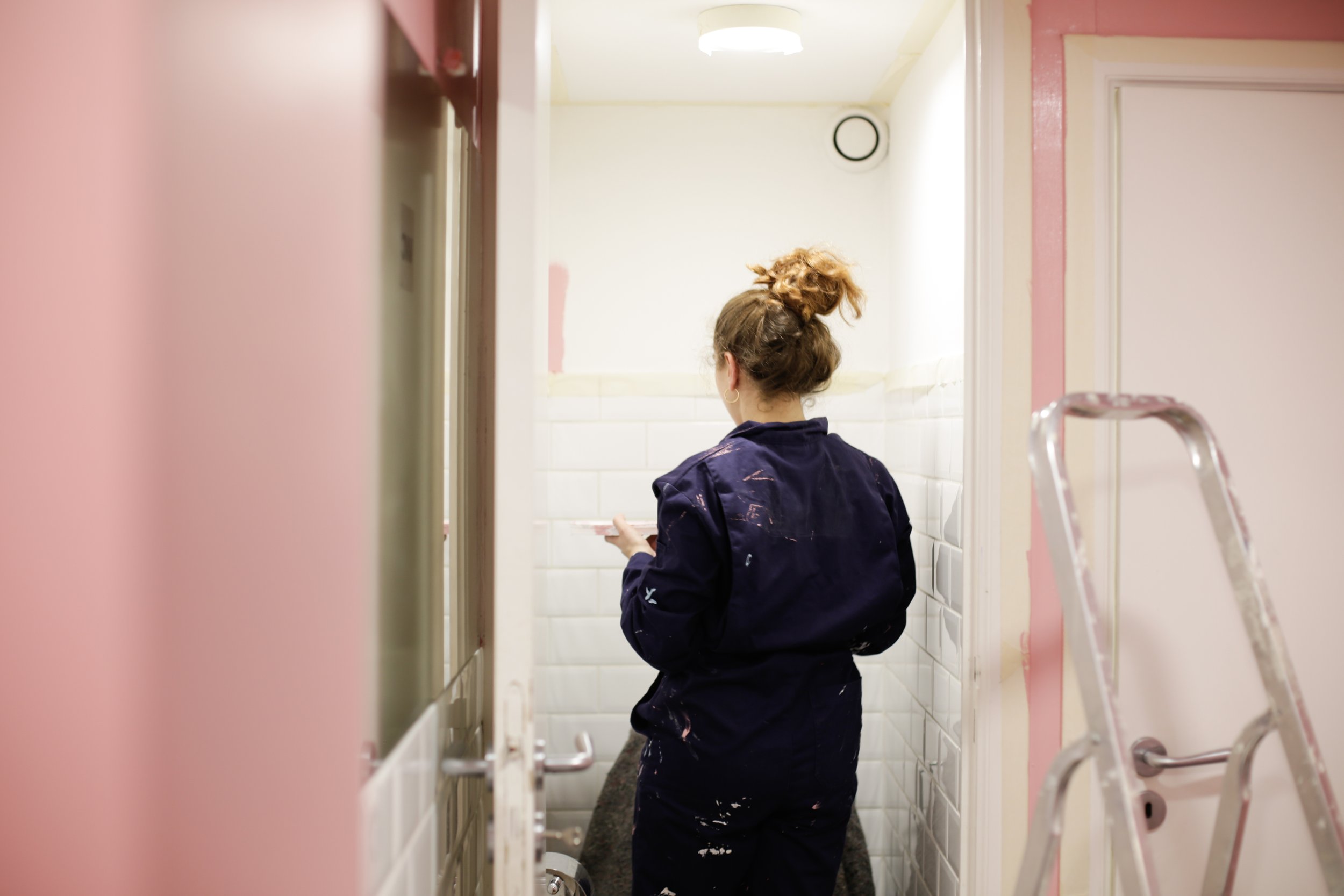
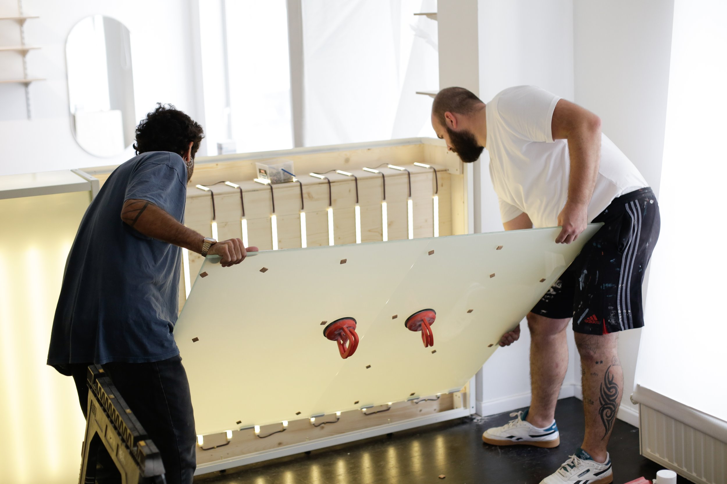
Pics and video by Joe Khoury Studio


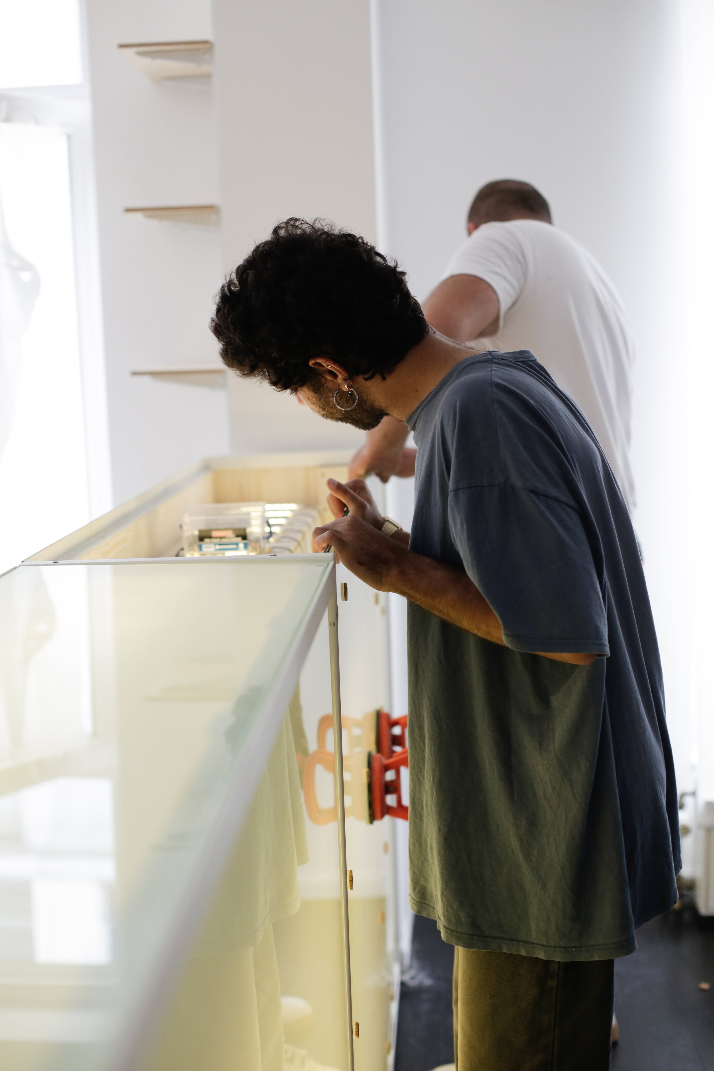
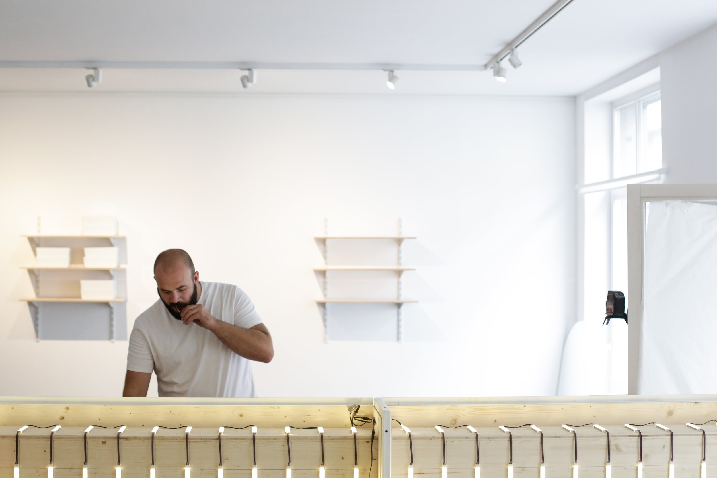
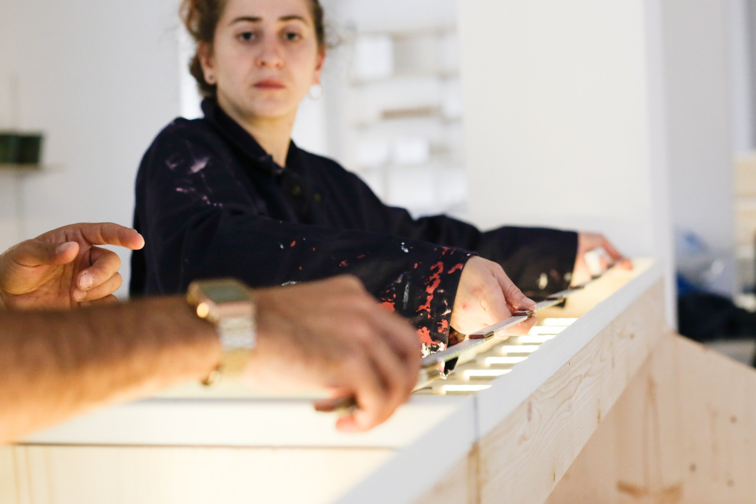
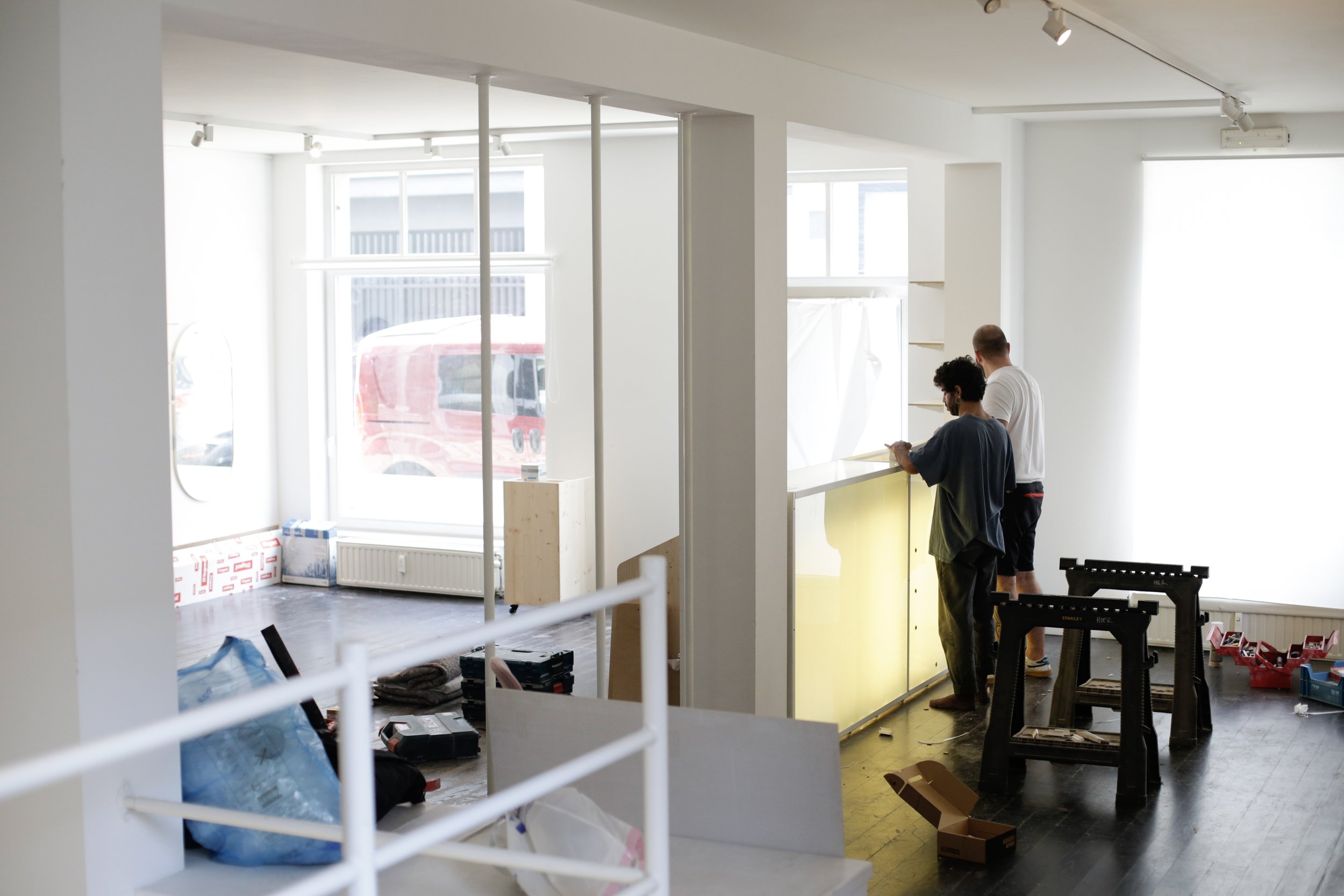

Route de la Laine - Mouscron
Branding Mouscron, branding the wool road, the new road.
Weaving the story of the city with a blue thread of wool. Hier an exciting 1700sqm journey, with two amazing illustrators: Hedi Baka and Wenc.
Branding Mouscron, branding the wool road, the new road.
Weaving the story of the city with a blue thread of wool. Hier an exciting 1700sqm journey, with two amazing illustrators: Hedi Baka and Wenc.
And an incredible set of hands @cocolaurens @bks_ttt @oresto_paobar @dzi_smooth @beata_kwasnica @anais_neo @colombine____


Project powered by Colora Zaventem
So happy and proud with this collaboration.
And if you drive by Moumou, slow down, and dive in the colours.
Video by Jules Cesure, the only one.
Extra thanks to Vedett for the daily fuel


ACE
While the main sign is composed of floating letters slightly offset from the facade surface, the secondary signage uses the same material, brass, as a sheet, more like three of them spreading along the grid of the elevation, caressing the entrance of the school.

A prime new image for a cool secondary school: a new signage, for a new logo. This project is the fruit of a collaboration with Jihane Chartouni and Mohammad Hosso on graphic branding.
HIER designed, produced and installed, the physical manifestation of this new colourful logo: a brass signage, monochromatic, putting forward the geometry of the new logo, its elegance, and juxtaposing it with the sobriety of the architectural standing of the facade.


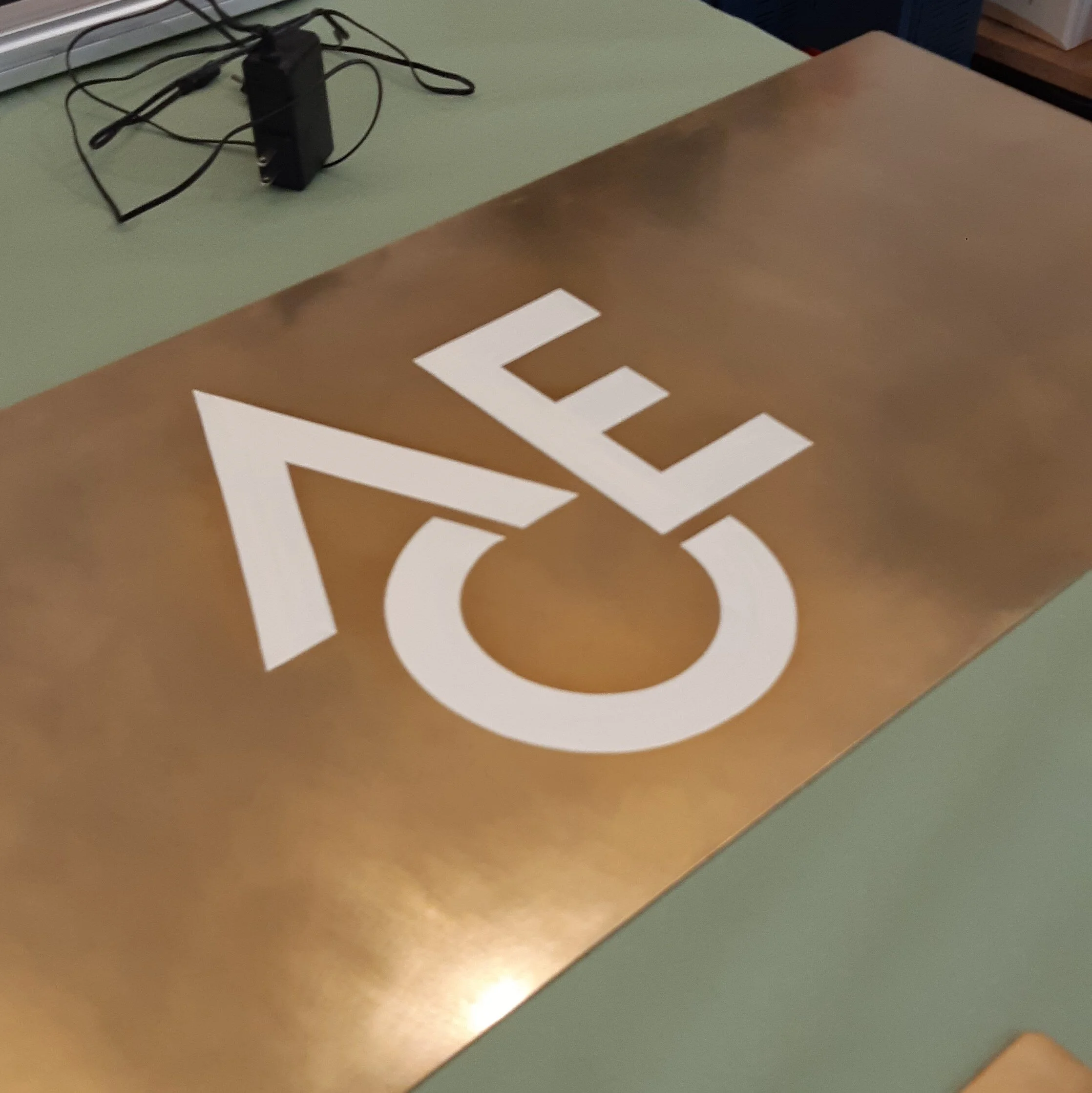

While the main sign is composed of floating letters slightly offset from the facade surface, the secondary signage uses the same material, brass, as a sheet, more like three of them spreading along the grid of the elevation, caressing the entrance of the school, and hand painted by our recurrent collaborator Maks Signs. Brass is a material that evolves with time, matures, grows a patina of time.


Send you children there >>> ACE


Inside Stories
A window of windows, of Inside Stories.
One of translation, transcription and essentially transmission.
This scenography, commissioned by MAD Home of Creators, is designed to host a series of fortunate events, from master classes to conferences and workshops.
A window of windows, of Inside Stories.
One of translation, transcription and essentially transmission.
This scenography, commissioned by MAD Home of Creators, is designed to host a series of fortunate events, from master classes to conferences and workshops.
We looked at the theatre as a space of transmission. From theatre to curtain. From a separating curtain to a technical curtain. A curtain of transmission. A frame of transmission. With one lighting element: the red mascot light that we previously conceived for MAD Home of Creators for the pop-up shop 100th Territory.
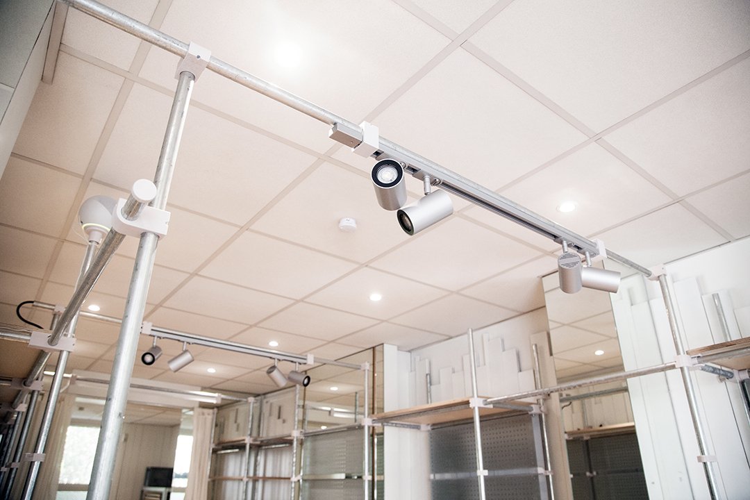
For the structure of the frame, we chose galvanised steel as it ages well, circular tubes for they could be easily assembled with ready-made connectors, reducing production operations.This system allows for reuse and flexibility for other events to come.
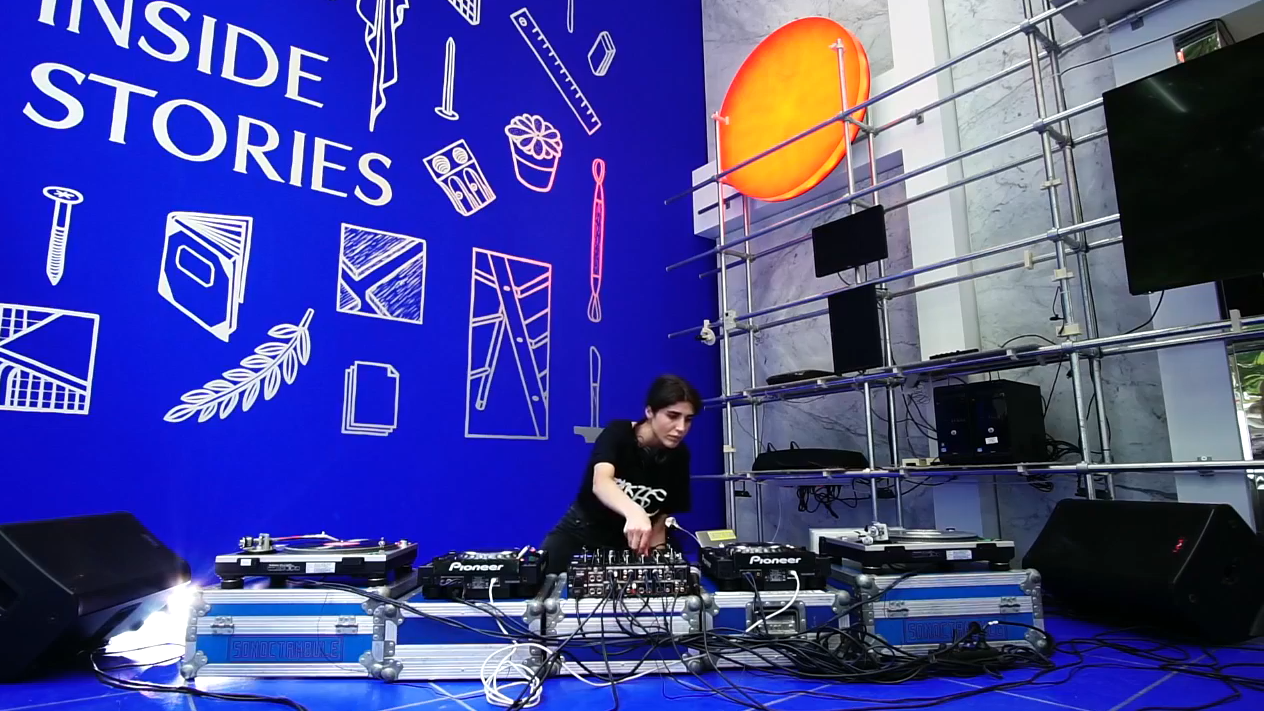
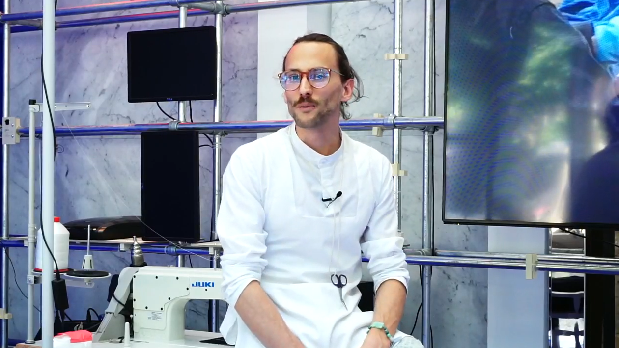
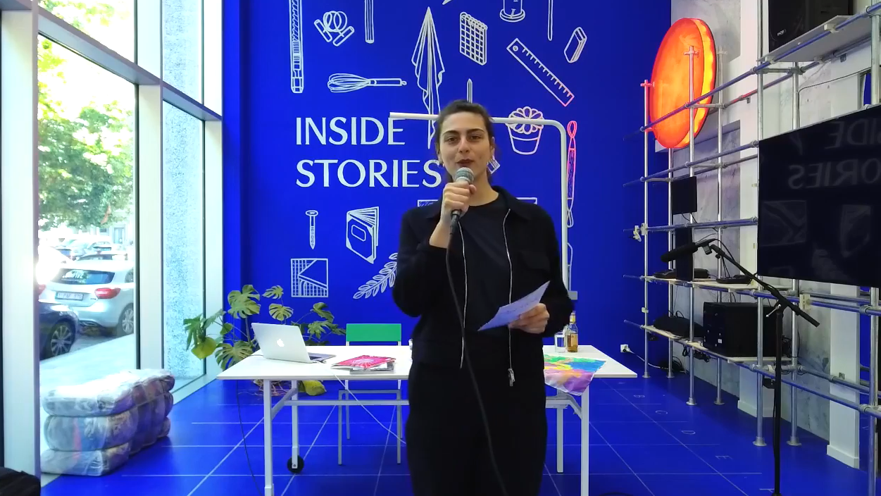
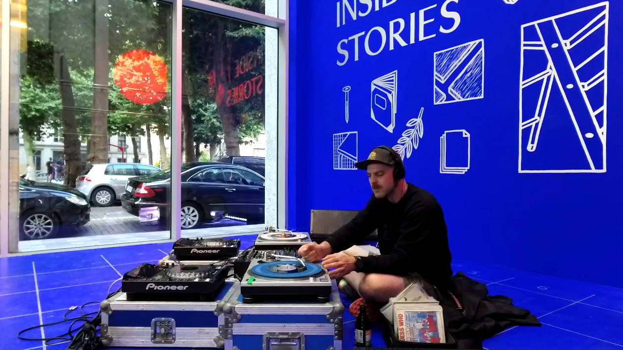
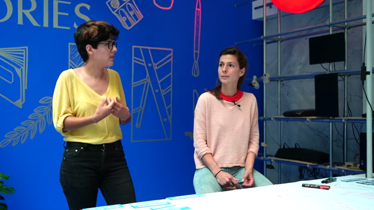
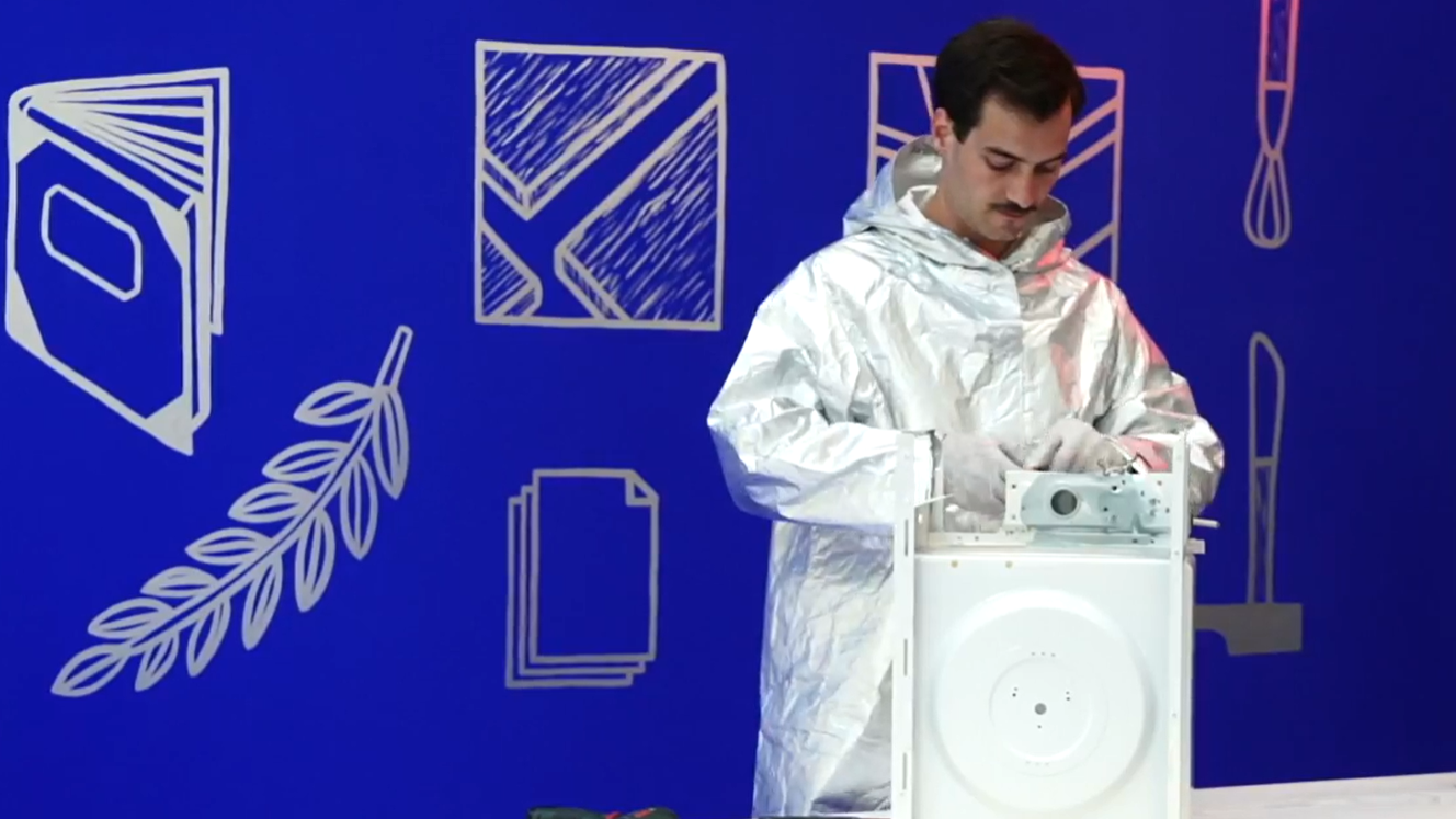
Inside Stories is a system
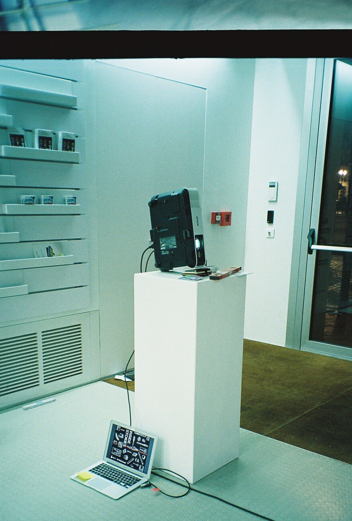
To the frame plug in the different tools of transcription. A camera capturing stills and top view moves, transmitting them on a screen. A tool that transcribes sound into words. A scanner that captures a digital imprint of a print. The content: Sound. Image. And text. All telling, the inside stories behind that window.
These different elements are fixed to the frame via home grown connectors that we customised and 3D printed with PLA, recyclable plastic.
All surfaces of the frame are cut out of material made from heat pressed residues of beer production.
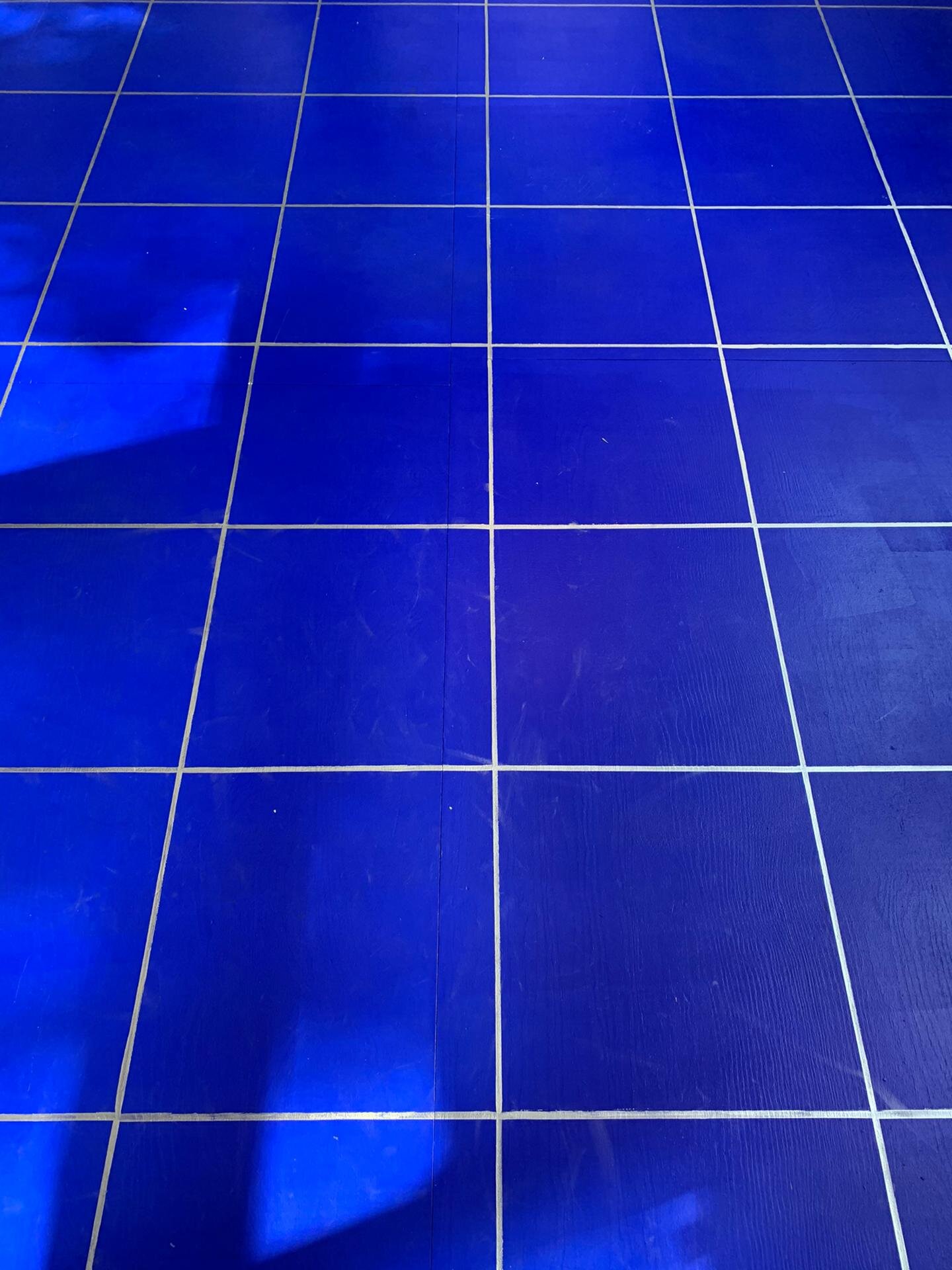
The spatial configuration is defined by an annotated grid hand marked on the floor on which the furniture moves and adapts to the different types of events happening in the window space. The grid on the floor follows the grid of the frame structure.
#WIP
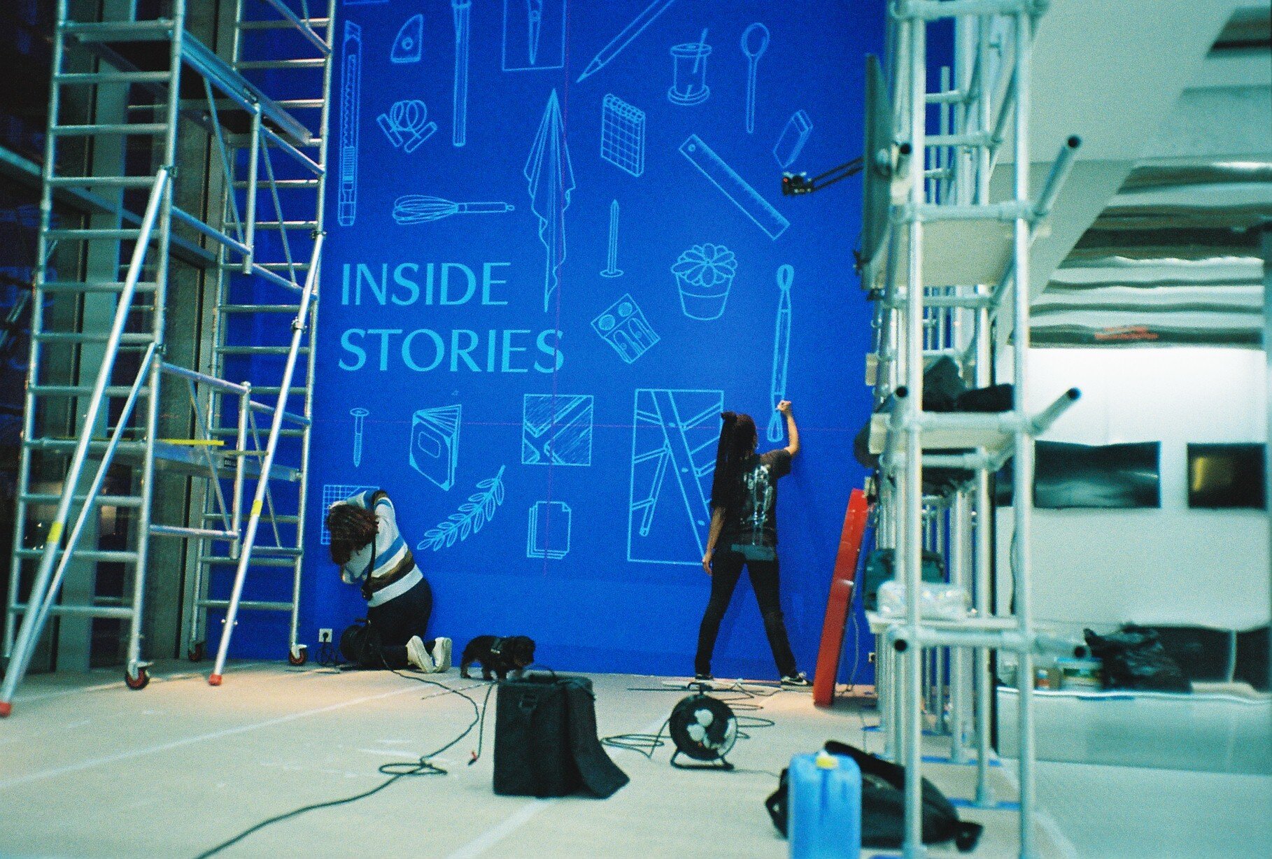
This same grid serves as a ruler for the wall, allocating spaces for the collaboration with Shayto Badjoko: 20 illustrations translating the theme of Inside Stories, winking at the different participants and the tools that they use.
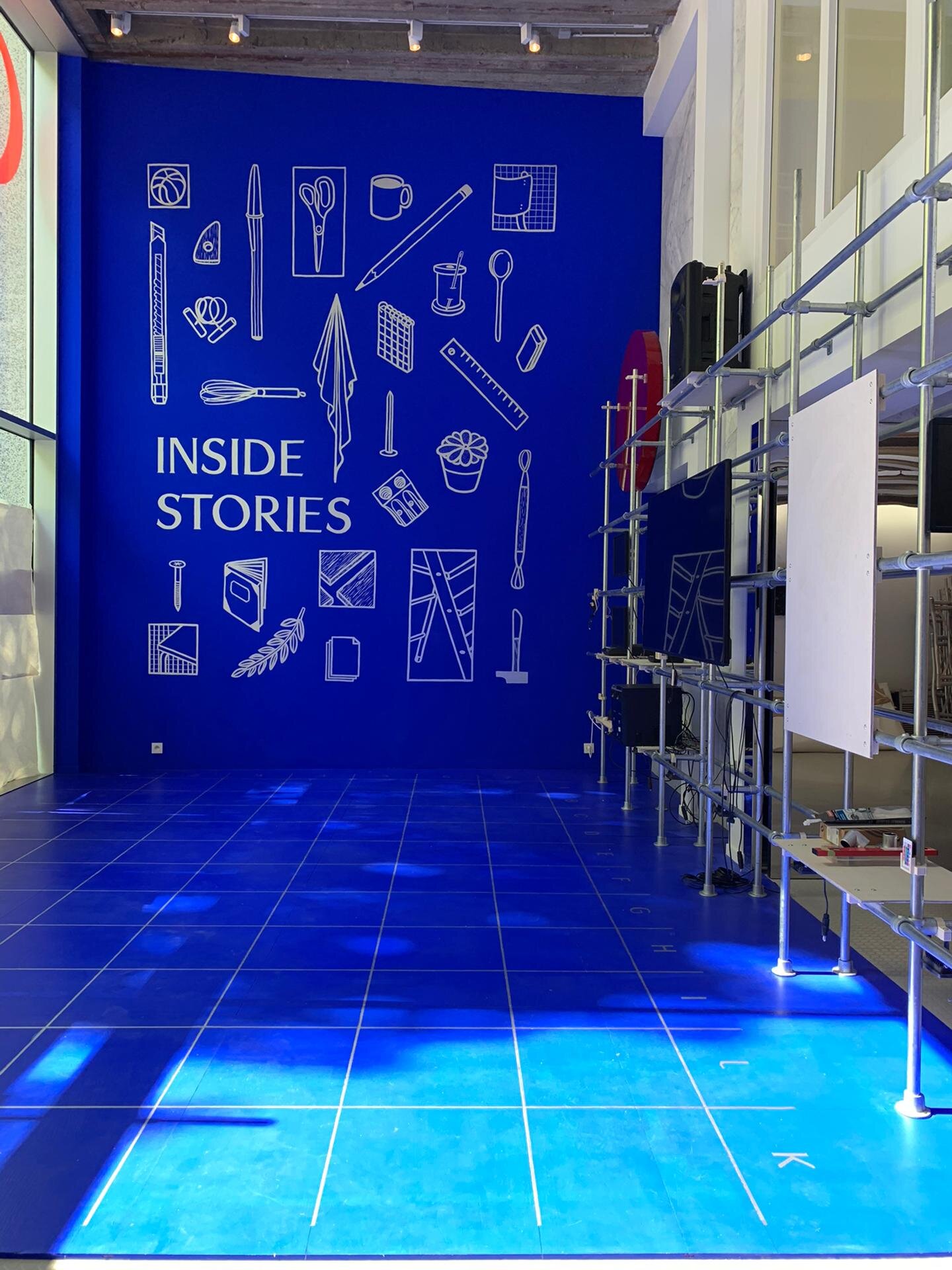
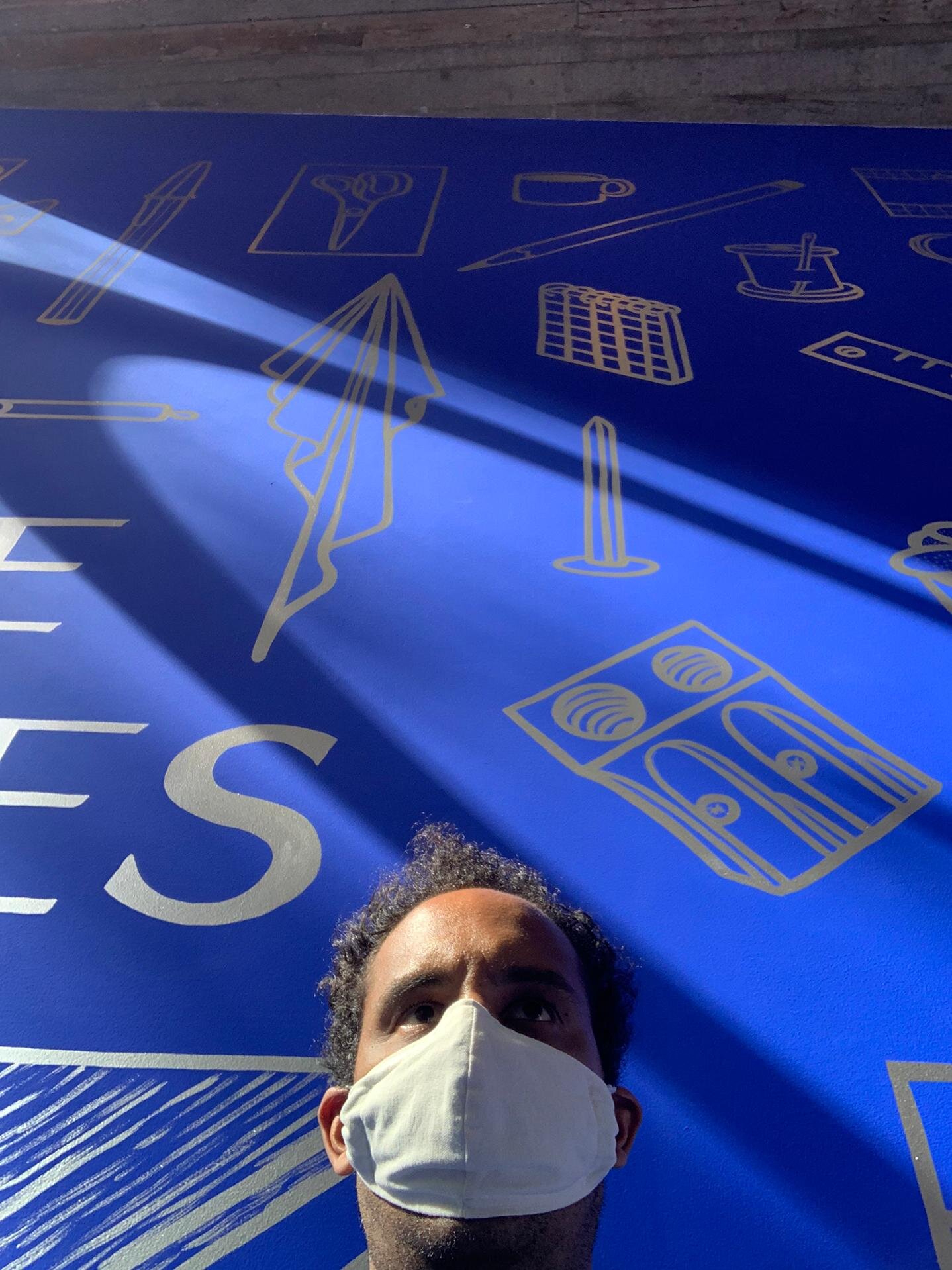
We kept the blue of Bureau Wolewinski from the previous MAD Window for it is a fantastic blue, and we would hate to waste a nicely painted wall. As for the furniture, we used those piling up in MAD’s storage, to put them at work, avoid waste and an extra layer on the storage pile, once the story of Inside Stories is dismantled.
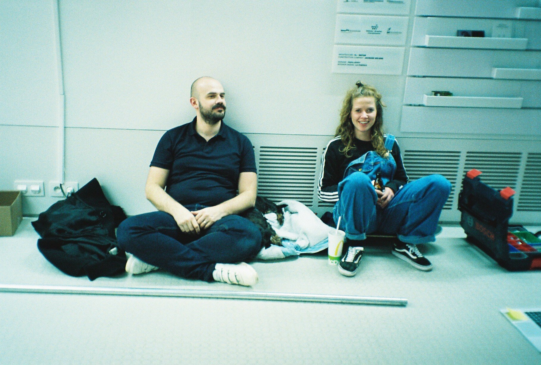
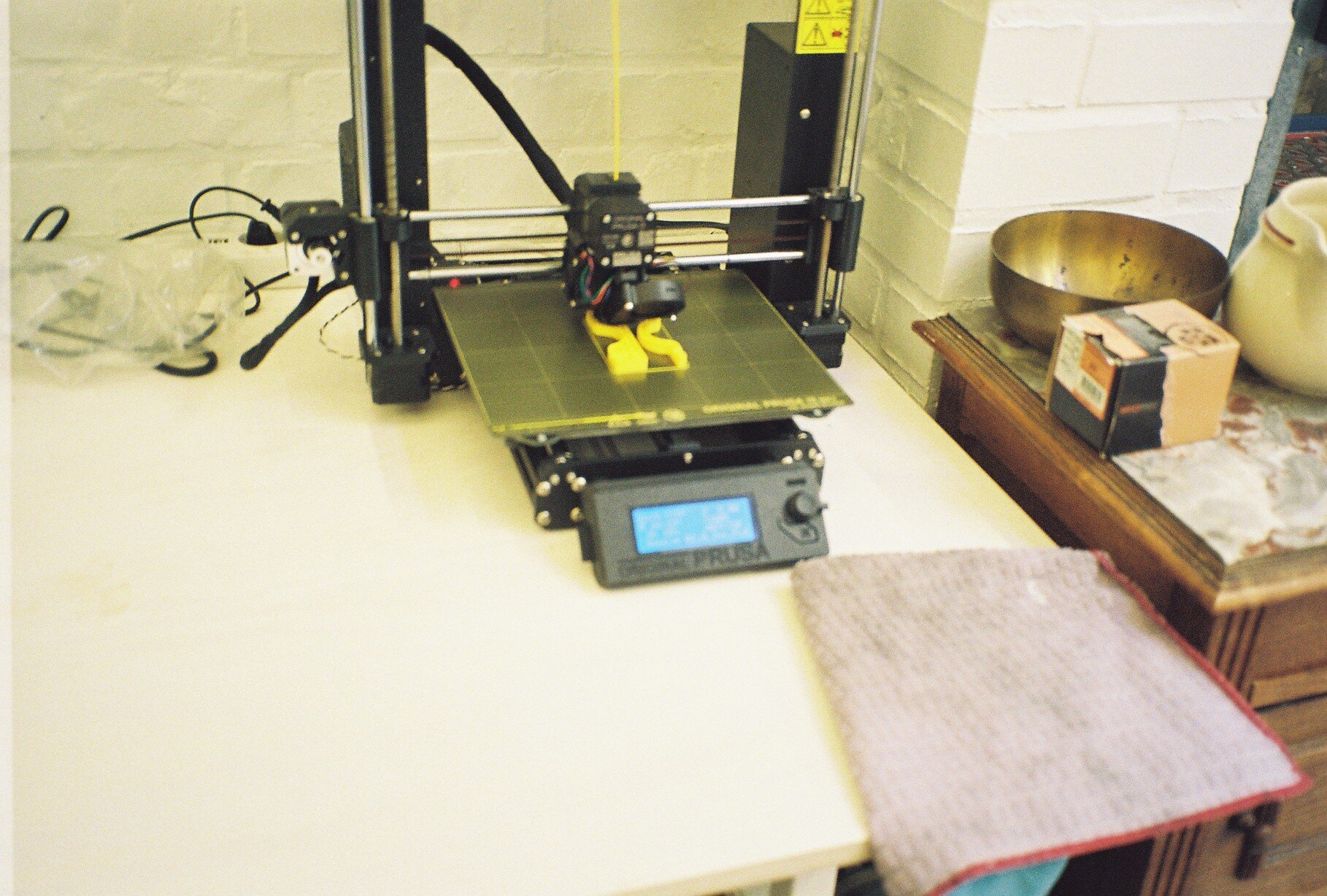
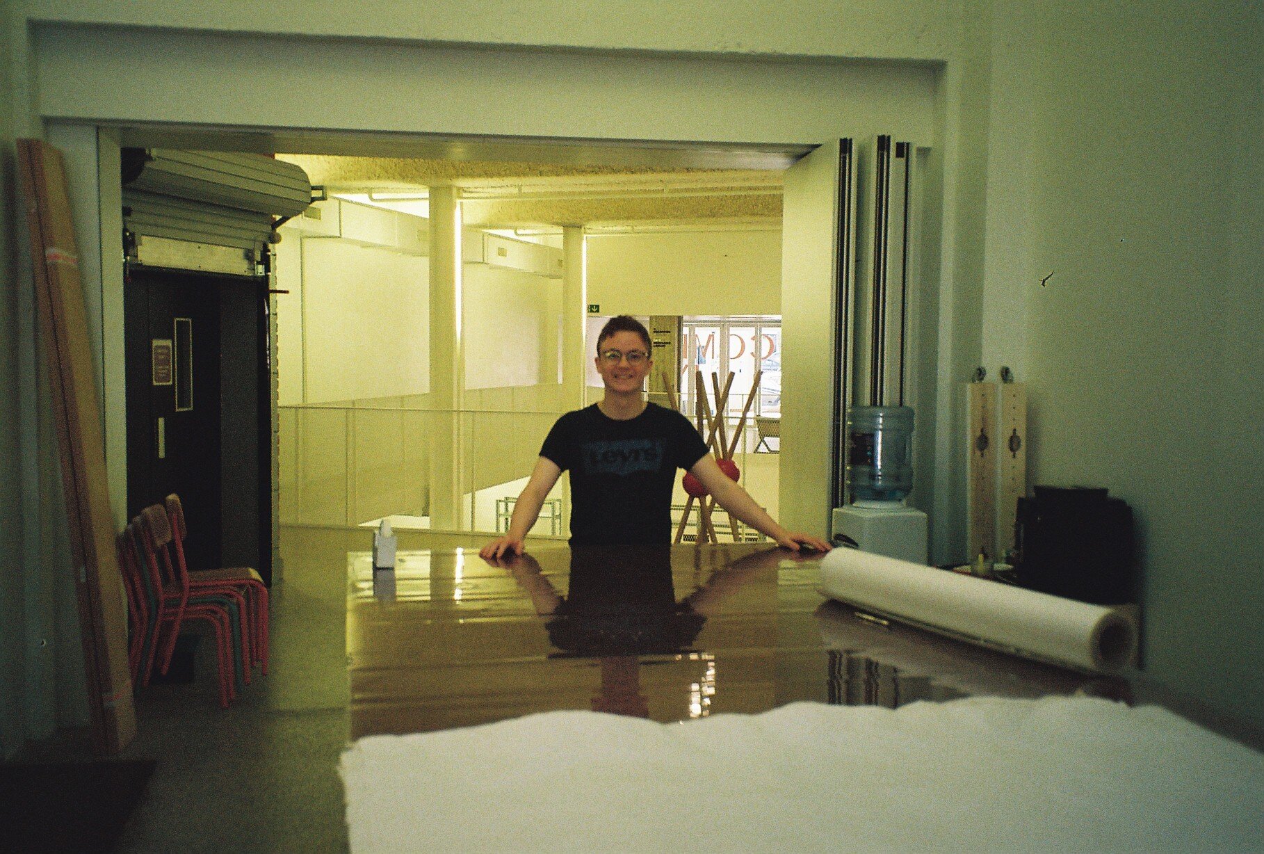
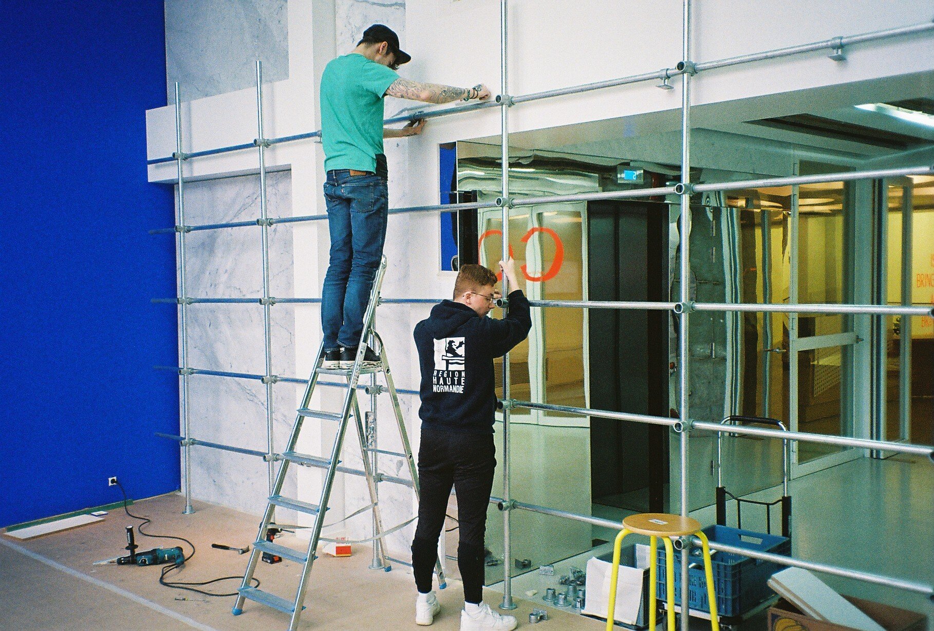
Special thanks to our team. Special thanks to MAD’s team :)
You can replay all the lives, they are here.
Some pictures are from Eline Willaert

Signs 4 hub.brussels
While KOKOTTE is a food incubator, L’Auberge Espagnole is a retail incubator. Both are projects set by HUB Brussels to help businesses test their ideas before investing big. Both are constant spaces, with shops and restaurants varying throughout the year.

A signage for pop-up hosts.
While KOKOTTE is a food incubator, L’Auberge Espagnole is a retail incubator. Both are projects set by HUB Brussels to help businesses test their ideas before investing big. Both are constant spaces, with shops and restaurants varying throughout the year.
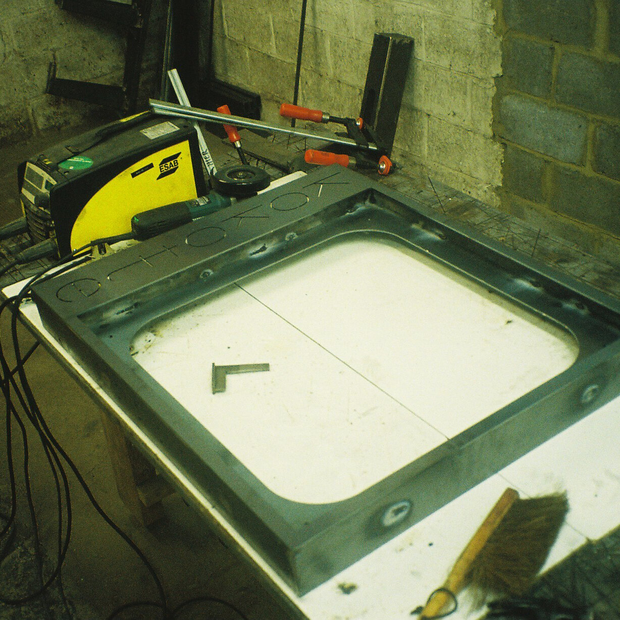
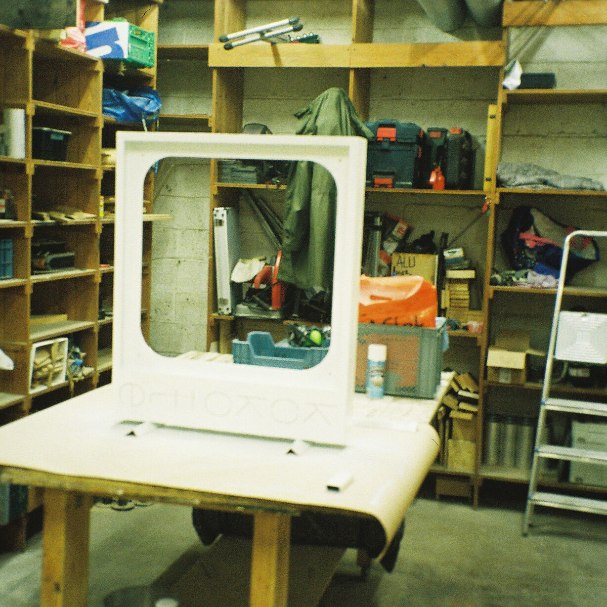
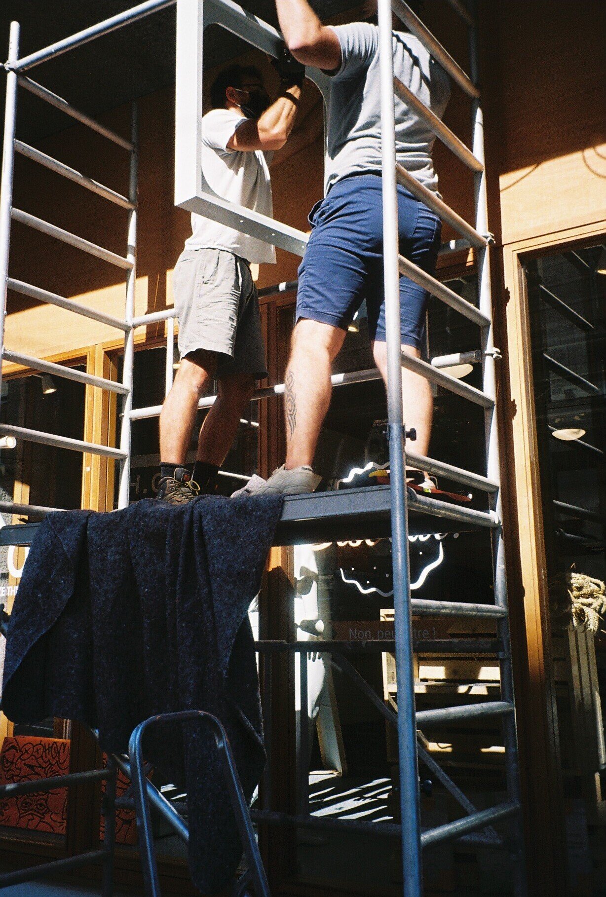
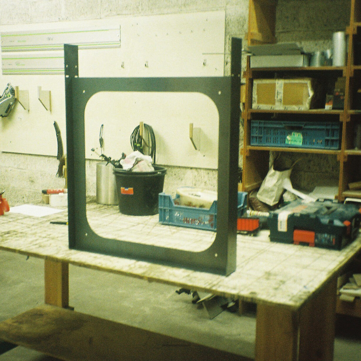
The brief was to design a signage that has integrated lighting and that allows for change, and adapt to every new business. The signage has both a constant part and a variable one. While the white structure always remains, the two surfaces attached to it ever change.


iMAL
In conversation with IMAL's Fablab team and the architect’s plans for the new space, we designed the furniture for Fablab present. All furniture is thought of within a system of pieces that are: easily assembled, thus dismantled and repairable, efficiently reproduced for possible future expansion, and as reusable as possible.
In conversation with IMAL's fablab team and the architect’s plans for the new space, we designed the furniture for fablab present. All furniture is thought of within a system of pieces that are: easily assembled, thus dismantled and repairable, efficiently reproduced for possible future expansion, and as reusable as possible.

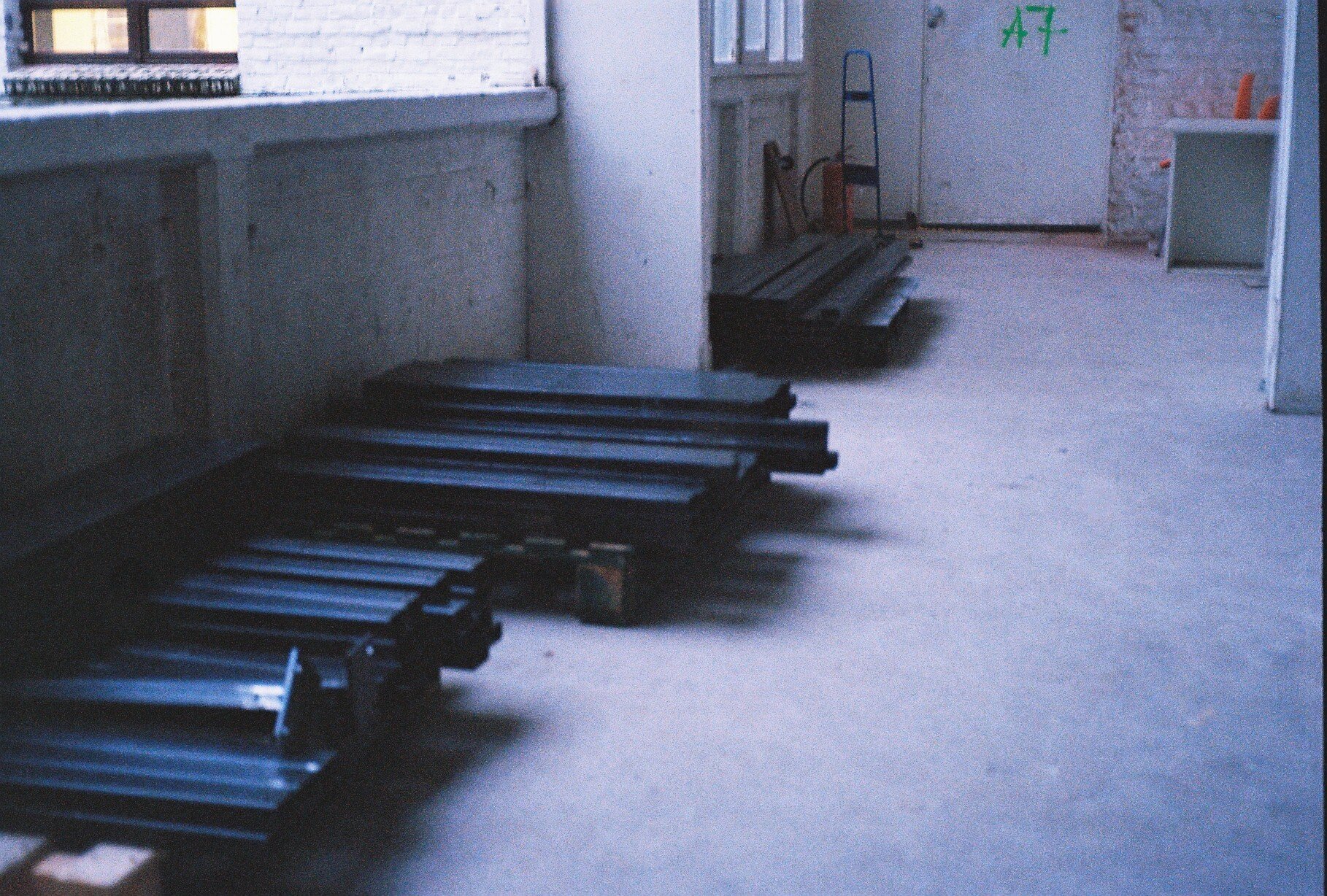
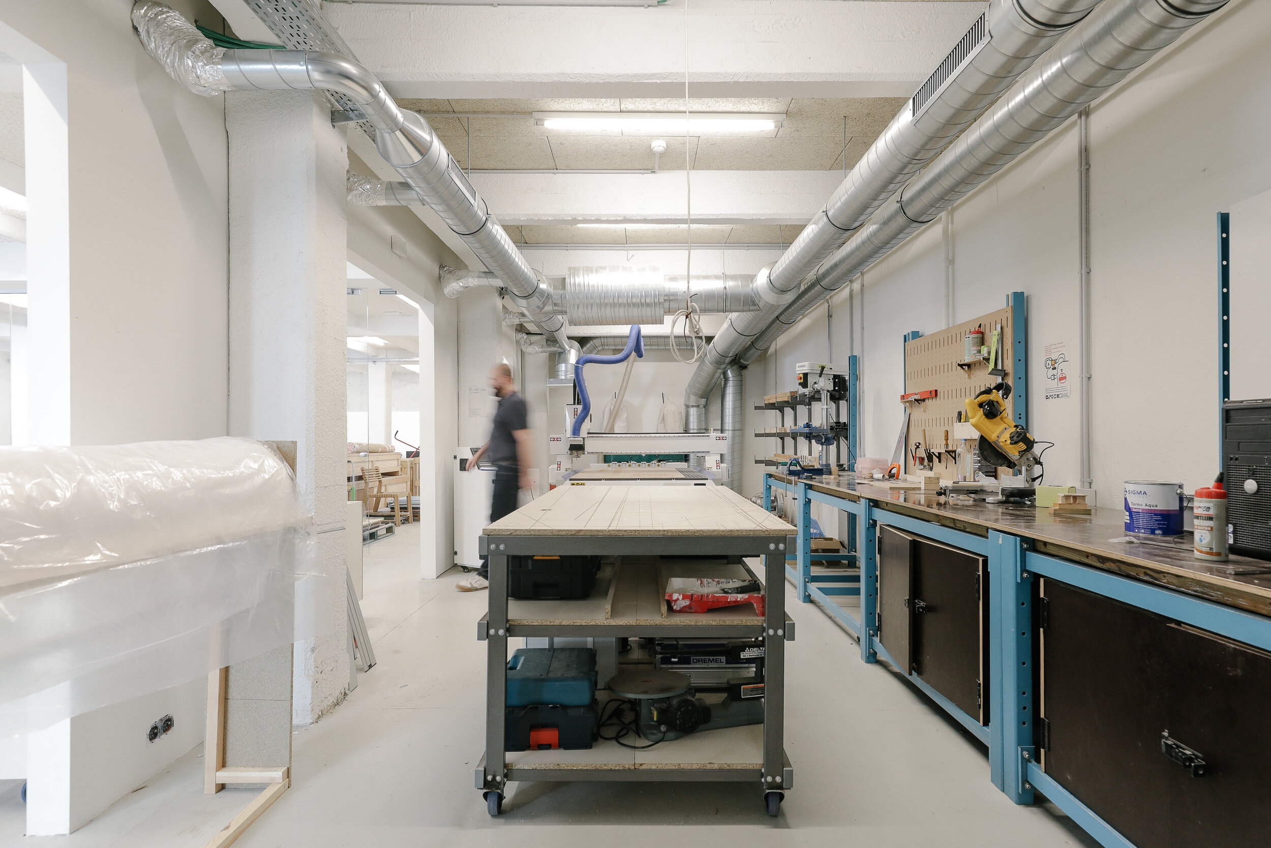
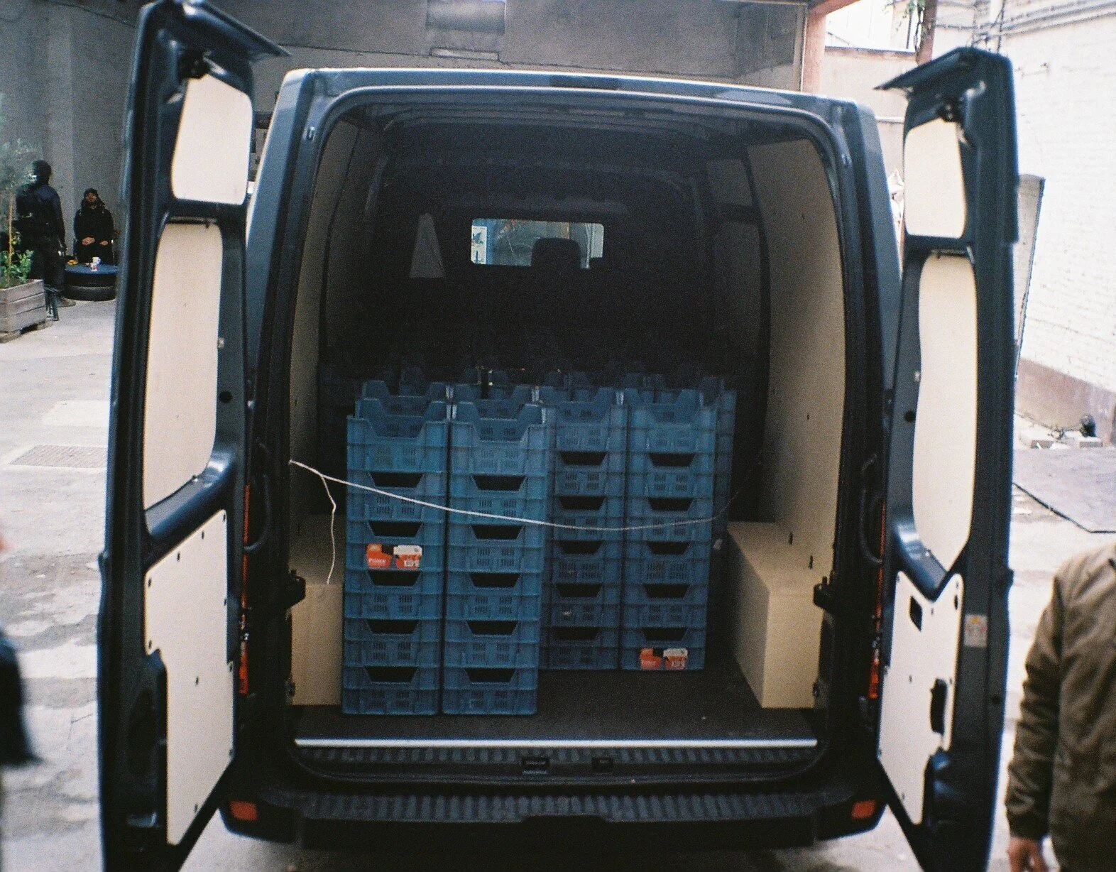
What could be salvaged from past was salvaged: furniture from IMAL’s fablab and all wood surfaces from soon to be dead WTC. The structures are hand painted with a hammered finish. The blue boxes are borrowed from the Mabru Morning Market in Brussels in exchange for a deposit. They might never return there.


Our ingredients:
120m of 40x20x2mm steel rectangular tube.
312m of 60x30x2mm steel rectangular tube.
102m of 20x20x3mm steel corner.
24m of flat 60x5mm steel flat bar. Cut. Pierce. Paint. Add rivets. Assemble.
150sqm of agglomerated reused wood from WTC soon to be dead building. Cut. Structured. Placed.
208 blue plastic crates from the Mabru Morning Market. Paid for caution. Free renewal: Filled with materials and tools. Stored in furniture and on shelves.
97 eurostandard grey plastic crates. Recyclable. Filled with material and tools. Stored in furniture.


To their dishes:
3 counter stations: kitchen area, electronic area, chemistry area, caressing the windows
2 3D work station
1 2D work station
4 mobile working surfaces
1 triple shelving unit
4 double shelving units
High and low shelves with storing plastic crates, blue for the high, grey for the low. The shelves are off-cuts from the work surfaces
Off-cut boxes on wheels made with off-cuts of the wood used for the surfaced


Nice and clean pictures by Eline Willaert
Special thanks to iMal team for the co-construction.
Gregory, Guillaume, Stefan, Xavier, we love you <3


Dear WTC, goodbye and thank you :)


100th Territory
This place is your place. A hundred times.
It is redefined. Limited by walls, and edges.
Dispossessed.
Some even call it a non-territory of the multidisciplinary.

This place is your place. A hundred times.
It is redefined. Limited by walls, and edges. Dispossessed. Some even call it a non-territory of the multidisciplinary.
It is not ours. It is your place.
It used to be Belgium.
Now it travels.
It pops up in Maasmechelen Village. It is powered by MAD.
Pictures and video: © Maasmechelen Village 2019 09/19
Special thanks to L’Ouvroir for the support.


Bar Rodin + Duvel
On the first day there was Duvel. A gift to Bar Rodin they wanted to make.
When HIER began to design the benches and the bars— the courtyard was without straight floor, and it was dark over the night— HIER said: Let there be also light.


On the first day there was Duvel. A gift to Bar Rodin they wanted to make.
When HIER began to design the benches and the bars— the courtyard was without straight floor, and it was dark over the night— HIER said: Let there be also light.
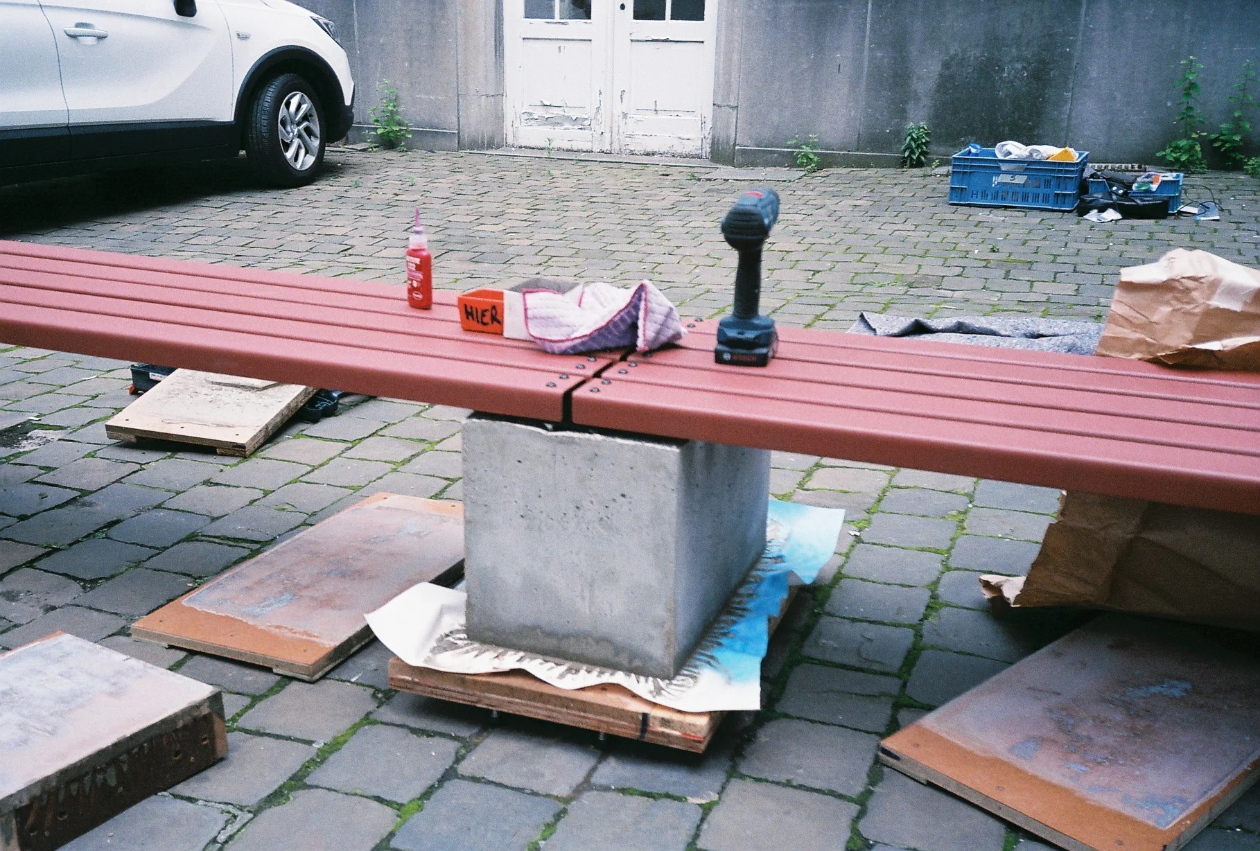
Let there be an aisle of benches leading to the two symmetrical bars on the two sides of the entrance hall.
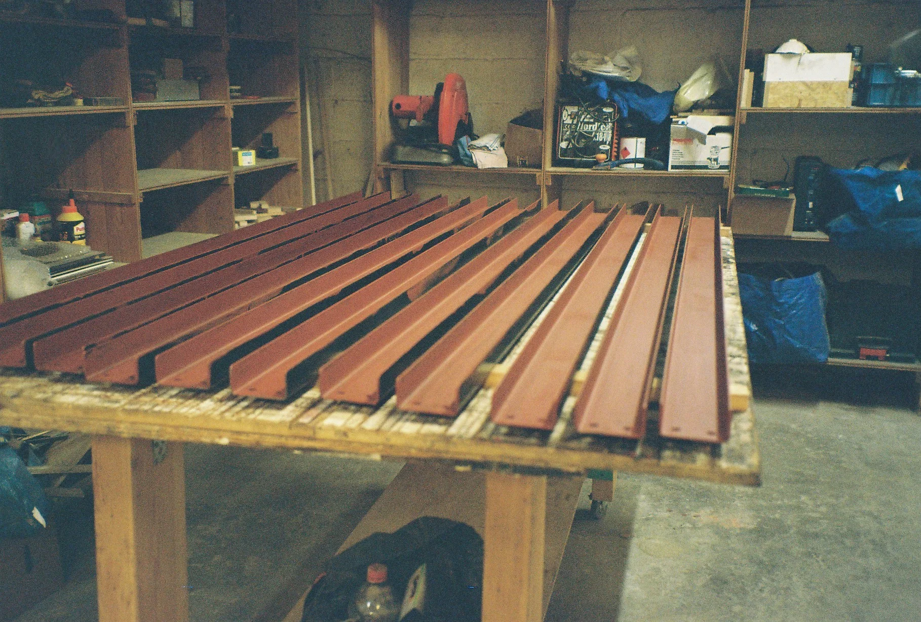
Let the benches be made out of lines, forcing the perspective into the Holy middle. And let those lines rest on stone. Or concrete.
Let the D’s of DUVEL be symmetrical too. With one mirroring the other.
Let them be embossed in the concrete.
Let the concrete be flexible, be smart, and adapt to the levelled floor.
And on the last day, there came people. They celebrated. And stained.
A mark of use.
Some pictures are from Eline Willaert





Antoine architectural finishes
A simple, sample story.
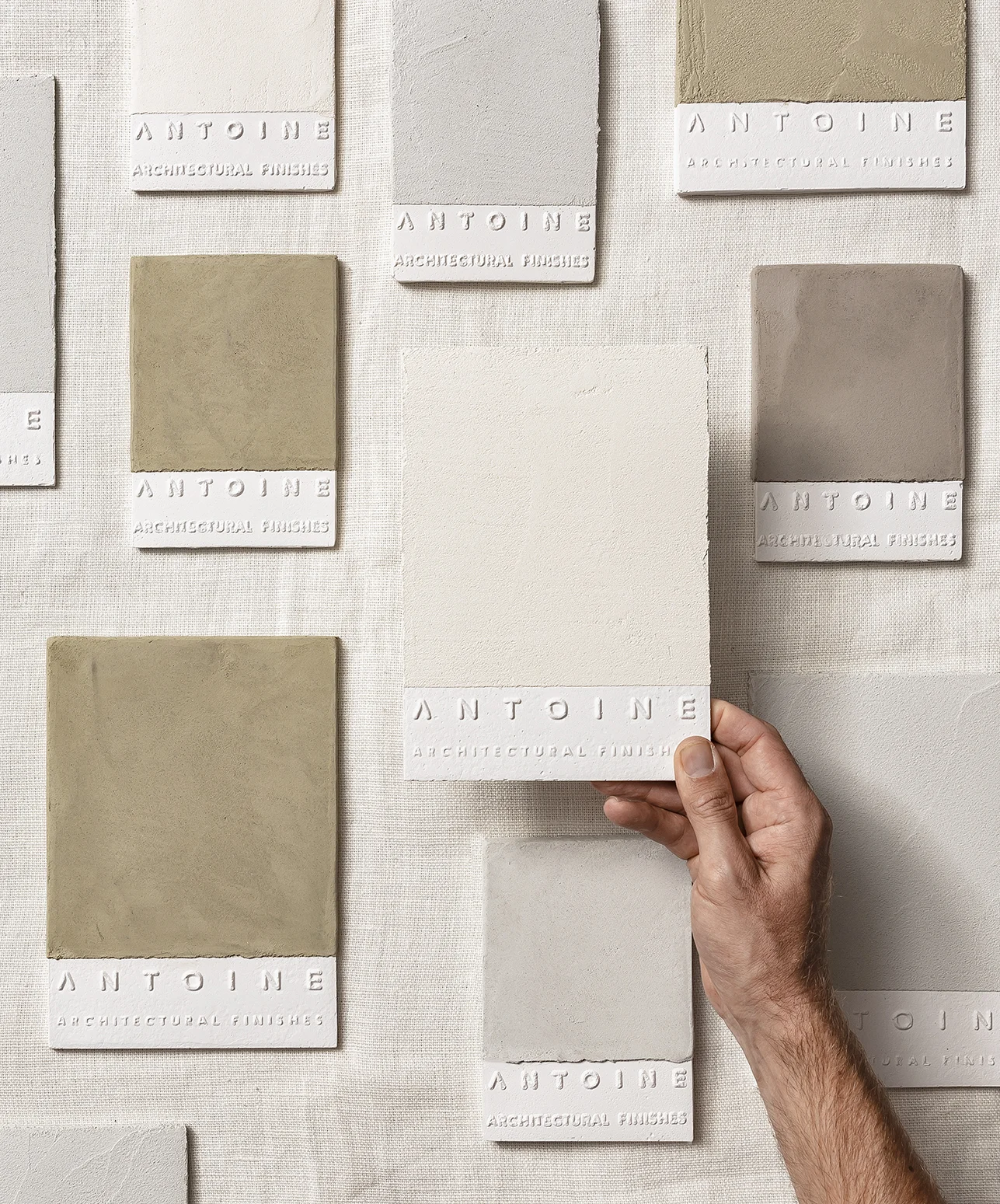
The story of a genuine sample meeting an architect, hoping to be caressed, kept, and then maybe chosen.

A simple, sample story.
The story of a genuine sample meeting an architect, hoping to be caressed, kept, and then maybe chosen.
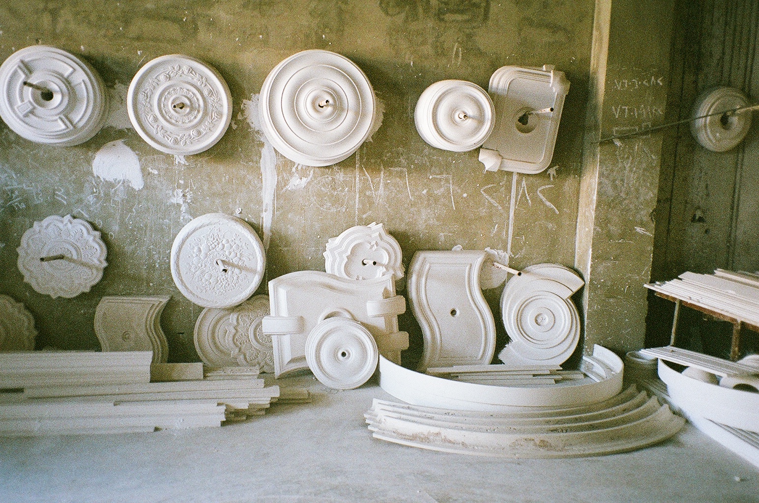
We have spent sometime listening to the brand, to its lean towards the beautiful imperfections; to it’s raw/natural story, its textures, and wanted to reflect it in a simple sample that is different from others, and would attract and be kept by an architect who receives un-storable amounts of samples. A sample that is genuine, and therefore out of plaster, lightweight, imperfect, covered then with natural paint, Antoine's architectural finish. The sample has Antoine’s name embossed from its surface, waiting to be felt with the run of the fingers, poetic to the touch, just like Antoine's textures.
Collaboration with Joost Vanhecke
Photos by: Piet Goethals


One line. Two lines. A horizon line.
A library for Antoine. A display of a sample story. For a line of architectural finishes. For Milan design week. In the heart of a collaboration with collective BRUT.
The materials of the library _from dark to light, from heavy to light_ are steel for the structure and plaster coated with an Antoine finish for the shelves, just like the simple samples, only bigger.
The structure, an assembly of two frames, one straight one tilted, allows the samples to be displayed in a vertically tilted position, standing on one shelve while resting on the other.
Photos by: Eline Willaert


Photo by: Alexander Popelier

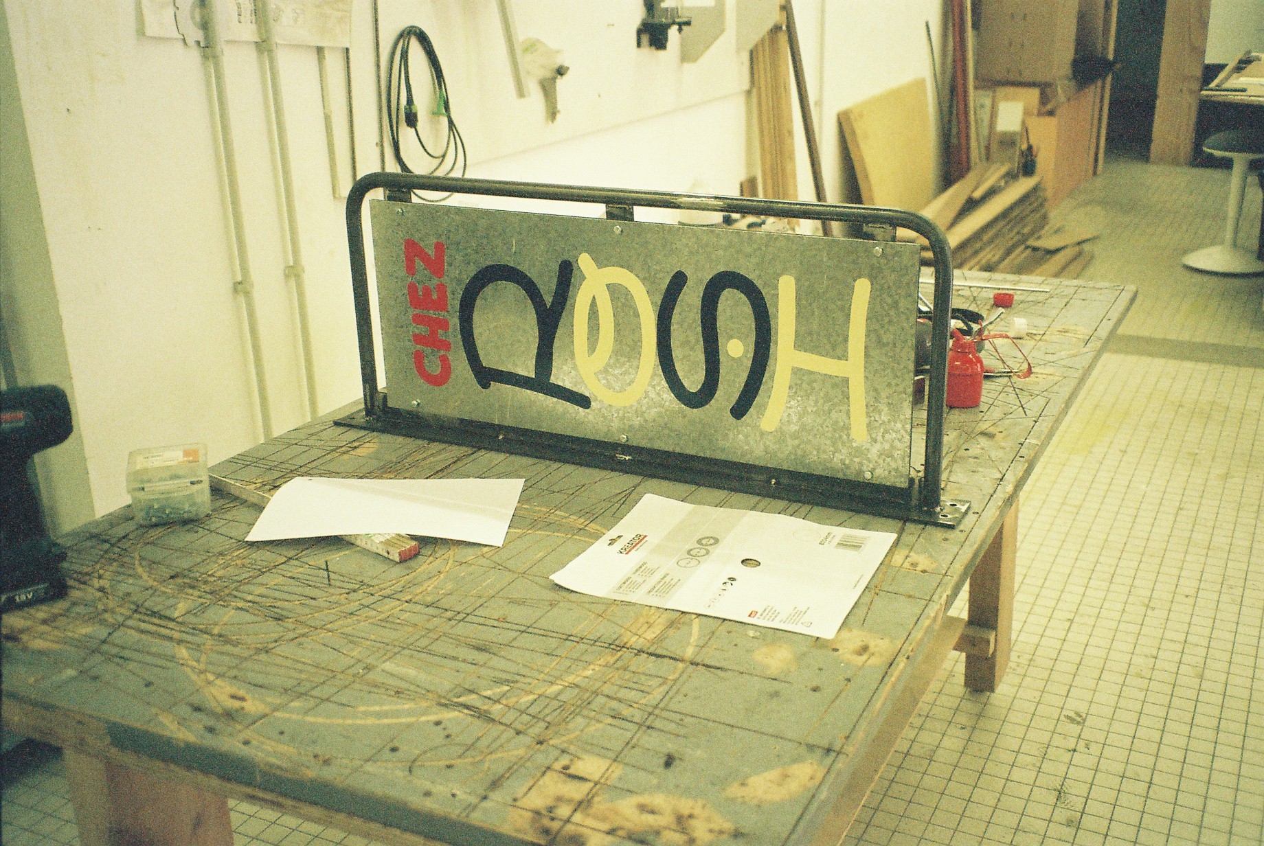
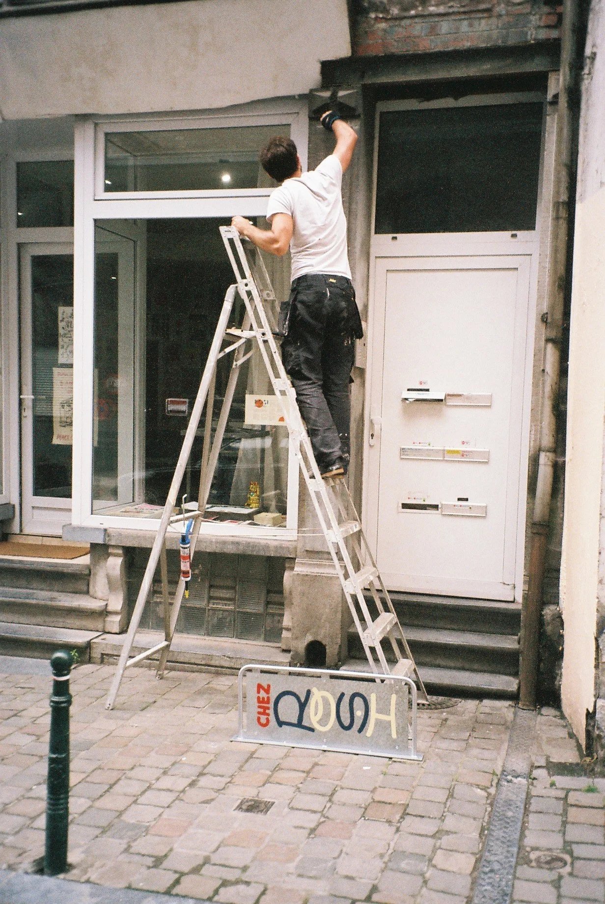
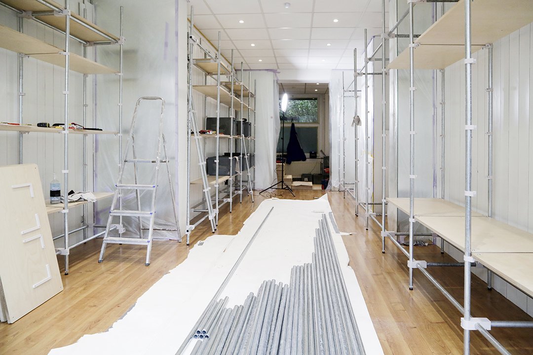
The galvanised era - MAD LAB
MAD LAB, funded by the public sector, is an incubator for young designers in Brussels.
Now, MAD LAB and its residents occupy the 13th and last floor of the highest social housing tower in Rue Haute, Brussels, Belgium, Europe, Earth.

And MAD LAB said: 'Let there be galvanised!'
MAD LAB, funded by the public sector, is an incubator for young designers in Brussels.
Now, MAD LAB and its residents occupy the 13th and last floor of the highest social housing tower in Rue Haute, Brussels, Belgium, Europe, Earth.

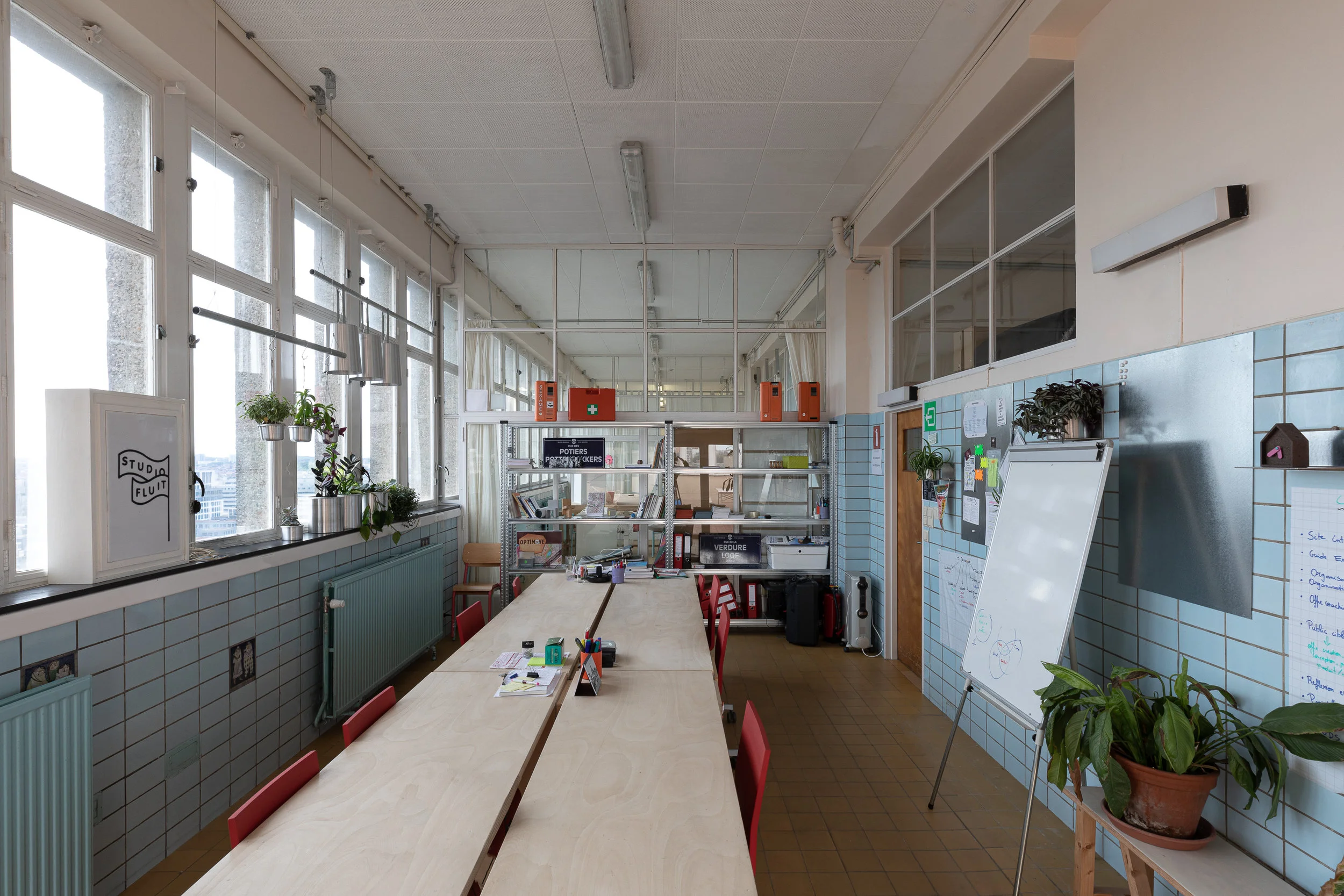
Formerly a daycare for the building, the space is a succession of pool blue tiled studios, separated by glass walls, with windows surrounding from all sides, looking at Brussels.
This floor needed deep cleaning, the holes patching, the studios privacy, and the whole, a touch of non clinical lighting and a spread of green.
MAD LAB had to stamp its presence there. Refurbish while occupying. This new era, marked by the metallic, is referred to as the galvanised era.
Pictures by Eline Willaert




MIKO/MIKO Studio
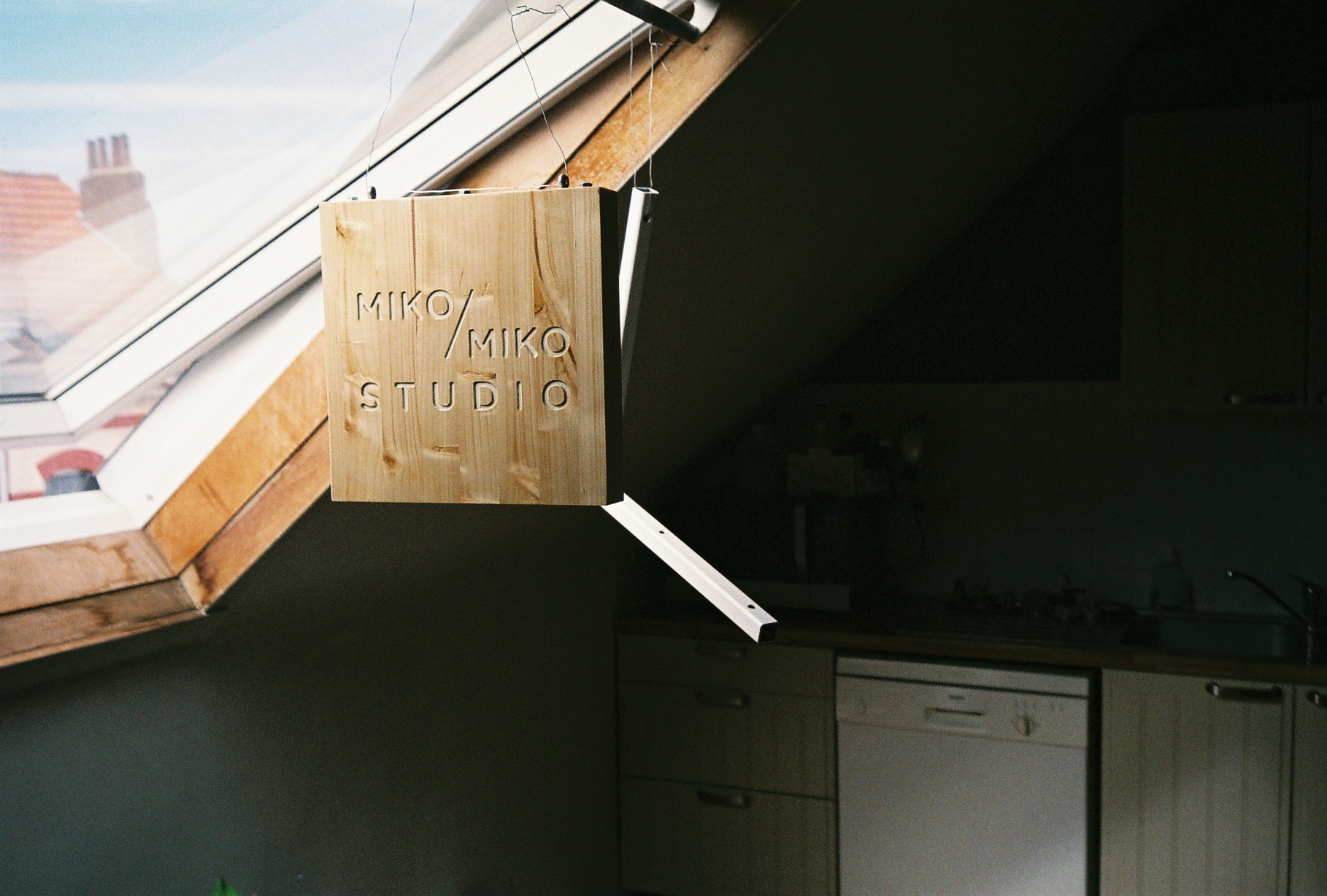
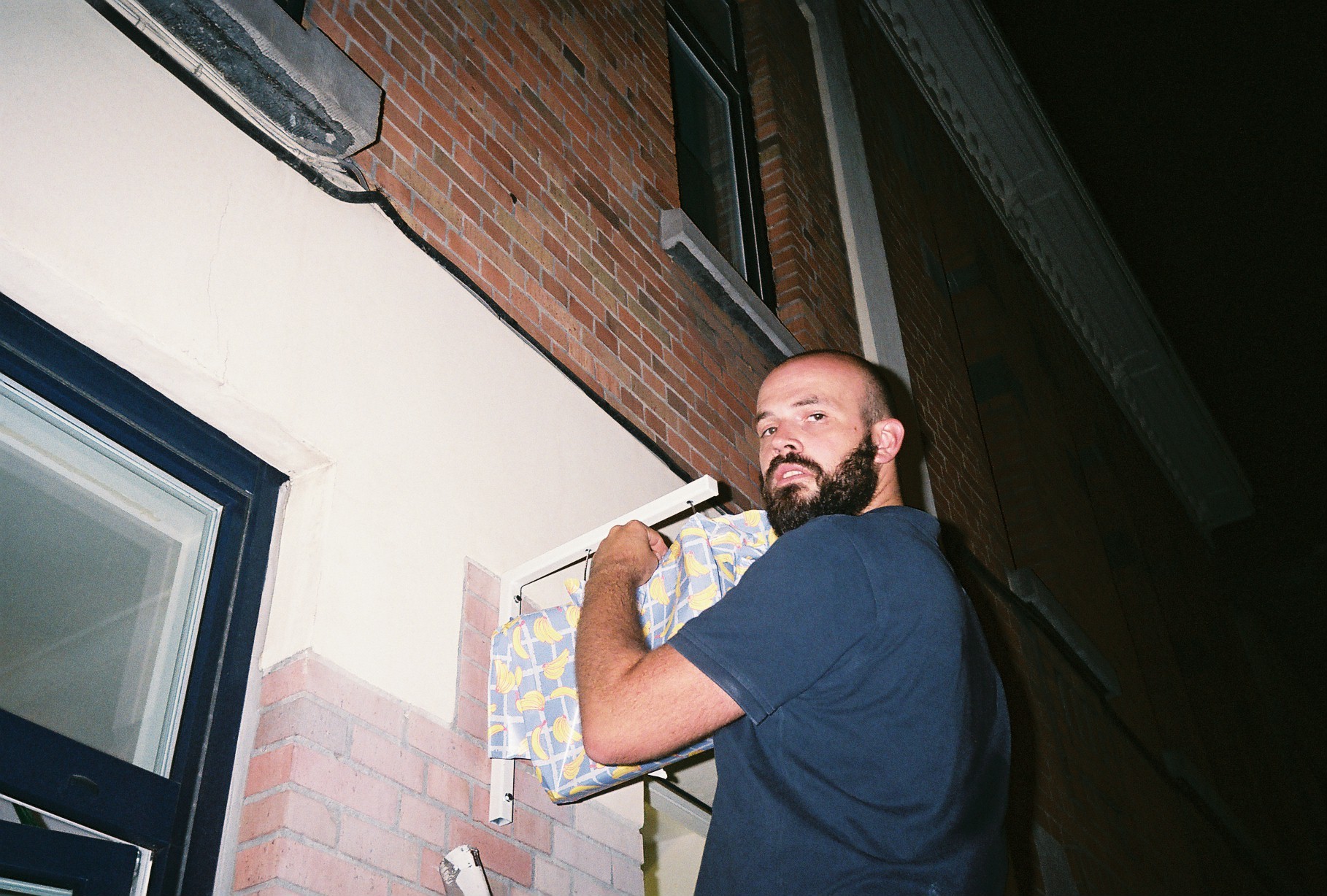
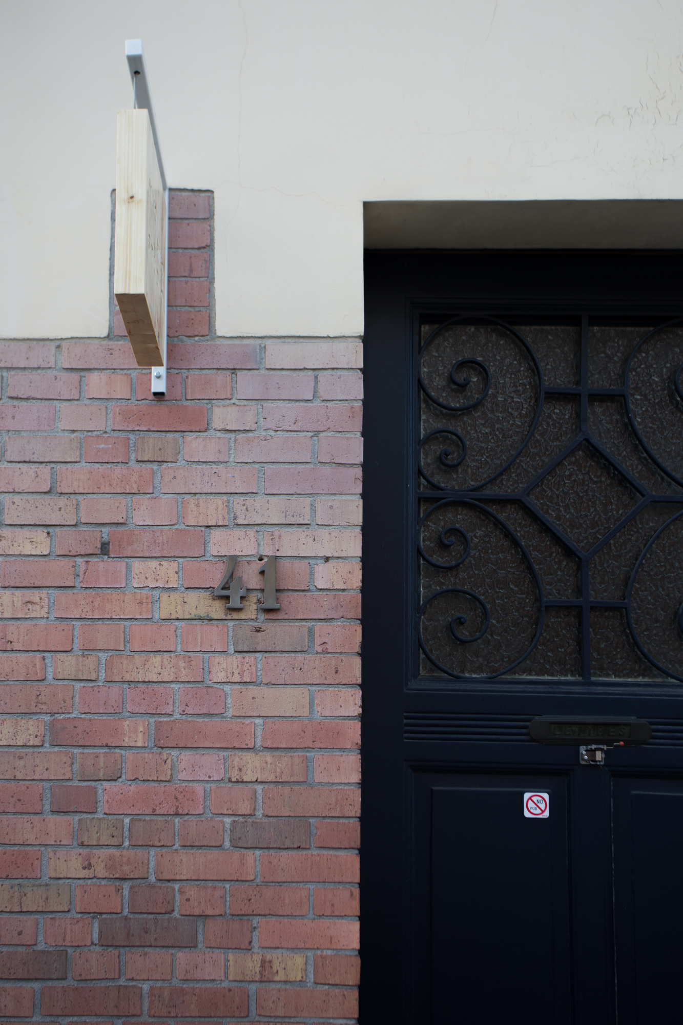
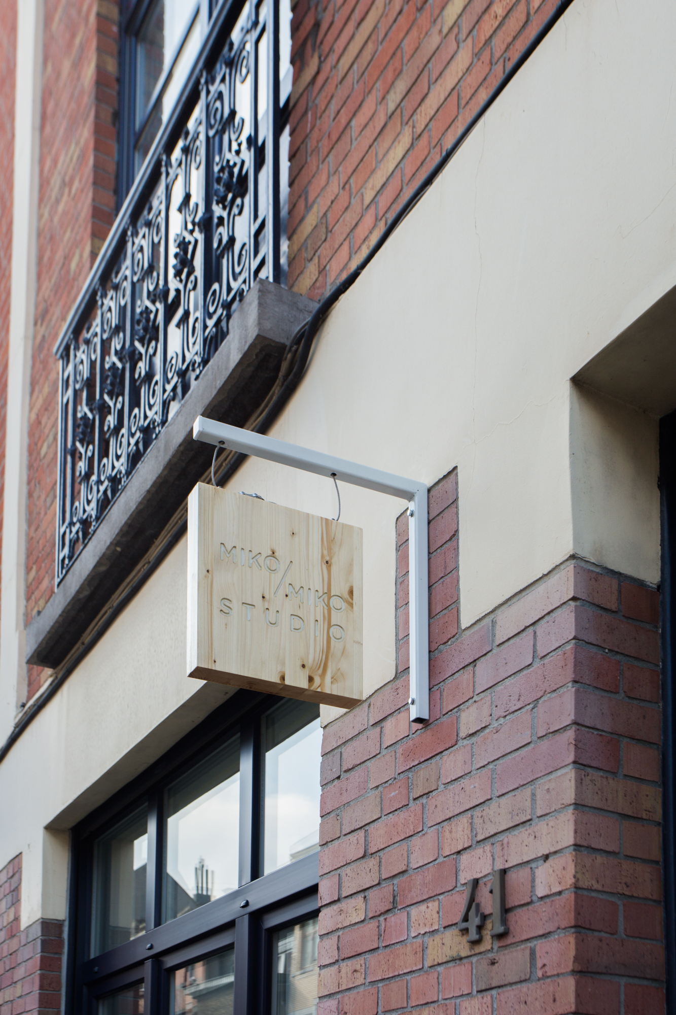
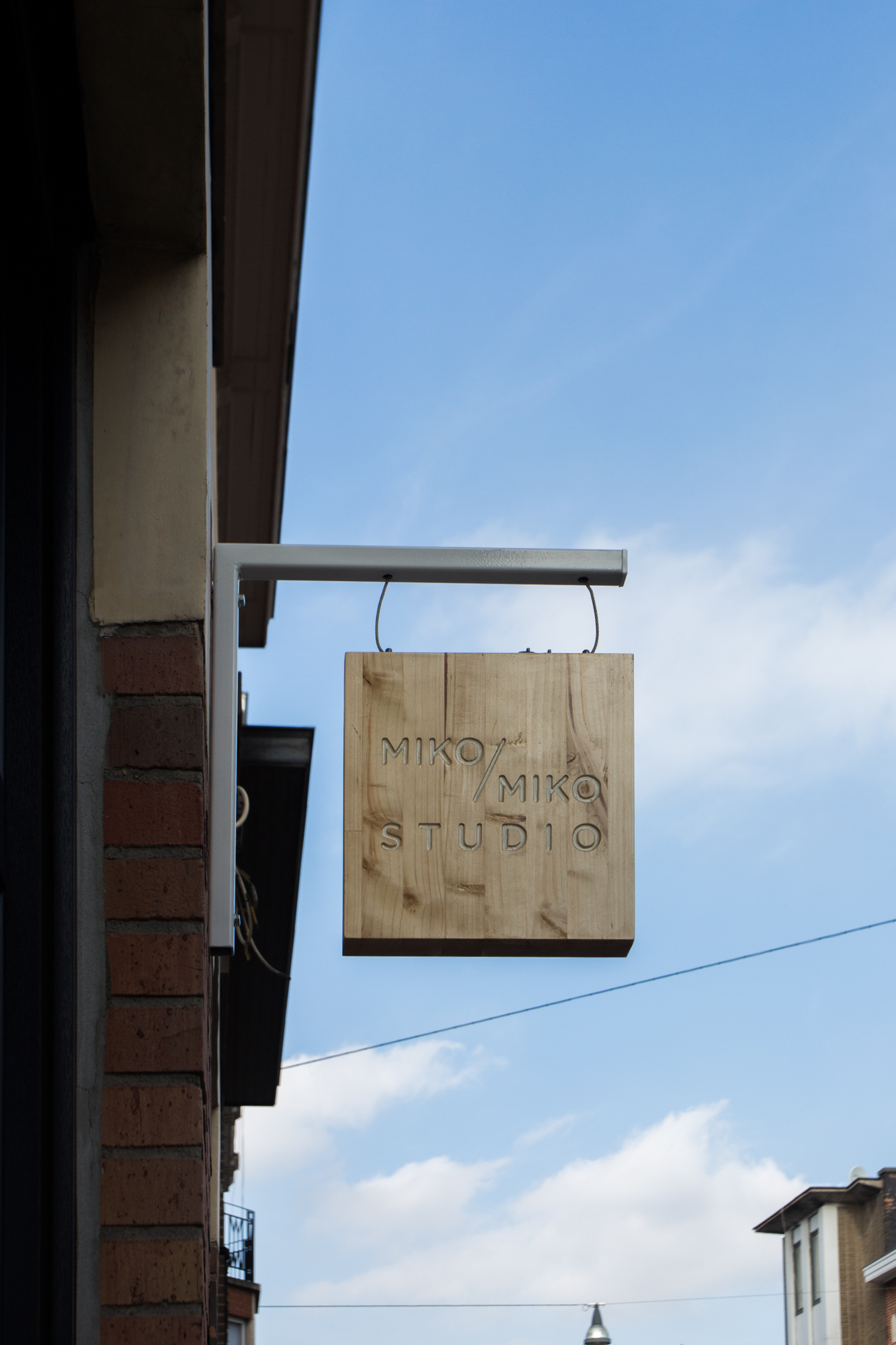
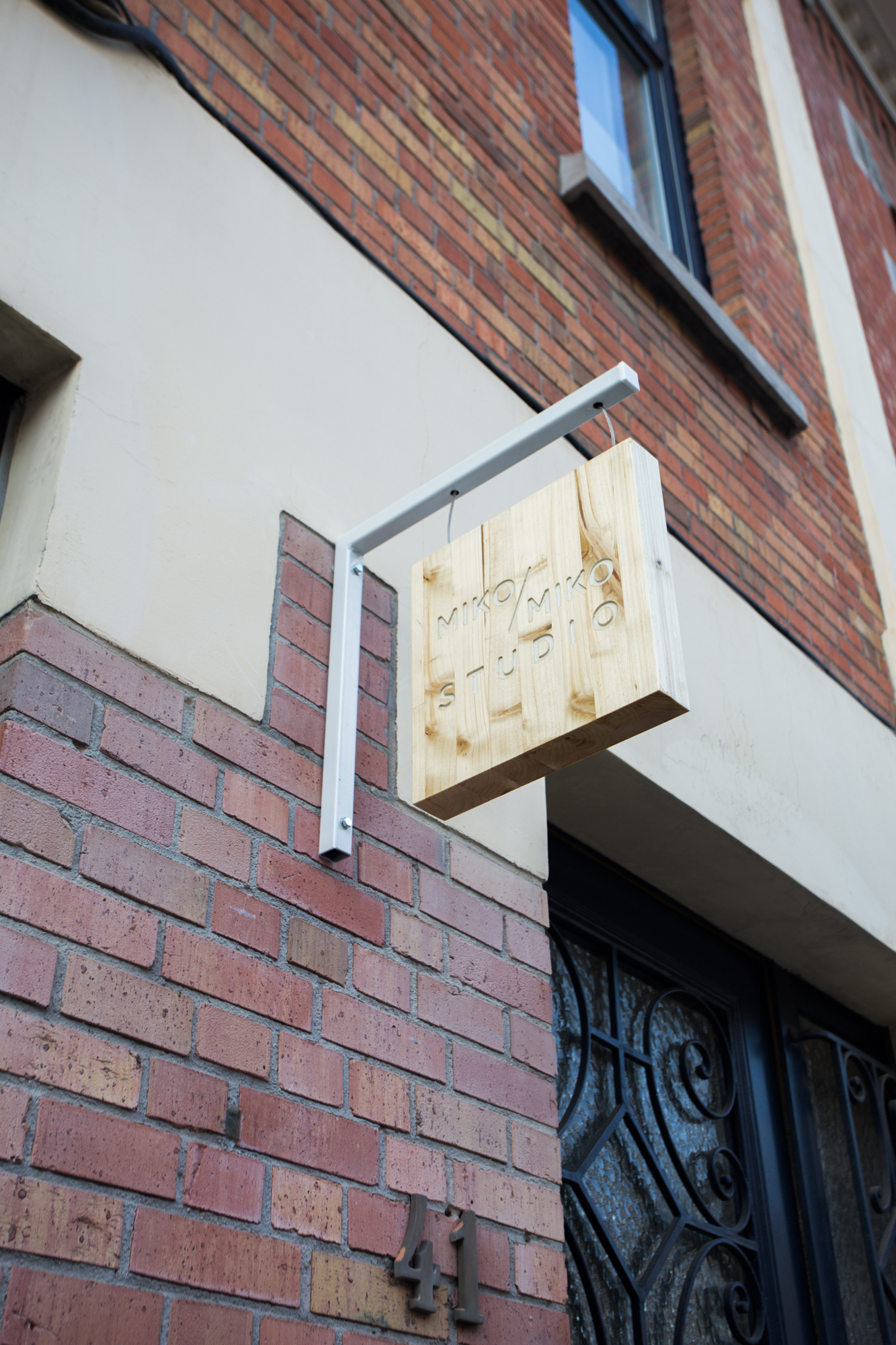
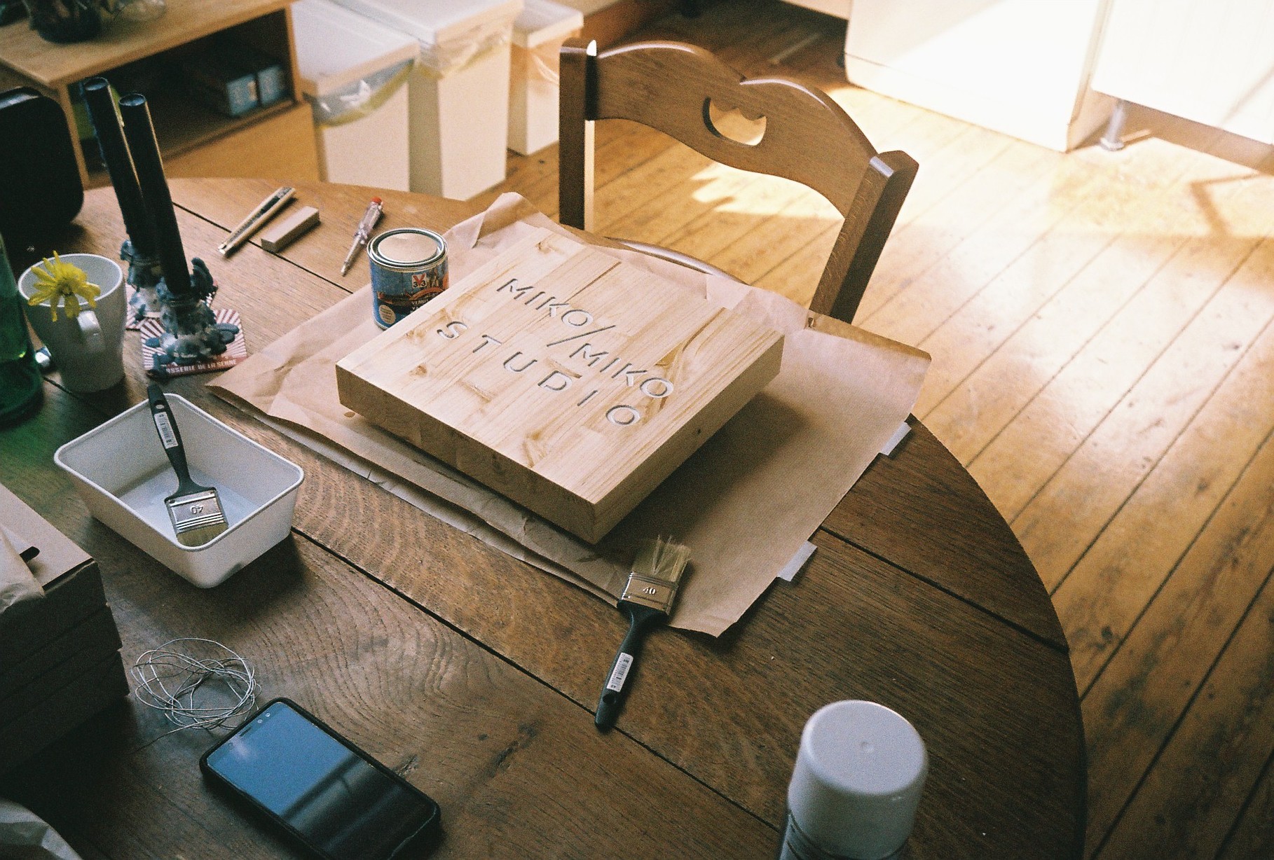
A sign for MIKO/MIKO photography studio, inspired by Japanese Ramen restaurants



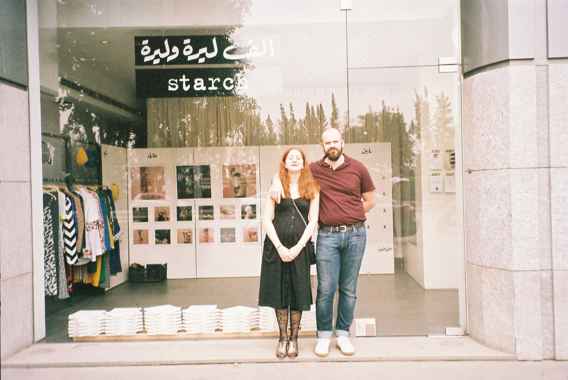
1000 Lira w Lira
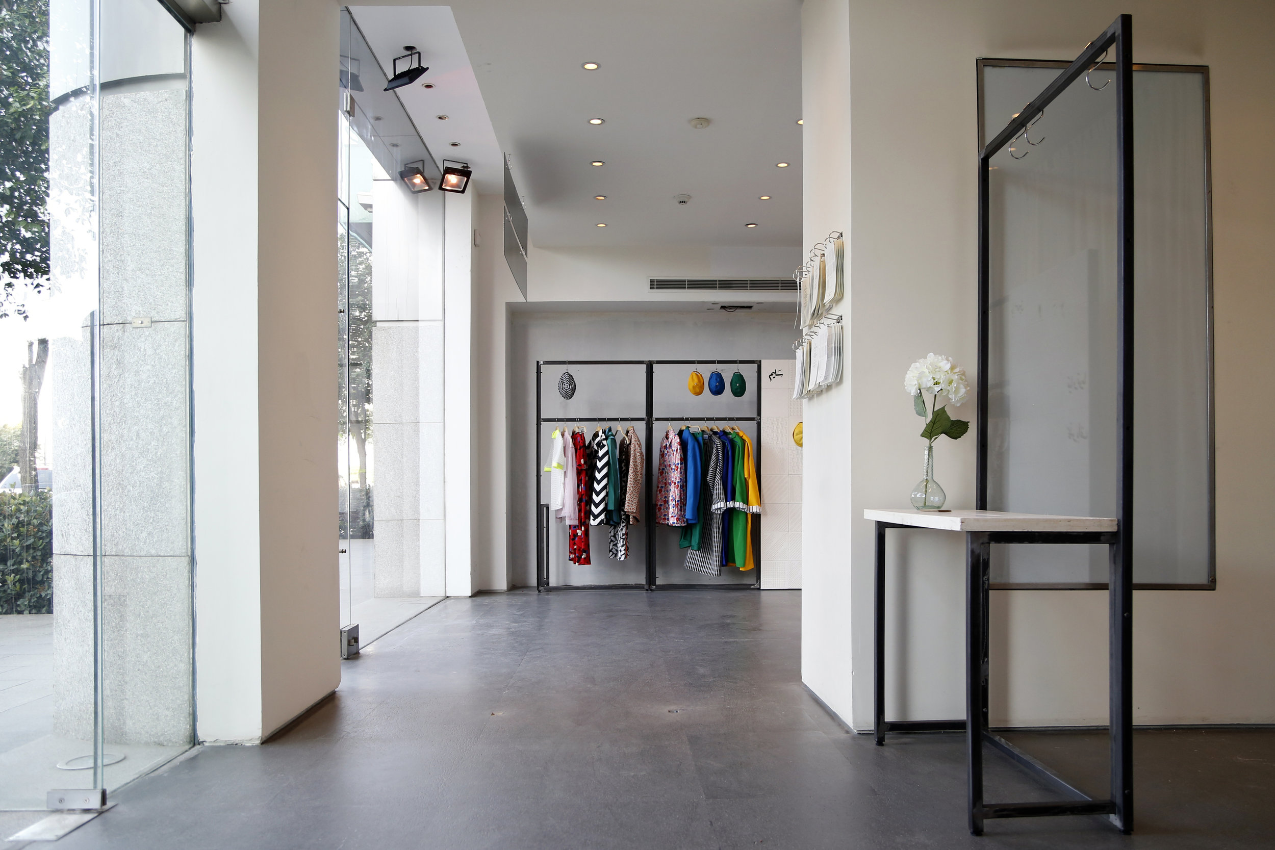
1000 Lira w Lira we revisited the “1 Dollar Shop” concept and adapted it to the Lebanese Lira, an inflated currency that looses its value as we go, for value is a controversial topic.

In this project, 1000 Lira w Lira we revisited the “1 Dollar Shop” concept and adapted it to the Lebanese Lira, an inflated currency that looses its value as we go, for value is a controversial topic.
1 Dollar Shops, Pound shops, are shops where you find many materials.
1 Dollar Shops, Pound shops, all share 1 rule: no matter how big or small the product, or what it is made of, it is sold at the same unit price, 1, (here, 1000).
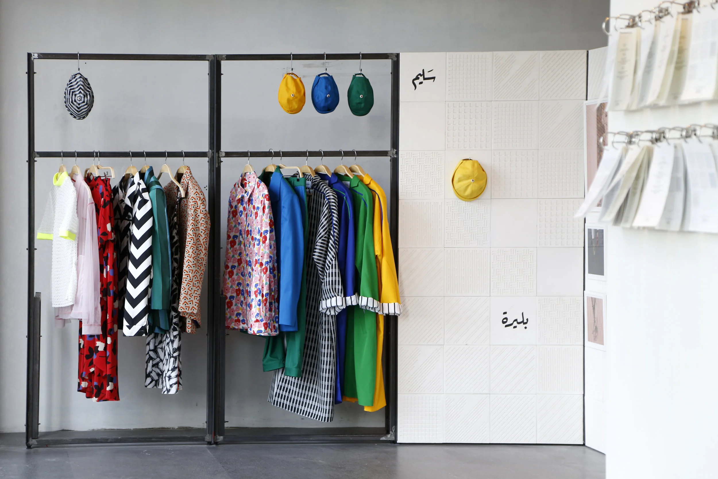
1000 Lira w Lira shop is a shop of a “1000“ materials all represented in “1”:
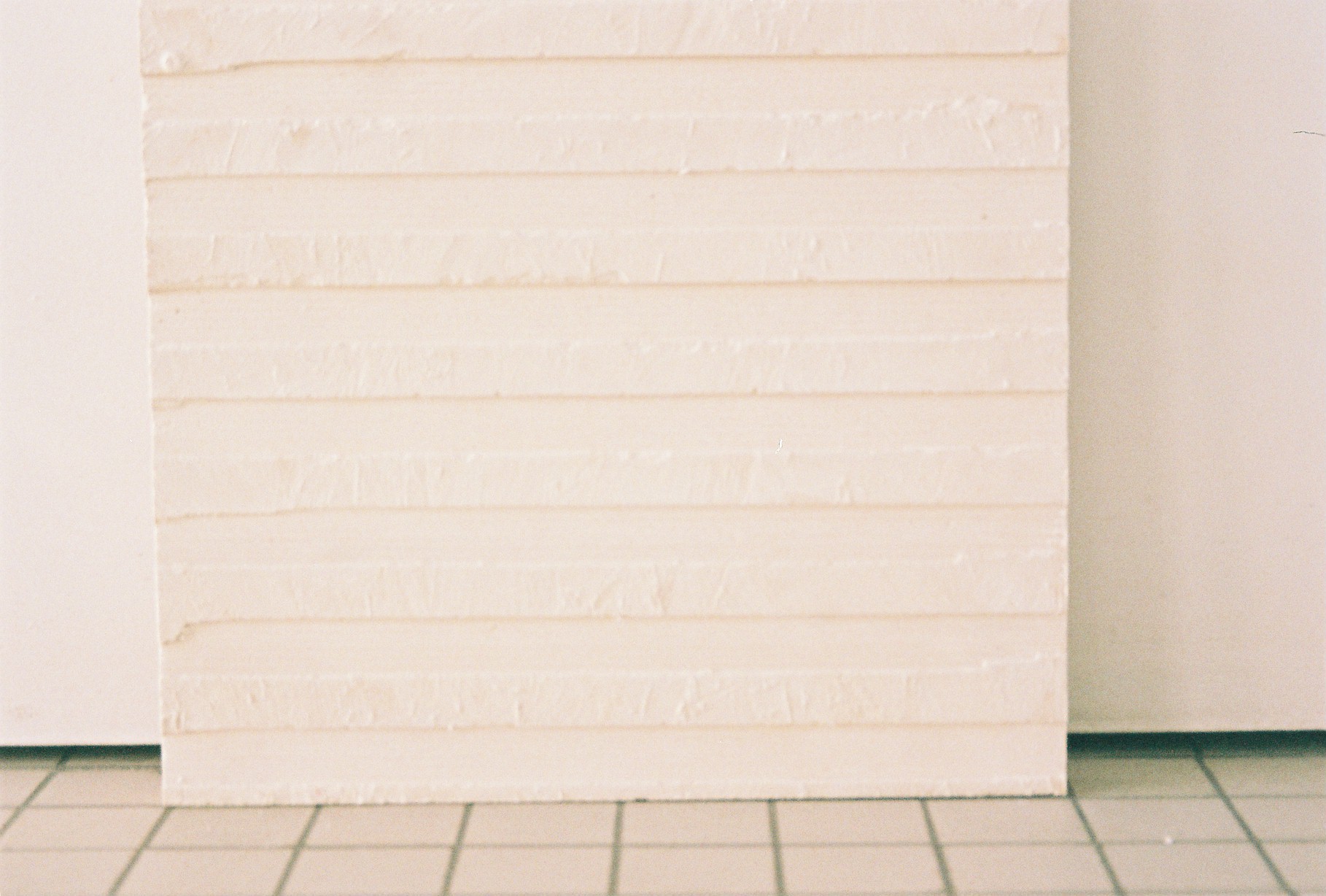
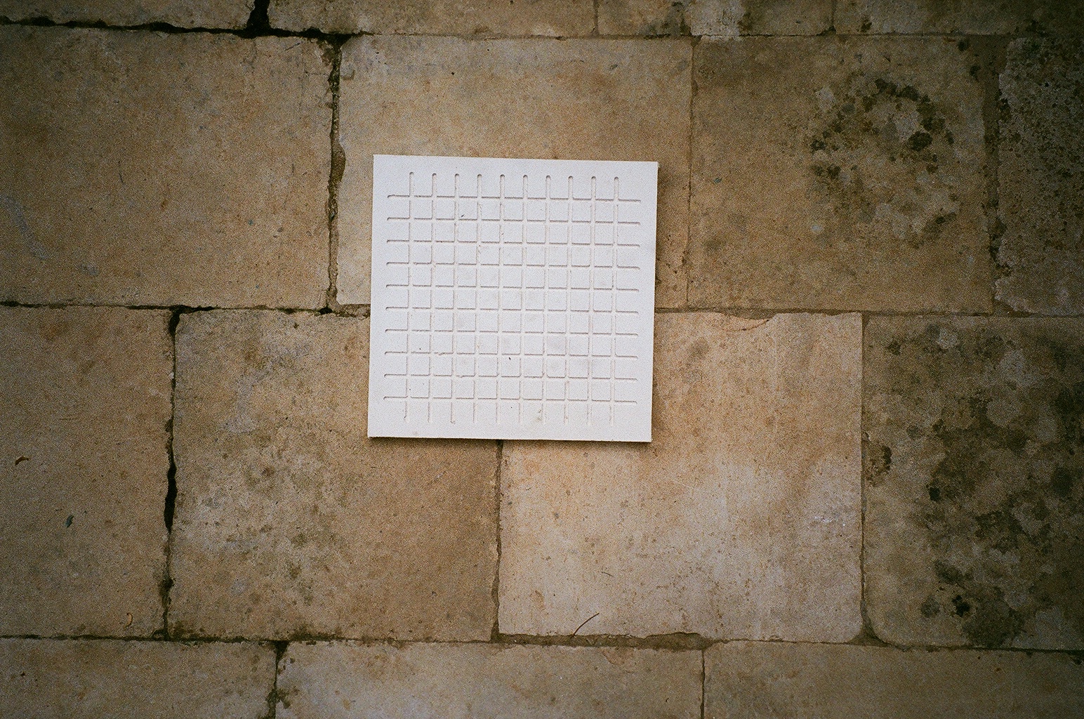
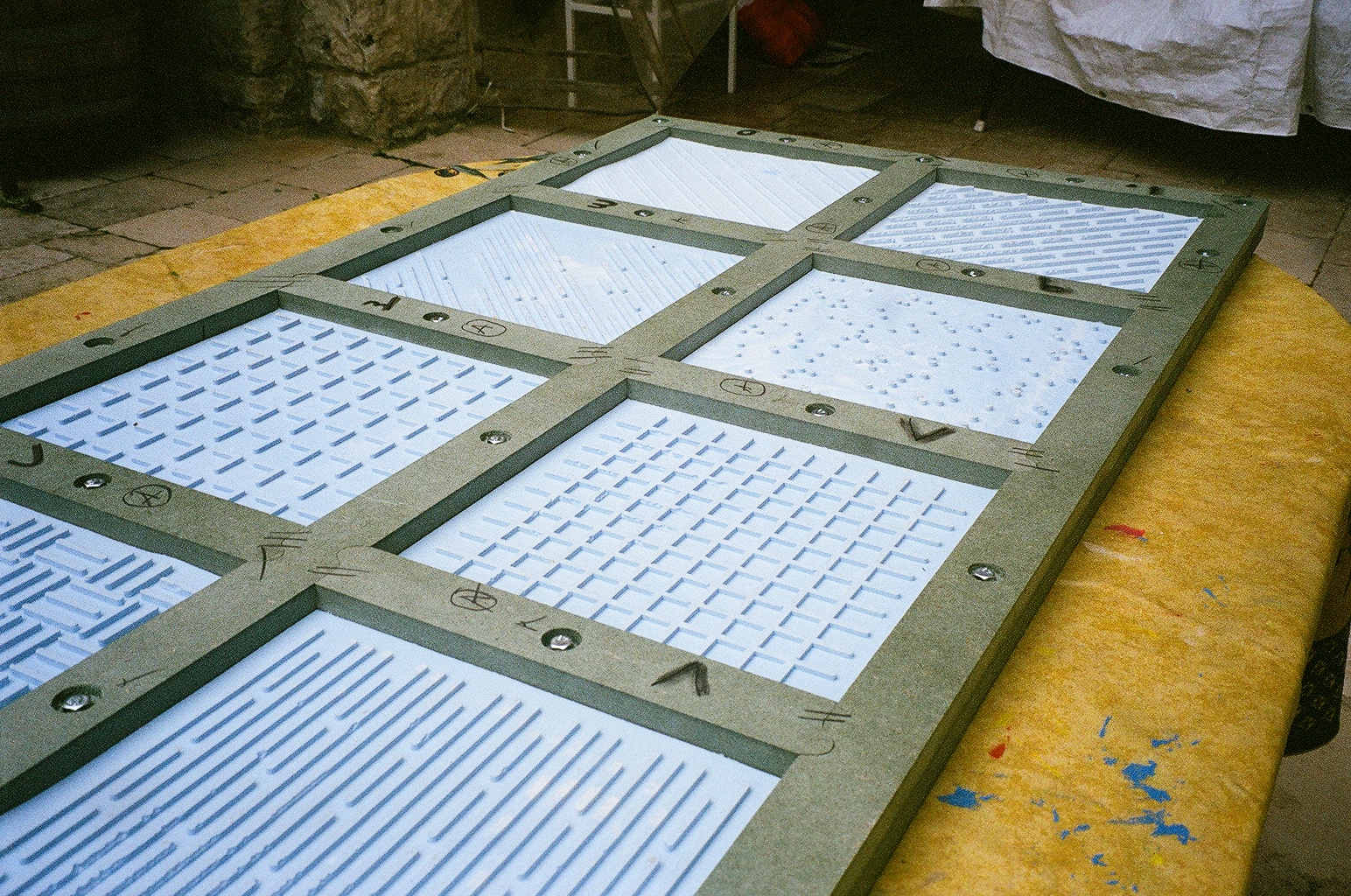
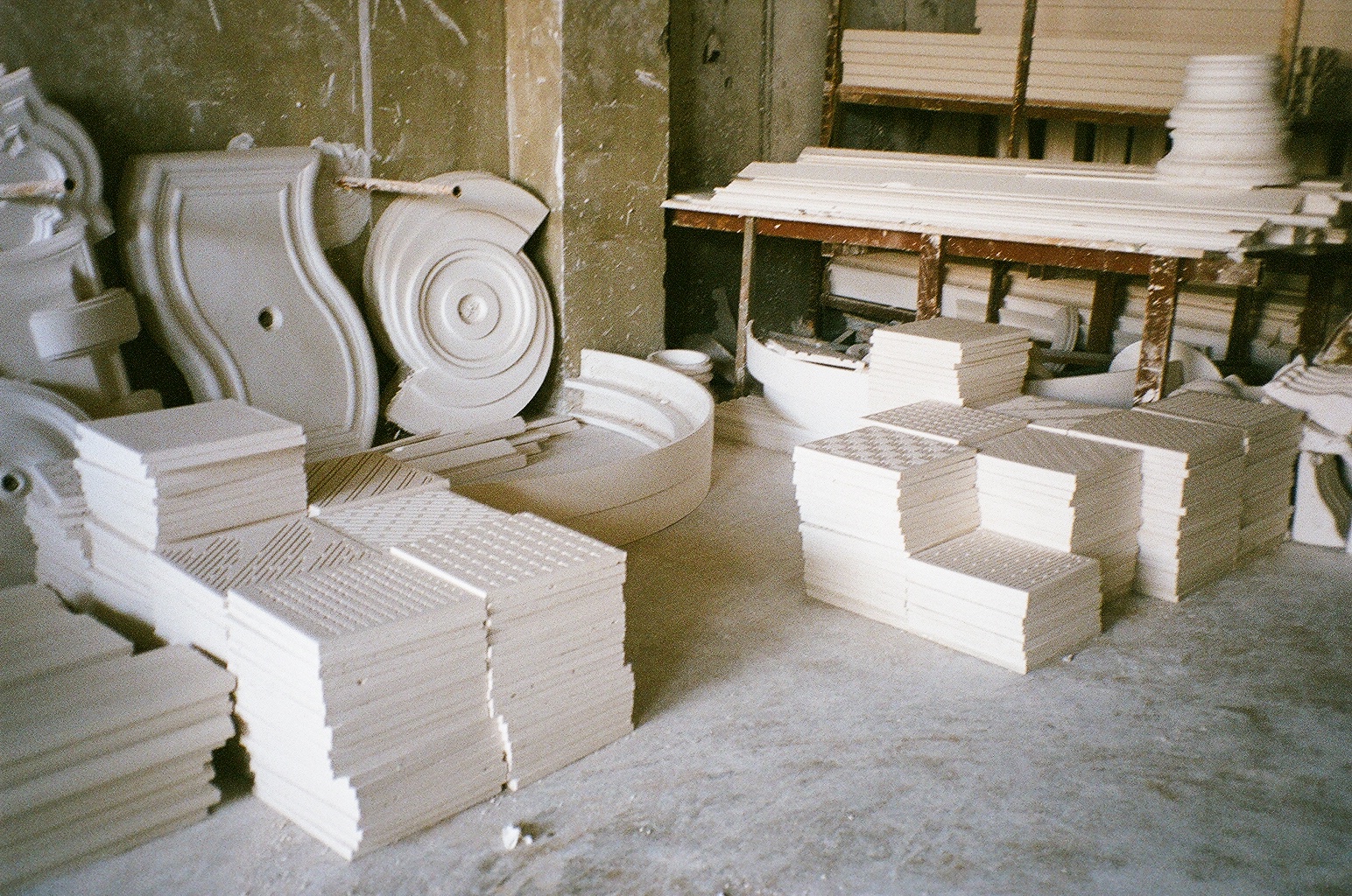
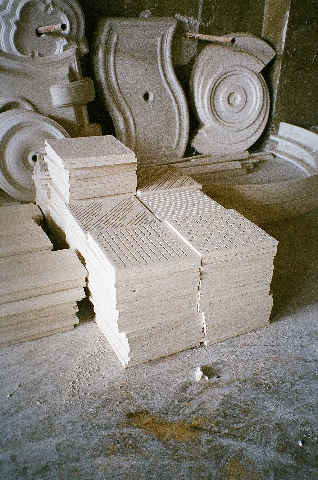
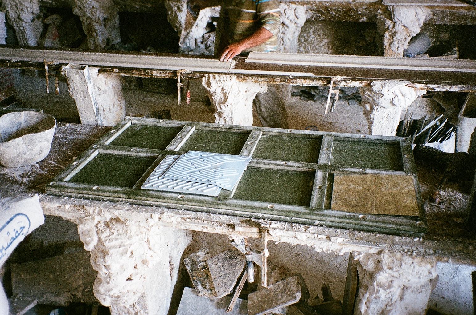
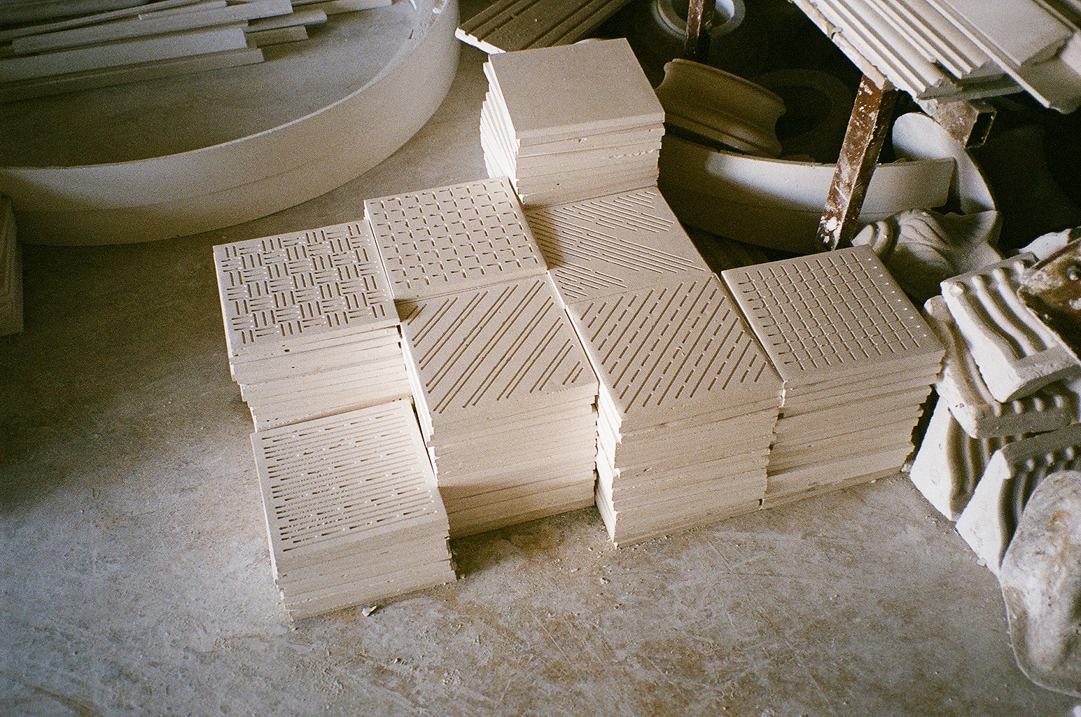
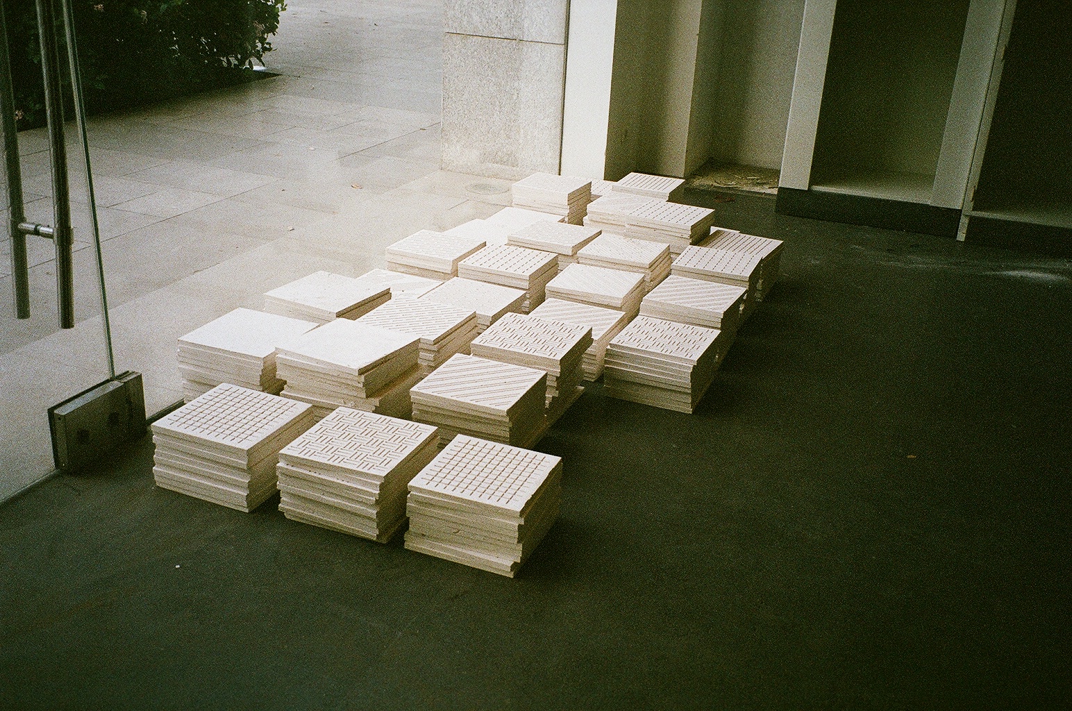
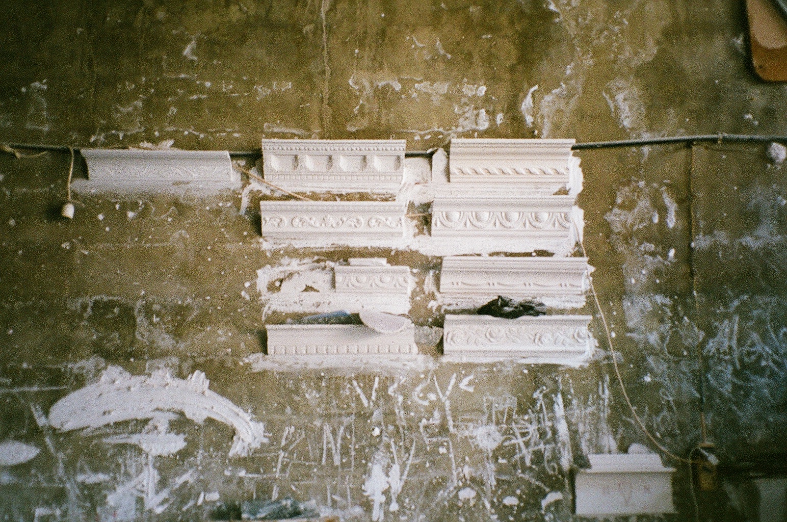
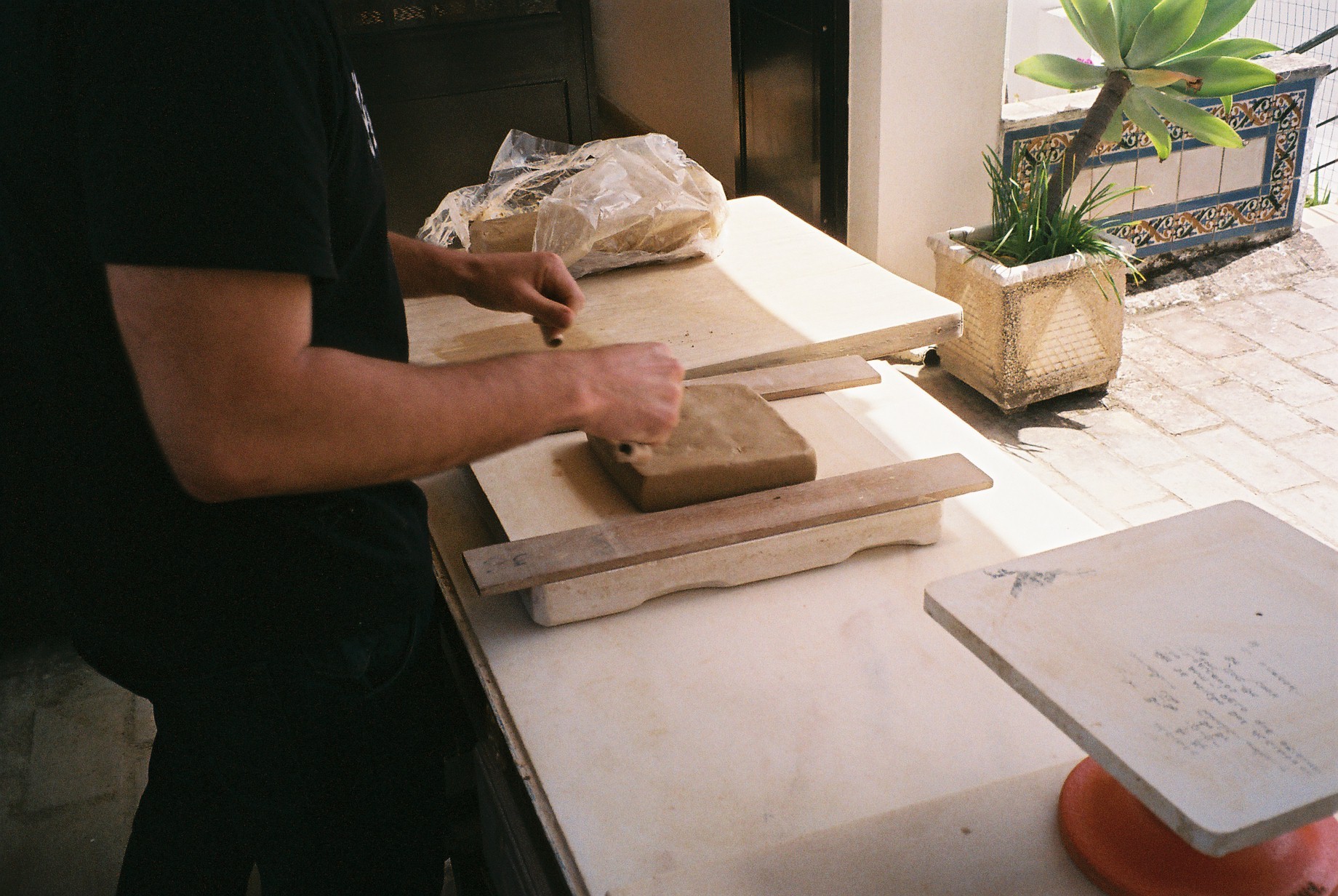
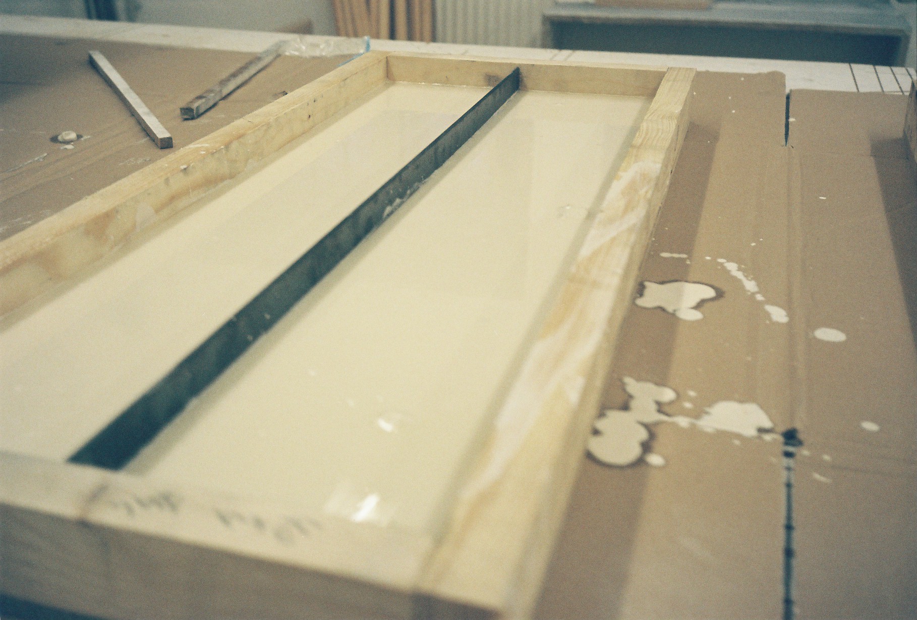
A plaster tile of 250*250*15 mm with 1 variable engraved hatch that symbolizes the different materials: steel, glass, brass, etc.
However in this shop, tiles are sold according to the material they are referring to. And therefore, a brass/plaster tile is more expensive than a steel/plaster tile, of course.
In this shop you can find a “1000” different products from designer clothes to photographs to illustrations, all sold at a “1000”. Well, the currency varies with each product and 1000 as a number is big or small depending to what it is referring to. So you will find cheap or expensive, but those are relative terms.
A “1 Dollar shop” is usually a saving store for the mass.
Geographically, this Lira w Lira shop is located in Beirut Central District, one of the most expensive and “luxurious” location in town: A location where saving stores were gentrified. This project aims to both honour and re-invite the middle mass, the “1000” to join the privileged “1” in a small shop of 30sqm with 1 big changing room of 55sqm, where the budget is somewhere in between. Big or small we mean.
Photos by: Joe Khoury
1000 Lira w Lira
is a shop of
1000 materials all represented in
1 and its 1000 architectural, symbolic hatches.
1000 Lira w Lira
is a shop where
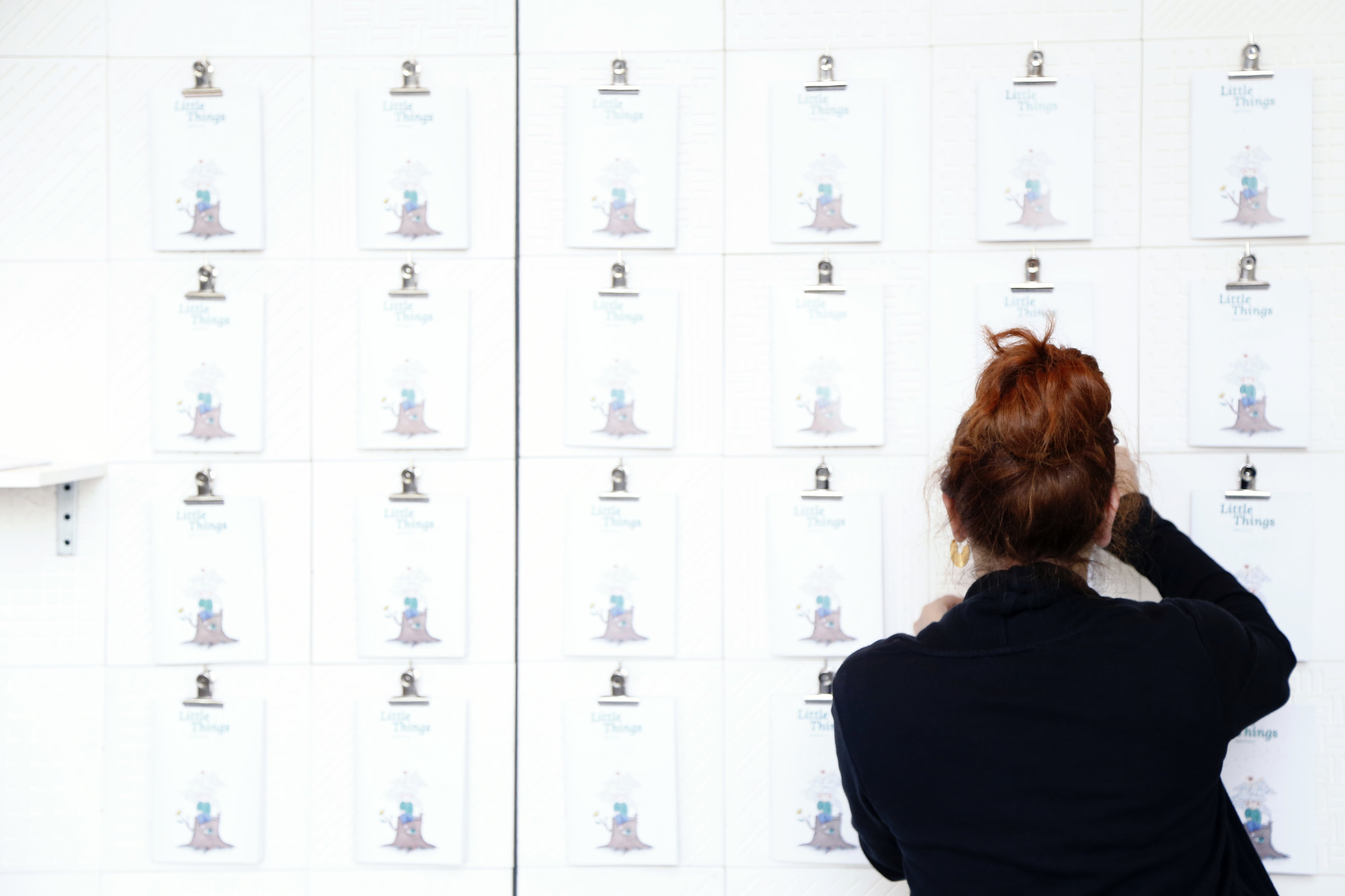
1000 ideas are collaged in 1.
1000 looks are unified.
1 memory is divided, multiplied, and scattered to the mile.
1 idea is documented in 1000 steps.
Or even sold, 1000 times.
1000 Lira w Lira
is the shop of
1000 designers. More like 7, where 2 make 1.
But the rest is yet to come.
1000 Lira w Lira is the hyperbolic/understated story of 1000/Lira and everything around those 2.








Brasserie de la Senne
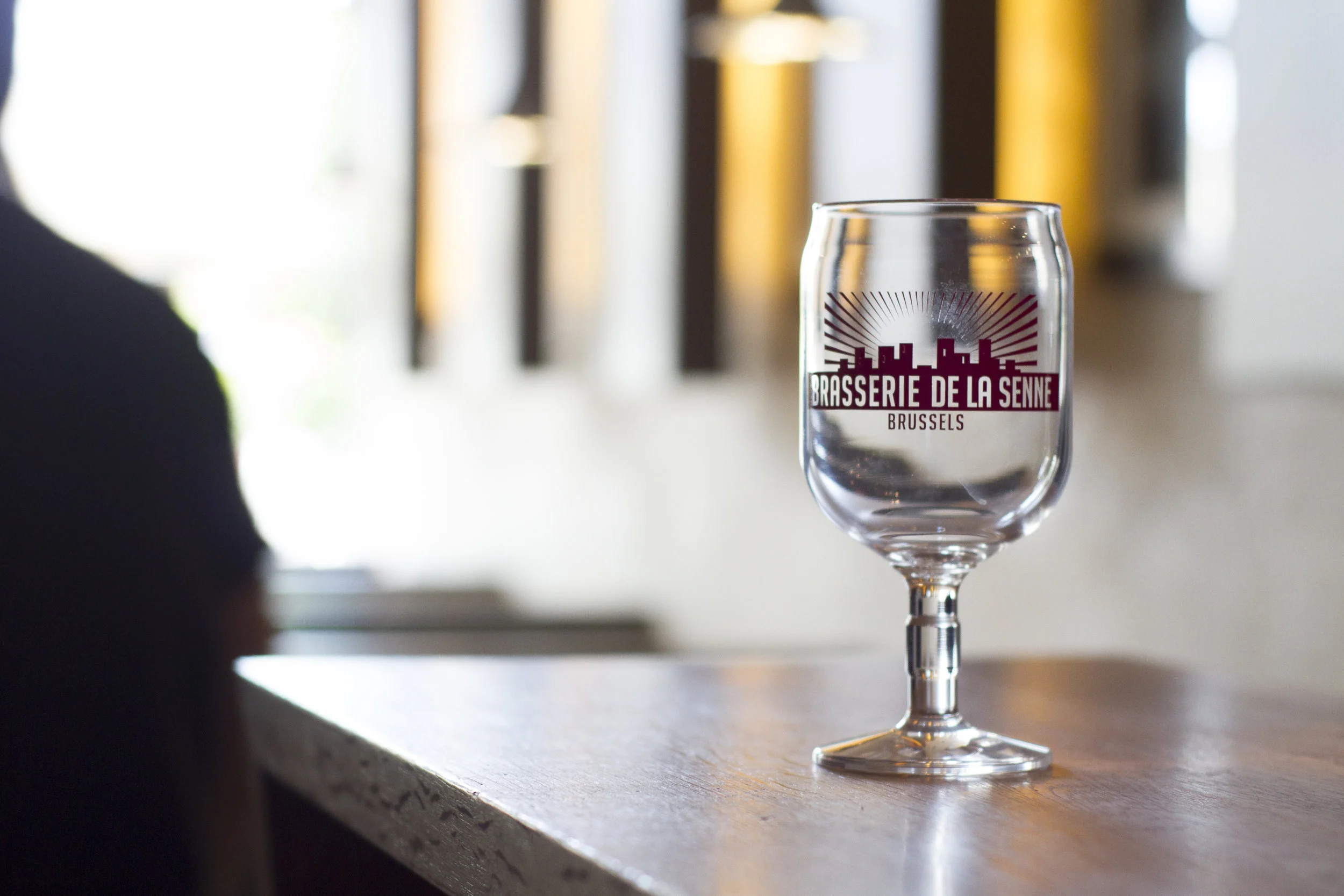
Design a beer glass specifically for the brewery, one that is not picked from a catalogue
Design a beer glass specifically for the brewery, one that is not picked from a catalogue
A particular care should be given for the conservation of the foam
The straight sides of the glass (which is not common in beer glasses) is a “vitrine” for the beer
The converging neck tightens the aromas
The aim was to design a glass that is in between the calice of a special beer and the simple glass of the table beer, perfectly representing the philosophy of Brasserie de la senne, a beer for connoisseurs, without elitism.